


 ACS Logo PNG
The ACS logo reflects a commitment to scientific research in chemistry. It has become a symbol of collaboration among scientists who share their knowledge and expertise. At the same time, the emblem demonstrates the organization’s dedication to high scientific standards and its core mission of pursuing innovation.
The American Chemical Society was founded on April 6, 1876, when 35 chemists met at New York University. Professor Charles F. Chandler chaired the meeting and became the first president. The association was created to unite American chemists, support research, and build a national professional network.
In 1879, ACS published the first issue of the Journal of the American Chemical Society, later known as JACS. During the 1880s, local sections appeared across the country, giving chemists regular professional contacts. In 1907, the US Congress granted ACS a federal charter, formally recognizing its national role. The 1920s brought new journals, including Industrial & Engineering Chemistry News Edition, and specialist divisions for separate branches of chemistry.
During the Great Depression, ACS continued work on professional ethics and chemical education. Its members joined wartime research during World War II, while the society expanded publishing and national conferences through the 1950s and 1960s. In the 1970s, the Chemical Abstracts Service became a major database for chemical information used by researchers worldwide.
Educational programs grew during the 1980s and 1990s, including student projects and public science outreach. In the 2000s, ACS moved journals and chemical data online. From 2011 to 2023, it launched programs supporting international partnerships, global research cooperation, and new work across the chemical sciences.
Meaning and History
What is ACS?
This is a scientific organization that supports research and development in chemistry. It facilitates knowledge exchange among scientists and professionals, publishes authoritative scientific journals, and organizes international conferences. The organization also promotes chemistry education by providing grants and scholarships. Its mission focuses on advancing science and leveraging chemistry to address global challenges.
Old

Although the American Chemical Society was founded in 1876, its visual identity history dates back to 1908, when a special committee approved a proposed design. The organization, focused on research activities, adopted the emblem to enhance its reputation, attract new members, and strengthen its influence in the scientific field. In the 1940s, the ACS Constitution finally included requirements for the brand’s distinctive mark, specifying its colors as gold and cobalt blue.
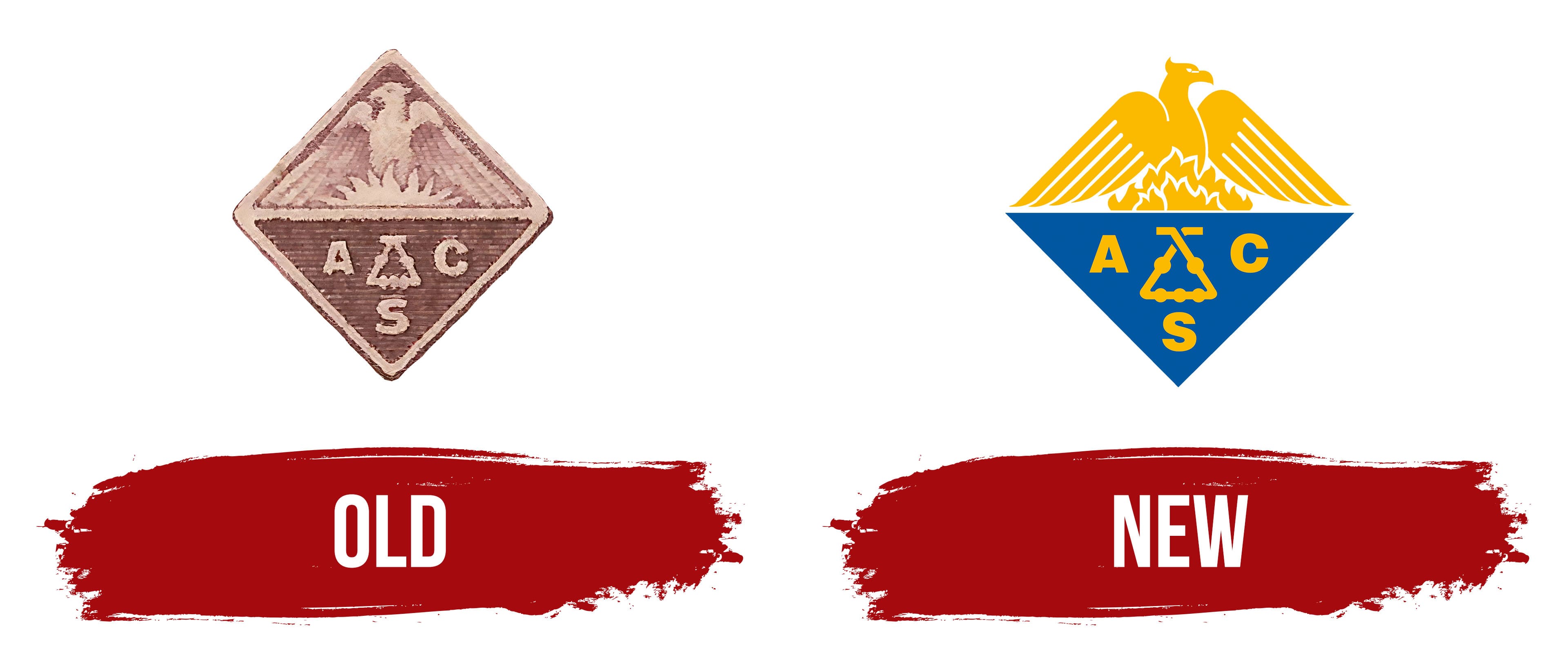
The old ACS logo, depicted on a 1951 postage stamp, has survived. It is a diamond with slightly rounded corners. A horizontal stripe runs through the center, dividing the geometric shape into two parts and merging with the outer frame.
In the upper triangle, a phoenix is engulfed in flames. The rebirth of this mythical bird symbolizes the creation of a new substance due to a chemical reaction. The lower half of the emblem features a Kaliapparat, a laboratory device resembling a triangle with five spheres. Next to it is the acronym “ACS,” also forming a triangle, with one letter on each side.
Although the American Chemical Society’s official colors were gold and cobalt blue at the time, the logo was rendered in shades of brown to match the colors of the postage stamp on which it appeared.
New
In 1987, the journal Chemical & Engineering News reported that the ACS had modified its logo by turning the phoenix to face right. However, this design was officially registered as a trademark in 1978, as documented in the United States Patent and Trademark Office database.
The emblem retained its original diamond shape but lost its geometric precision, as the upper half no longer resembles a triangle with a sharply defined border. The top now features a large yellow phoenix resting on outstretched wings. The bird is turned to the right, marking the primary difference from the older logo. The sharp crest on its head creates a visual counterbalance to the large downward-curving beak.
The yellow flames indicate this is a phoenix: the immortal bird burns itself to be reborn as a small chick. This mythical image symbolizes transformation, closely tied to chemical principles, in which one substance can change into another. Additionally, the phoenix represents resilience and eternity, emphasizing the continuous advancement of science, its ability to overcome challenges, and its adaptability to the modern world.
The lower portion of the ACS emblem contains a blue triangle resting on a 90-degree angle. This element symbolizes stability and foundational balance, which are central to chemistry. Interestingly, the inverted triangle resembles the alchemical symbol for water, making it a counterpoint to the fiery phoenix.
Inside the triangle is a zigzag line with five bold dots. This is not merely a geometric abstraction but a real laboratory apparatus known as the Kaliapparat. It is a triangular glass tube with five spherical bulbs, invented by German chemist Justus von Liebig for analyzing organic substances. The Kaliapparat was included in the ACS logo because one of the society’s 35 co-founders was a student of Liebig.
Surrounding the laboratory apparatus are the uppercase letters “A,” “C,” and “S.” Their confident, bold sans-serif font resembles Foundation Sans Black by FontSite Inc. and Pragmatica Black by ParaType, as it features the same even line thickness and clean shapes.