![]() Adobe Logo PNG
Adobe Logo PNG
Information technology and software from the American company Adobe are represented by an emblem that is no less famous than its products. The modern minimalist version of the Adobe logo ensures recognizability, better visual representation, and convenience.
Adobe: Brand overview
| Founded: | December 1982 |
| Founder: | John Warnock, Charles Geschke |
| Headquarters: | San Jose, California, U.S |
| Website: | adobe.com |
Meaning and History
![]()
The company’s logo was proposed by Marva Warnock, the co-founder’s wife. It was immediately accepted and used as a unique symbol until 1993. Throughout its existence, Adobe has had two emblems and the same number of fixed variations. That is, the logo has changed only three times since its introduction.
What is Adobe?
Adobe is the largest software corporation in the USA, founded in 1982 by Charles Geschke and John Warnock. Its headquarters is in San Jose, California. The company develops software for creating vector illustrations, editing images, drawing, and publishing audiovisual content.
1982 – 1990
![]()
The debut version contains a graphically transformed company name. It’s a dark gray rectangle with the white inscription “Adobe” in uppercase. The letters appear overlaid on each other, so “E” protrudes from under “B,” “O” from under “D,” and “A” overlaps the leg of the second symbol. In addition, the first letter in the word is made in the form of an open triangle at the bottom, creating an impression of openness.
Under the name, formed from the name of the Californian stream flowing between Mountain View and Palo Alto, is the phrase “Systems Incorporated.” All letters are capitalized and of the same size.
1990 – 1993
![]()
The basis of this logo was its predecessor, which underwent a slight correction. As a result, the lower inscription “Systems Incorporated” disappeared, and the word “Adobe” became black on a white background.
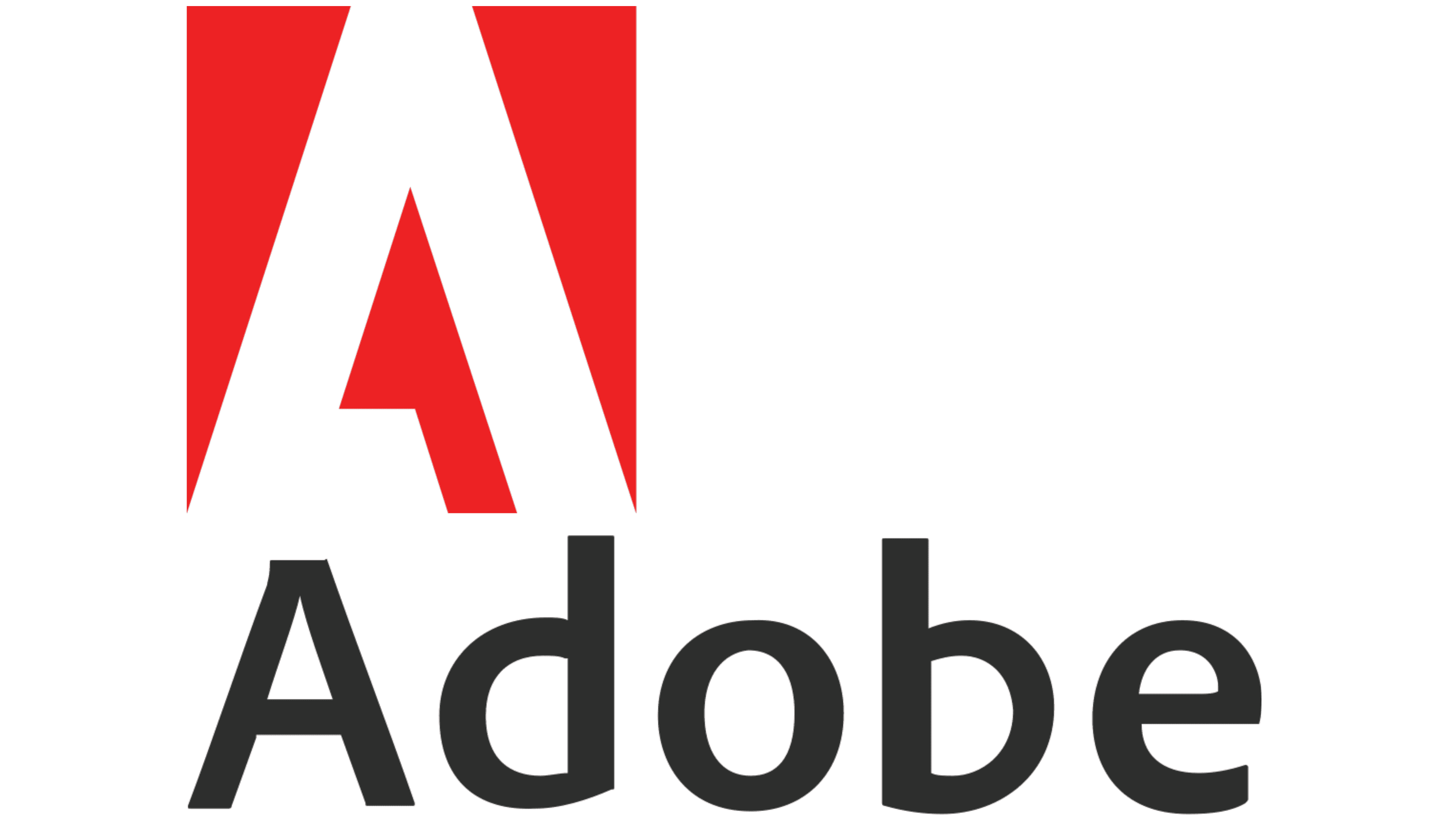
1993 – 2014
![]()
In 1993, the company’s emblem received a completely new interpretation: it is now the initial letter “A” on a red background. The style of writing, shape, color – everything is preserved to the smallest detail to remind users of the debut version maximally. This step was taken in connection with the appearance of software named Adobe Creative Cloud, which was executed in red and white colors.
Later, the same version was used to denote other innovative products: Photoshop (in 2013), Adobe Acrobat, and Adobe Dreamweaver (in 2015). It is currently relevant and operates parallel to a later version.
2014 – 2020
![]()
The logo, presented by Acid House and John Warnock, was created for the official website. It almost completely repeats its predecessor, with the only difference being that the word “Adobe” is placed separately from the graphic sign.
2020 – today
![]()
After the intervention of The Acid House studio, the logo of the editorial program received minimal adjustments. They are primarily related to color. The lower word “Adobe” turned from black to red, and the background of the upper rectangle, in the negative space of which appears the figurative letter “A.” The font chosen for the decal remained – it is still Adobe Clean Bold Condensed.
2023 – today
![]()
The recently modernized logo for the Adobe application differs in originality, modernity, and compactness. This fresh image uses a new approach: it includes only part of the brand name in combination with a unique, easily recognizable symbol. Thanks to this strategy, the software giant has managed to create a strong visual identity that is both organic and balanced.
The classic letter “A” in the name Adobe has been replaced with a solid symbol – a separately placed square. Such a departure from tradition allowed for the creation of a bright and memorable logo that attracts attention while remaining familiar.
Previously, the graphic symbol was more substantial than the adjacent text. However, this was masterfully corrected to maintain a balanced aesthetic. Slightly enlarging the traditional letters, designers achieved a bold typography that harmoniously combines with the size of the main symbol, thus creating a cohesive visual identity.
The logo now starts with a triangle that echoes the contours of the traditional letter “A” from the English alphabet. However, a fundamental difference lies in the placement of the crossbar. The standard letter “A” is centered and shifted to the bottom of the logo. The crossbar expands to the left, intentionally leaving a minimal gap, not touching the opposite side. Despite these changes, the essence of the original logo is traced, repeating the initial emblem created by Marva Warnock, the wife of Adobe co-founder John Warnock.
A bold design decision was made regarding the color scheme. The logo’s palette was updated to a bright red color, significantly different from previous shades. This vibrant color choice gives the logo energy and passion, making it more noticeable and memorable.
Overall, the modernized Adobe logo is a study in strategic design. The brand has created a visual identity that is distinctive and rooted in history, maintaining key elements of the original and infusing it with fresh, modern components. This logo serves as an emblem of Adobe’s commitment to innovation and evolution, symbolizing its enduring relevance in the ever-changing technology landscape.
Adobe: Interesting Facts
Adobe Inc. was started in December 1982 by John Warnock and Charles Geschke. It’s a big deal because it made a lot of cool stuff for computers and art.
- How Adobe Got Its Name: It’s named after a creek that flowed behind John Warnock’s house, showing off the company’s connection to nature right from the start.
- First Big Thing—PostScript: Adobe created PostScript, which was huge for magazines and newspapers because it allowed people to mix pictures and words easily.
- PDFs: In 1993, Adobe created PDFs, which make it super easy to share documents that look the same no matter what computer you use. By 2008, everyone agreed that PDFs were the way to go for document sharing.
- Buying Macromedia: In 2005, Adobe bought another company called Macromedia, getting its hands on popular tools like Flash and Dreamweaver, which made Adobe even bigger in website design and animations.
- From CDs to Clouds: In 2013, Adobe switched from selling its software in boxes to a subscription online through Adobe Creative Cloud. This meant people could get software updates right away without buying new CDs.
- Getting Into Digital Marketing: Adobe isn’t just about art; it helps companies sell things online. They have tools that let businesses figure out the best way to advertise and sell stuff on the Internet.
- Research and New Ideas: Adobe loves to invent new tech, working on smart tech like AI to make its software even cooler. This includes making pictures look better and figuring out how to sell things online.
- Changing the World: Adobe’s software is everywhere, changing how movies are made, pictures are taken, and websites look. Because of its popularity, “Photoshop” has become an everyday language.
- Global Giant: Adobe is based in California but works worldwide. Its tools are used by artists, companies, and anyone who wants to do something creative or sell something online.
From starting as a small company, Adobe has grown into a big name in the digital world, changing how we create and share everything from art to ads.
Font and Colors

It was developed by the founder’s wife (Marva Warnock) and approved in the year the company entered the information technology field. Initially, the logo contained the full company name – “Adobe Systems Incorporated,” with a visual emphasis on the first word. Then only “Adobe” remained, and then – just the large letter “A.” Each adjustment is the evolution of the logo towards simplification for better visual perception and convenient transmission on various media.
Also, the company’s proprietary programs have their designation. Adobe Illustrator is an orange abbreviation with a large “A” and a small “i.” Adobe Flash is a two-letter image of uppercase “F” and lowercase “f.” Adobe Photoshop is an emblem of uppercase “P” and miniature “s.” One of the main versions also plays with mirror images of “d” and “b.”
From 1982 to 1993, the words on the logo were executed in a graphic font – that is, drawn. But then the approach changed: the text version came to the forefront, where great attention was paid to the font. In the original version, the product name is written in elongated bold letters. Then, they became thinner, wider, and squatter. Designers also increased the space between characters and diagonally trimmed the bottom part of the legs of “d” and “b.”
The palette of emblems is also divided into two periods: before and after 1993. Initially, the background was dark gray and white, and the letters themselves were drawn in white and black. Then, red was added, which is still used in combination with white.
Adobe color codes
| Red | Hex color: | #fa0c00 |
|---|---|---|
| RGB: | 250 12 0 | |
| CMYK: | 0 956 100 2 | |
| Pantone: | PMS 172 C |