![]() Agoda Logo PNG
Agoda Logo PNG
The Agoda logo reflects the idea of connecting different people and countries, which is exactly what the company does—helping travelers find accommodation anywhere in the world. The emblem’s design conveys the reliability and professionalism of the online travel operator, highlighting its innovative approach to travel planning.
Agoda: Brand overview
In Thailand, Agoda’s history started in the late 1990s. American businessman Michael Kenny, who relocated to Thailand in 1994, started the company. When it was first established, the business was known as PlanetHoliday.com, and it was a tiny startup with an emphasis on Asian Internet hotel reservations.
Kenny founded PlanetHoliday.com in 1998, and it quickly rose to prominence as one of Southeast Asia’s first online hotel booking platforms. Online reservations were a novel concept for the area when the internet was only beginning to gain traction. The business began by providing hotel booking services in Thailand and then progressively spread to other Asian nations.
Robert Rosenstein became a co-founder of PlanetHoliday.com in 2002. Rosenstein improved the company’s web platform by bringing his skills from the IT industry. The business started aggressively developing its technological solutions, enhancing the website’s usability, and adding new features throughout this time.
The company reached a major turning point in 2003 when it decided to rename. The rebranding was chosen because it is short and simple to remember and pronounce in various languages. This action aimed to develop a more powerful and identifiable brand that could compete globally.
Following the makeover, the firm began to grow outside of Asia. The corporation expanded into other parts of the world and solidified its position in the Asian market by opening offices in Bangkok and Singapore.
The loyalty program, Agoda Cash, was introduced in 2005. Customers who booked hotels through the website were eligible for bonuses. This program facilitated the service’s rising popularity and became one of the most important resources for drawing in and keeping clients.
An important turning point in the company’s history occurred in 2007. Major players in the travel business took notice, and in November 2007, Priceline Group (now Booking Holdings), one of the biggest online travel companies globally, bought it. The firm gained access to Priceline Group’s worldwide resources and technologies and new growth and development opportunities with this acquisition.
After being purchased by Priceline Group, the business continued its aggressive growth. In 2008, new offices and partnerships with hotels in North America and Europe greatly expanded its activities in these countries.
One of the first hotel booking businesses to allow smartphone booking was the firm, which debuted its mobile application in 2009. This innovation increased the business’s popularity and made booking easier for travelers.
The Insider Deals program was introduced in 2011, providing registered consumers special hotel stay savings. This program was an additional step in enhancing user experience and boosting client loyalty.
2013 saw the introduction of reserving villas and apartments, thereby broadening its selection. This choice enabled the business to broaden its product line and addressed the rising need for alternate forms of lodging.
For the company, 2015 was a year of major technology advancements. The business implemented a new artificial intelligence system to provide users with personalized search results and suggestions. This invention increased the platform’s effectiveness and raised the caliber of client care.
The PointsMAX program, introduced in 2017, allows passengers to accrue miles and points from airline reward programs when using the service to book hotels. This approach enhanced the company’s standing among business and frequent travelers.
Meaning and History
![]()
What is Agoda?
It is an online travel agency and metasearch engine specializing in hotel reservations, accommodation rentals, flights, and airport transfers. Based in Singapore, the company provides travelers with a comprehensive platform to search and book accommodations worldwide, offering a wide range of options from budget hostels to luxury hotels. The platform features user reviews, competitive rates, and various booking options to cater to the diverse needs of travelers. It is part of Booking Holdings, one of the largest travel services companies worldwide. booking.
2004 – 2005
![]()
This logo was used before the official registration of the Agoda brand. It contains the travel startup’s name, which doesn’t mean anything. The made-up word starts with the letter “A” on purpose – it was intended to make it easier to find on the Internet. To emphasize the importance of the first “A,” the designers made it almost twice the size of the other glyphs. And there are no lowercase letters in the inscription.
The unique name Agoda was chosen because it sounds similar to the phrase “I go to…,” suggesting hidden energy and a hint of movement. These associations are embodied in the emblem with an italic font, which appears to be rapidly moving forward. The “G” looks like a circular arrow, conveying the idea of traveling by land and air. The dynamic form of the logo symbolizes gaining new experiences, as the main thing Agoda offers its clients is vivid emotions and impressions from exciting trips.
The designers depicted the letters in negative space to show the brand’s originality and modernity. They are in white spaces inside a long dark blue rectangle, making it seem like the ghostly inscription slowly emerges to the surface. Each glyph’s contours are also highlighted with shadows on the right, so the travel startup’s name appears confident and clear. The open parts of the letters symbolize Agoda’s accessibility and the absence of boundaries for those who want to travel.
The base’s rectangular shape creates a sense of orderliness, stability, and reliability, which is important for travelers seeking comfortable conditions and quality service. The dark blue color evokes associations with professionalism and stability, as the newly created startup aimed to build trust with its clients.
2005 – 2007
![]()
In 2005, the official launch of the travel platform and its new logo took place. The developing brand made its symbol five colorful circles, corresponding to the number of letters in the word “Agoda.” They are arranged under the inscription so that each glyph has its color:
- “a” – red;
- “g” – orange;
- “o” – green;
- “d” – purple;
- “a” – blue.
This palette resembles a rainbow, though with a different sequence of colors. It symbolizes the variety of experiences travelers gain. Judging by the bright, life-affirming shades, joy and optimism dominate among the wide range of emotions.
The designers used a gradient to make the logo radiate positivity. This effect makes the circles appear as three-dimensional spheres with a light top and a shaded middle. The color transitions characterize Agoda as a progressive online travel agency targeting pioneers and adventure seekers. At the same time, the round elements create a sense of calm, comfort, and safety as many travelers seek a peaceful retreat. This duality helps the company appeal to all categories of clients with a single emblem.
The brand name is in lowercase because lowercase letters are associated with accessibility, friendliness, and simplicity. Additionally, this was done so that each glyph has its ring, matching the size of the colorful circles in the bottom row. The harmony of forms makes the logo cohesive, uniting the inscription and the graphic symbol. The thin sans-serif font looks concise, aiming to show Agoda’s restrained professionalism. For the same purpose, black is used, creating an impression of seriousness and responsibility.
2007 – 2013
![]()
In 2007, the travel platform became a part of Booking Holdings, necessitating a new logo to reflect its transformation from a little-known startup into a major company serving the entire Asia-Pacific region. The rebranding was carried out under the slogan “go farther. go smarter. go agoda,” which influenced the structure of the emblem.
The main symbol of the online travel agency remains the five colorful circles: red, orange, green, purple, and blue. The gradient gives them a three-dimensional appearance, showcasing the brand’s modernity and commitment to progressive technologies. As before, the circles are arranged beneath the inscription, which is rendered in a thin geometric font.
Now, the logo includes an additional element – the word “go.” It is styled similarly to the name of the travel platform, ensuring visual consistency. The designers reduced its size and placed it under the orange circle, directly opposite the letter “g.” This short call to action is part of the slogan, so in the animated version of the emblem, the words “farther,” “smarter,” and “agoda” appear sequentially after “go.” The interactive element creates a sense of dynamism and playfully motivates travelers to choose this company.
2013 – 2016
![]()
The travel platform’s identity evolved along with it, so by 2013, the old slogan had taken a backseat. It no longer clutters the logo, focusing all attention on the brand name and its constant symbol—the long row of five colorful circles highlighting the variety of services and the wide range of vivid experiences.
The emblem retains its smooth, shiny texture achieved through a gradient and an impressive three-dimensional effect. Due to the visual volume, the circles look like balls ready to roll. The illusion of movement reflects Agoda’s connection with travel and journeys, as the company helps tourists book hotel rooms, rent apartments, buy plane tickets, and find interesting activities—essentially, everything for a comfortable vacation.
However, the font has completely changed. It no longer has rings matching the colorful circles in size, so the logo doesn’t seem as perfectly balanced as before. The letters are predominantly oval and appear elegant due to the rounded ends. The contrasting thickness of the strokes enhances the dynamism of the inscription, and the smooth curves create a sense of softness and safety.
The brand name is colored gray, which is usually considered dull, but not in this case. The Agoda logo needed gray to balance the excessive emotionality of the rainbow circles. Thanks to the restrained color, the word immediately catches the eye, attracting attention with its elegant design. Here, gray is associated with calmness, seriousness, and a practical approach, characterizing the travel platform as a reliable partner.
2016 – 2019
![]()
The designers decided not to change the structure of the emblem because it serves as Agoda’s calling card. Clients instantly recognize the online travel agency by its colorful circles: red, orange, green, purple, and blue, always arranged in that specific order. This iconic symbol has earned the trust of travelers worldwide, especially those living in the Asia-Pacific region.
The quirky vertical “traffic light” is positioned under the inscription, with each circle supporting a specific letter. This arrangement creates a sense of mutual support and collaboration, emphasizing the need for a reliable assistant in vacation planning.
The logo has become much simpler, as it no longer has a gradient or a three-dimensional effect. The previously voluminous, shiny texture has been replaced by a standard flat look, reflecting the accessibility of Agoda’s services. The color palette has also changed: the colors have lost their brightness and adopted pastel shades. Previously, they expressed vibrancy, but now they convey confidence and calmness. The use of a minimalist style indicates that the online travel agency keeps up with fashion trends to attract young travelers.
2019 – today
![]()
In 2019, the company underwent a major rebranding to reflect its ongoing growth and commitment to innovation. However, it didn’t completely change its visual identity to avoid losing recognition. Instead, the travel platform aimed to revive the best elements from its previous logos.
This refers to the old font used since 2005. Its rounded letters looked great in combination with the colorful circles, making the inscription and graphic symbol seem like a unified whole. To achieve the same harmony, designers revived the long-forgotten font but made several changes:
- Shortened the vertical strokes, removing protruding parts (from the top of “a” and “g” and the bottom of “d”).
- Made the letters bold for greater clarity.
- Rounded the ends to create a sense of softness and comfort.
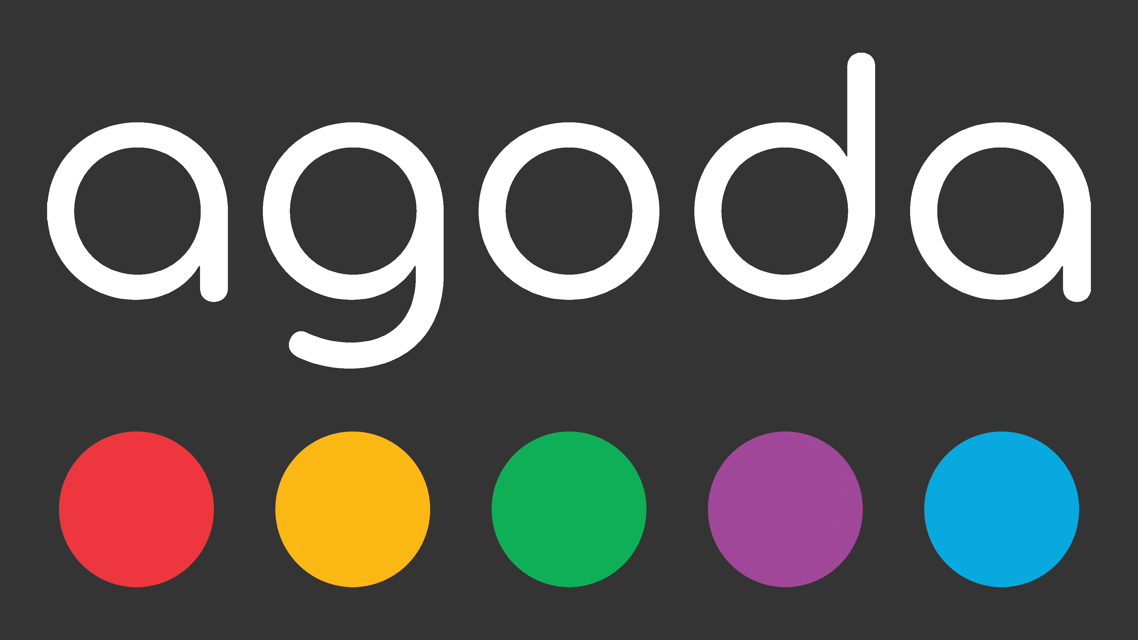
This gave rise to Agoda’s signature font, whose rounded shape resonates with the five colorful circles. The refined typography reflects the brand’s friendly nature and ability to solve serious tasks with playful ease.
The logo’s colors became brighter and more saturated. Green, purple, red, blue, and orange not only support an atmosphere of optimism but also symbolize the variety of services the travel platform offers. This visual representation also highlights that the company employs people from over 90 nationalities. The dark gray color of the inscription, in turn, emphasizes Agoda’s seriousness and professionalism.