The Air New Zealand logo encapsulates the airline’s dedication to embodying the spirit and beauty of the nation, from its environmental stewardship to its celebration of New Zealand’s unique culture and people. The emblem, evocative of New Zealand’s iconic kiwi bird, signifies the airline’s connection to the country’s biodiversity and environmental conservation efforts.
Air New Zealand: Brand overview
Air New Zealand’s history started on April 26, 1940, when Tasman Empire Airways Limited (TEAL) was founded. Together with Union Airways of New Zealand, TEAL was a joint venture of the governments of Australia, the United Kingdom, and New Zealand. During World War II, the firm was established to offer air transportation services between Australia and New Zealand.
The airline used a Short S.30 Empire flying boat to conduct its first transoceanic journey from Auckland to Sydney in 1947. This flight was a crucial turning point in the growth of aviation in the Southern Hemisphere, signaling the start of regular air service between the two nations.
The business acquired its first Douglas DC-6 in 1953, marking the start of the organization’s transition from flying boats to land-based aircraft. As a result, the company was able to increase the size of its route network and boost productivity.
The New Zealand government established the National Airways Corporation (NAC) in 1961 by combining several local airlines. NAC emerged as the nation’s main domestic carrier and played a significant role in the airline’s future growth.
In 1965, the government of New Zealand acquired the shares of Australia and the United Kingdom, renaming TEAL Air New Zealand Limited and making the company entirely New Zealand-owned. This move reflected the nation’s increasing independence and desire to build a powerful national airline.
Following the merger of the airline and NAC in 1978, a single national airline operating domestic and international flights was established. This transaction greatly enhanced the company’s market position.
In the 1980s, the airline aggressively expanded its international route network, adding additional stops in North America, Europe, and Asia. Additionally, the business updated its fleet by purchasing brand-new wide-body planes.
The government of New Zealand sold private investors 65% of the company’s shares when it privatized the airline in 1989. This was done as part of a broader national economic reform initiative.
After the company’s abortive attempt to acquire the Australian airline Ansett Australia, the airline encountered a serious financial problem in 2001. Renationalizing the corporation, the government of New Zealand intervened to keep it from going bankrupt.
Launching its budget subsidiary Freedom Air in 2004, the company sought to counter the increasing number of low-cost carriers in the industry.
Joining the global aviation alliance Star Alliance in 2008 greatly expanded the airline’s ability to collaborate with other major airlines worldwide.
The business unveiled the cutting-edge Skycouch economy class seats in 2010. These seats enable travelers to lie flat on long-haul flights to sleep.
The company began a major fleet renewal program in 2013 when it acquired its first Boeing 787 Dreamliner.
The business commemorated its 75th anniversary in 2015, solidifying its position as one of the most venerable and established airlines globally.
The airline continued its innovative streak in 2018, training flight attendants with augmented reality technology and improving passenger experience.
Like the aviation sector as a whole, the corporation faced enormous hurdles in 2020. The company had to modify its operations to align with the significantly altered conditions within the aviation industry.
Meaning and History
Air New Zealand, known for its top-notch service and safety, has a deep history shown through its changing logos. Since the start, the airline has represented New Zealand’s spirit of adventure and its mission to connect people worldwide. The logos tell the story of this aviation company, showing its values and its ties to the beautiful nature and Maori culture of New Zealand. These logos mark key moments in the airline’s path from a local service to an international representative of New Zealand’s friendliness, creativity, and care for the environment. The company’s logos show a story of persistence, flexibility, and a strong desire to bring everyone the best of New Zealand.
What is Air New Zealand?
It is the country’s national airline, captures the unique spirit of New Zealand, and acts as its sky ambassador. It has been crucial for years in boosting tourism, the economy, and the nation’s connections worldwide. The airline is known for its outstanding service, comfort, and the warmth of Maori traditions.
1965 – 1973
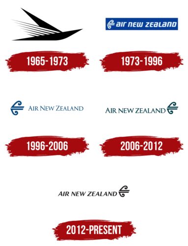
Between 1965 and 1973, Air New Zealand introduced its first logo, featuring a stylized bird made up of three triangles, symbolizing dreams of flight. This wasn’t just a logo but a story of ambition and progress. The triangles, shaped like arrows, represented speed and accuracy, with the bird appearing to cut through the air, highlighting the airline’s promise of fast and smooth travel.
The wings, designed with stripes reaching the sun, symbolized the quest for new opportunities, embodying the airline’s role in bringing people and places closer. The logo’s uniqueness came from its lack of text, focusing solely on the image to convey Air New Zealand’s commitment to offering efficient flights.
This era was key in shaping Air New Zealand’s brand. It focused on visual stories expressing the desire to explore and discover. The logo reflected a hopeful and adventurous spirit, making Air New Zealand a symbol of new possibilities in flying.
1973 – 1996
Upgrading to modern jets marked a big step for the airline, opening up new possibilities. The logo’s blue background represents the sky, showing the airline’s wide reach and connection to New Zealand, highlighted by the color’s nod to the country’s flag.
The logo’s white and silver text reflects the clear skies the airline’s planes fly through. Silver adds a touch of hope, and blue suggests endless opportunities ahead. This design conveys a sense of optimism and progress.
Next to the name is a design that looks like a gust of wind and a fern leaf. Ferns are a key symbol of New Zealand, showing growth and the airline’s leading role. This symbolizes the airline’s expansion worldwide, much like how ferns cover New Zealand’s landscapes.
The logo’s combination of wind and fern captures the airline’s renewal, movement, and exploration spirit. The logo is more than a brand; it declares the airline’s mission to connect New Zealand globally, encouraging travel and bridging distances.
1996 – 2006
Buying Ansett Transport Industries was a big deal for the airline, opening up growth and new opportunities in Australia. This change was shown by eliminating the old rectangle in the logo, which meant the airline was ready for more opportunities. Instead, the brand name was set against a backdrop suggesting openness and endless possibilities.
The logo’s slim letters and the arrow-like design spoke of quick progress and the drive to explore new areas. It was meant to show speed and advancement, capturing the airline’s energetic push into new markets.
Switching to a greenish-blue color also highlighted growth. This color was chosen to remind people of renewal and expansion, not just in where the airline flies but also in improving its services, abilities, and dedication to being eco-friendly in a changing industry.
2006 – 2012
Introducing a new logo was a big moment for Air New Zealand, showing it had overcome tough times with strength and a fresh focus. This logo was more than just a new look; it reflected the airline’s ongoing dedication to its core values: its rich history, respect for New Zealand’s cultural traditions, and commitment to providing great service. Like the adaptable fern, Air New Zealand has shown resilience and the ability to find new ways to succeed.
The koru symbol, placed next to the Air New Zealand name, represents progress and moving forward. In Māori culture, the koru stands for new starts, growth, and renewal, much like the unfolding frond of the New Zealand fern. It hints at continuous motion and the chance for new beginnings. With the koru seeming to push the airline’s name ahead, this design symbolizes a breakthrough into a world full of possibilities and clear direction.
2012 – today
With a subtle forward tilt, Air New Zealand’s logo symbolizes the airline’s steady move towards the future, focusing on thoughtful growth rather than rapid expansion. This new logo reflects the wisdom and stability gained from years of experience, with its black color suggesting depth of knowledge and careful progress.
The logo represents the airline’s commitment to constant improvement and innovation. It always seeks to enhance booking processes, update the fleet with more efficient planes, and improve passenger service. This reflects Air New Zealand’s aim to lead the aviation industry.
The logo, featuring fern fronds, connects to New Zealand’s heritage, showing that despite modern changes, the airline remains deeply tied to its cultural roots. This combination of innovation and tradition is crucial to Air New Zealand’s success and charm.
FAQ
What is the symbol on the Air New Zealand plane?
The planes of this aviation company feature a distinctive symbol on the tail known as the koru, which is deeply significant in New Zealand culture. This emblem, also called Mangōpare, resembles a hammerhead shark and represents strength, determination, and resilience—qualities the airline aspires to embody. Its spiral shape, inspired by the new fern shoots in New Zealand’s forests, signifies hope and the interconnection of all things. This helps the company highlight its origins and values on a global stage.
What is the color palette of Air New Zealand?
This aviation operator’s black and white planes reflect the country’s national colors. This choice highlights the country’s connection to its culture and the pride derived from its famous rugby team, the “All Blacks.” The aircraft design includes a fern symbol, representing New Zealand’s heritage and natural beauty. The striking black-and-white design communicates New Zealand’s identity to the world. Select planes sport an all-black design with a silver fern, offering a sleek and contemporary appearance. The first Boeing 787-9 showcased this design, emphasizing the airline’s commitment to innovation and its roots in New Zealand culture.
What does the Air New Zealand logo mean?
The airline uses a special symbol called the Koru, important in New Zealand’s Māori culture. This symbol, resembling a new fern leaf beginning to open, is a common sight in New Zealand and stands for new beginnings, growth, strength, and peace. It symbolizes life’s ongoing changes and progress. The airline has chosen a specific Koru design named ‘mangōpare,’ which looks like a hammerhead shark. This choice reflects the strength, determination, and perseverance the aviation company aspires to embody. By featuring the Koru on its airplanes and logo, the company expresses its pride in its New Zealand roots, celebrating its rich culture and natural beauty.
Who designed the Air NZ logo?
In 1972, Ken Chapman created the Koru logo for this aviation enterprise. This symbol has represented the airline since the 1970s, and Chapman crafted it as the lead designer with a vision to create a lasting symbol. The team aimed to select a symbol that encapsulated New Zealand’s essence and its people. The symbol needed to be unique and memorable. The Koru was an ideal choice for the company. It embodies the concepts of a warm welcome, fresh starts, and progress, aligning perfectly with the airline’s ethos. Ken Chapman’s contribution to the aviation company is significant, demonstrating the power of design to convey the essence of a country and its people.


