


 All That Logo PNG
The All That logo is full of fun and friendliness, embodying the atmosphere of relaxed communication among close friends. The symbols create a sense of warmth and openness as if inviting lively conversations on various topics. The emblem conveys ease and comfort, encouraging candid discussions where one can freely express their thoughts, share feelings, and enjoy the moment.
All That began in 1993, when producer Brian Robbins and Mike Tollin developed a sketch comedy series for children and teenagers. The concept adapted the Saturday Night Live model for a younger audience on Nickelodeon, mixing short sketches, music, celebrity guests, and young performers. The show premiered on April 16, 1994, with Josh Server, Kel Mitchell, Lori Beth Denberg, Kenan Thompson, and Angelique Bates in the original cast.
The first season quickly found its audience through recurring characters and a fast comic rhythm. Kel Mitchell’s Good Burger sketch became one of the most recognizable segments. At the same time, the format gave young actors space to build comic identities. After early success, the series continued with new seasons. They added performers, including Amanda Bynes, who became one of the show’s most popular cast members.
By 1996, All That had become a major children’s sketch comedy hit and a launchpad for young talent. Kenan Thompson, Kel Mitchell, and Amanda Bynes later moved into larger television and film careers. In 1997, the show produced its first major spin-off, Kenan & Kel, built around Thompson and Mitchell. By 1999, many original cast members had left, and younger performers gradually replaced them.
The series reached its 100th episode in 2000, a rare mark for a children’s comedy show. The Good Burger sketch had already grown into a feature film, expanding the brand beyond television. Ratings declined in the early 2000s, and a new cast arrived in 2002. The original run ended in 2005 after ten seasons. A revival premiered on June 15, 2019, with Kenan Thompson and Brian Robbins as executive producers, and production continued until 2020.
Meaning and History
What is All That?
This is an innovative sketch comedy show for a youth audience on Nickelodeon, featuring a diverse cast of talented young and adult actors performing comedic sketches, parodies, and recurring roles. The program stood out for skillfully blending complex pop culture references with humor accessible to children, creating a series that appealed to viewers of all ages. Many young actors who started their careers on this show later became prominent figures in the entertainment industry. The sketch comedy on this show included funny parodies, slapstick, and clever wordplay, making the program unique in children’s television.
1994 – 2005
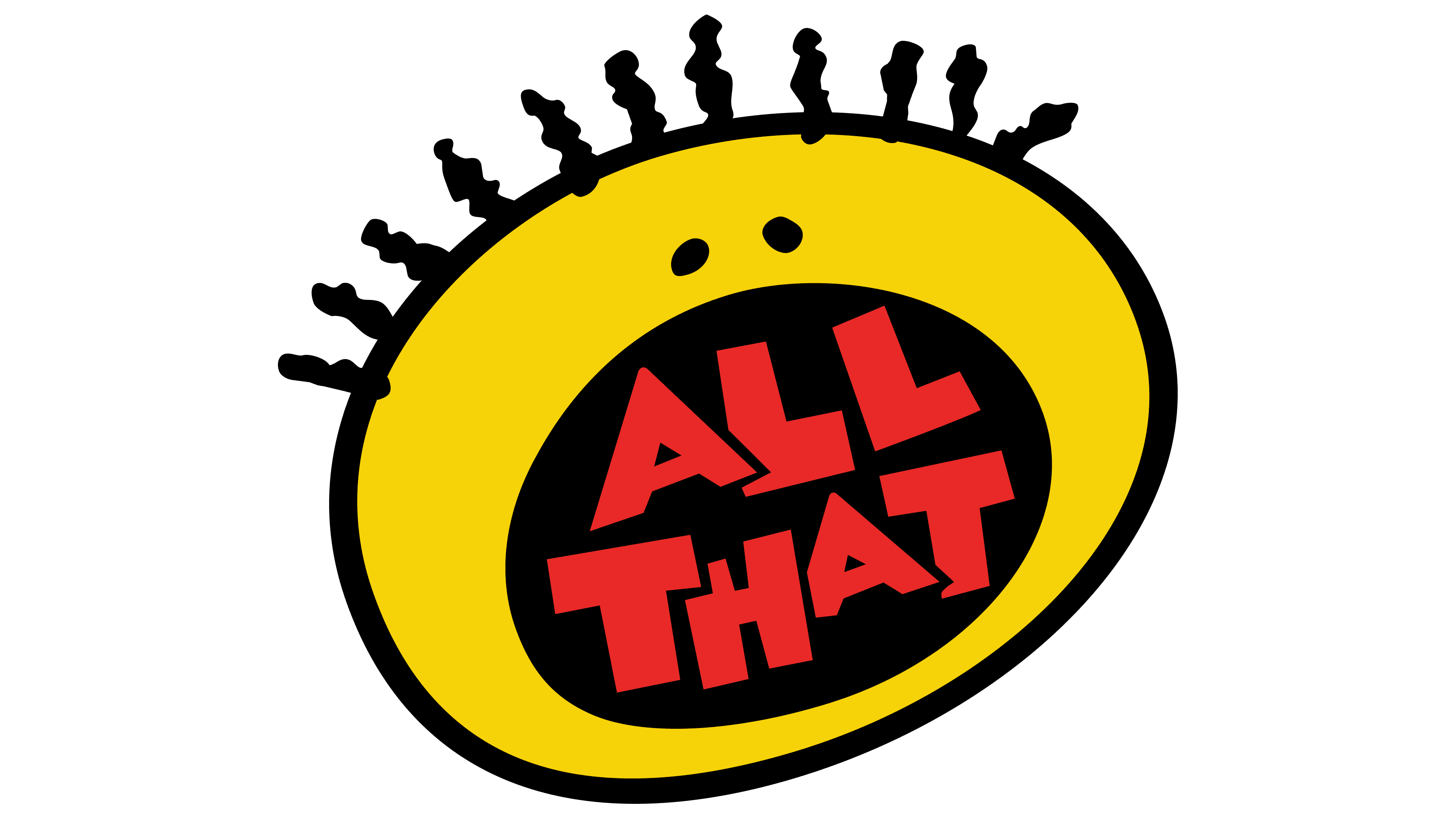
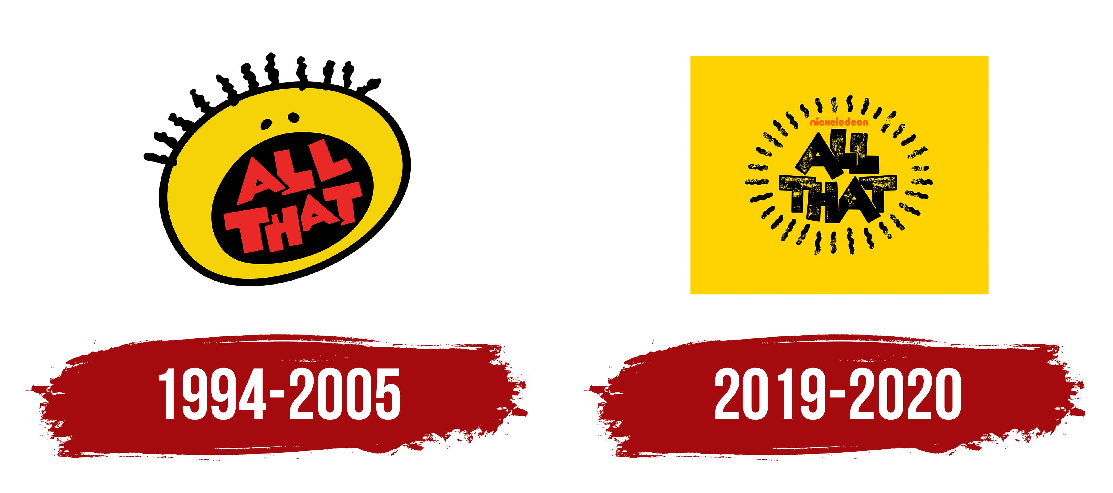
The show’s logo features a smiling child, emphasizing its focus on a young audience. The main participants in the program are children and teenagers, as reflected in the logo itself. The baby’s wide-open mouth symbolizes lively communication and creativity. The show’s title is placed inside it. This element hints at the conversations, songs, and comedic performances that form the foundation of each episode. The participants joke and entertain the viewers, bringing smiles and laughter. The red logo highlights successful skits and relevant and interesting topics. The emblem was used for the show’s original Nickelodeon version, further emphasizing its significance in children’s content.
2019 – 2020
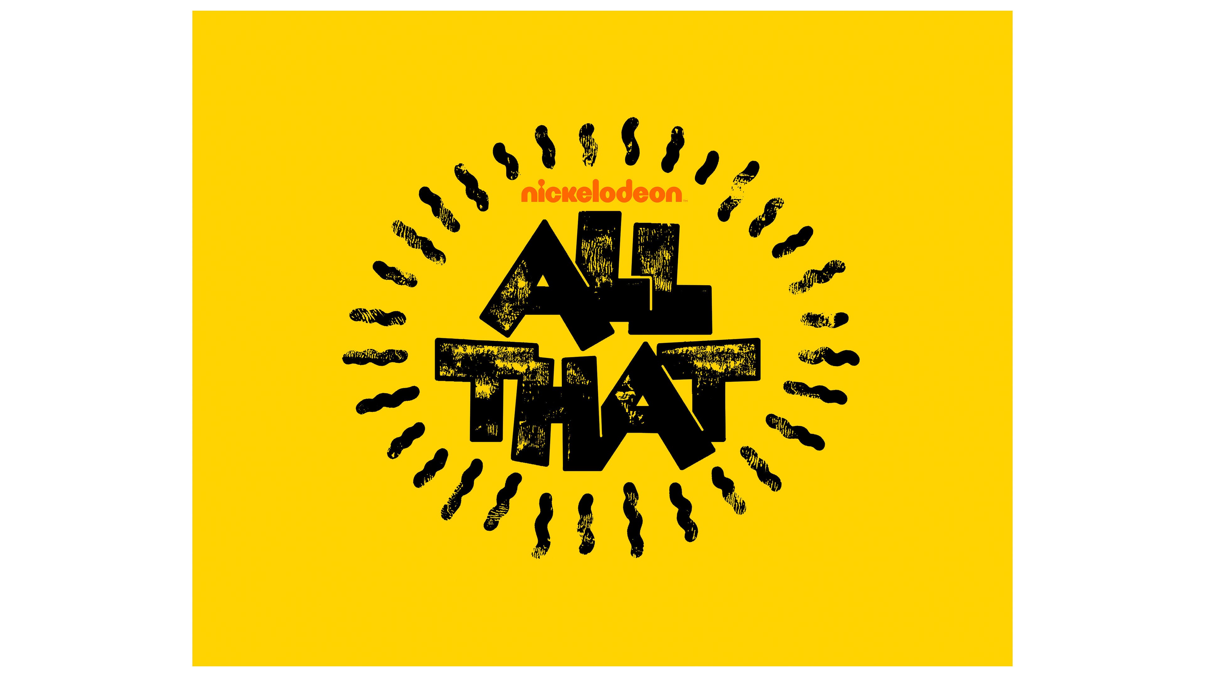
In 2019, it was announced that the show would return, and the new emblem underwent changes, reflecting the show’s maturation and its participants’ growth within the project. The logo acquired a more mature look but retained its energy. The show’s bright yellow title symbolizes joy, fun, and laughter. This color creates a positive aura, highlighting the show’s carefree atmosphere. The black letters are slightly worn, as if covered in sand or accidentally splattered with paint, adding a light, informal effect, as though viewers are being given a behind-the-scenes glimpse, especially during the cold open. The lettering looks like a rough sketch, symbolizing spontaneity and simplicity.
The symbols are arranged to resemble a rounded figure, hinting at friendship and communication. This arrangement gives the impression that the logo gathers everything of interest to the young audience. The title is surrounded by black wavy lines, which can have several meanings:
- Sun rays symbolize energy.
- Sound waves represent active communication.
- The image of a scent enhances the perception of emotions.
- A circle of friends united by an idea.
The emblem perfectly conveys the spirit of unity and togetherness, highlighting the show’s key aspects that attract viewers.