



The American Chemical Society has introduced a logo intended to unite its scientific, educational, and professional activities. Bulletproof developed the update to mark the organization’s 150th anniversary. On August 5, 2026, just one day after the unveiling, a petition called for a return to the previous emblem. Supporters criticized the replacement of the phoenix and Liebig apparatus with a generic symbol. They requested information about the budget, research, and approval process.
Founded in 1876, ACS publishes scientific research, provides information services, and supports education, professional development, and conferences. Audiences often viewed these activities separately. The new brand presents them as parts of a single organization. It reflects the international reach of its work across scientific disciplines.
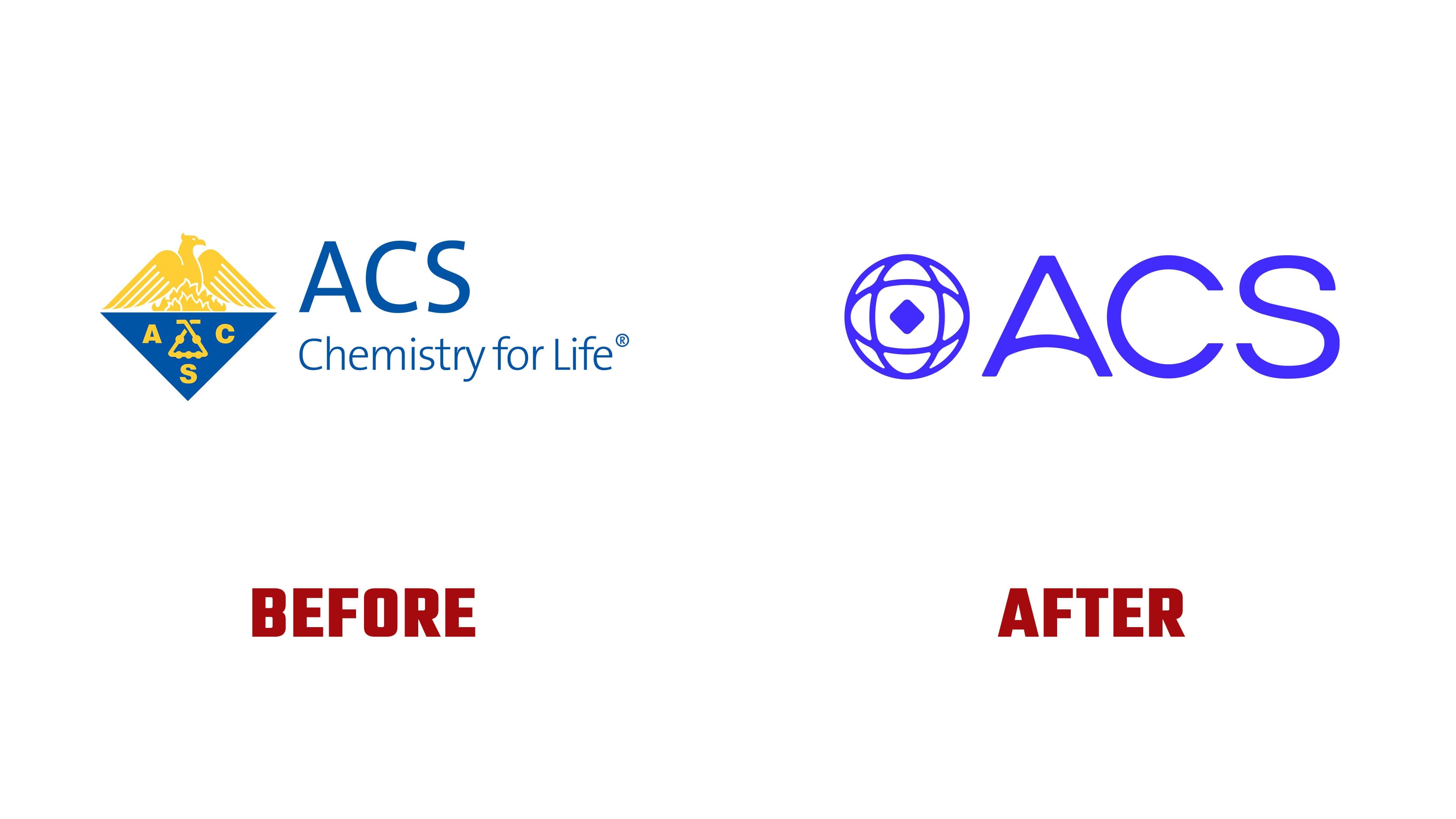
The emblem centers on a small diamond with rounded corners, maintaining a connection to the historic shape. Intersecting oval outlines surround it, representing interconnected atoms. An outer circle expresses membership in the global scientific community. The concept “A World Built on Science” accompanies the design, emphasizing connections among people, discoveries, and disciplines.
The previous emblem traces its origins to work begun by an ACS committee in 1908, based on a proposal from Tiffany & Co. In the upper half of the diamond, a gold phoenix rose from flames. It represented chemical activity and the emergence of new substances through transformative energy. Below, the letters ACS and a glass Liebig apparatus appeared on a cobalt-blue field. The design was stylized in 1987.
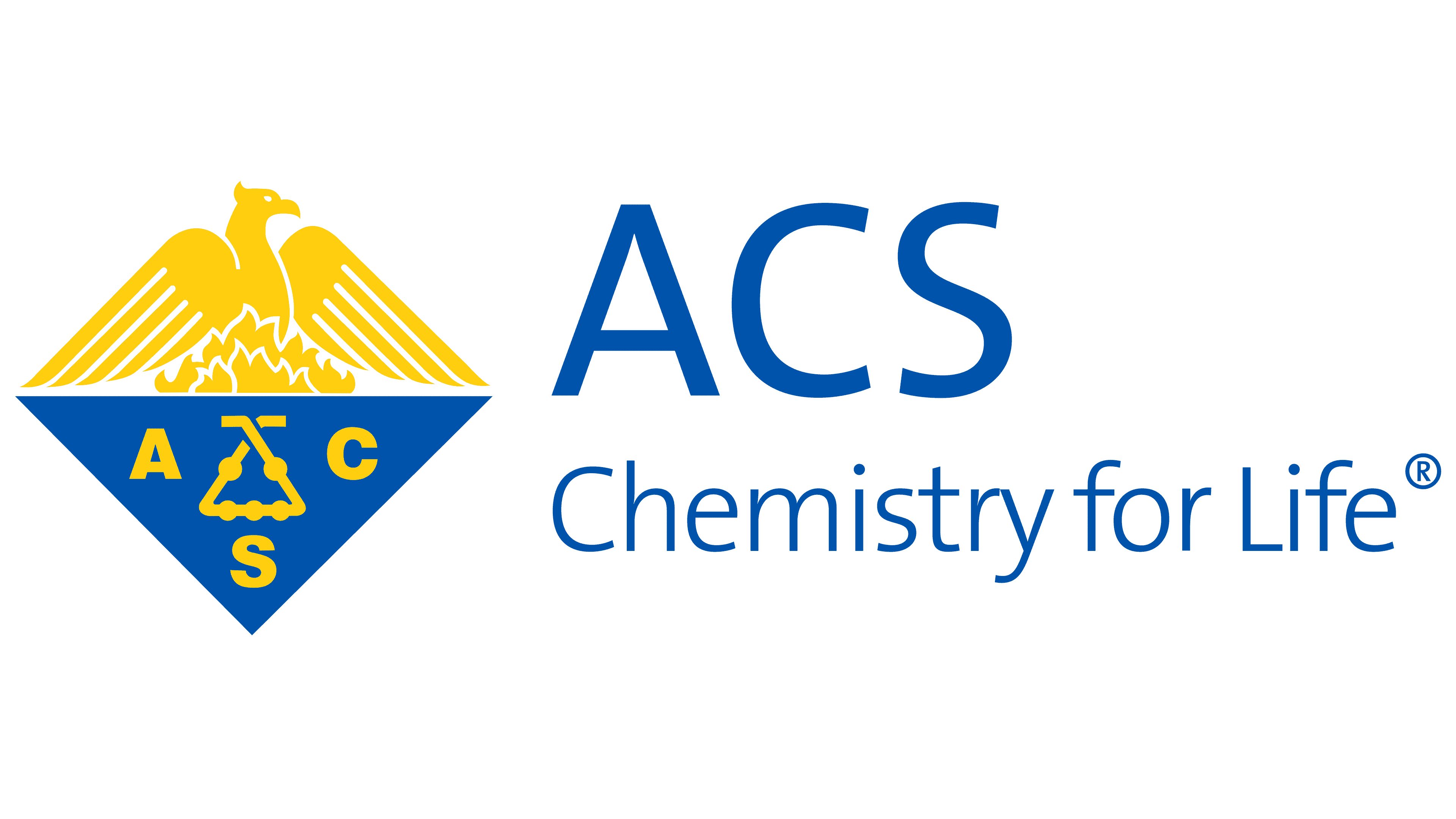
The apparatus, known as a kaliapparat, had five spherical chambers and represented the experimental side of chemistry. It absorbed carbon dioxide released when organic compounds were burned. The difference in weight before and after the experiment revealed how much gas it absorbed. This laboratory instrument complemented the mythical phoenix, connecting practical experimentation with the transformation of matter. The historic emblem will remain in use for selected ceremonies and official documents honoring the society’s heritage.
A redesigned ACS wordmark sits beside the new symbol. The uppercase letters are wider, with nearly uniform stroke weights. The apex of the “A” is slightly truncated, and an upward-curving arch replaces its conventional crossbar. A nearly circular “C” sits alongside the smooth curves of the “S.” The primary version now pairs the emblem with the abbreviation, replacing the previous arrangement with the tagline “Chemistry for Life.” An extended version places American Chemical Society on a line beneath.

A saturated blue-violet replaces blue and gold as the primary color. For the supporting identity, Bulletproof drew on the emission spectra of oxygen, hydrogen, carbon, and nitrogen. ACS connected the color names to compounds, ions, chemical elements, and CAS Registry Numbers.
Development took two years and included research, workshops, and discussions with society members, staff, customers, and partners. The agency sought to broaden perceptions of ACS beyond chemistry while preserving its reputation. Creative Director Holly Carlsson represented Bulletproof. The team developed the positioning, division and program identities, animation, and campaigns.