ARIN updated its logo after 24 years with the old mark. The familiar abbreviation remained at the center, while additional details were removed from the system. For the American Registry for Internet Numbers, the update is tied to digital channels, community meetings, print, presentations, and small formats. In these environments, the long name slowed down recognition of the mark.
ARIN keeps its status as an organization with a public mission and as the regional internet registry for the United States, Canada, the Caribbean, and the North Atlantic region. The organization is responsible for internet number resources, including IPv4 and IPv6 addresses and autonomous system numbers. The brand’s role has remained the same. At the same time, the importance of the website, social media, interfaces, online materials, and events has grown over two decades. The previous logo became too heavy for current needs.
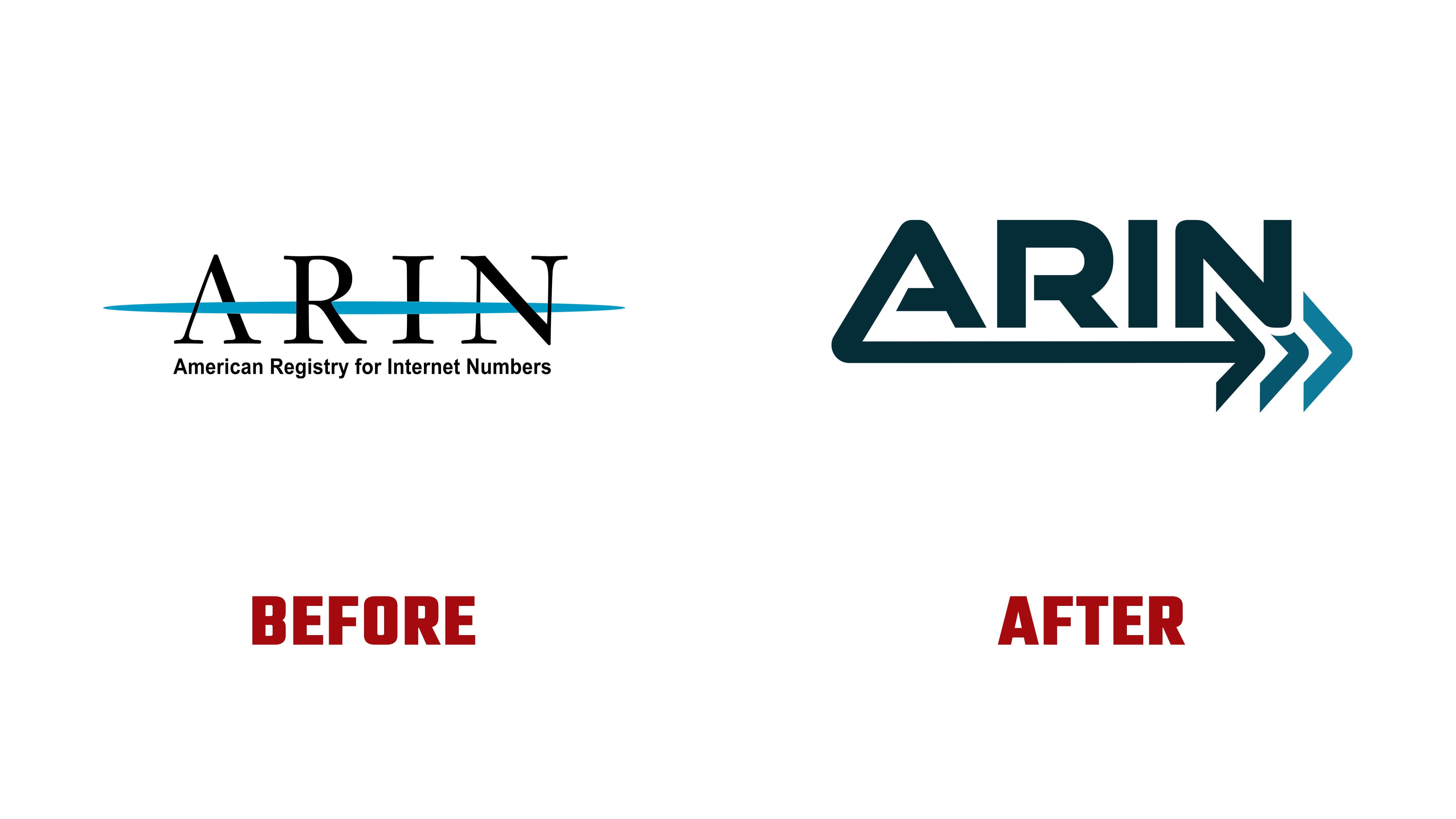
The old mark consisted of a large serif abbreviation, a blue line, and the full name American Registry for Internet Numbers. It recalled the early days of the internet and industry associations. The logo looked official and explained the organization’s status. Still, at small sizes, it overloaded applications that needed a short identifier.
In the new version, the ARIN abbreviation remains the brand’s main name. The entire form became more compact. The main motif of the new logo consists of three right-pointing arrows. They are connected with the three areas of the ARIN region: Canada, the United States, and the Caribbean and North Atlantic region. The mark suggests routing, network flow, the development of internet infrastructure, and the organization’s role in operating the address space.

Blue remained part of the image, while the overall tone grew darker and more technological. Black text with a light blue accent gave way to a dark blue-green shade and a bright blue extension of the arrows. The logo now feels more aligned with an engineering and digital environment.
The meaning of the update is connected with development while preserving the organization’s history. It strengthens the abbreviation, removes extra text, and moves the registrar’s image into a format suited for constant digital use.