


Amperos has moved the electrical motif from its standalone icon into the first letter of its name. In the logo introduced in 2026, a wave inside the “A” replaces the lightning bolt. London agency Together connected the form to the service’s role in helping healthcare providers collect overdue insurance payments. Ben Wynn-Owen served as creative director.
The U.S. company has operated since 2023 and serves outpatient healthcare providers. AI agents work alongside specialists on insurance claims awaiting payment or denied. They call insurers, navigate portals, prepare appeals, and resubmit documents. Clinic staff step in as needed. According to Amperos, the service has helped collect more than $700 million for 3,000 healthcare facilities across all 50 states.
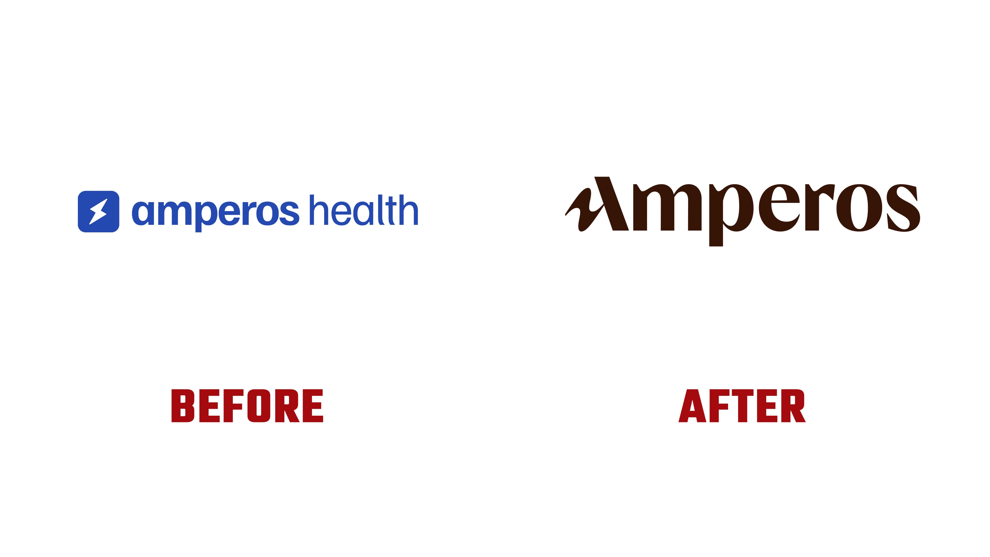
Together sought to present the company as a partner in recovering payment for care already delivered. The identity centers on combining automation with human expertise. The agency described the approach as 90% trust and professional rigor with 10% punk. The punk component expresses resistance to drawn-out payment processes and bureaucratic obstacles. The emphasis is on changing how the work gets done and collaborating with insurance companies.
The previous logo paired a blue rounded square containing a white lightning bolt with the words “amperos health.” Both words were lowercase, with “amperos” in bold and “health” in a light weight. The new logo uses only the Amperos name. It begins with a capital “A,” sits on a single line, and appears in dark brown.
The defining detail is in the first letter. A heavy diagonal stroke forms its right side, while the left side and crossbar flow into a wave. Together, it connects the sine wave to electrical current and a steady flow of revenue. In the agency’s metaphor, payment delays resemble resistance in a circuit, and Amperos helps remove those obstacles. The wave carries the previous logo’s electrical theme into the wordmark.
The remaining letters combine thick main strokes with thin joins and terminals. Small indentations appear at the upper joins of the “m,” “p,” and “r,” while the “o” has an oval counter. The stroke contrast gives the wordmark a professional tone, and the curve of the “A” suggests handwriting. The designers compare the custom lettering to a personal signature, linking it to the people responsible for the service’s work.
A portion of the “A” appears in avatars and the browser favicon. The abbreviated version references the letters “AI,” for artificial intelligence. Its curved section and diagonal stroke connect the electrical motif to the technology behind the product. The logo focuses on current references, while the rest of the identity draws on everyday paperwork.
Collages of torn insurance forms, denial letters, and other documents extend the punk theme. Paperwork that complicates the payment process becomes material for the identity. Designer Adam Burn explains that pairing it with fragments of digital interfaces represents people and AI working together. Warm, light colors and a dark reddish-brown tone complement photographs of employees processing claims and communicating with insurers.