


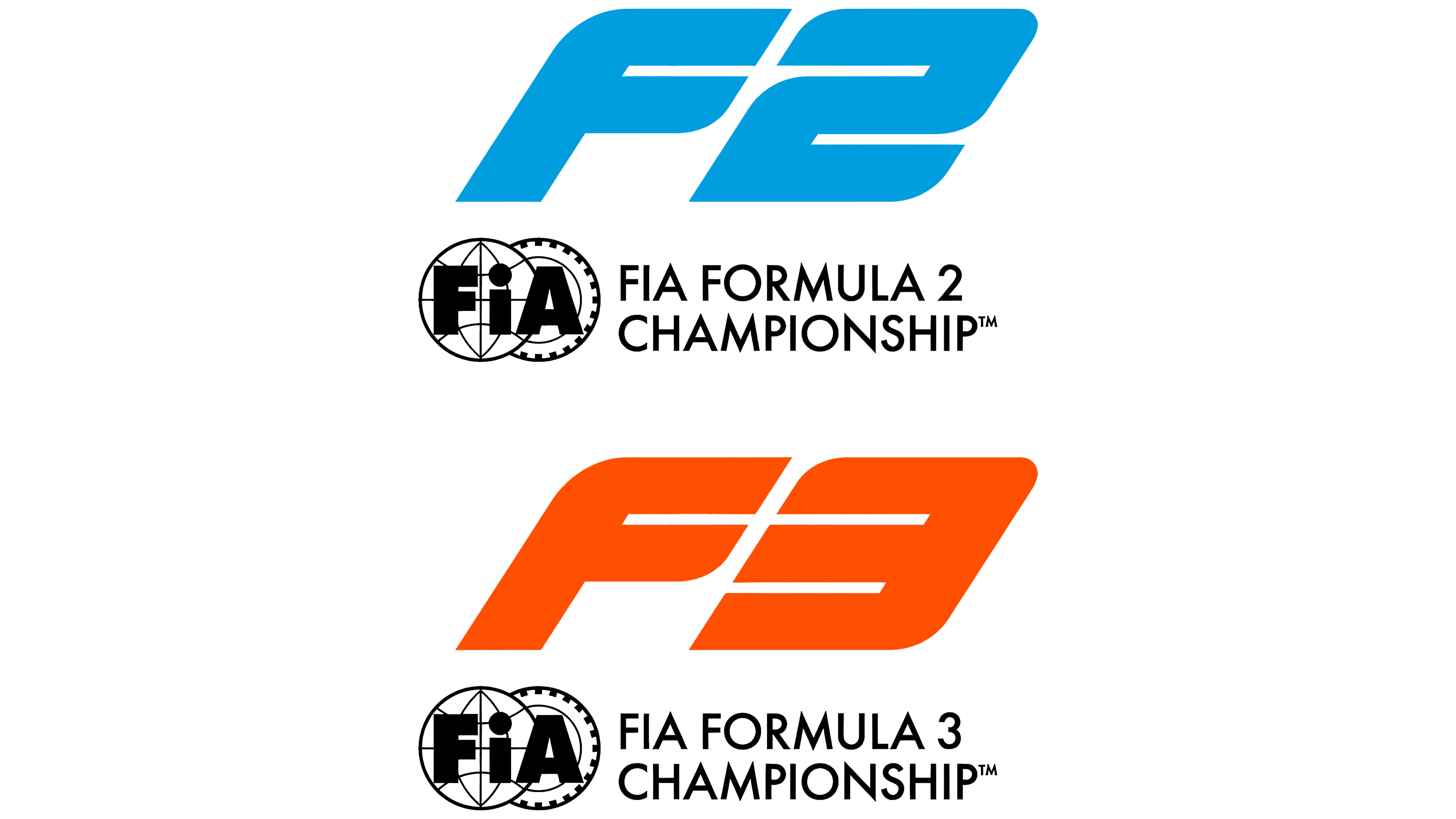
On June 1, 2026, FIA Formula 2 and FIA Formula 3 introduced updated logos. The work was carried out within the Formula 1 structure in collaboration with the FIA. After the presentation, the marks began appearing in series materials.
F2 and F3 remain the main stages for young drivers before moving to Formula 1. The update was built around a shared system. Viewers can see the connection between F3, F2, and F1, while each series keeps its own image.
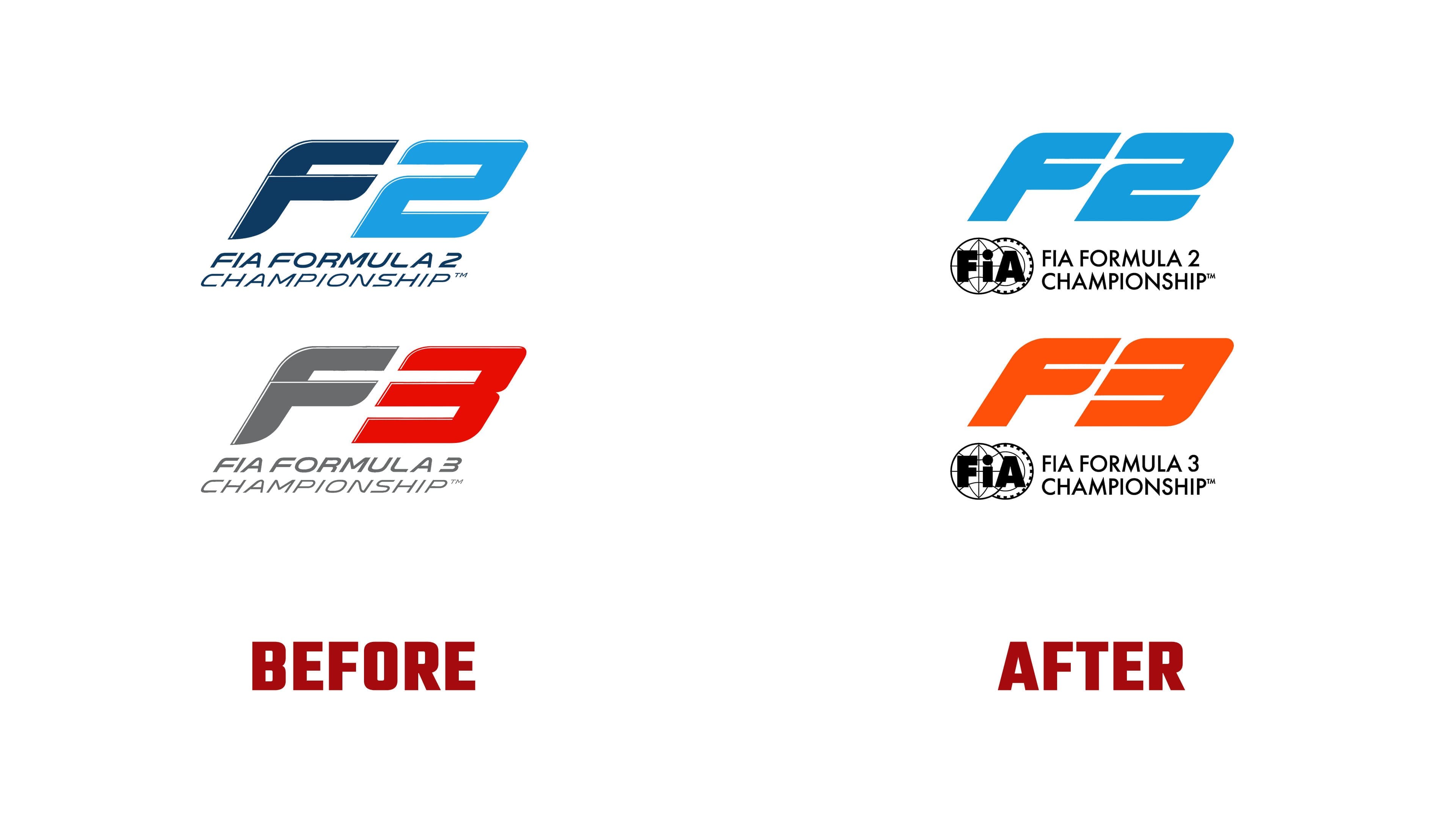
The main change affected the form of the logos. The old versions relied on sharp angles, slant, small details, and racing aesthetics from the early 2000s. The new marks became larger, denser, and calmer. They contain less visual noise, so the emblems work well for broadcasts, interfaces, promotion, cars, and track graphics.
Formula 2 kept the blue color familiar to fans, teams, and partners. The F2 letters were brought into a single mark. The FIA label appears next to it, showing the championship’s status inside the international motorsport system. The logo is associated with speed, while the feeling of racing comes through a large form and strong color contrast rather than a set of decorative details.
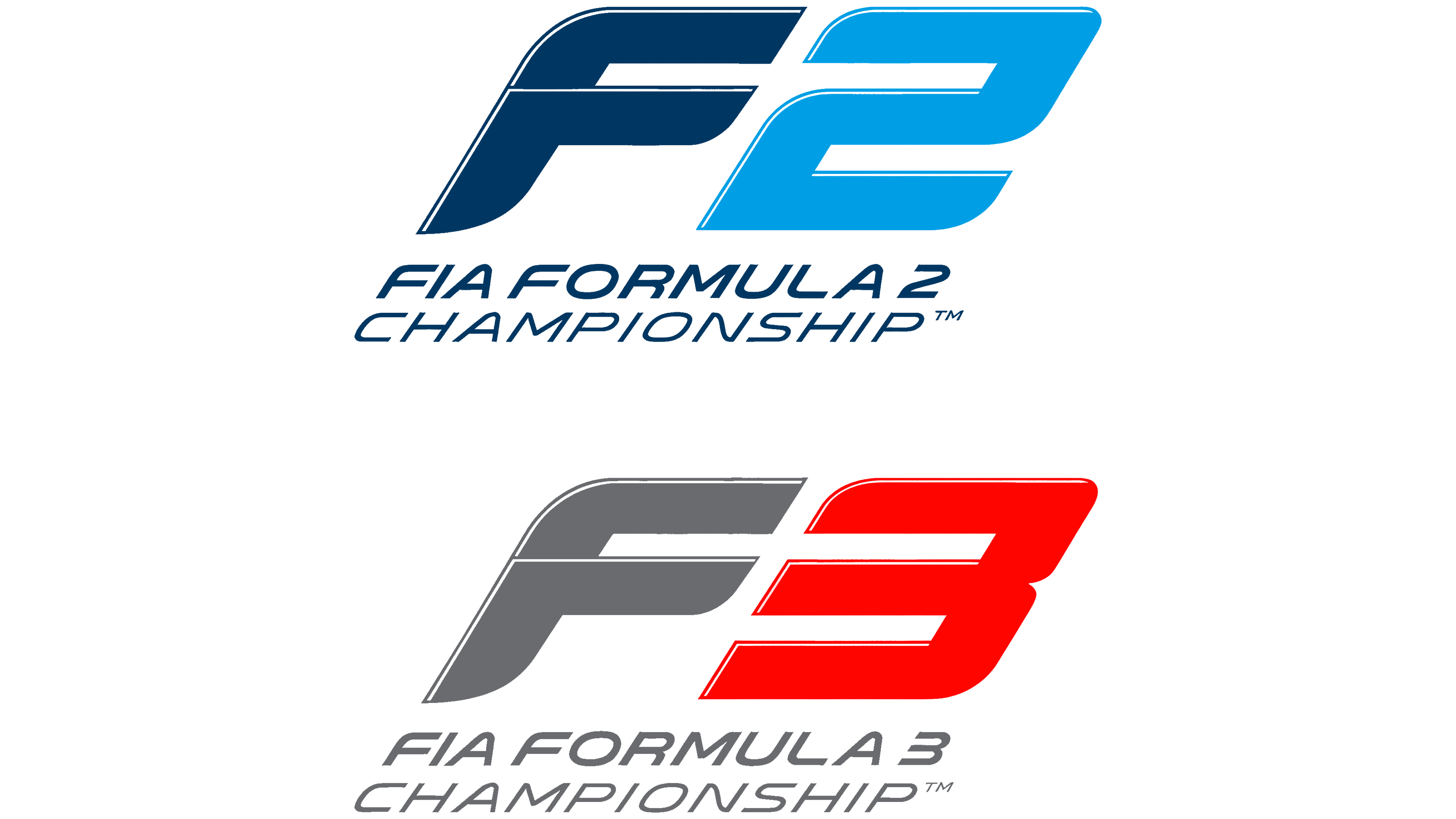
For Formula 3, the changes look bolder. The gray-and-red scheme was replaced with an orange one. It separates the junior series from F2 and adds a younger, more competitive tone. The F3 letters received a simpler outline. The mark reads as a unified whole, without the feeling of a set of technical fragments.
The update helps F2 and F3 look like part of a single sporting ladder leading to Formula 1. The series remain separate championships, while their connection to the top level of motorsport has become more visible. The new emblems are designed for the modern racing environment, where the mark works on screen, on the car, in the pit lane, on social media, and on merchandise.