An apple with a bitten segment symbolizes the practical application of a brilliant idea; the monochrome color allows one to focus on the main concept. This is how the Apple logo “works,” ensuring the recognition of the legendary brand.
Apple: Brand overview
Meaning and History
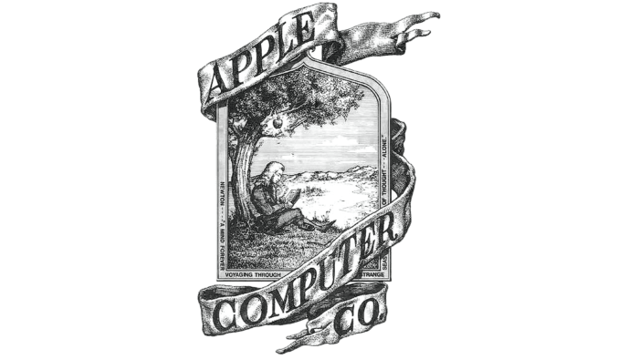
The American company’s logo appeared immediately in the year of its founding. Steve Jobs and Ronald Wayne were creative inspirations inspired by a Wordsworth quote. Therefore, the emblem depicts a scene where Isaac Newton sits under a tree, and above him hangs an apple that, according to legend, will fall on his head, and then a brilliant idea will visit the scientist.
Without troubling himself with work, Ronald Wayne combined apple and enlightenment concepts. He depicted Newton, upon whom a ripe fruit of “unexpected enlightenment” is about to fall. The drawing was accepted and approved as branding, but it contained too many unnecessary details that distracted from the central element. Therefore, several more options were subsequently proposed.
What is Apple?
Apple is a globally recognized brand associated with online services and consumer electronics. It belongs to the eponymous company from the USA, founded by Steve Jobs and his colleagues. Apple is one of the largest suppliers of computers and mobile phones, including the iPhone. Its logo, depicting a bitten apple, is recognized by millions of users worldwide.
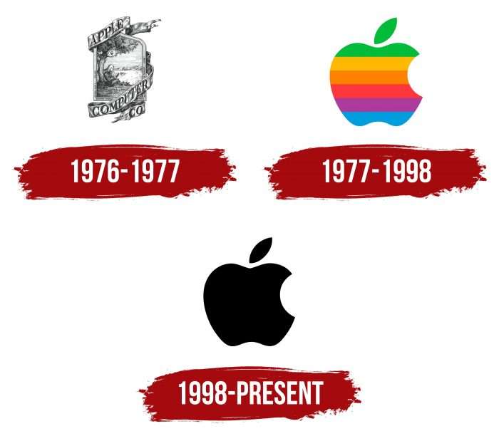
1976 – 1977
The emblem of this period looks like an artistic painting in the form of an elongated rectangle. It depicts a man with a book in his hands. He sits under a leafy canopy, and above it hangs a large apple. A wide ribbon with twisted ends runs above and below the monochrome logo. On it is the inscription “APPLE COMPUTER CO.”, which wraps around the logo.
1977 – 1998
After the black-and-white version with many details, the company introduced a colorful and concise version. Its author was the popular artist at the time, Rob Janoff. After speaking with the owners of the computer corporation, he went to the store and bought a whole pack of apples. He experimented at home, cutting the fruits to achieve the best visualization.
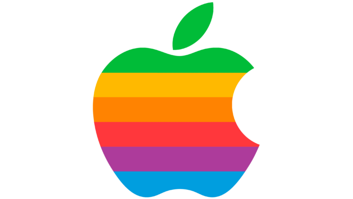
Finally, after a week, the designer presented the new logo. It looks very bright as if assembled in layers from different varieties of apples. The bitten side symbolizes the practical application of a brilliant idea that came to mind after the fruit fell. The color palette is rainbow and juicy. Jobs insisted on this because, at that time, the company was mastering the production of color displays.
1998 – today
In 1998, the company’s founder switched to a new dark version of the logo. This was done so that the striking range would not distract attention from the main concept. However, another motive is a return to the original version because Rob Janoff made the logo precisely in monochrome.
Apple: Interesting Facts
Apple is a big company that makes all kinds of tech stuff, like computers and iPhones.
- How It Started: Apple was created by Steve Jobs, Steve Wozniak, and Ronald Wayne on April 1, 1976. The name “Apple” came from Jobs’s eating lots of fruits and thinking it was friendly and fun.
- Cool Computers: In 1983, Apple made a computer called Lisa, the first one that people could use by looking at pictures on the screen instead of typing commands. This idea was used again in the Macintosh, which changed how people use computers.
- A Big Ad: Ridley Scott directed Apple’s famous TV ad during the Super Bowl in 1984. It showed a world where everyone thought the same until the Macintosh computer emerged.
- Design Matters: Apple’s products look simple and clean, which is something Steve Jobs cared about. This design makes Apple’s stuff easy to recognize.
- Apple Stores: The first Apple Stores opened in 2001 in Virginia and California. These stores are known for looking cool and being a nice place to shop.
- Music Goes Digital: iTunes, launched in 2001, changed how people buy music. Instead of CDs, people could buy music online, and iTunes became the biggest music store in the U.S.
- The iPhone: In 2007, Apple introduced the iPhone, which was different from other phones because it had a touch screen and looked simple. It became popular and changed how phones are made.
- App Store: Starting in 2008, the App Store let people download all kinds of apps for their iPhones, making it possible for app makers to share and sell their apps to everyone with an iPhone.
- Helping the Planet: Apple wants not to harm the environment, so it’s working on using clean energy and recycling. By 2030, Apple wants to not add carbon to the air from making and using its products.
- A Big Deal: Apple is worth a lot of money. It was the first company in the U.S. to be valued at over $1 trillion and then reached $2 trillion and $3 trillion.
Apple has grown from a small project in a garage to a huge company that makes technology used by people worldwide. It has always focused on making products that look good and work well.
Font and Colors
All American corporation products, including the iPad and iPhone, are adorned with the famous Apple emblem. It’s a legendary trademark that has made the manufacturer famous and its products recognizable in different parts of the world. The bitten fruit is synonymous with Apple and the main element of its visual identity. That’s why it has remained unchanged since 1977, except for a slight change in the palette.
The modern logo has no inscriptions – they were present only on the old brand name, used in 1976-1977. The font was similar to Caslon with minor deviations from the accepted letterforms.
Regarding the palette, the apple was completely black in the original version and placed on a pure white background. Until 1998, it was bright and colorful. The fruit consisted of six stripes (top to bottom): light green, yellow, orange, raspberry-red, purple, and blue.
