Aquamar has moved away from the calmer presentation typical of the seafood market and is making the brand brighter. The company has been operating since 1991, is based in Rancho Cucamonga, California, has a production facility in Carteret, New Jersey, and supplies seafood across North America for retail and foodservice. The new look by ONE23WEST helps Aquamar shift from a supplier image to a brand built for growth, shelf presence, and shopper engagement.
The update is connected with the “Unfishingbelievable” platform and the “Big Fish Energy” tone. Aquamar wants to bring liveliness, humor, and the feeling of a fresh category back to seafood. The previous mark already referred to water with wide, wavy letters. Still, it looked more like an aquarium or a restaurant. For a company supplying products across North America, a more cohesive image and a clearer connection to the product were needed.
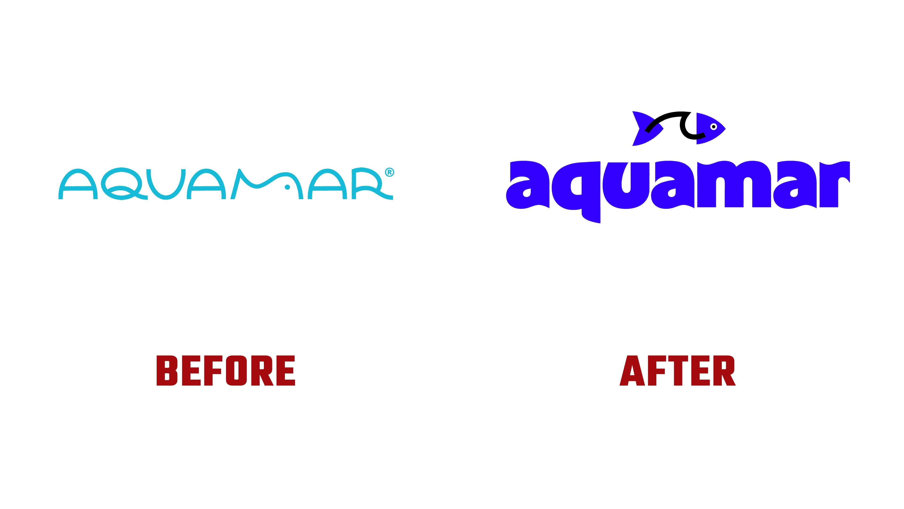
In the new logo, the fish is separated from the name and becomes a standalone symbol. An abstract wave connects the tail and head, so the marine theme reads without the need for an illustration of a catch. It connects the brand with water, processing, and prepared products. The eye adds a slight cartoon touch, while the silhouette remains memorable.
The main change is visible in the wordmark. The name is set in RL Aqva, a typeface with wave forms in almost every letter. Aquamar gains a feeling of water. The letters look large, dense, and friendly.
The new logo changes the perception of Aquamar more than the additional identity elements. Previously, the brand looked like an ordinary seafood supplier. Now the mark gives it energy, scale, and shelf strength. The wave inside the fish and the waves in the letters create a new shared style.