


 Bank of New York Mellon Logo PNG
The Bank of New York Mellon logo is simple and informative, remaining true to traditions. Its minimalist style emphasizes restraint and the absence of unnecessary elements without diminishing its presentability or originality. This perfectly reflects the scale and status of one of the world’s largest banks.
The modern identity is filled with elegance and aristocratic flair, demonstrating informativeness through restrained forms. The logo uses only three typographic marks and one graphic element, creating a powerful impression. The emblem embodies reliability, stability, and the bank’s impeccable reputation. The color accents and clean graphics make it aesthetically appealing and a symbol of stability. Each logo element conveys grace and stillness, which is particularly important for a respected and prestigious institution like the Bank of New York Mellon.
The Bank of New York was founded in 1784 by Alexander Hamilton, making it New York’s first bank and one of the oldest in the United States. It helped finance railroads, canals, and industrial projects during the country’s early growth. In 1822, the bank became a joint-stock company, and in 1913 it joined the Federal Reserve System.
A parallel history began in Pittsburgh in 1869, when Thomas Mellon established T. Mellon and Sons. Renamed Mellon National Bank in 1902, it expanded under Andrew and Richard Mellon and financed the city’s industrial sector. Both institutions survived the Panic of 1837, the Civil War, the Great Depression, and postwar changes in American finance.
During the 1980s and 1990s, both banks shifted toward asset management and securities services. In 2007, Bank of New York merged with Mellon Financial Corporation to form Bank of New York Mellon Corporation, or BNY Mellon. The deal combined Mellon’s asset-management and private-wealth operations with Bank of New York’s global securities-services business.
After the 2008 financial crisis, BNY Mellon expanded its international network and invested in blockchain, artificial intelligence, and digital assets. Charles Scharf became CEO in 2018. During 2020 and 2021, the company developed new digital services, and in 2022 it increased work in blockchain and digital assets. By 2023, BNY Mellon operated in more than 35 countries, serving governments, corporations, financial institutions, and wealthy clients.
Meaning and History
What is the Bank of New York Mellon?
This financial giant plays a crucial role in managing the global economy behind the scenes. As one of the world’s largest asset management and custody banks, it is responsible for safeguarding and managing trillions of dollars in assets for major corporations, institutions, and high-net-worth clients. The bank focuses primarily on investment management, clearing, settlement, and asset custody services. Its influence spans all global financial markets, making it a critical component of the complex international financial system. The institution combines modern financial technologies with a historical legacy that traces back to the early development of the American banking system.
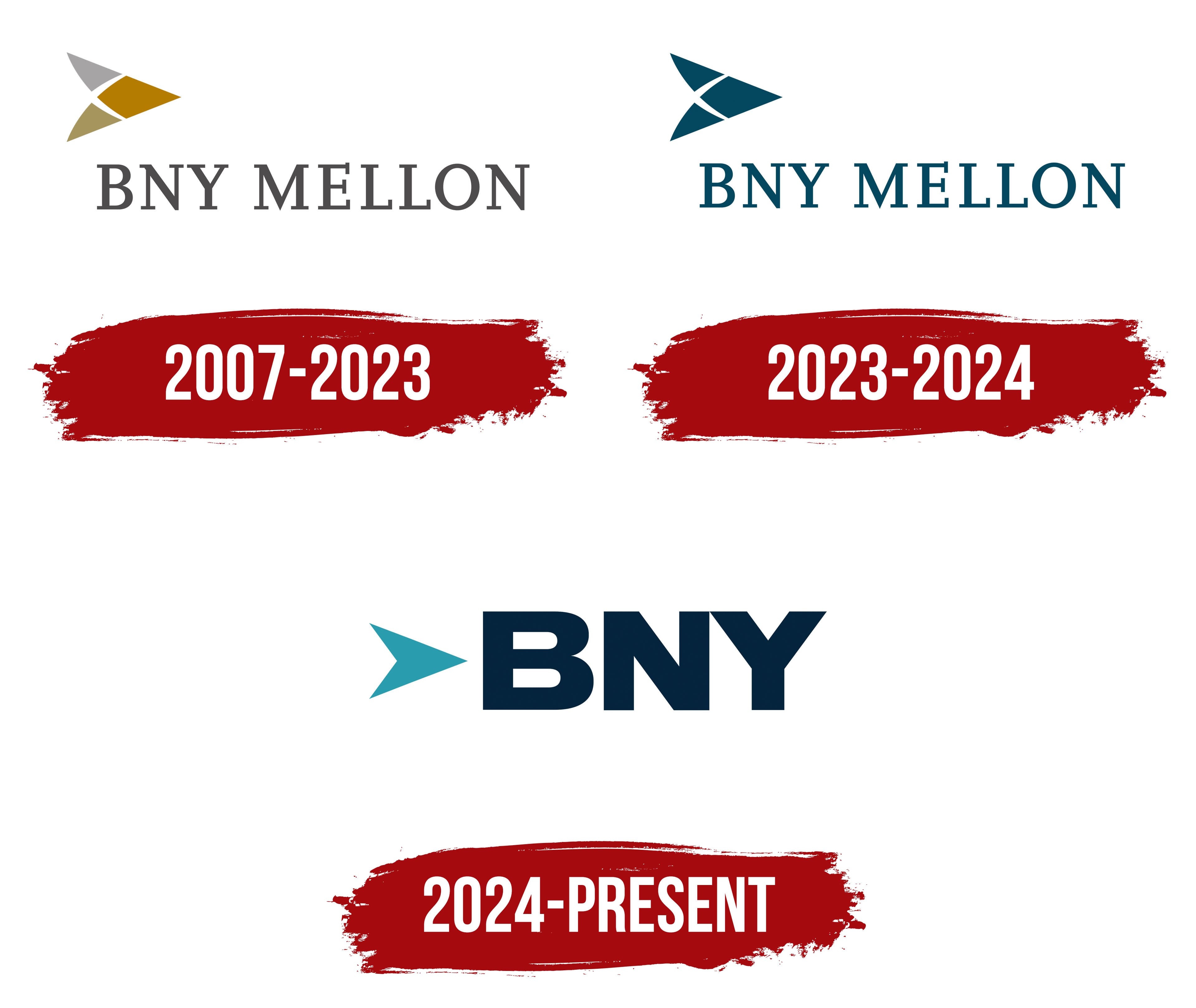
2007 – 2023

The bank’s first logo was an original symbol reflecting the scale and significance of a large financial organization. It was simple, yet the brightness of one element gave it a special charm and individuality. The emblem was presentable and easy to remember, which aligned with the bank’s operations.
The primary background for the logo was white, a popular choice among many companies, as it highlighted key information, letters, signs, and symbols, making them more expressive. The logo was conventionally divided into two parts: the upper and lower sections. In the upper section, on the left, there was an arrow symbol composed of three colors. This element consisted of two triangles and a rhombus, with the sharp side pointing to the right. Gray, gold, and deep orange created a harmonious combination that attracted attention and appeared visually striking. The arrow symbolizes the bank’s focus, confidence in the future, and reliability.
Below the arrow was the bank’s name. The first three capital letters represented the abbreviation “Bank of New York,” followed by the word “Mellon.” All the letters were in the same font and size, creating balance and harmony. The gray color was chosen for the text element, ideal for conveying solidity and stability. Against the white background, the logo was expressive, making the bank’s name easy to read.
2023 – 2024

The identity introduced in 2023 appears somewhat simpler than the previous version. The logo retains its main features but has lost the variety of colors and shades present in earlier versions. The new version lacks bright color accents and contrasts, with the color palette becoming more restrained and concise. The white background, which remains unchanged, retains its smoothness and purity, highlighting the elegance of the minimalist approach.
All symbols and text elements are rendered in deep blue tones, reminiscent of the shade of a moray eel. This color gives the logo a sense of seriousness and solidity. All letters are large and capitalized, with sharp horizontal serifs, giving them an imposing, solid appearance. They symbolize stability and longevity, emphasizing the financial corporation’s power.
The arrow, an important graphic element, has been reduced in size and now looks more refined. It consists of two parallel triangles and a rhombus, maintaining the traditional symbolism and forward direction, but presenting them in a more restrained, minimalist graphic design in the new version.
2024 – today
The modern Bank of New York Mellon logo stands out with its expressiveness despite its simplicity. It is not overloaded with text or graphic elements; its strength lies therein. Simple in color scheme, it does not require excessive visual richness, as it reflects the essence its creators aimed for. Loyalty to tradition is embodied in the depiction of the arrow, symbolizing the rich history of the oldest financial institution. The arrow, however, has lost the complexity of its previous design and is now presented as a single blue element. It confidently points forward, symbolizing a drive for growth and hinting at the potential the bank plans to realize.
The three capital letters of the abbreviation, rendered in bold font and deep blue shade, lend significance to the logo. The sharpness of the lines, the confidence in execution, and adherence to principles showcase the bank’s reliability and help maintain its reputation on the global stage. This minimalist yet powerful logo underscores the Bank of New York Mellon’s impeccable status and undeniable leadership in the financial world.