 Standard Bank Logo PNG
Financial operations in African countries must account for local conditions, regulatory differences, and economic structures. Banking operations, lending, and settlements are structured based on specific markets and their characteristics. The Standard Bank logo represents a financial group that provides banking services across various African countries, serving both private clients and the corporate sector.
Standard Bank was founded on October 15, 1862, by John Paterson in Port Elizabeth. The institution was named Standard Bank of British South Africa. Initially, the bank served the wool trade and agriculture. By the 1870s, it began financing diamond and gold mining enterprises.
In 1886, the bank moved its headquarters to Johannesburg. The city had become the center of the gold rush. During this period, the bank became the main lender to mining companies.
At the beginning of the 20th century, the bank expanded its presence on the continent. It opened branches in Rhodesia, Kenya, and Uganda. After the formation of the Union of South Africa in 1910, the bank became one of the country’s leading financial institutions.
In 1962, it merged with the Bank of West Africa. In 1969, Standard Bank began trading on the Johannesburg Stock Exchange.
During apartheid, the bank remained the largest participant in the domestic market despite sanctions. After 1994, it began developing services for clients who previously had no access to banking products. In 1998, it merged with the insurance company Liberty Group.
In 2007, the Industrial and Commercial Bank of China acquired a 20 percent stake in Standard Bank. The deal was valued at $ 5.5 billion.
Since the 2010s, the bank has been developing digital technologies. It launched mobile banking and online platforms. In 2021, it opened a digital bank in Nigeria. In 2022, it implemented blockchain for cross-border settlements.
The bank manages assets in 20 countries. It serves about 30 million clients and remains Africa’s largest financial institution by asset size. The partnership with ICBC remains a key element of its ownership structure.
Meaning and History
What is Standard Bank?
It is Africa’s largest financial group, with an extensive network of subsidiary banks and investment structures. Its operations span 20 countries across the continent, with South Africa as the main focus. The main areas include services for individual and business clients, corporate and investment banking, and life insurance and asset management through Liberty. The bank operates thousands of ATMs and more than a thousand branches.
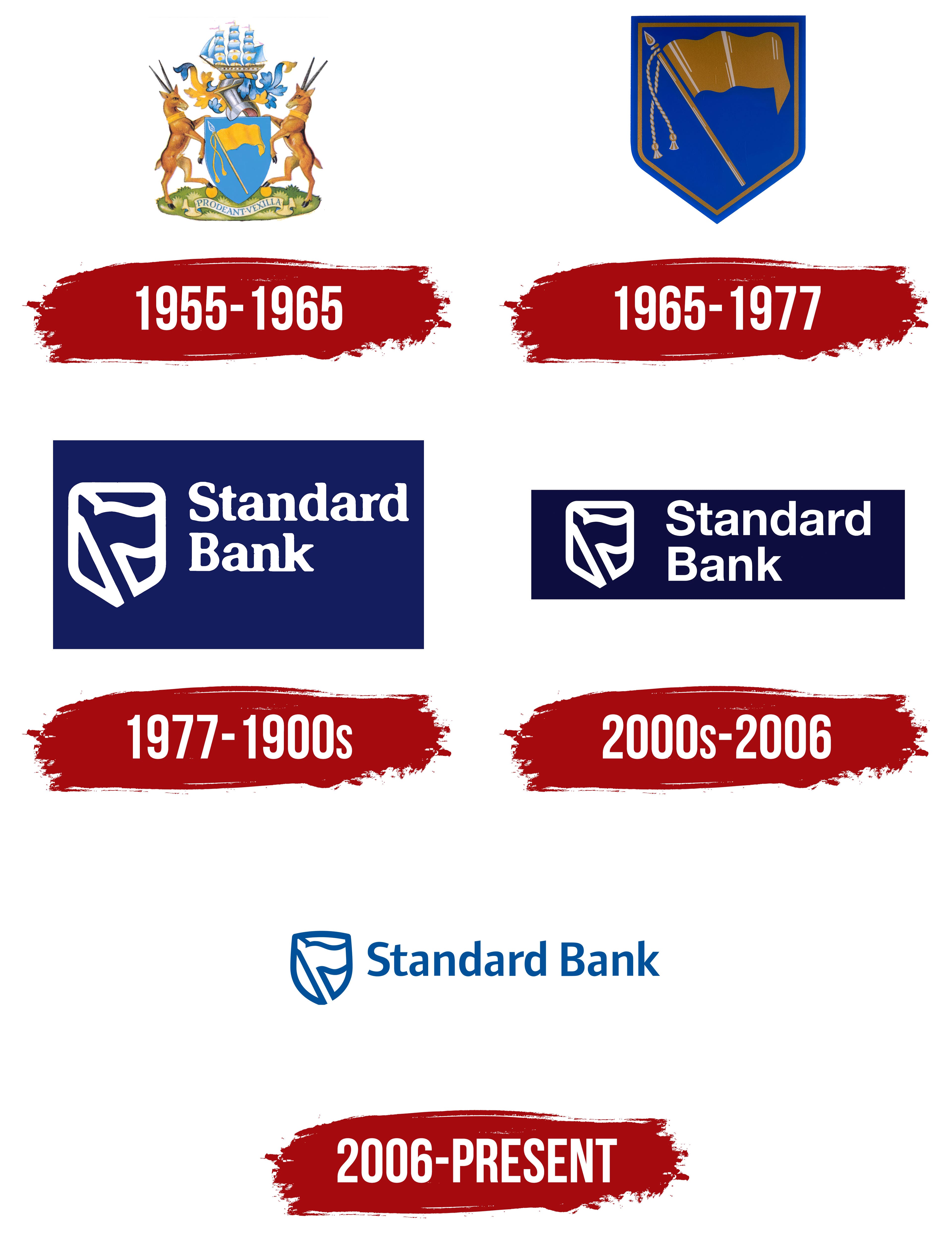
1955 – 1965
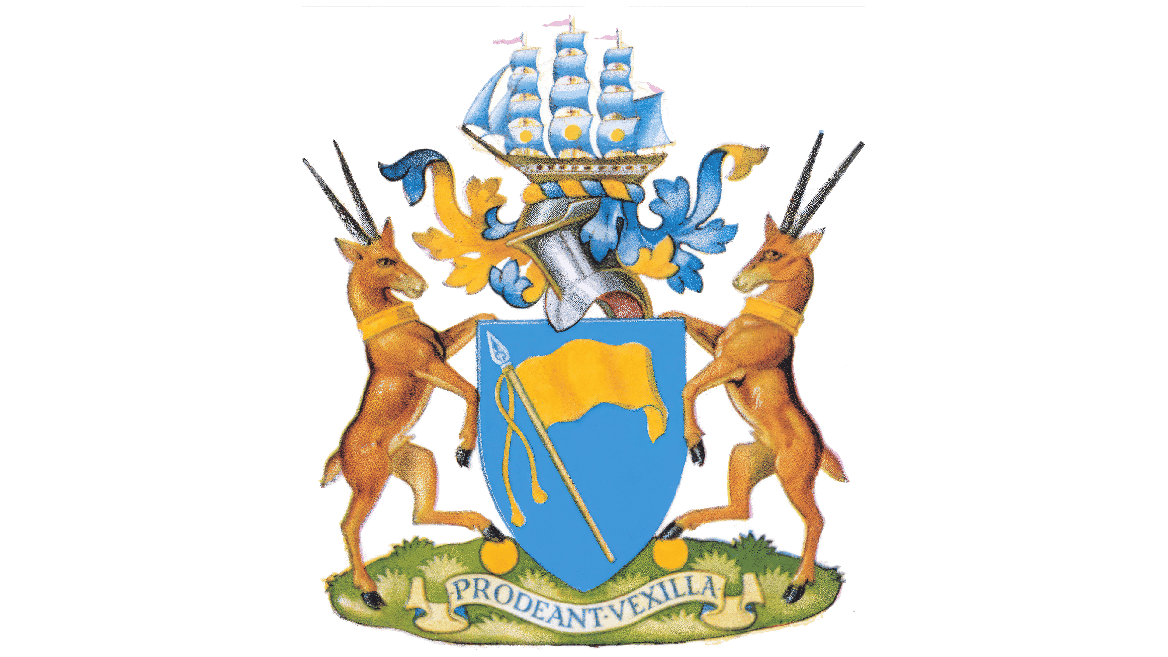
On March 30, 1955, Standard Bank received a coat of arms from England’s College of Arms. The gold banner on the shield played on the bank’s name, since one meaning of “standard” is a flag or banner. Images associated with Africa, maritime trade, and banking surrounded it.
The organization’s history began with an initiative by entrepreneurs led by John Paterson. They planned to establish a bank operating in South Africa and signed its founding agreement on October 13, 1862. The Standard Bank of British South Africa was established in London on October 15. Its first branch opened on January 16, 1863, in Port Elizabeth, which became its South African headquarters. The bank served trade, agriculture, and wool exports, later participating in the development of diamond-mining districts and the Witwatersrand goldfields. In 1883, the name was shortened to The Standard Bank of South Africa, removing “British.”
The bank used flag imagery before adopting its coat of arms. From approximately the 1870s to the early 1950s, the bank used a seal featuring the British Royal Standard. Its design followed the tradition of Victorian banks and colonial institutions. The seal appeared on checks, banknotes, letterheads, and other business documents.
In the 1955 coat of arms, a golden-yellow banner appeared on a light blue shield. The solid-colored fabric curved to the right. A pole with a pointed tip stood vertically just left of center, with a braided cord and tassels hanging beside it. The blue background symbolized the African sky.
Two antelopes with long horns and gold collars supported the shield. Their front legs touched its edges, while their hind legs rested on gold coins. The animals stood in symmetrical poses, with their heads turned toward the center. Their pointed ears were raised, and their slender tails hung down. Dark areas along the body contours complemented their ochre-brown coloring. The antelopes represented African wildlife, while the coins symbolized financial activity.
A knight’s helmet with a raised visor appeared above the shield. A 19th-century three-masted sailing ship crowned it, recalling Port Elizabeth and maritime trading connections. Gold coin-shaped circles decorated the blue-and-white sails. The ship was drawn in detail, with pinkish flags on the masts, gold outlines, portholes, yardarms, and lines defining the sails. A heraldic wreath of intertwined blue and yellow bands appeared beneath the vessel. Fabric mantling spread from either side of the helmet, featuring scrolls, folds, and shading.
A green grassy base united the lower portion of the coat of arms. A light-colored ribbon ran across it, carrying the Latin motto “PRODEANT VEXILLA,” a call for the banners to advance. The wording continued the theme of the flag on the shield. The blue uppercase letters had serifs, and a centered dot separated the 2 words.
By 1957, the coat of arms had become part of the bank’s identity. It began appearing on engraved forms in August 1958 and on flags, ties, and employee lapel accessories in the early 1960s. South Africa recognized the coat of arms in 1963. After a stylized logo was introduced in 1965, the detailed heraldic version continued to be used on some bank documents.
1965 – 1977

In 1965, Standard Bank simplified the coat of arms, retaining the shield and banner. The detailed design with its ship, antelopes, coins, and ribbon required careful rendering at smaller sizes. A compact flag image connected to the bank’s name was prepared for signs and small applications. A lapel emblem called the “furling emblem” appeared in the fall.
The shield had a dark blue background and a thin double gold border along its edge. Inside was a mustard-yellow banner. The pole, tipped with a sharp point, leaned to the left, while the fabric extended to the right in wavy folds. Two twisted cords ended in tassels. Narrow light bands on the pole, fabric, and cords suggested a reflective surface.
In February 1967, the bank introduced a more compact blue-and-white shield. Brass plaques bearing the updated emblem began to be installed in branches in February 1968. By 1970, the transition from gold and blue to the new color pair was complete.
The bank also began using short advertising phrases. The first, “You Can Bank on the Standard,” appeared in 1967. The wordplay around “standard” complemented the banner image and connected the advertising message to the bank’s name.
1977 – 1900s
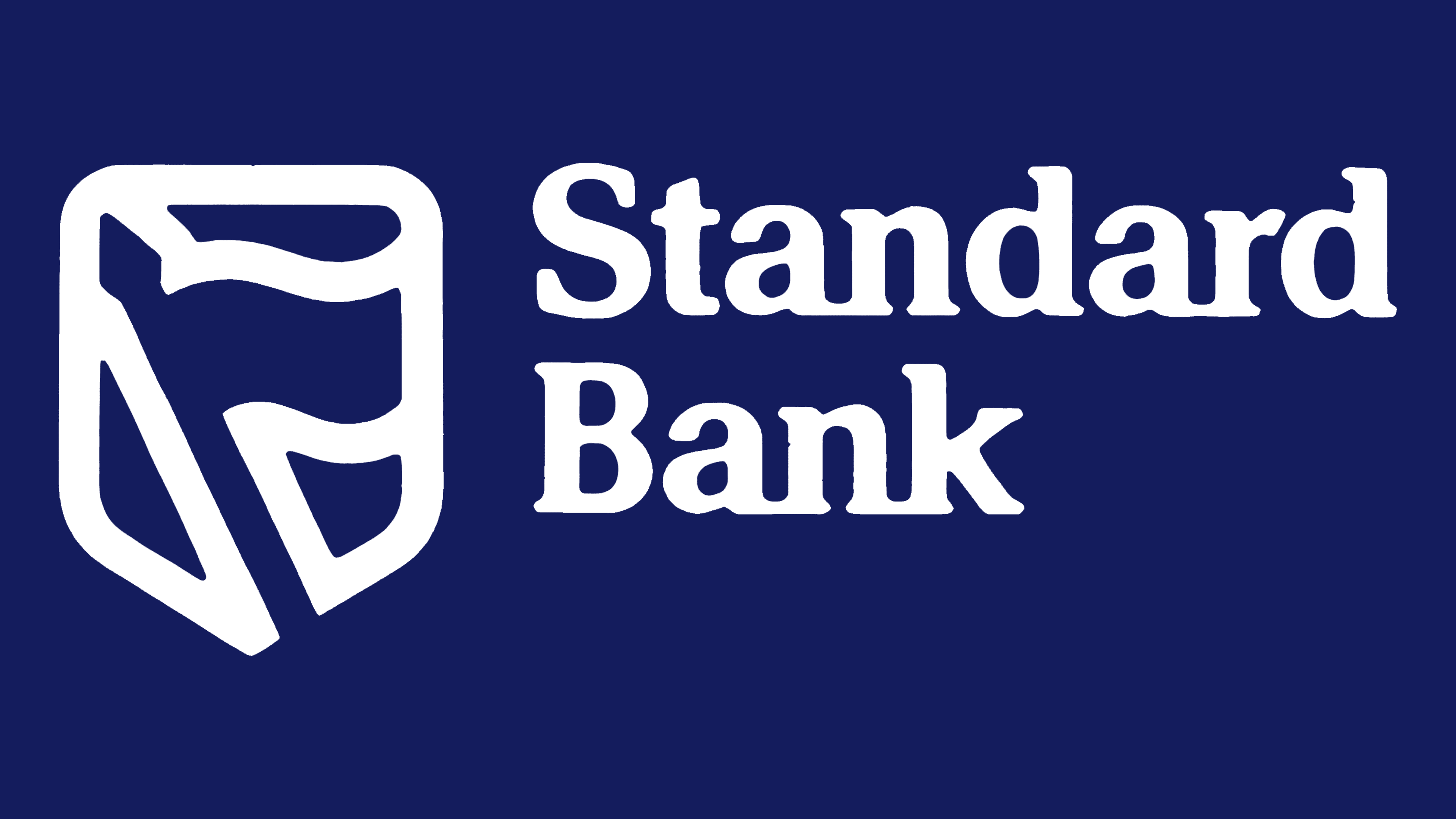
In 1978, Standard Bank placed the emblem and name on a shared dark blue field. The white shield and banner appeared on the left, with a two-line wordmark on the right. The colored background framed the entire logo and united its components in a horizontal block.
The historic shield and flag motifs were rendered in thick white bands. The pole became a line, while the upper portion of the flag curved to the right. White areas around the pole formed the shield’s outline. Enlarging the shapes and reducing the detail simplified the design while preserving both heraldic images.
The name was set in a bold typeface with heavy serifs. “Standard” appeared above “Bank,” with both lines left-aligned. The words began with uppercase “S” and “B” letters, followed by lowercase letters. The stroke weight complemented the emblem’s bands. White lettering stood apart from the dark blue background.
2000s – 2006
In 2000, Standard Bank updated its logo as part of a program to simplify its services. The changes were accompanied by the phrase “Simpler. Better. Faster.”, connecting improvements in the bank’s operations with the new identity. The tagline remained in use until the next brand update.
The main changes concerned the name. A lighter sans-serif style replaced the heavy serif typeface. White “Standard” lettering remained above “Bank.” The emblem on the left was reduced, leaving additional open space between the image and wordmark.
The shared blue background retained its horizontal shape but became shorter and darker. The white shield and name remained inside the colored field. The background’s revised proportions complemented the smaller emblem and updated lettering.
2006 – today
In April 2006, Standard Bank began gradually introducing a shared identity for the international group. It was based on corporate guiding principles established in 2005. The update was intended to represent different business areas and support the bank’s position as one of Africa’s leading financial institutions operating beyond the continent.
A horizontal arrangement on an open background replaced the two-line logo on a dark field. The blue emblem appeared on the left, with “Standard Bank” on a single line to the right. Removing the background panel made the logo lighter and allowed greater flexibility across formats. The shared color united the image and text.
The emblem retained the flag, vertical pole, and the shield’s lower outline. The lines became thinner, angular joins were softened, and the gaps between the components increased. The historic forms remained, with additional open space within the design.
The name was set in a sans-serif typeface with rounded contours. A space separated “Standard” and “Bank.” The initial “S” and “B” remained uppercase, with the remaining letters in lowercase. The letters’ curves complemented the emblem’s smooth transitions.
The update was accompanied by the phrase “Inspired. Motivated. Involved.” It replaced “Simpler. Better. Faster.”, which had referred primarily to retail banking services. The new tagline encompassed different parts of the group. It conveyed the bank’s intention to become more actively involved in its clients’ affairs.