 Bankinter Logo PNG
Banking services include accounts, loans, transfers, and asset management for private clients and businesses. These operations support daily financial tasks and business activities. The Bankinter logo is associated with a Spanish bank that provides financial services and develops digital solutions for clients.
Bankinter was founded in June 1965 as a joint venture between Banco Santander and Bank of America. The new structure was named Banco Intercontinental Español. The goal was to introduce modern banking services to the Spanish market. In 1972, the bank was listed on the Madrid Stock Exchange and became an independent organization. This completed the separation process from its founders. By that time, the bank had strengthened its position in the retail and corporate segments.
In the 1970s and 1980s, the bank expanded its range of services. It developed lending, insurance, and asset management operations. In 1995, together with the Royal Bank of Scotland, it established Línea Directa. It was one of the first insurance companies to use a direct telephone sales model. Línea Directa became one of the group’s most profitable units. In April 2021, it went public as an independent company.
In 2016, the bank acquired Barclays’ Portuguese division. This transaction accounted for about 8% of the bank’s total revenue and strengthened its position on the Iberian Peninsula. By 2020, the Bankinter network included 446 branches across Spain. The main shareholders were Cartival S.A., with a 23.19% stake, and Corporación Masaveu S.A., with a 5% stake.
In August 2024, Jaime Botín-Sanz, the founder and longtime chairman of Bankinter, passed away. Under his leadership, the bank became one of the most profitable financial institutions in the country.
Bankinter reported a record net profit of 812 million euros. This was 11 percent higher than the previous year’s figure. The bank confirmed its growth and leading position in the Spanish financial market.
Meaning and History
What is Bankinter?
A Spanish commercial bank based in Madrid, founded jointly by Banco Santander and Bank of America to develop consumer lending. It gradually became one of the largest private banks in the country with assets exceeding 100 billion euros. The bank operates in three areas: retail banking, corporate lending, and asset management. The network includes more than 400 branches in Spain, and subsidiaries operate in Portugal, Ireland, and Luxembourg.
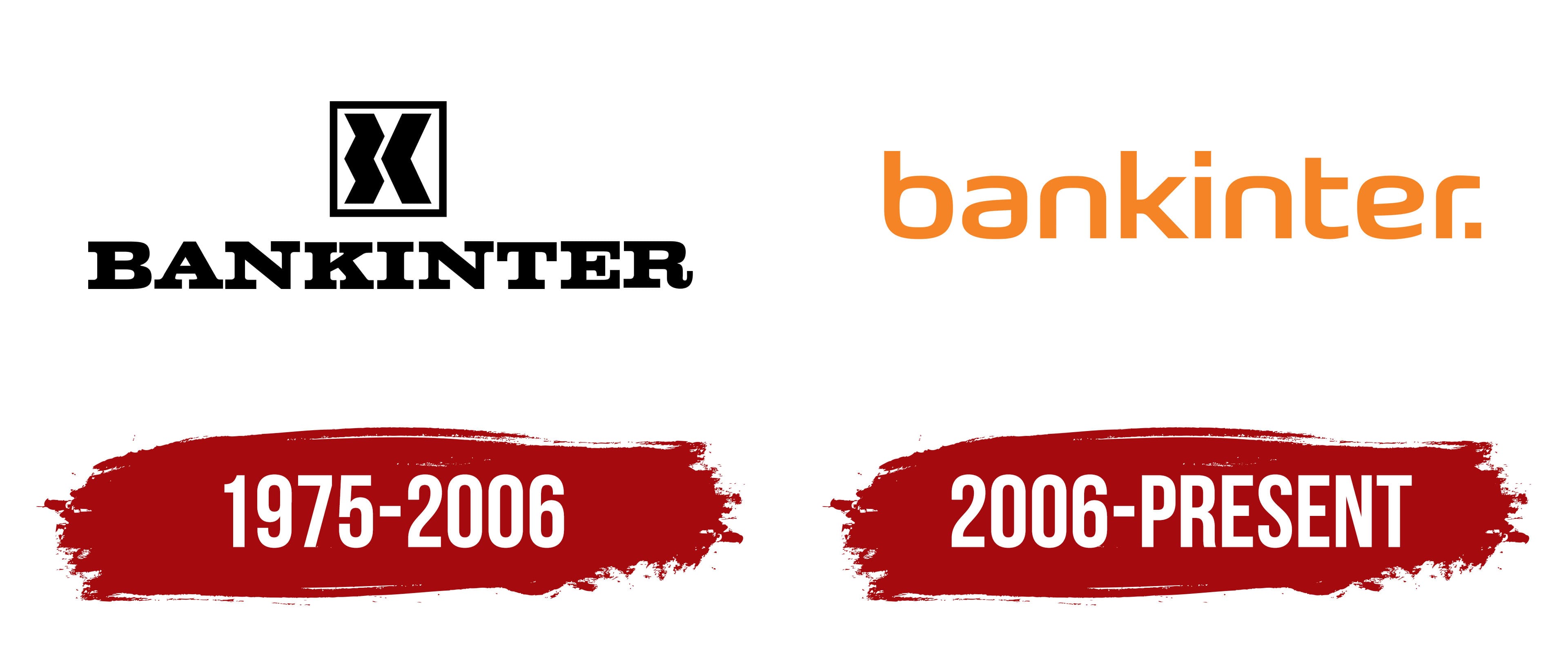
1975 – 2006

A black monogram within a square frame formed the basis of the Bankinter logo. The letter “K,” connected to the second part of the name, is visible inside the figure. The word BANKINTER appears below.
The bank began operations in June 1965 as a joint venture between Banco Santander and Bank of America. Its first official name, Banco Intercontinental Español, reflected the participation of Spanish and American capital as well as the international focus of the new financial institution. Its main customers were companies operating in foreign markets and using modern banking services.
The shorter name Bankinter gradually became common in business circles. It combines “Bank” and “Inter,” with “Inter” derived from “International.” The shortened name was more convenient than the full Spanish designation and remained in use throughout the bank’s history.
The logo has a vertical layout. A square with a thin black outline appears at the top. Inside are two broad curved figures. The left one has an angular form, while the right one resembles an arrow pointing toward the center. A narrow white gap between them forms the letter “K.”
The word BANKINTER appears beneath the monogram in black uppercase letters. The typeface has large serifs and resembles Clarendon and other fonts from the Egyptian Slab Serif family. Broad vertical strokes and heavy terminals give the wordmark high visibility. It completes the logo and establishes the bank’s name.
2006 – today
The period after the word bankinter became part of the logo. It completes the name and gives it a distinctive appearance. Orange and lowercase letters replaced the former system with a separate emblem. The entire composition now centers on the bank’s name.
The international agency Saffron Brand Consultants, founded by Wally Olins, developed the update. The studio’s Madrid office participated in the work. Saffron was responsible for the brand and the overall identity system. At the same time, British designer Miles Newlyn, known for creating custom typefaces for companies, designed the logo.
The name appears in lowercase letters. A round period in the same orange color follows the final “r.”
The sans-serif typeface has rounded contours and resembles Avenir, Varela, or newer versions of Neo Sans. Flowing curves are combined with angular cuts. The stroke width is nearly uniform across all letters. The lowercase lettering gives the logo a softer appearance than the previous version, which used uppercase letters and heavy serifs. Orange covers the entire name and the final period.