 Millennium BCP Logo PNG
Daily transactions, loans, and savings require a banking system that supports financial needs at different stages of life. Individuals and businesses use accounts, payment services, and credit products to manage their funds. The Millennium BCP logo is associated with Banco Comercial Portugues, a bank that serves individuals and entrepreneurs in Portugal and beyond.
Millennium BCP was founded on June 25, 1985, as Banco Comercial Português after the deregulation of Portugal’s banking sector. The institution united more than two hundred shareholders and a team of specialists. Their goal was to create an independent private bank to serve the national financial market.
In March 1995, BCP gained control over Banco Português do Atlântico, the largest private bank in the country. In June 2000, the merger with it was completed. In the same year, the bank acquired Império, Banco Mello, and Banco Pinto & Sotto Mayor. These acquisitions strengthened the bank’s position in Portugal.
In October 2003, the process of consolidating all operations under the single brand Millennium BCP began. It was completed in 2006. In 2004, the bank sold the insurance companies Império Bonança, Seguro Directo, Impergesto, and Servicomercial to Caixa Geral de Depósitos Group. In the same year, it signed an agreement with Fortis, which later became Ageas.
From 2004 to 2010, BCP reduced its presence in France, Luxembourg, the United States, Canada, Greece, and Romania. The bank focused on its core activities. In February 2012, the bank carried out a management restructuring. In December 2012, the bank submitted a transformation plan to the Portuguese government. In July and September 2013, the European Commission approved the document.
In May 2014, BCP revised its partnership with Ageas. In April 2016, Banco Millennium Angola and Banco Privado Atlântico completed their merger. As a result, it became Angola’s second-largest private bank.
In January 2017, the bank issued 1.3 billion euros in shares. It used these funds to repay government securities and lift restrictions associated with receiving state aid. In August 2019, the shareholders of Bank Millennium S.A. approved the merger with Euro Bank S.A. It was completed in November of the same year.
In June 2021, BCP sold its Swiss entity, Banque Privée BCP (Suisse) SA, to Union Bancaire Privée. In December 2021, the subsidiary bank in Mozambique entered into a partnership with Fidelidade.
In the first half of 2023, Bank Millennium S.A. sold 80 percent of its stake in Millennium Financial Services. In 2024, the bank announced it had completed its recovery plan.
Meaning and History
What is Millennium BCP?
A bank in Portugal with its headquarters in Porto. It offers a wide range of services, including deposits, loans, investments, cards, and digital banking. It operates in Angola, Macau, and other countries. Major investors include Sonangol, Grupo Teixeira Duarte, and Banco Sabadell.
1985 – 2004
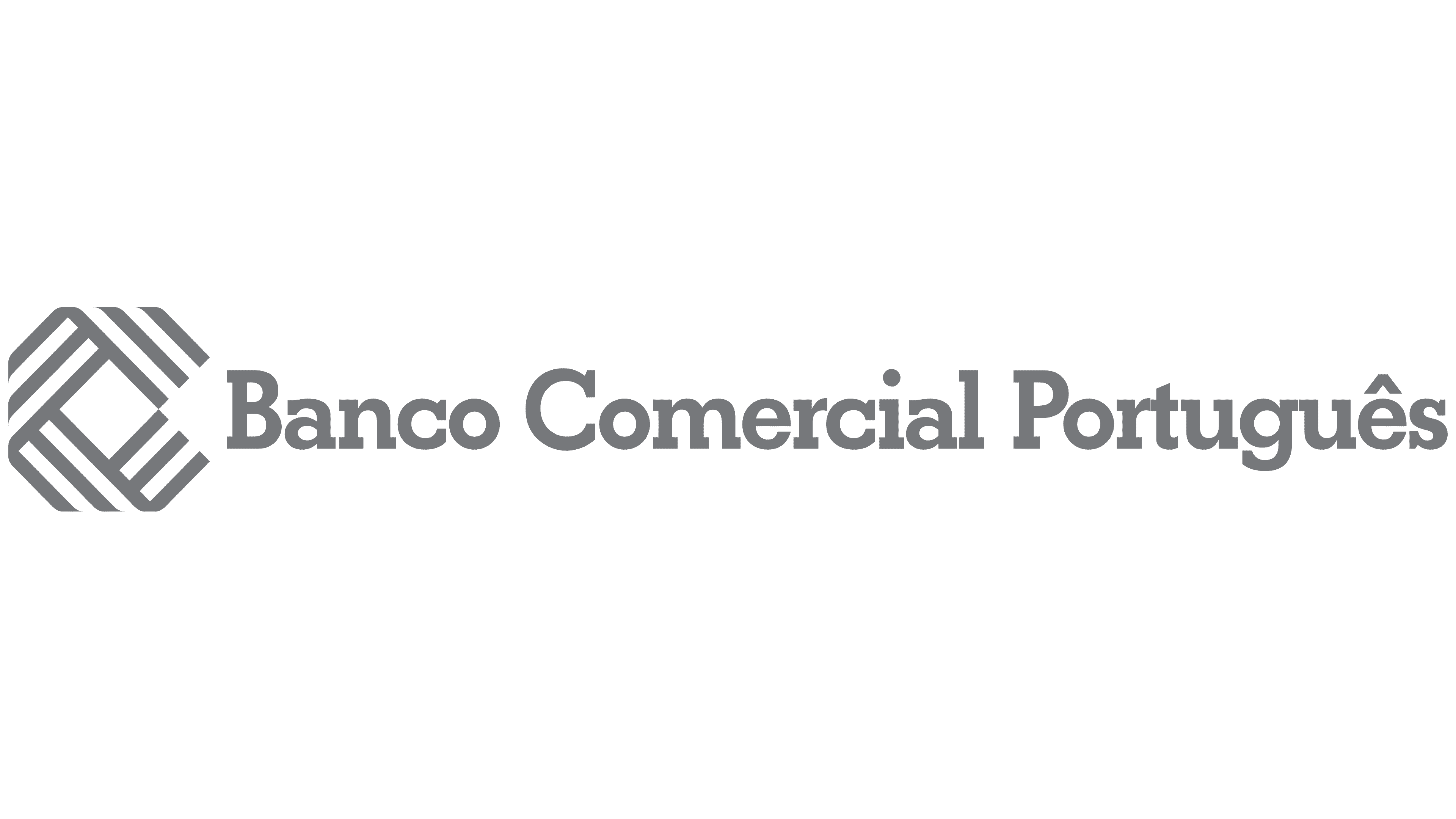
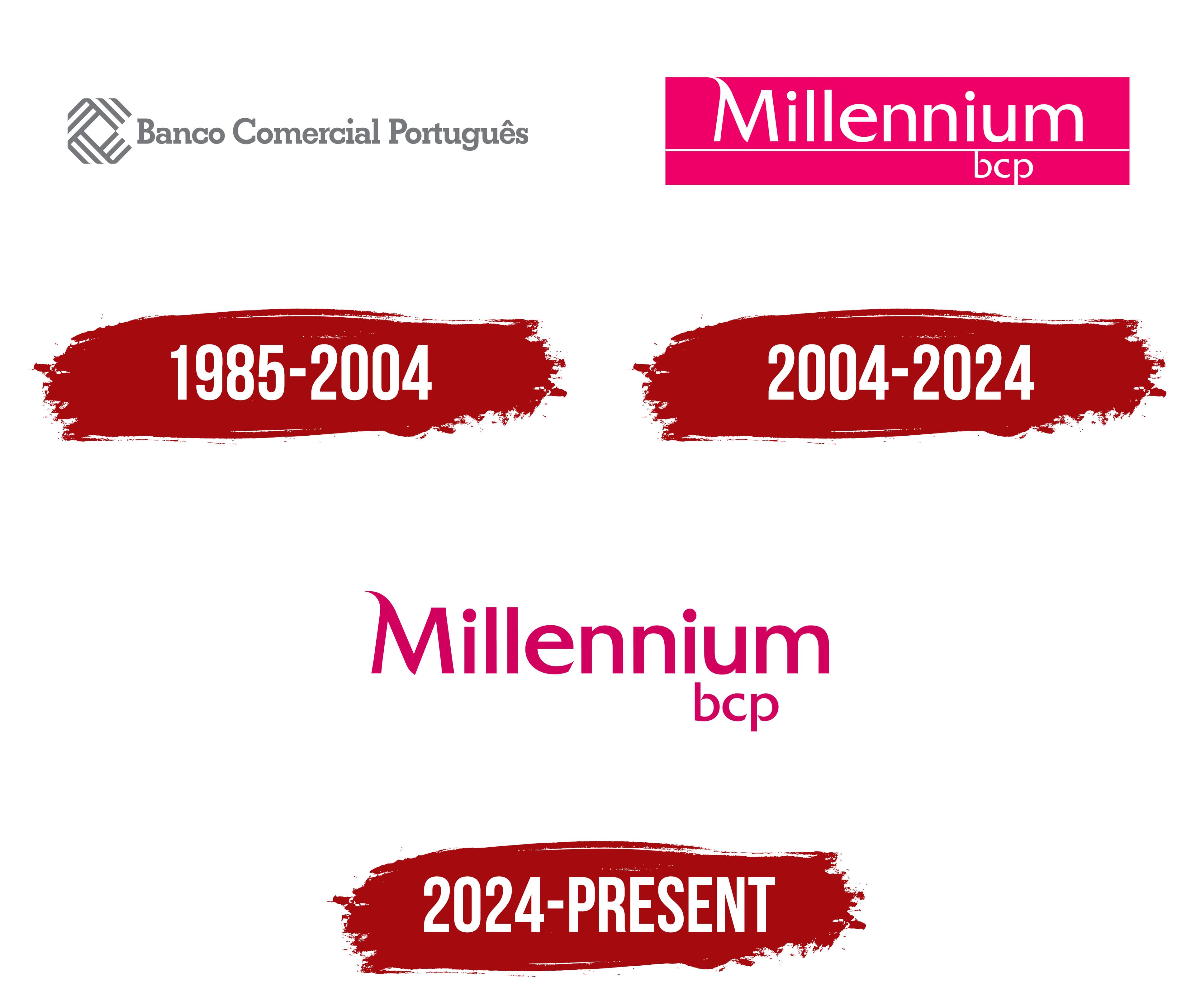
The Banco Comercial Português emblem appeared three years before the bank was established. Project archives date the work to 1982, when the future organization was still in development. Portuguese designer Carlos Rocha created the identity. After BCP opened, his design became the new financial institution’s corporate symbol.
Banco Comercial Português was established on June 25, 1985, following the liberalization of Portugal’s banking sector. More than 200 shareholders and a group of banking professionals led by Jorge Jardim Gonçalves participated in its creation. The private bank entered the market as an alternative to government-owned institutions, which had dominated the country after the 1970s nationalizations. Its full name means “Portuguese Commercial Bank.”
Carlos Rocha created a diamond-shaped emblem with four interwoven sections and rounded corners. Each section contained three gray lines of equal thickness positioned at a 45-degree angle. Their intersection formed a smaller diamond in the center. A triangular opening on the right interrupted the outer boundary, making the woven structure more complex.
The gray name “Banco Comercial Português” appeared to the right of the emblem. All three words occupied a single line and began with capital letters. The inscription used heavy serif lettering with slightly condensed horizontal proportions. The dense text balanced the multiline figure and placed the full legal name beside the compact emblem.
Over time, the diamond became a short identifier for the bank, while the abbreviation “BCP” became part of the Millennium bcp brand. The full legal name Banco Comercial Português, S.A. remains in use. Millennium bcp serves as the bank’s commercial brand.
2004 – 2024

By January 2004, more than 1,000 BCP branches in Portugal had begun operating under the Millennium bcp name. The large-scale replacement of signs, business documents, and branch interiors followed the brand presentation to employees and market representatives on October 23, 2003. International implementation continued through 2006. The group’s banking divisions in several countries gradually adopted the shared Millennium name.
The unified brand emerged from acquisitions completed during the 1990s. BCP gained control of Banco Português do Atlântico in 1995. In 2000, the group incorporated Atlântico and acquired Banco Mello and Banco Pinto & Sotto Mayor. Its retail operations included the Nova Rede, Atlântico, Mello, and SottoMayor networks. By the end of 2001, the bank had begun restructuring its commercial model. The goal was to unite the networks under one name and present the group outside Portugal.
The name Millennium referred to the new millennium and worked across markets with different languages. Management associated it with change, innovation, the future, and international expansion. Jorge Jardim Gonçalves noted the word’s vitality, independence, and Latin origin, which conveyed longevity and scale. The lowercase “bcp” preserved the connection with Banco Comercial Português and the banking group’s established reputation.
The corporate signature appeared against a rich crimson-red background shaped like an elongated panel. The white word “Millennium” occupied the upper section, with a thin horizontal line below it. A small “bcp” appeared near the lower right edge. The new name received primary prominence, while the abbreviation of the former name identified the bank’s origins.
The designers created custom lettering for “Millennium.” The capital “M” stood taller than the other characters. Its left stem extended downward and curved inward beneath the word. The following letters were lowercase, thin, and sans-serif. They formed an elongated line with softly rounded details. The smaller “bcp” used white rounded sans-serif lettering.
The crimson shade distinguished Millennium bcp from the blue and green colors banks frequently used during this period. The bank later adopted magenta as its corporate color and associated it with leadership, quality, innovation, professionalism, and transparency. The launch included the phrase “A vida inspira-nos,” meaning “Life inspires us.” It referred to customers’ plans and appeared in corporate communications following the rebranding.
Millennium bcp updated its positioning, communication system, and branch interiors in early 2016. The phrase “A vida inspira-nos” was replaced by “Aqui consigo,” meaning “Here with you.” The bank’s name, magenta color, and custom lettering remained the foundation of the identity. The update covered communication materials and branch environments, while the primary logo remained in use.
2024 – today
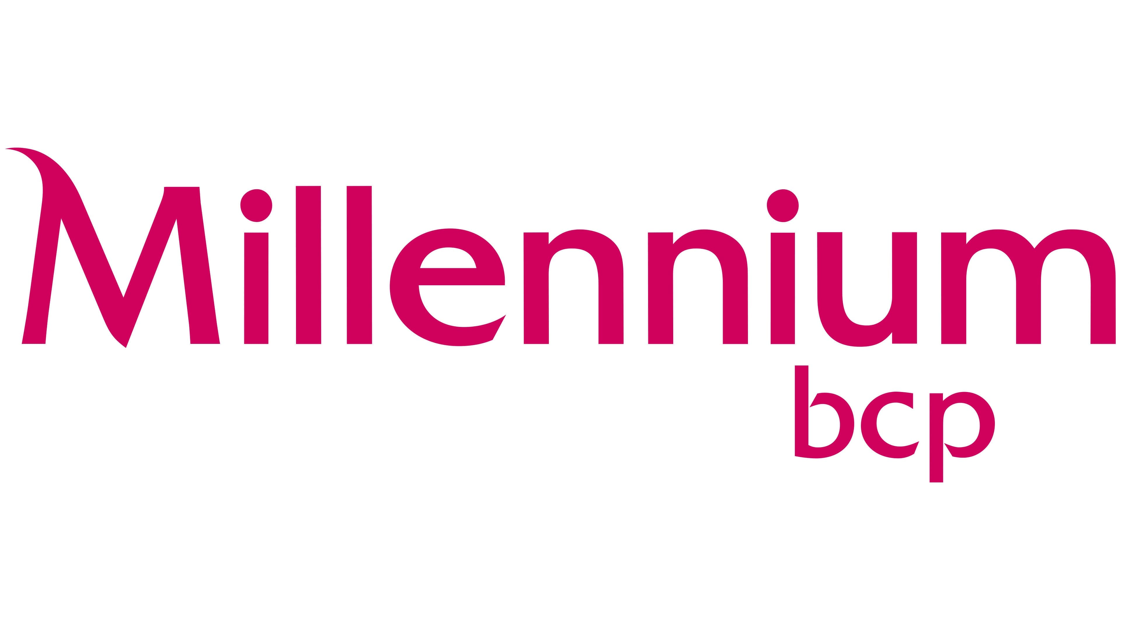
Magenta moved from the background to the lettering in the current Millennium bcp logo. The name now appears against an open background. The large colored panel and long white line were removed, creating a freer typographic composition. The wordmark became more compact and visually lighter.
“Millennium” sits on the upper level in a rich magenta-pink. The lowercase “bcp” sits below, near the right edge of the main name, and uses the same shade. The size difference separates the Millennium commercial brand from the abbreviation of the bank’s legal name.
The letterforms continue the system introduced with the unified brand. The update changed the background, dividing line, and color distribution. The wordmark’s structure remained close to the previous version. The open background made the name easier to place on different surfaces. At the same time, magenta remained the brand’s primary color.
Official bank materials identify Millennium bcp as the commercial brand of Banco Comercial Português, S.A. The small “bcp” maintains the connection with the legal name. Millennium addresses customers and partners and occupies the leading position in the corporate signature.