The basis of the bank’s work is trust in customers. Therefore, the VakıfBank logo demonstrates benevolence, providing loans for growth and development. The logo symbols communicate that the organization has a solid foundation for a broad loan portfolio.
VakifBank: Brand overview
| Founded: | April 13, 1954 |
| Headquarters: | Ümraniye, Istanbul, Turkey |
| Website: | vakifbank.com.tr |
Meaning and History
The full name of VakıfBank sounds like Türkiye Vakıflar Bankası Türk Anonim Ortaklığı. It is a stock corporation owned by the Turkish government. It was established in 1954 as a joint-stock company. The founder was the organization Türkiye Bankalar Birliği, which manages all banks in the country, both private and state. The initial capital was 50 million Turkish liras.
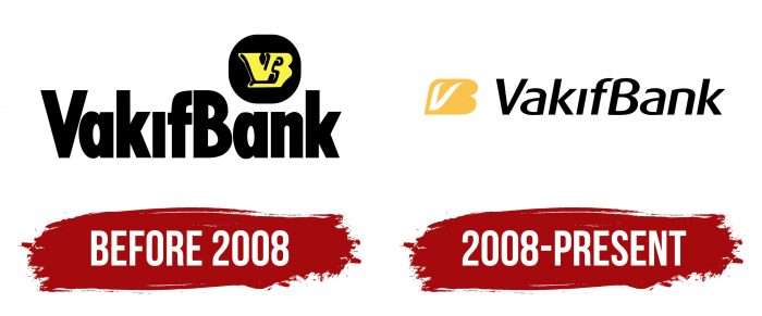
During the entire period of its existence, VakıfBank changed its logo only once – in 2008. In both cases, it used simple word signs, supplemented by a monogram of the letters “V” and “B.” It is noteworthy that none of the options contained the full name of Türkiye Vakıflar Bankası Türk Anonim Ortaklığı because this bank is better known by its abbreviated name. It is popular both domestically and abroad.
What is VakifBank?
VakifBank is one of the largest credit and financial institutions in Turkey. It offers various banking, insurance, and investment services, attracting customers with beneficial loyalty programs. The company was founded in 1954 and has since established a broad network of branches and ATMs worldwide. It has overseas branches in Qatar, Iraqi Kurdistan, Bahrain, and the USA.
Before 2008
The old logo contained black lettering “VakıfBank” in bold. Above “an,” there was the same black circle of irregular shape. Inside it was a yellow monogram: “V” and “B” connected at the top. The letter mark appeared three-dimensional due to the dark outlines.
2008 – today
In 2008, Türkiye Vakıflar Bankası TAO’s leaders organized a survey to find out what the public thinks about the bank’s symbols. As it turned out, customers viewed the corporate image as outdated and non-innovative. Therefore, it was decided to change the company’s corporate identity, spending a huge amount on it.
After the redesign, the font became italic, and the black circle disappeared. The monogram’s shape has also changed: it now looks like a yellow B-shape with a white “V” inside. Rather, it is not even a monogram, but a graphic image. The location of the letter element has not changed: it, as before, is located above the second half of the bank name, in the free space between the upper edges of the “B” and “K.”
VakifBank: Interesting Facts
VakıfBank, also known as VakıfBank Türk Anonim Ortaklığı, is one of the leading financial institutions in Turkey, known for its deep history, contributions to the country’s economy, and banking achievements.
- Origins: In 1954, VakıfBank was inspired by the Ottoman Empire’s “vakıfs,” or charitable trusts, aiming to use these foundations’ capital for national development.
- State Ownership: A notable feature of VakıfBank is its significant state ownership, with a large portion of shares owned by the General Directorate of Foundations, emphasizing its commitment to public welfare and economic growth.
- Banking Innovations: VakıfBank introduced many firsts in Turkey, such as ATM services and Internet banking, making banking more convenient for its customers.
- Going Global: The bank has branches and offices abroad, helping Turkish businesses internationally and promoting global trade and investment.
- Supporting the Community: Staying true to its roots, VakıfBank invests in social welfare, education, health, and cultural projects in Turkey.
- In Sports, VakıfBank is also known for supporting women’s volleyball. Its team has won numerous national and international titles, including the FIVB Volleyball Women’s Club World Championship.
- Stable and Strong: The bank is recognized for its financial stability and performance. It is crucial in financing infrastructure projects, supporting SMEs, and boosting Turkey’s economy.
- Digital Advances: VakıfBank has embraced digital banking, offering mobile apps, online platforms, and new financial products to meet its customers’ digital needs.
- Awards: It has earned many awards for its services, innovations, and impact on the banking industry, showing its dedication to excellence and customer satisfaction.
- Education Focus: Besides its financial activities, VakıfBank strongly supports education through programs, scholarships, and research initiatives.
VakıfBank blends traditional charitable principles with modern banking, significantly contributing to its success and Turkey’s economic and social development. Its focus on innovation, community welfare, and international expansion continues to shape its path forward.
Font and Colors
VakıfBank is a conservative brand that only had two logos. Both word signs had approximately the same structure: the inscription, supplemented by the stylized letters “V” and “B” in the upper right corner. The emblem’s main evolution was that the round black and yellow monogrammed symbol was replaced by a yellow oblique figure with a white checkmark inside.
Since the central element of the bank’s logos is its name, the designers relied on the font. In the first case, they chose a bold grotesque to make the inscription better visible. The same vertically elongated letters compressed at the edges can be found in modern Neusa ExtraBold or Coegit Compact Bold typefaces.
In 2008, the font was changed to Dax OT-Medium Italic. It is published by FontShop International and developed by Hans Reichel. It is a sans serif italic font that looks dynamic thanks to its rounded corners.
Both logos are made in the same palette because yellow and black are the traditional colors of VakıfBank. The shade is now Golden Yellow (# FFDF00), which is brighter than the old emblem. He painted a figure in the shape of the letter “B,” inside which is a white “V.”
VakifBank color codes
| Fluorescent Orange | Hex color: | #ffc441 |
|---|---|---|
| RGB: | 255 196 55 | |
| CMYK: | 0 23 75 0 | |
| Pantone: | PMS 1225 C |
| Black | Hex color: | #000000 |
|---|---|---|
| RGB: | 0 0 0 | |
| CMYK: | 0 0 0 100 | |
| Pantone: | PMS Process Black C |
