 Banco Sabadell Logo PNG
Banking services for businesses and private clients include payments, lending, and cash management in day-to-day operations. These services support trade, entrepreneurship, and personal finances. The Banco Sabadell logo represents a Spanish bank that provides financial services to companies and private clients, with a focus on small and medium-sized businesses.
Banco Sabadell was founded in 1881 in the Catalan city of Sabadell. Industrialists established it to finance the development of the local textile industry. The first chairman of the board was Joaquim Salas i Fàbregas. By the beginning of the twentieth century, the bank had expanded its operations beyond the region. It opened branches in Barcelona and other Catalan cities.
After the Civil War and the Franco dictatorship, the bank continued to grow steadily. In the 1960s and 1970s, it became part of Spain’s economic boom. By that time, the number of branches exceeded one hundred. In 1988, Banco Sabadell shares began trading on the Madrid and Barcelona stock exchanges.
In the 1990s, the bank carried out a series of acquisitions. Banco Herrero and NatWest España joined the group. These deals strengthened its position in the national market. In the early 2000s, Banco Atlántico and Banco Urquijo joined the group.
During the 2008 crisis, the bank maintained liquidity and avoided bankruptcy. The company took advantage of the situation and acquired assets of failed competitors. In 2010, it purchased Lloyds’ Spanish business. In 2013, Sabadell acquired the nationalized Banco CAM.
In 2015, the bank acquired the British company TSB Banking Group for 1.7 billion pounds. Following the 2017 events related to the Catalan referendum, the bank moved its headquarters from Barcelona to Alicante.
Since 2018, Sabadell has been investing in digital transformation. The bank has struggled to integrate TSB’s IT systems. In 2020, the bank negotiated a possible merger with BBVA. The deal did not take place.
Banco Sabadell is among the largest banks in Spain. It serves millions of clients in Spain and the United Kingdom.
Meaning and History
What is Banco Sabadell?
The fourth-largest bank in Spain by assets, headquartered in Alicante, serves about 12 million clients. The network includes more than two thousand branches in Spain, the United Kingdom, and Mexico. Initially founded by Catalan entrepreneurs to support the textile industry, it later shifted to commercial banking and expanded beyond the region. The structure consists of three divisions: the domestic market of Spain, the British bank TSB, and the Mexican Banco del Bajío.
1960s – 1974
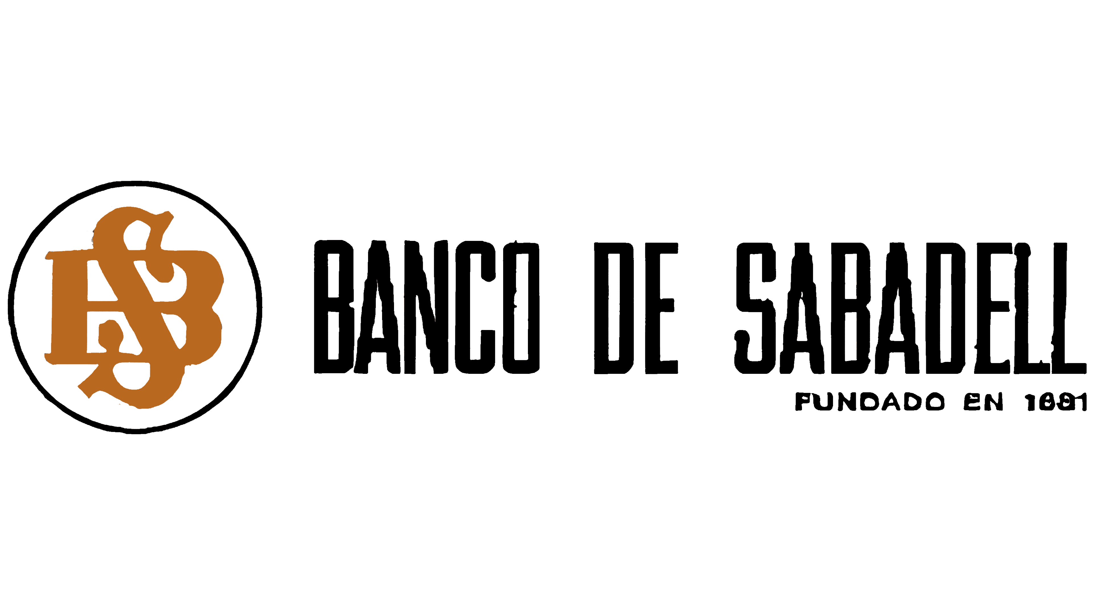
The year 1881 appeared in the Banco de Sabadell logo as the bank began expanding beyond its home city. One of the earliest known versions was used from the 1960s until 1974. It combined a BS monogram, the full Spanish name, and a line showing the year the organization was founded.
Banco de Sabadell was established on December 31, 1881, by 127 business owners and merchants from Sabadell, Catalonia. The bank was created to finance local industry and purchase wool and coal under favorable terms. Its name came from the city and identified the organization’s geographic origin.
The bank used the full Spanish form Banco de Sabadell during its early decades. The Catalan form Banc Sabadell later became common. Banco Sabadell became the commercial name in the 1990s. The 1960s version retained the earlier Spanish name with the preposition “de.”
The logo had a horizontal layout. A circular emblem appeared on the left, with 2 lines of text on the right. BANCO DE SABADELL occupied the upper line, while FUNDADO EN 1881, meaning “FOUNDED IN 1881,” appeared below. The size difference separated the bank’s name from its founding date.
Inside the circle, the uppercase letters “B” and “S” intertwined through broad strokes. The letters overlapped, filling the interior. The monogram was ocher brown, while the typographic section was black. A thin black outline surrounded the initials and formed the circular frame.
BANCO DE SABADELL appeared in black uppercase letters. They had tall, narrow proportions, even forms, and heavy primary strokes. The condensed style allowed the long name to fit beside the compact monogram without increasing the logo’s height.
FUNDADO EN 1881 appeared smaller and in the same black. It was aligned with the right edge of the bank’s name above. The year linked the identity to the bank’s history and referenced the organization’s origins in Sabadell’s business community.
Banco de Sabadell opened its first branch outside its home city, Sant Cugat del Vallès, in 1965. The network later expanded to Barcelona, Madrid, and London. The full name and FUNDADO EN 1881 line introduced the bank to new audiences. They communicated where and when it was founded.
1974 – 1981

In 1974, the Banco de Sabadell logo introduced a 3-level wordmark to the right of the monogram. The bank used this version until 1981. The bank’s full name was divided across separate lines, and the entire composition appeared in dark blue.
A circular emblem with intertwined uppercase “B” and “S” letters stood on the left. The strokes became thicker, making their connection dense and substantial. A dark blue outline surrounded the monogram and matched the interior lines.
The intersecting initials occupied most of the circle. Their compact arrangement and enclosed outer contour resembled a traditional heraldic composition. The form turned the Banco de Sabadell initials into a separate emblem connected with the full name on the right.
The typographic section consisted of 3 lines. BANCO occupied the top, DE appeared in the middle, and SABADELL formed the bottom line. The name used decorative uppercase letters with extended serifs. All 3 lines began at the same left edge, while the longer SABADELL line formed the base of the text block.
The name and monogram used the same dark blue. The shared color unified the circle, intertwined initials, and 3-line wordmark. Starting with the 1974 version, blue became Banco de Sabadell’s primary corporate color and carried through later identity systems.
The logo accompanied the bank’s expansion beyond Catalonia. By the end of the 1970s, Banco de Sabadell had opened an international office in London. The circular monogram and full Spanish name represented the bank as it entered new territories and international markets.
1981 – 1992

Banco Sabadell introduced a unified identity system for all its divisions in 1981. As it expanded its branch network and formed a banking group, the organization brought its separate logo versions under a common standard. A circular BS monogram and the bank’s full name formed the basis of the identity.
The logo adopted a vertical arrangement. A thin circle containing the intertwined “B” and “S” initials appeared at the top. BANCO DE SABADELL ran beneath it. Moving the name below the emblem replaced the previous horizontal format.
The circle and BS letters were black. A thin outer outline surrounded the intertwined initials, leaving open areas between them. The monogram remained compact, while the added space above the lower line separated it from the bank’s full name.
BANCO DE SABADELL appeared in traditional uppercase serif letters. Expanded letter spacing stretched the long line beneath the circle. The shared black color combined the name and monogram into one corporate identifier.
The unified identity accompanied the bank’s infrastructure development. Banco Sabadell expanded its network and introduced computer technology and remote data processing. The shared emblem appeared across all divisions and business areas of the emerging banking group.
1992 – 1998

In the early 1990s, Banco de Sabadell adopted the shortened commercial name Banco Sabadell. The new name reflected the form commonly used in everyday speech. The logo was rebuilt around the 2-word name, removing the preposition “de.”
The composition adopted a horizontal arrangement. A circular BS monogram appeared on the left, with the bank’s name on the right. A turquoise section made from 2 lines, a small square, and white gaps ran beneath the wordmark. The logo was divided into the monogram, name, and lower colored section.
The intertwined “B” and “S” remained inside the circle, connecting the new version with the previous identity. Their strokes became thinner, giving the monogram lighter contours. The circle separated the initials from the typography and served as the bank’s compact emblem.
Banco Sabadell appeared in blue. Both words used upright sans-serif letters. Uppercase “B” and “S” letters marked the beginning of the words, while the other characters were lowercase. The shortened name occupied a compact area and reflected the organization’s commonly used name.
Two thin turquoise lines appeared beneath the typographic section. White gaps separated individual segments, with a small square in the same color placed nearby. Open space separated the lower section from the blue wordmark, and the lines extended beneath most of the name.
1998 – 2012
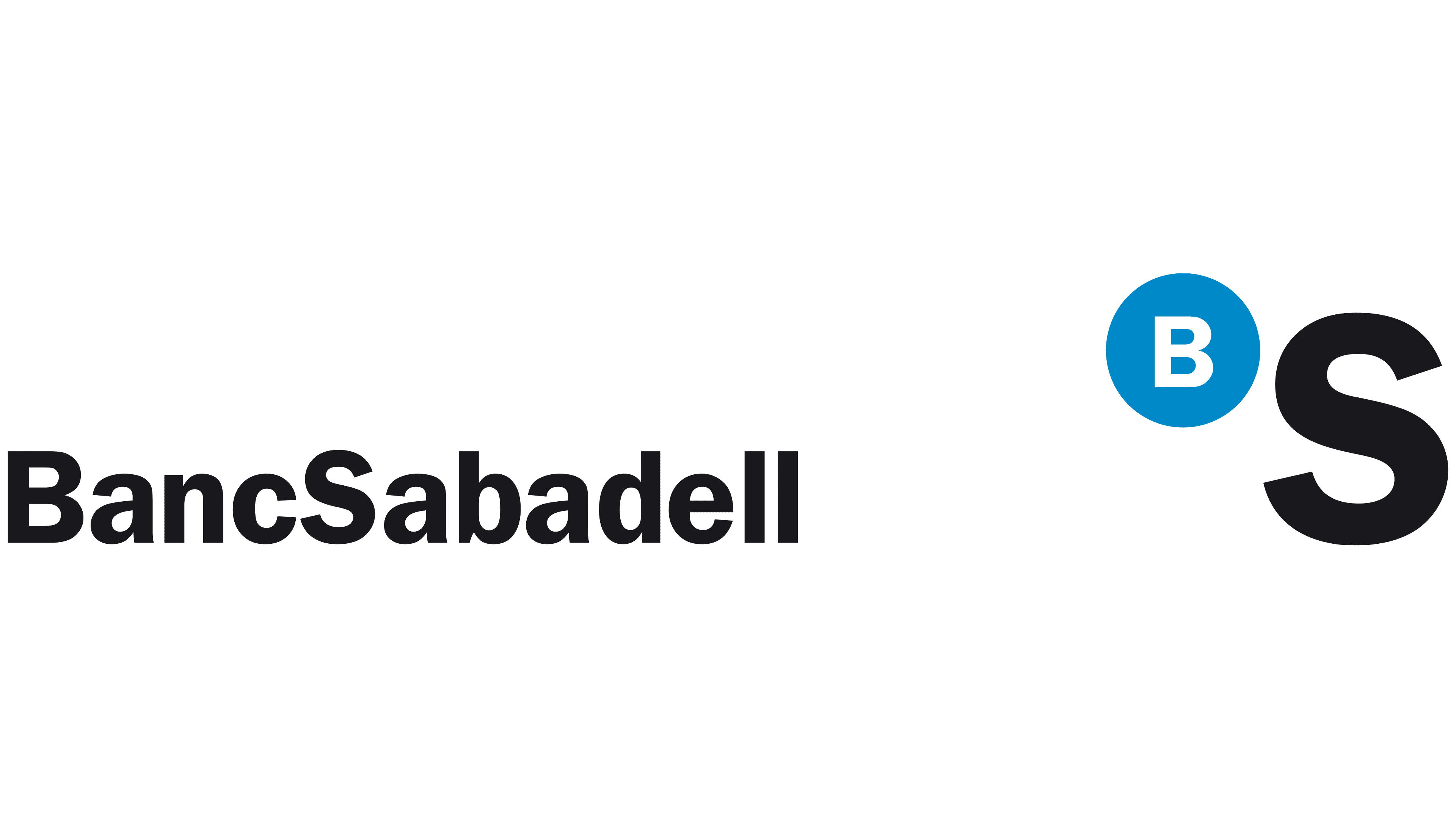
During the mid-1990s, the “B” and “S” moved from an intertwined monogram to a flexible system developed for the entire banking group. Argentine designer Mario Eskenazi created the redesign. According to Eskenazi, Banco Sabadell’s previous identity had become outdated, and the commission required an identity system that could accommodate acquired banks.
Eskenazi retained the initials but changed their form and relationship. Separate letters replaced the circular frame and intertwined BS monogram. A large black “S” formed the foundation of the emblem, while a smaller white “B” appeared inside a bright blue circle above it.
In the early version, the name appeared as the single word BancoSabadell. Uppercase “B” and “S” letters marked the beginning of its 2 parts, while the remaining characters were lowercase. The black wordmark used a dense semibold version of the Franklin Gothic sans-serif typeface. The combined form presented the bank’s name as a single brand and worked within a system of related names.
The wordmark appeared on the left, while the emblem stood farther away on the right. The large “S” matched the style and black color of the text but used a different scale. The blue circle with a white “B” sat in the upper area beside the “S.” The circle used the bright color #009CDE.
The size difference let the BS pair stand apart from the full name. Eskenazi described the “B” as an identifier for the first part of the bank’s name. At the same time, the large “S” formed the emblem’s foundation. Separating the letters allowed them to appear beside the names of different organizations within the group.
The shared system was applied to BancoHerrero, SabadellAtlántico, BancoUrquijo, and Solbank. The names changed, while their connection to Banco Sabadell was communicated through typography, layout, and the initials. Acquired banks entered the common identity system while retaining their commercial names.
2012 – today
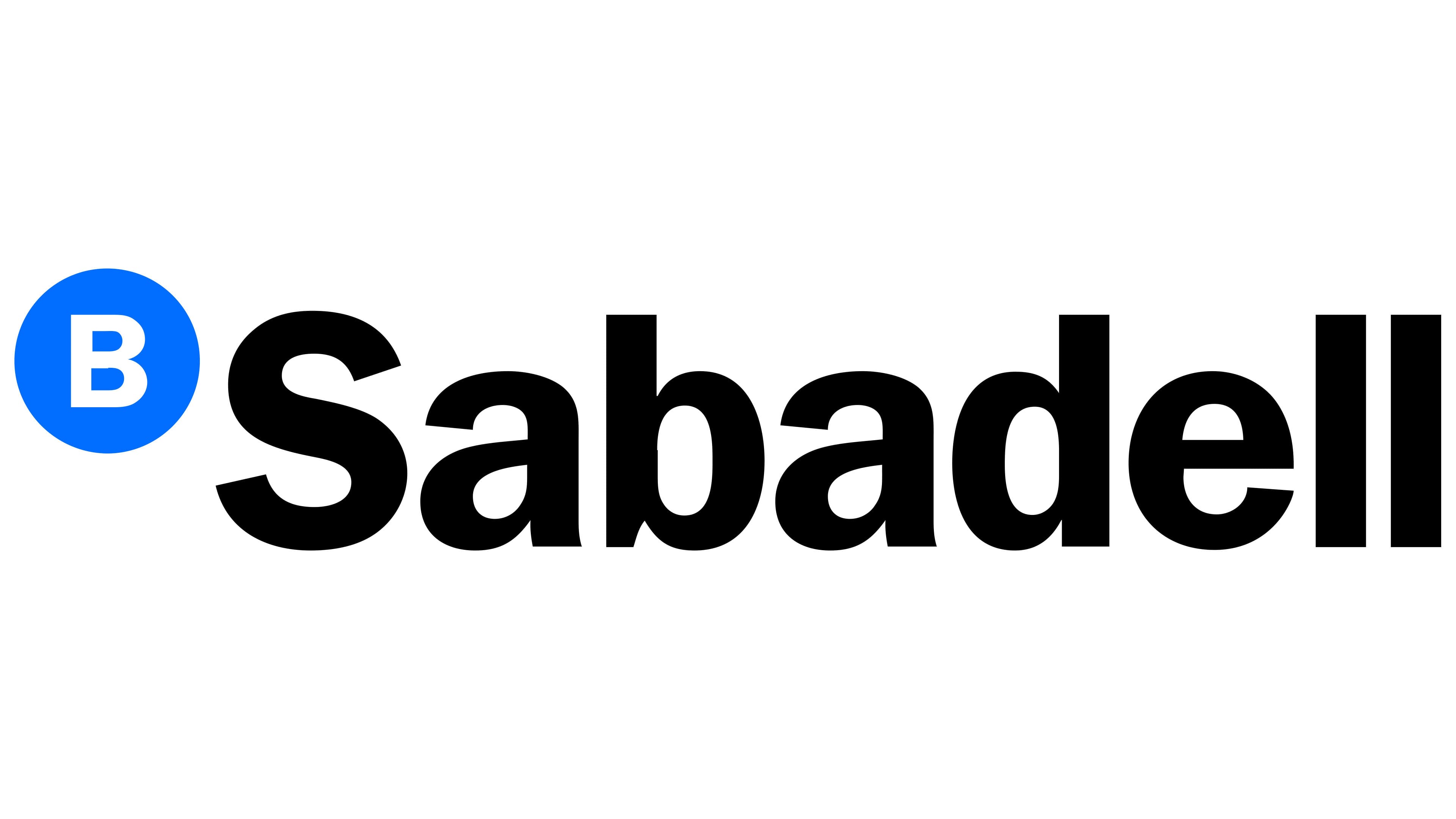
The word Banco was removed from the name in 2012, giving the shortened form Sabadell the primary role. The redesign accompanied the unification of the group’s identity following a series of acquisitions involving regional banks in Spain and other countries. The new version shortened the previous identifier while retaining Mario Eskenazi’s recognizable construction.
The BS symbol and Sabadell name were combined in one horizontal line. The blue circle containing a white “B” moved to the upper area of the large black “S.” The “S” opened the word Sabadell while forming the main part of the emblem. The arrangement connected the shortened name with the earlier system of initials.
A white uppercase sans-serif “B” appeared inside the bright blue circle. The circle sat to the left of the name and matched the height of part of the upper section of the “S.” The contrast between the blue field, white letter, and black wordmark separated the 2 parts of the identifier while keeping them connected within one composition.
Sabadell used a heavy upright sans-serif typeface. The initial “S” was uppercase and larger than the remaining characters. The following letters appeared in compact lowercase black forms. Banco no longer appeared in the typographic section. However, the white “B” inside the circle preserved the connection with the bank’s full name.
The shorter logo accompanied the group’s move away from lengthy regional identifiers, including SabadellAtlántico. Following the acquisition of Banco CAM in 2011, the SabadellCAM brand was created using the shared system. The structure linked acquired banks with the group through the Sabadell name and common emblem.
The version introduced in 2012 still uses the blue circle with a white “B,” the large black “S,” and the Sabadell name. Branches and divisions use horizontal, vertical, and reversed layouts. They change the placement of the components and background color while retaining the letterforms and emblem structure.
Mario Eskenazi and Raúl Goñi used the brand’s typographic foundation in flagship office interiors. Their work extended the corporate system into the physical banking environment while keeping the short Sabadell name as the group’s primary identifier.