


 GE Capital Logo PNG
For an industrial business, buying equipment begins with calculating costs and finding financing. The GE Capital logo represented General Electric’s financial division, which provided leasing and commercial lending services. The division financed equipment and inventory purchases, as well as working capital needs, linking the industrial brand to other companies’ operations.
GE Capital began in 1932, when General Electric created General Electric Contracts Corporation to help U.S. households buy GE appliances in installments, including refrigerators, washing machines, and kitchen equipment. During the Great Depression, consumer credit supported sales when cash was scarce. At first, the unit served the parent company rather than operating as an independent financial force.
Over the following decades, the business expanded into equipment leasing, inventory finance, and real estate. Between 1979 and 1984, assets doubled to $16 billion. In 1988, the unit was renamed GE Capital Services. Under General Electric CEO Jack Welch, who took over in 1981, GE Capital became a major source of corporate profit, using GE’s AAA credit rating to borrow cheaply and invest in higher-yielding financial assets.
By 1995, its assets exceeded $160 billion. In the 1990s, GE Capital moved into Japan, buying 80% of Marubeni Car System in 1996, acquiring Lake Corporation’s consumer loan portfolio in 1998, and creating GE Edison Life. It later absorbed Japan Leasing Corporation’s leasing business, which had $7 billion in assets. Expansion continued in Europe, Australia, and Latin America, in markets where Citigroup and JPMorgan Chase were active.
By 2008, GE Capital held about $600 billion in assets and ranked as the seventh-largest U.S. bank holding company. The credit crisis exposed its dependence on short-term debt. General Electric raised $3 billion from Warren Buffett, while the FDIC guaranteed about $139 billion of GE Capital debt. After the crisis, GE sold large parts of the unit, spun off Synchrony Financial in 2015, lost its systemic-risk label in 2016, and formally liquidated GE Capital on March 31, 2024.
Meaning and History
What is GE Capital?
This is the financial services division of General Electric, specializing in providing leasing and commercial loans to companies worldwide. It offers various products, such as working capital solutions, equipment financing, and inventory financing. The company works with mid-sized businesses and niche markets, including manufacturing, energy, and healthcare. The organization helps companies expand and maximize their operations by leveraging its industry knowledge and financial expertise.
1932 – 1988
The GE Capital name was introduced in November 1987, when “Capital” replaced “Credit” in the legal name of General Electric’s financial division. General Electric Credit Corporation, often shortened to General Electric Credit Corp., became General Electric Capital Corporation. The abbreviated name GE Capital retained the industrial group’s initials and paired them with “Capital” to identify the company’s financial focus.
The financial business dates to 1932, when General Electric established General Electric Contracts Corporation to finance sales of its own products. General Electric Credit Corporation succeeded it in 1943. By the 1987 name change, the business had evolved from an organization created to support its parent corporation’s sales into the division known as GE Capital.
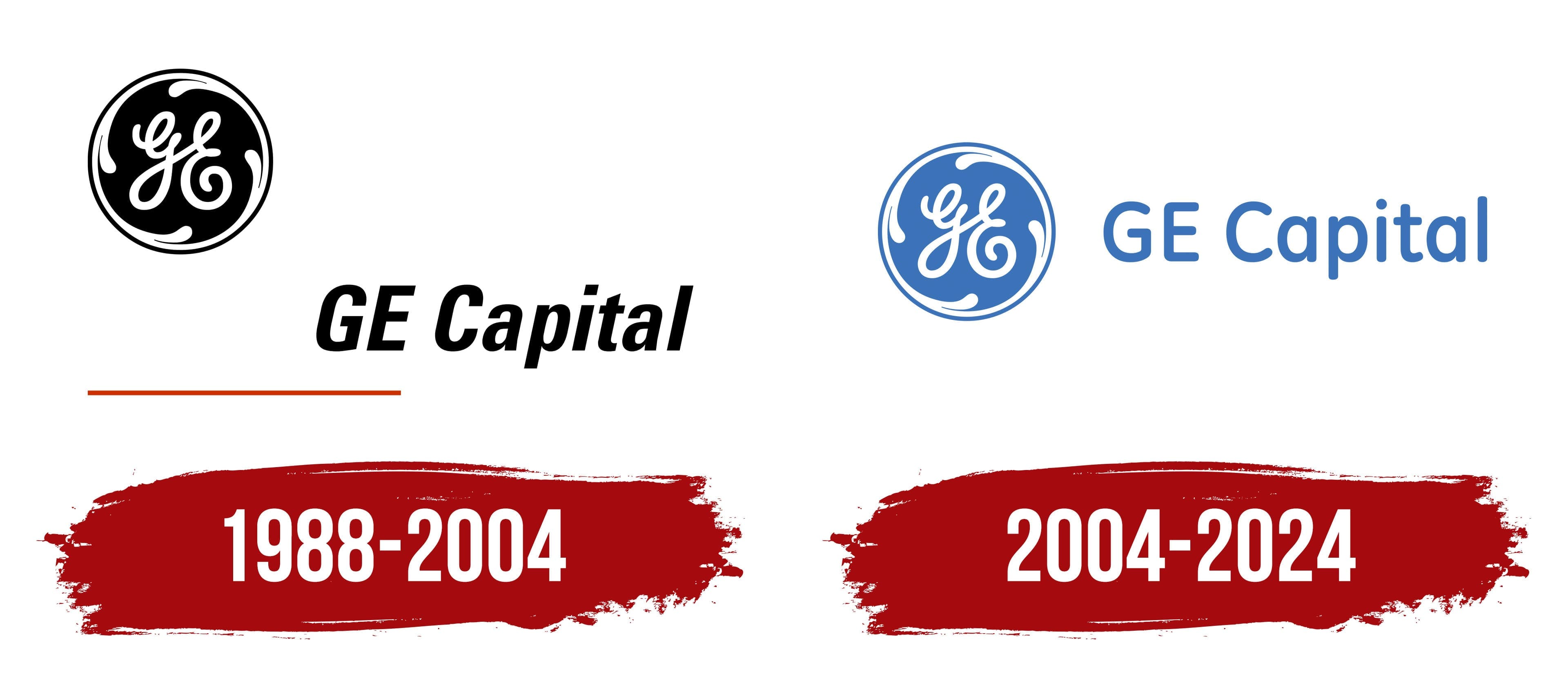
The inherited circular monogram conveyed its connection to General Electric. Calligraphic letters “G” and “E” appeared inside a decorative ring, with four flourishes curling inward from the border. The flowing initials and ornamentation reflected an Art Nouveau aesthetic. Over the decades, the proportions and line thickness changed, while the emblem’s basic structure remained intact.
The monogram’s history began well before the financial division was established. Its first known use dates to 1898, when it appeared on a suspension component of a GE ceiling fan. The company filed a trademark application in 1899 and received approval in 1900. The historic emblem accompanied the name in the GE Capital logo, identifying the business as part of General Electric.
1988 – 2004
Under the GE Capital name, the financial division used a logo that followed General Electric’s corporate design standards. This identity preceded the 2004 redesign and was part of Landor’s corporate identity program. The agency retained the historic monogram while standardizing division names and emblem-use guidelines. The project aimed to represent GE’s diverse businesses, reinforce its reputation for reliability, and convey its connection to technology and innovation.
In the GE Capital logo, a black circle containing the white monogram appeared at the upper left, with the name below and offset to the right. The lettering used Univers 68, a bold, condensed sans-serif typeface with a rightward slant. The corporate guidelines associated the slanted letters with growth and activity. The name’s heavy strokes complemented the compact circular emblem. Their placement followed the design standards shared by GE’s divisions.
A thin red horizontal line called the Laser Line completed the logo. It ran beneath the lettering, starting in line with the emblem’s left edge and ending below “GE,” underlining only the initials. The line used the corporate color Laser Red. The guidelines even specified the endpoint’s shape, requiring a vertical cut to distinguish it from the slanted lettering.
Together, the monogram, name, and Laser Line identified the divisions as members of the same group. To implement the system, Landor prepared a two-volume guide covering naming and visual identity. It included broad principles and precise specifications for the details that made up the GE Capital logo.
2004 – 2024

GE Capital’s 2004 logo redesign aimed to give General Electric a warm, approachable image. Wolff Olins developed the corporation’s updated identity. The project covered brand structure, colors, typography, and the design of materials used by its divisions. The monogram was retained with minor refinements, and the color palette was expanded to convey GE’s intended image. The financial division adopted a blue version of the logo within this shared system.
The letterforms connected the new identity to the company’s history. Wolff Olins created a custom typeface, GE Inspira, for the redesign, with Mike Abbink and Patrick Giasson leading its design. They drew on the calligraphic “G” and “E” in the monogram to develop a contemporary sans-serif family. Simple forms and flowing curves linked the wordmark to the historic emblem. Jim Wasco and Carl Crossgrove expanded the family and developed character sets for other writing systems, while Monotype handled technical production.
The previous staggered arrangement gave way to a compact horizontal layout. The circular emblem moved to the left, with GE Capital on a single line to its right, roughly aligned with the circle’s horizontal centerline. The white monogram stood out against the blue circle, and the name appeared in the same blue. The red line was removed. Upright letters with rounded contours and softly finished strokes replaced the slanted lettering. The name retained the uppercase “GE” and an initial capital “C,” followed by lowercase letters in “Capital.”