


 Belgium National Football Team Logo PNG
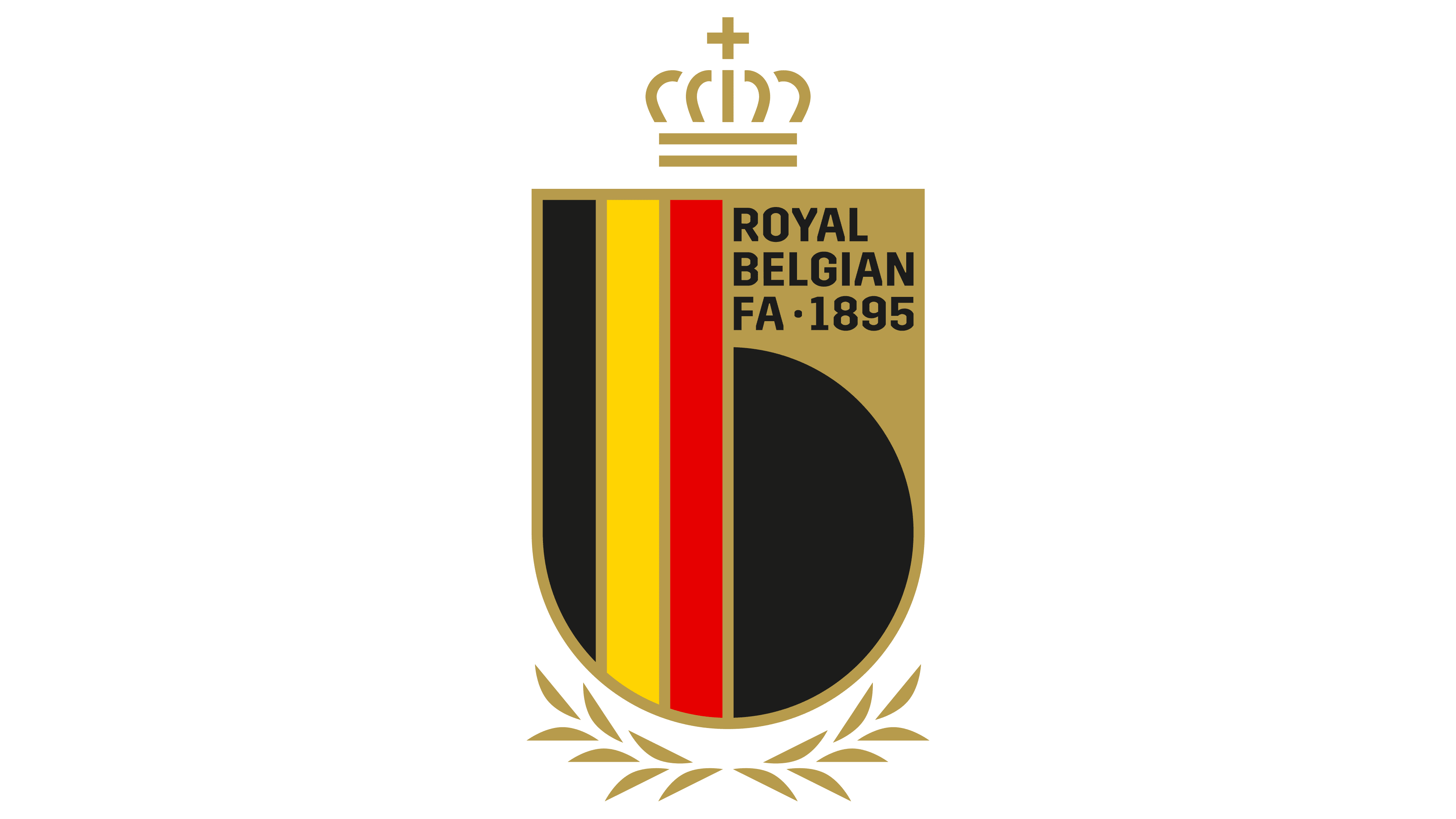
The logo of the Belgium National Football Team is regal and majestic. The emblem, surrounded by victories and crowned with laurels, combines historical and national symbols, reflecting pride, courage, and a drive for success.
Belgium’s national football team was formed in 1904, soon after the creation of the Royal Belgian Football Association. The Red Devils played their first official match in 1905, defeating France 3-1. The early period brought the team its first major medals, with bronze at the 1920 Olympic Games in Antwerp and Olympic gold four years later in Paris.
The 1930s and 1940s were harder, as Belgium struggled to turn early promise into stable international results. A new stage appeared in the 1960s, when players such as Paul Van Himst and Jan Mulder gave the team a stronger profile. In 1972, Belgium finished third at the UEFA European Championship, behind West Germany and the Soviet Union.
The 1970s and 1980s brought mixed campaigns, missed qualifications, and several players who remained closely tied to the national team’s history. Goalkeeper Jean-Marie Pfaff became one of the main figures of the 1986 World Cup side, while Enzo Scifo and Franky Vercauteren shaped the midfield. In the 1990s, Luc Nilis, Marc Degryse, and Philippe Albert formed the next wave.
The main change came in the 2000s, when Eden Hazard, Thorgan Hazard, Romelu Lukaku, Thibaut Courtois, Vincent Kompany, and Marouane Fellaini became the core of a new generation. Belgium reached the 2014 World Cup quarterfinals in Brazil, then finished third at the 2018 World Cup under Roberto Martinez after a semifinal loss to France. In 2022, the team again entered the World Cup knockout stage.
Meaning and History
What is the Belgium National Football Team?
The Belgium National Football Team, known as the Red Devils, represents Belgium in international football competitions. Managed by the Royal Belgian Football Association (KBVB/URBSFA), the team has gained significant prominence in recent years, consistently ranking among the top teams in the world. Known for their attacking prowess and talented squad, Belgium has produced many world-class players who have excelled globally. The team’s dynamic style of play and strategic acumen have earned them respect and admiration in international football. Belgium’s passionate fan base and commitment to excellence make it a formidable sports force.
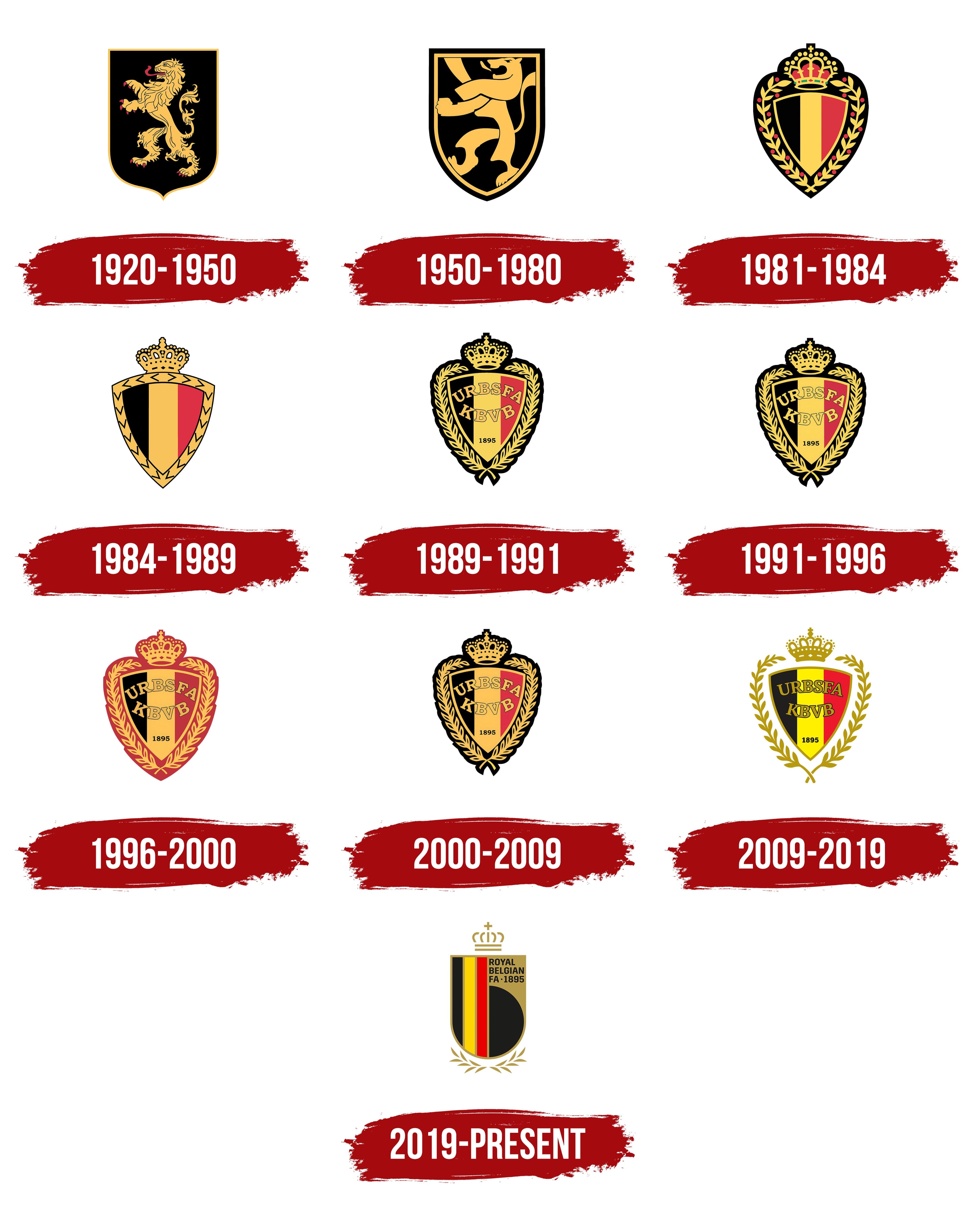
1920 – 1950
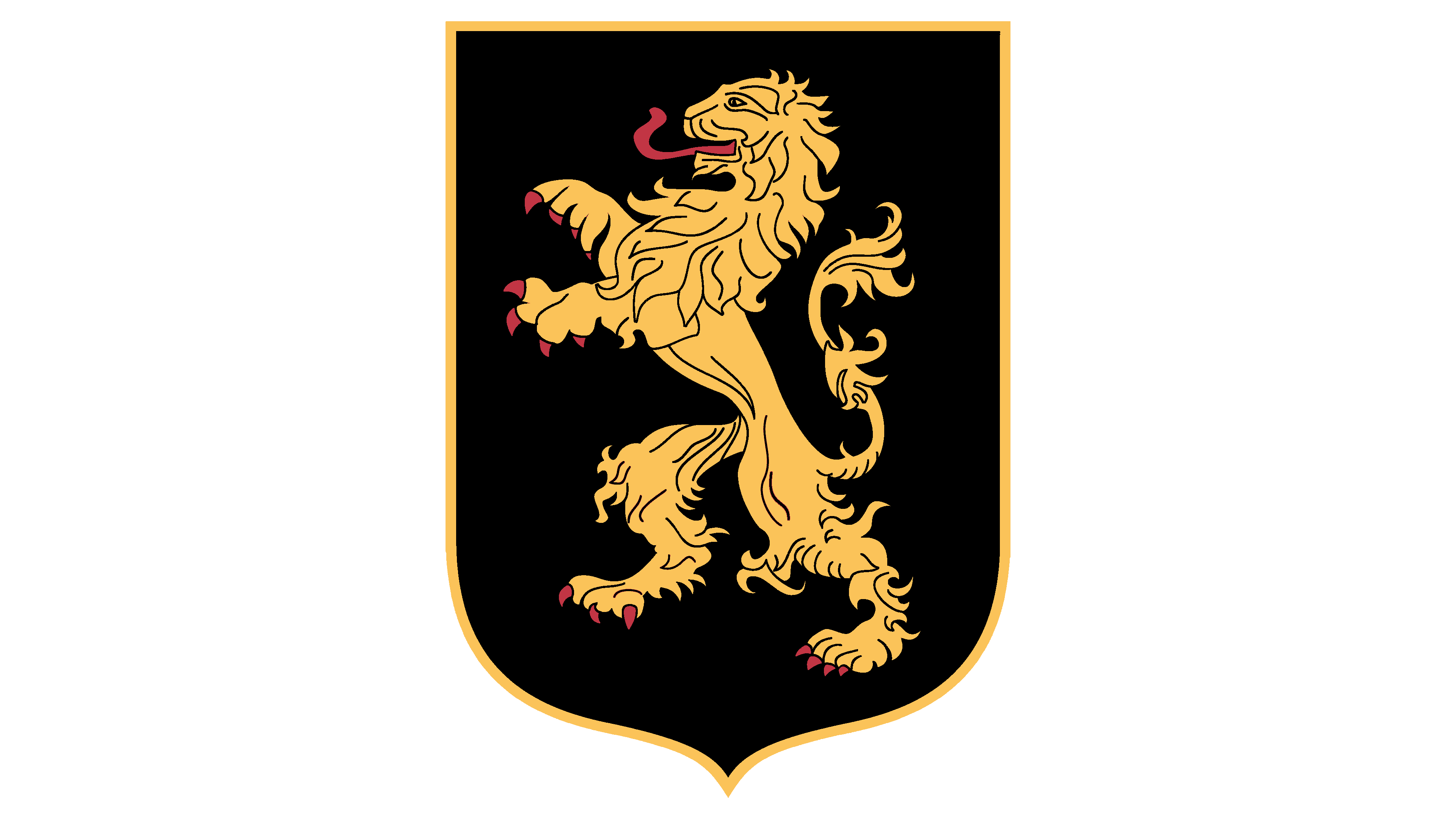
After World War I, the sports club aimed to make its mark internationally. The logo features a heraldic lion from Belgium’s coat of arms. The black background highlights the players’ masculinity and toughness. The king of beasts predicts a leading position for the team in world football. The combination of gold and black looks luxurious, giving the emblem an elegant and regal appearance. The detailed and precise rendering of the elements demonstrates seriousness, responsibility, and the ability to plan clearly and play strategically.
1950 – 1980
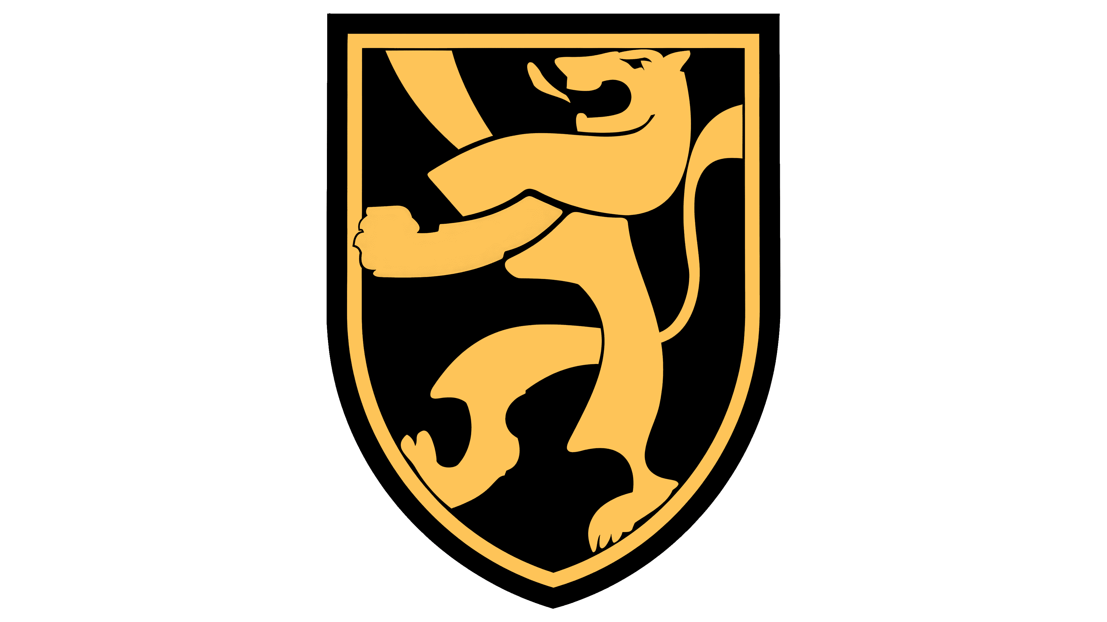
After the war, up to the 1960s, Belgium participated in only one international event, the 1954 World Cup in Switzerland. The preparation for the game included rebranding. The logo was updated, retaining the lion in a more stylized and modern form. The royal symbol reflected the spirit of the times, emphasizing the team’s renewal and modernization. The transformation conveyed a desire for a new beginning and progress, aligning with societal and sporting changes. The new lion seemed confined within the shield, illustrating readiness for international cooperation and embracing a renewed world.
1981 – 1984
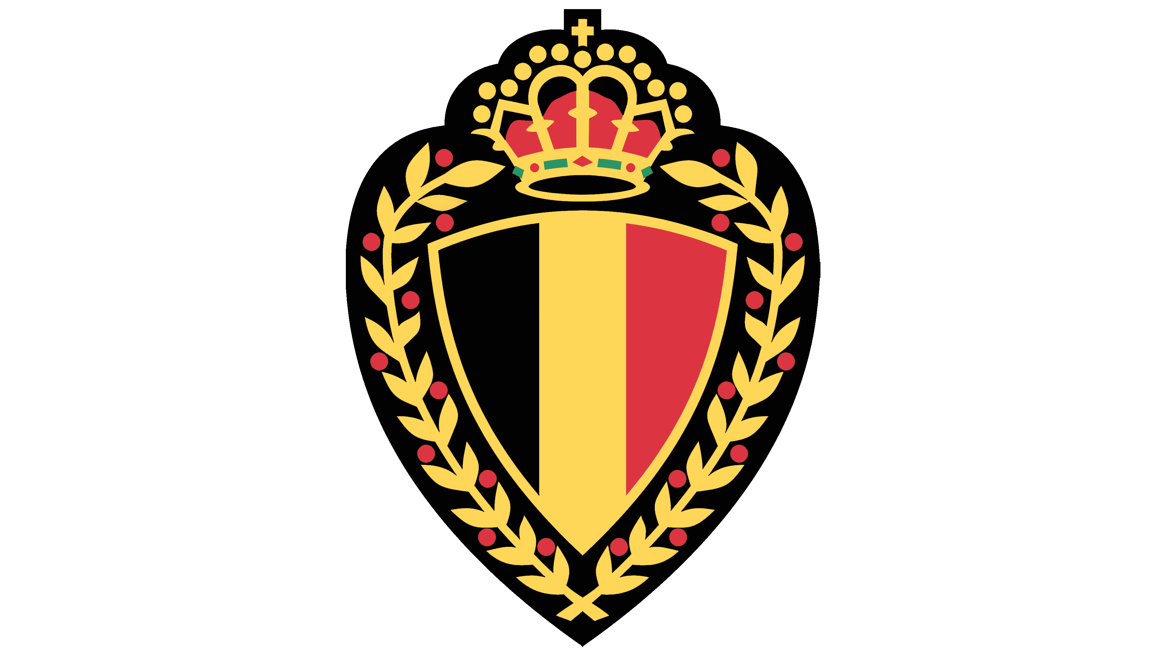
In 1981, the logo adopted a more official and ceremonial appearance, emphasizing the team’s status after securing second place at the 1980 European Championship. A heart shape with a triangular shield inside highlighted national pride and love for the country’s team. The Belgian flag within conveyed the team’s patriotic feelings. Laurel branches around the edge symbolize triumph and victory. The royal crown, representing the support of the ruling monarchs, made the emblem majestic and noble.
1984 – 1989
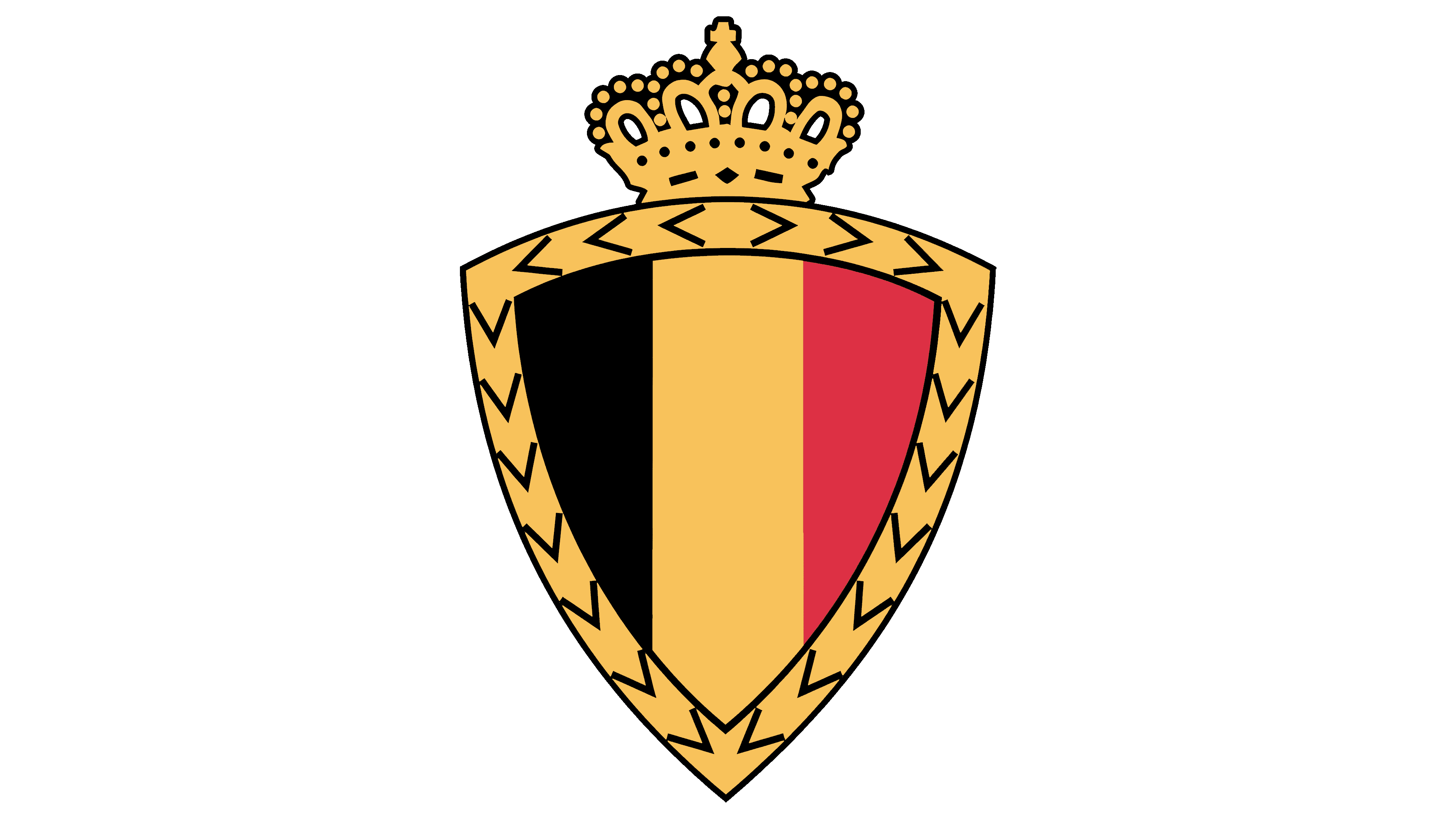
The 1984 symbol became more athletic and streamlined. The main elements remained: a shield with the Belgian flag, a laurel wreath, and a crown, but the lines gained clarity with smooth, streamlined features. The laurel leaves transformed into a broad gold border, resembling a golden chain, hinting at the athletes’ awards and achievements. The team achieved strong results in championships for several years and felt confident facing experienced, worthy opponents. The black heart shape disappeared, making the emblem more dynamic and free. The logo showcased the readiness for a determined fight for first place.
1989 – 1991
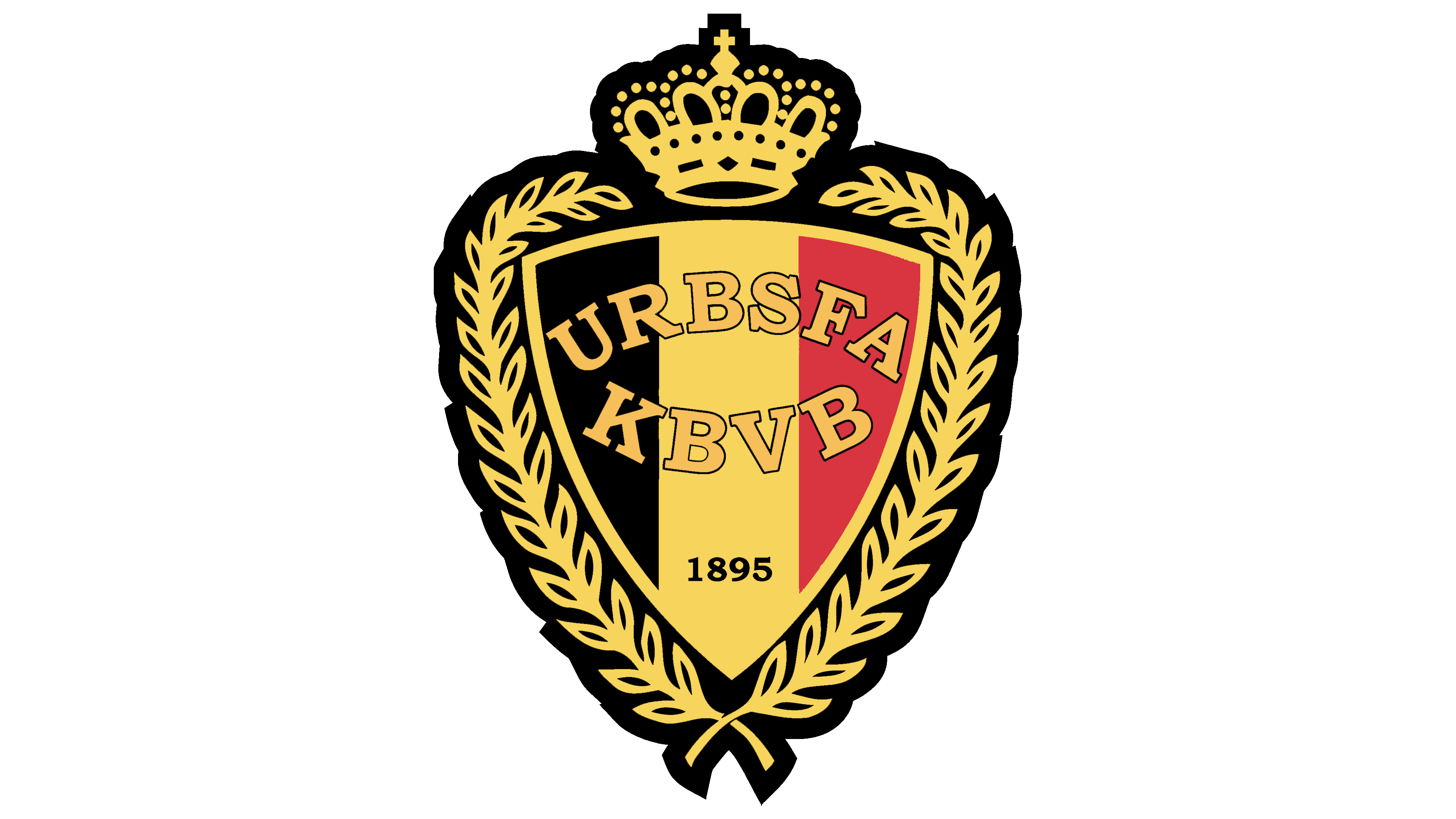
The main update to the logo included a dense laurel wreath around the image and the return of a black border, mirroring the country’s coat of arms. The rich gold and detailed rendering of the crown made the emblem look festive and ceremonial.
For the first time, inscriptions appeared in the center. Two abbreviations in French and Dutch, the official languages of Belgium, represented the Royal Belgian Football Association. URBSFA stands for Union Royale Belge des Sociétés de Football Association, and KBVB stands for Koninklijke Belgische Voetbalbond. The organization oversaw the national team and was responsible for its formation.
1991 – 1996
In 1991, the color of the abbreviation was slightly modified to a lighter, brighter shade. This change aimed to create an effect of radiance and sparkle. The letters were designed to blend more harmoniously with other golden elements, making them stand out clearly against the flag’s backdrop. This adjustment enhanced the emblem’s overall visual appeal and coherence, ensuring the abbreviation was prominent and easily recognizable.
1996 – 2000
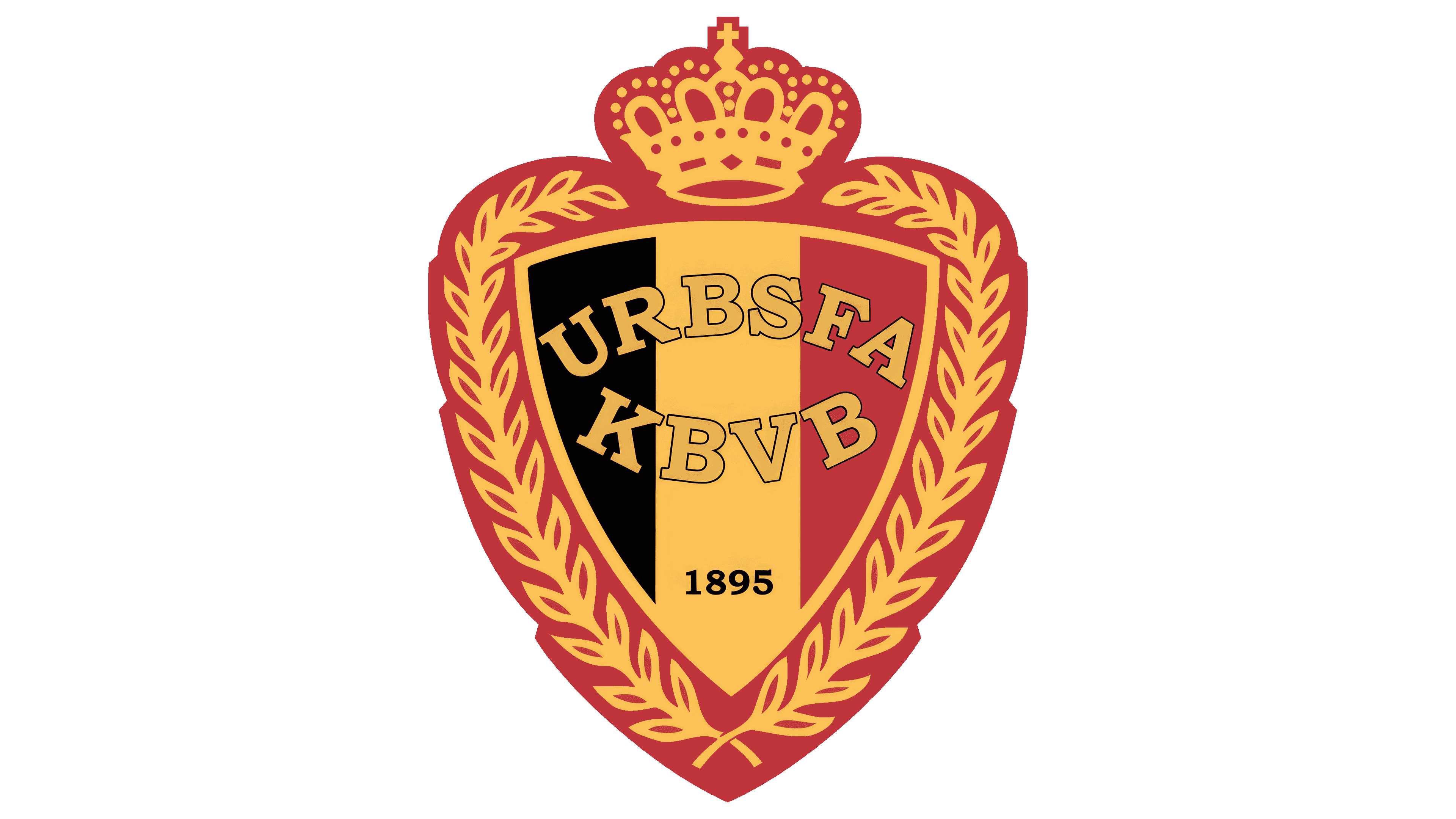
Replacing the primary background with red was a tribute to the national team’s achievements and victories. This change highlighted the golden era of Belgian football. Adjustments to the base color influenced the entire logo palette. The crimson gold on the noble scarlet background appeared luxurious and celebratory, enhancing the overall aesthetic and creating a sense of grandeur.
2000 – 2009
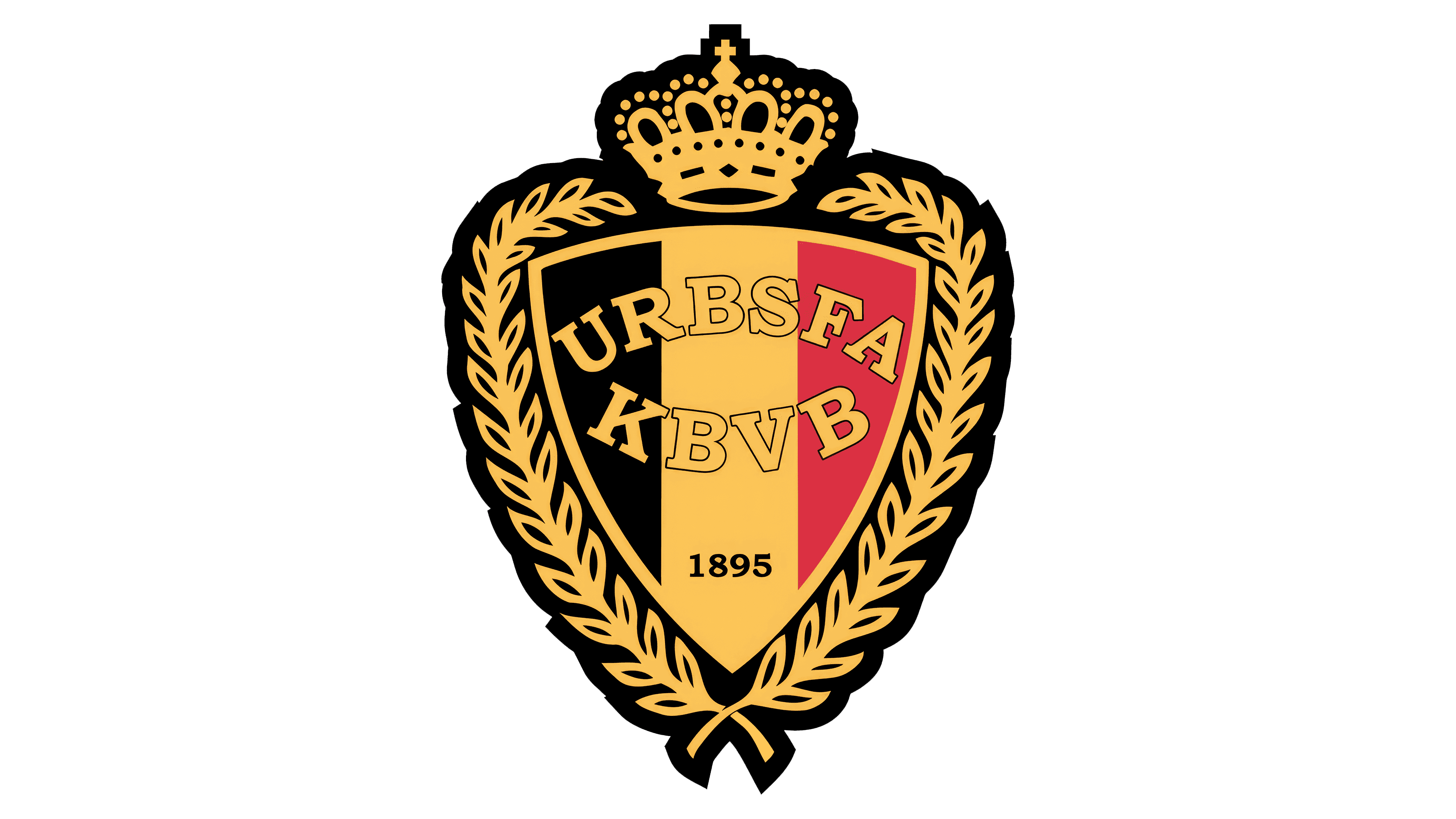
The team returned to a previous design, maintaining a darker shade for the golden elements. Many of Belgium’s football stars had left the team, and the emblem served as a reminder of the national team’s glory days. This change in the emblem preserved the legacy and celebrated the memorable moments of Belgian football history, ensuring that past stars’ accomplishments remained recognized.
2009 – 2019
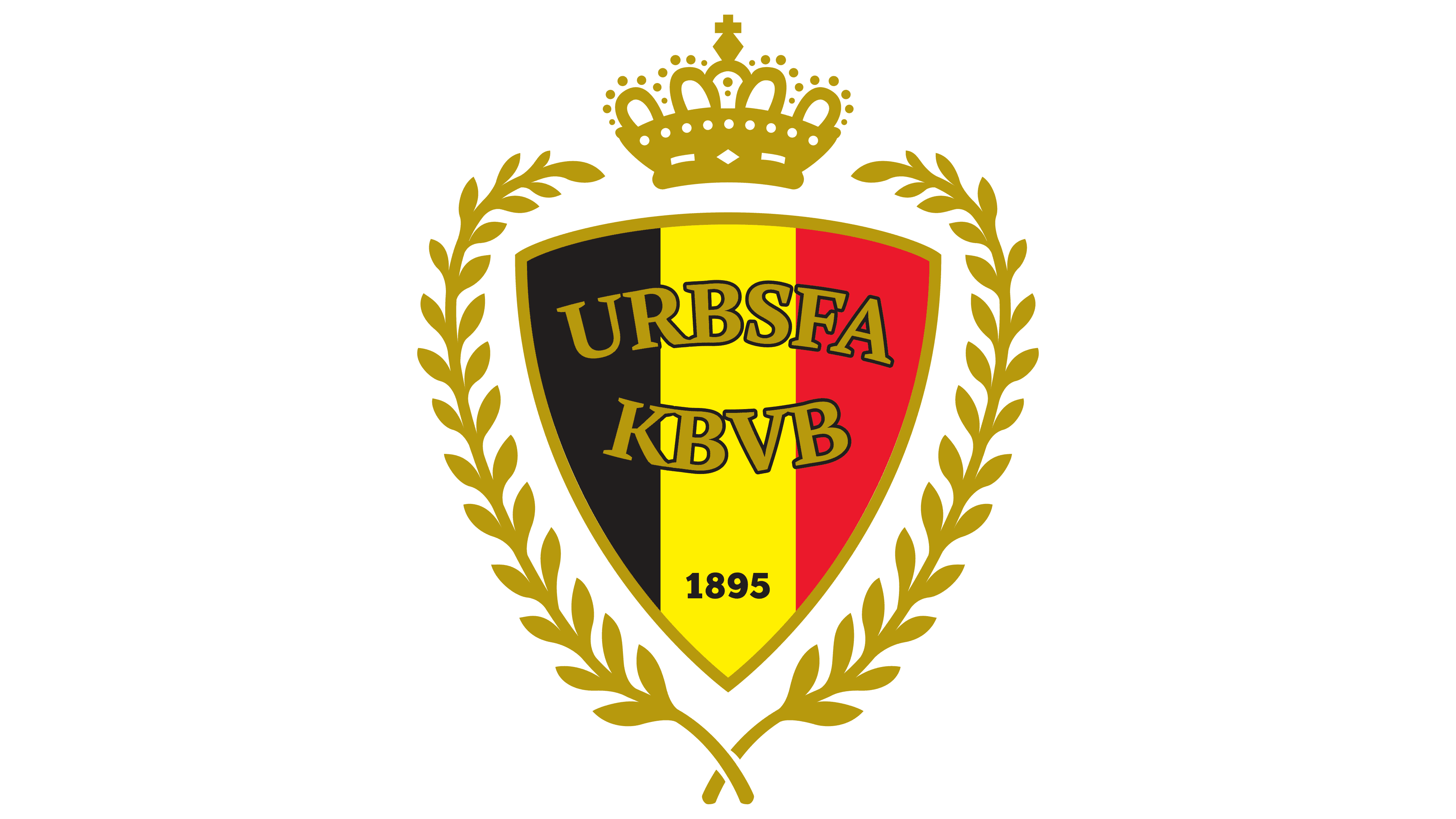
Dark gold serves as the primary color of the logo. Removing the background brought the laurel branches and the central inscription to the forefront. The logo conveys a greater sense of lightness and freedom. The inner triangle appears smaller, symbolizing the younger generation that has joined the team. These young players are expected to prove themselves and aspire to reach the heights and achievements of the previous roster.
2019 – today
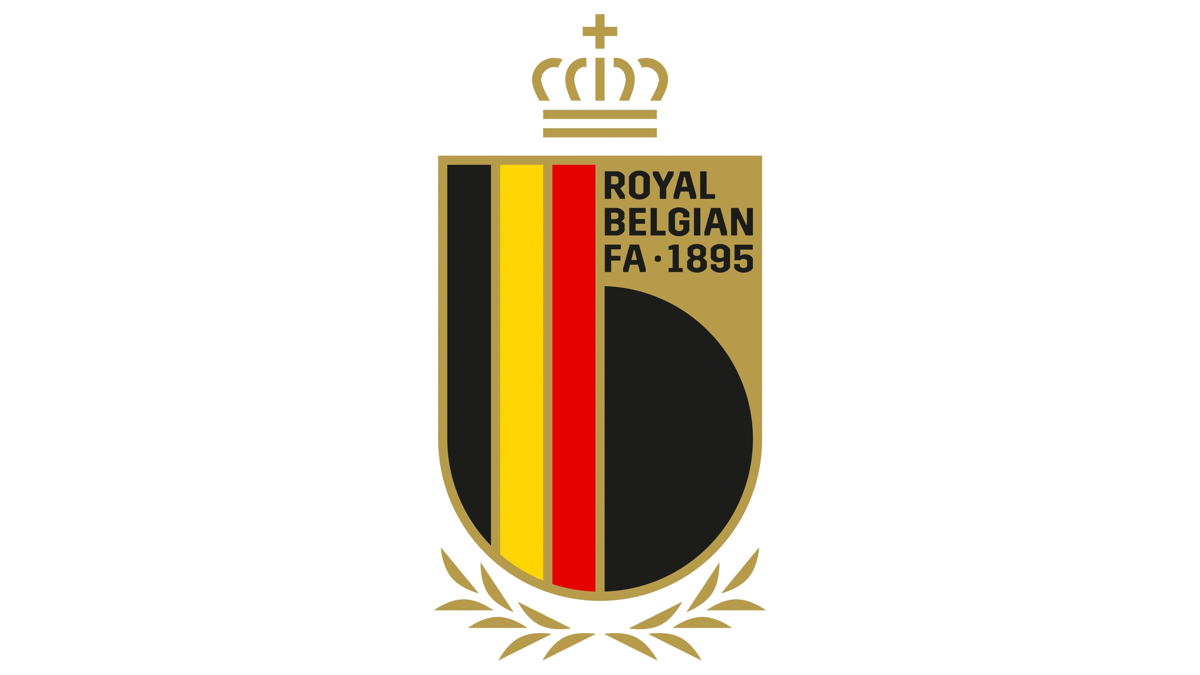
The modern logo’s central element is a shield, symbolizing protection. This element is associated with bravery and honor, highlighting the courage and resilience of Belgian footballers.
Inside the shield is a lowercase “b.” The symbol’s vertical glyph consists of three stripes from the Belgian flag. Black represents determination and strength. Yellow signifies prosperity and wealth. Red embodies courage and bravery.
Previous logo elements have been retained but slightly modernized. The crown above the shield now has lighter and more schematic lines. As a symbol of the monarchy, it underscores respect for the country’s traditions and history. The laurel wreath now surrounds only the lower part of the shield, symbolizing victory, triumph, and the team’s successes on the international stage.
The logo’s minimalist elements combine tradition and modernity. They emphasize a commitment to innovation and the team’s development while using the experience and knowledge of the past.