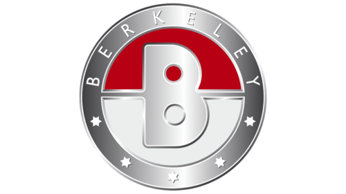
The Berkeley logo represents success, greatness, the desire to become famous, and progress. The emblem is full of balance and grace; it shows the ability of the company to realize its plans, turning the idea into a real embodiment.
Berkeley: Brand overview
Berkeley is a brand of three- and four-wheeled sports cars that are small in size. It existed for four years, from 1956 to 1960, and was revived by Berkeley Sportscars Ltd in 2020. The Berkeley logo adorned many models: SA322, SE328, SE492, Foursome, B65, B95, B105, T60, and Bandit.
For four years, the company left a memorable mark in the history of the English car industry, producing more than 4,000 cars of 9 models. Some are very limited editions, making them a unique rarity. For example, T60 /4 and Foursome (20 each) or Bandit and B95 (2 each)
Meaning and History
The emblem conveys the rise up, completeness, and harmony, the ability of the brand’s cars to develop good speed.
What is Berkeley?
A brand of minicars from the 1956-1960s, designed by designer Lawrence Bond and implemented by Berkeley Coachworks. Production was in the English Biggleswade. In 2020, the revival of the brand was announced. Prototypes of the updated SE328 and Berkeley Bandit GT are in the works.
1956 – 1960
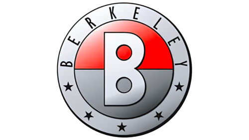
Berkeley, active from 1956 to 1960, chose an image of a wheel for its logo, symbolizing motion, with a steering wheel at the center representing mastery over one’s destiny. This design reflected the brand’s core principles of dynamism and control over the machinery, which are crucial for a company that produces small yet maneuverable cars.
The central part of the emblem was split into two halves, red and gray, each carrying additional symbolic meaning. The lower gray half was associated with asphalt and roads, highlighting Berkeley cars’ grounded and practical nature. The upper red part symbolizes speed and the uniqueness of the vehicles, emphasizing their sporty character and high performance. The lower half was painted white in some variations, paying homage to the brand’s English roots and traditions.
The large letter “B,” the initial of the company’s name, occupied a central place in the design. This choice was linked to the English town of Berkeley. However, the company’s production facilities were located in another part of England, adding a layer of intrigue to the name choice.
The full brand name, with five stars, was displayed around the edge of the logo, each symbolizing Berkeley cars’ premium quality and racing victories. These design elements emphasized the brand’s ambitious aspirations and motorsport successes, affirming the company’s high status and reputation in the market.
2020 – today
The logo is an iron frame with a circle and a large letter in the center, hanging on two iron handrails extending from the base. The name is inscribed in thin white type in a metal frame at the top and five stars at the bottom. In the center of the emblem, the background is white below the letter B and red above.
Berkeley Coachworks was the founding company of Berkeley Cars and carried that name across all brands and subsidiaries. The name is taken from the English city of Berkeley, located in the county of Gloucestershire, and comes from the Old English birch lea (birch leaf).
The letter B seems to float, moving from a new idea to implementation. This shows that the company’s success lies in combining new ideas with the characteristics of fast and comfortable machines.
Analogous to hotels, five stars represent the best offer: a top-class car. The company constantly innovated and developed new prototypes: fiberglass, triple carburetor, and folding doors. The modern owner went further along the path of innovation and replaced the fiberglass composite chassis with an environmentally friendly one made from a mixture of flax and wood resins. Engines, in addition to gasoline, added modern electric and hydrogen ones.
The white and red background comes from the flag of England – the cross of St. George and conveys the patriotic spirit of the manufacturers, as their cars represented the England teams in the races.
Font and Colors
The main colors of the logo are red, white, and metallic.
- Red – speed, beauty, development, passion for design.
- White – inventions, novelty, creation from scratch.
- Metallic – strength, strength, brilliance.
The inscription’s font is simple Calibri. Refined capital letters show a small but important contribution to history.


