The visual identity of the brand is thought out to the smallest detail. It fully reflects the scope and values of the company. In the center of the Bic logo, there is the company’s name in the form of large expressive letters, and on the left side, there is a thematic symbol – a little man holding a large pen in his hands. The original design distinguishes Bic from other similar manufacturers. In addition, bright colors convey a friendly and positive attitude.
Bic: Brand overview
| Founded: | 25 October 1945 |
| Founder: | Marcel Bich, Édouard Buffard |
| Headquarters: | Clichy, France |
| Website: | bic.com |
Meaning and History
Bic can be described as a strong and self-confident company that has had to win a place of honor in the market more than once. It developed under highly competitive conditions in producing pens and then the production of lighters. Despite this, the brand could maintain its position and significantly increase sales. Its main competitors at that moment were the well-known companies Gillette and Swedish Match.
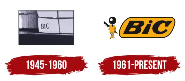
The ability to keep up with and even, to some extent, outsell these firms confirms Bic’s special focus. This can also be seen in the company logos. Initially, it worked under a simple inscription, and today it has an emblem recognizable all over the world. It is distinguished by detail, clarity of lines, author’s font, and an excellent combination of colors. The overall concept is complemented by a stylized graphic element in the form of a man.
What is Bic?
BIC is a company operating in the lower market segment. It specializes in producing disposable products, including mechanical pencils, lighters, razors, and pens. Among the main achievements is the creation of the famous Cristal pen.
1945 – 1960
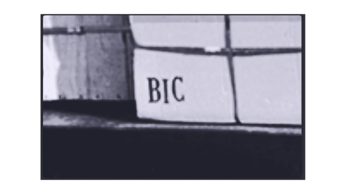
The history of the famous French brand began in 1945. In October of that year, Edouard Buffard and Marcel Bic set up a small business whose main focus was manufacturing parts for mechanical pencils and fountain pens. Ballpoint pens also began to be produced, but they were unreliable. The first logo of the company was a simple icon with nothing remarkable.
It consisted of 3 letters, which were the name of the company. They were made in a classic thin serif typeface. The minimalistic design was a harmonious addition to the Bic identity because the brand did not produce luxury products. He produced inexpensive parts distinguished by a long service life and an affordable price. For the inscription, a strict black color was chosen, which symbolized rigor and, at the same time, a refined style.
1961 – today
In 1961, a rather difficult period began, which gave impetus to rapid development. During this period, the modern Bic sign was created. It became the embodiment of one of the company’s main achievements – the release of its models of ballpoint pens. The goods had many advantages over their predecessors and were sold at a low price.
The image of a ballpoint pen has become part of the new emblem. Graphic designer Raymond Savignac developed it. He created an original picture of a stylized man with a black ball instead of a head. He had a pen on his back. This symbol is located near the name of the company itself. The inscription was framed in a non-standard author’s font.
The harmonious image became one of the advertising campaign elements, which was used after creating a new ballpoint pen. The main difference between the product was a ball made of special material. This element became the basis for creating the head of a man. It symbolized the success of the company and was also aimed at attracting the attention of schoolchildren.
Font and Colors
The BIC corporate logo is quite multifaceted. It includes a diamond-shaped figure that is colored entirely orange. In the Pantone palette, it corresponds to 1235C. There is a thin black line along the edges of the figure, which adds clarity and expressiveness. Inside the diamond-shaped element is an inscription of three letters BIC.
A distinctive feature is that none of the known fonts is used. The letters were hand-drawn by the designer. This makes it unique, just like the company. The font color is black. It symbolizes the status and elitism of the brand. The emblem is complemented by a stylized man, made in black and yellow.
Bic color codes
| School Bus Yellow | Hex color: | #f7ad12 |
|---|---|---|
| RGB: | 247 173 18 | |
| CMYK: | 0 30 93 3 | |
| Pantone: | PMS 137 C |
| Eerie Black | Hex color: | #1b1918 |
|---|---|---|
| RGB: | 27 25 24 | |
| CMYK: | 0 7 11 89 | |
| Pantone: | PMS Neutral Black C |
