


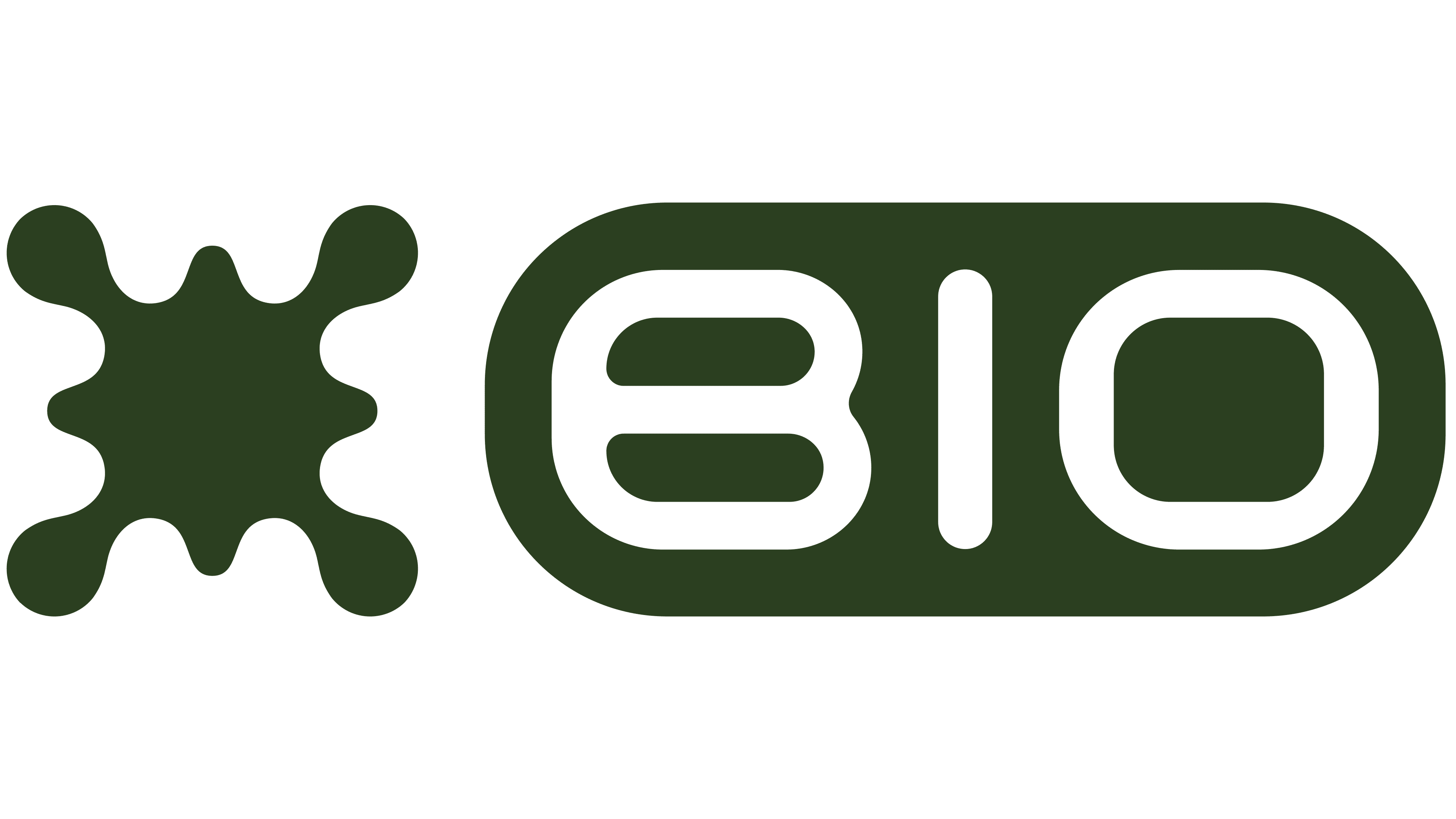
Biotechnology platform Bio now places its name inside a capsule-shaped frame. Uppercase “BIO” replaces the former “bio.xyz” wordmark, while the symmetrical symbol with rounded protrusions remains on the left. Cape Town-based Si Maclennan Studio developed the update as part of its collaboration with the platform, which began in 2022.
Bio, also known as Bio Protocol, brings together scientists, patient communities, and crypto industry participants. The platform helps fund early-stage research, build scientific networks, and develop promising biotechnologies. Communities help support research and share in the financial returns from its commercial success. Si Maclennan led the brand’s development, shaping a unified identity for a growing network of products and scientific initiatives connecting biology with blockchain.
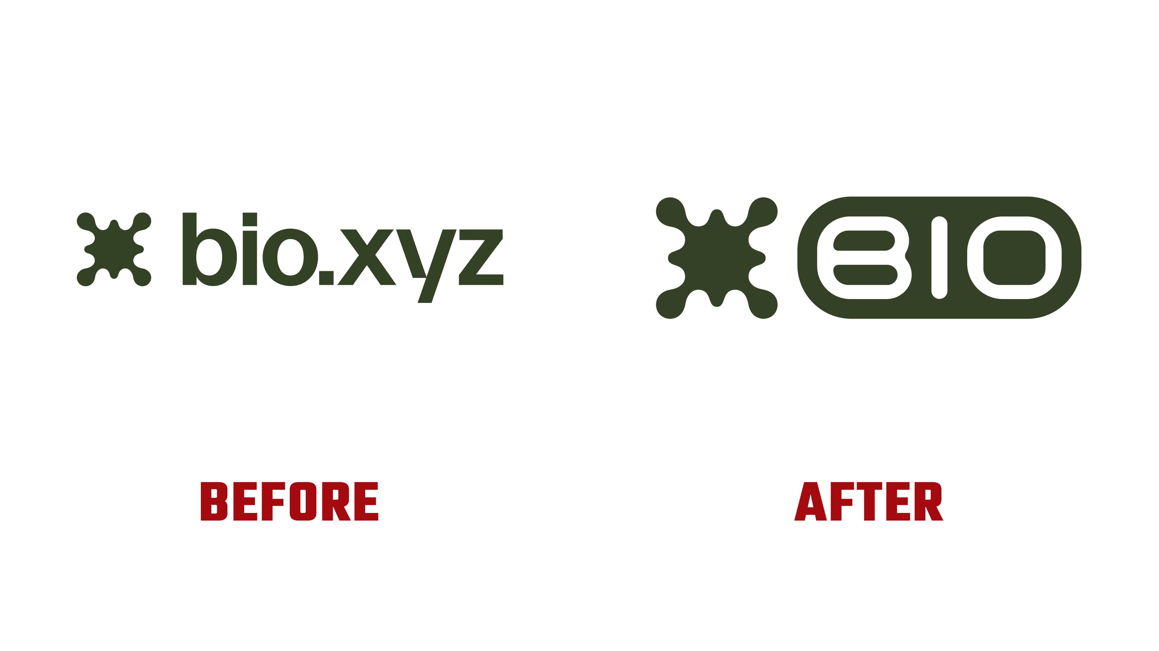
The studio expressed the relationship between these two fields through fluid forms and symmetry. The symbol draws inspiration from Rorschach inkblots and ferrofluids, which change shape in response to a magnetic field. The designers intended its resemblance to spreading liquid to reflect the complexity of living systems. At the same time, its orderly outline represents Bio’s role in organizing research and coordinating scientific work.
The symbol resembles a splash, with four large, rounded protrusions at the corners and several smaller ones between them. Concave sections connect them into a single shape. For the update, the studio retained the symbol’s outline and focused on the lettering.
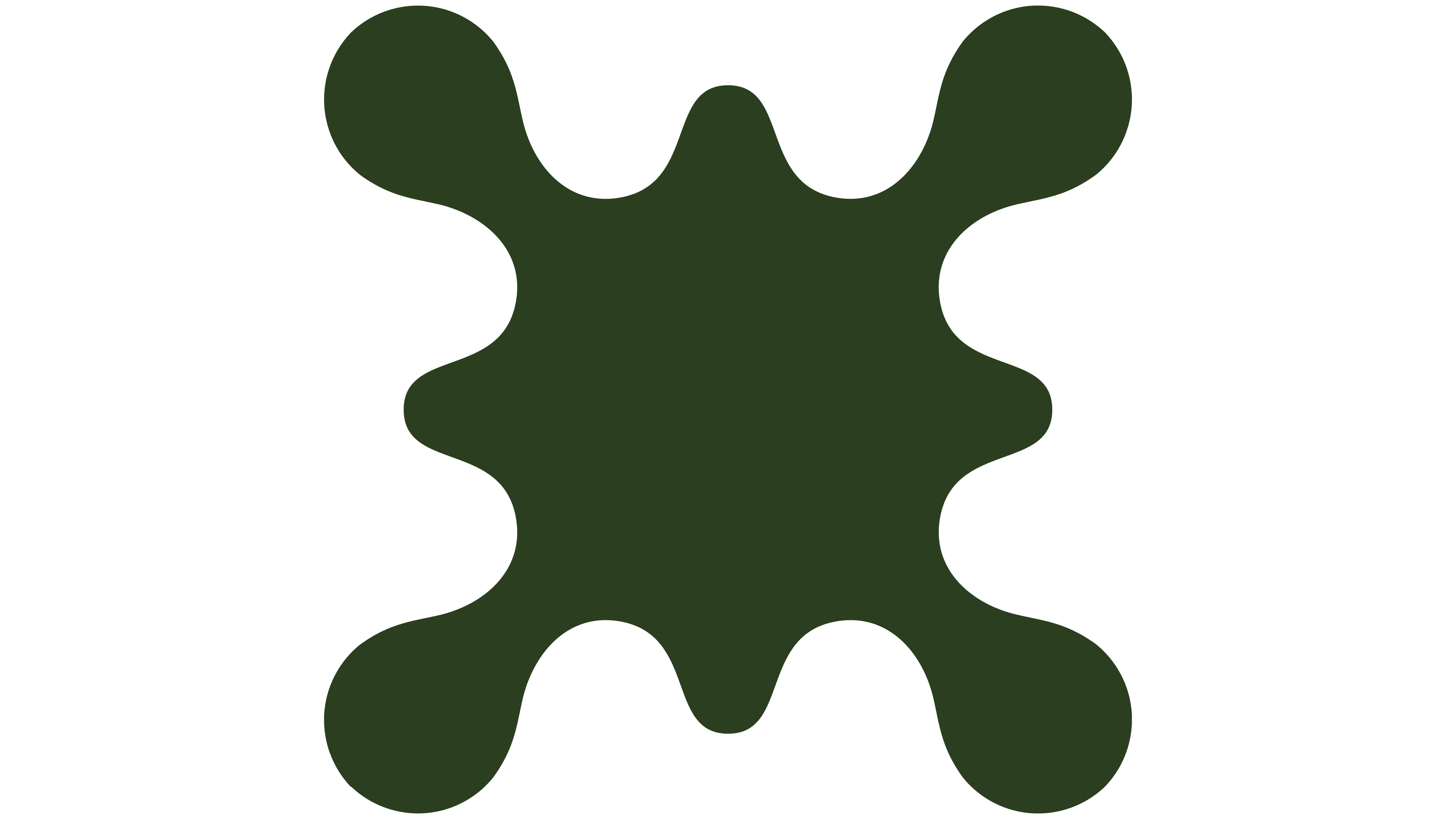
The previous logo paired the symbol with “bio.xyz” in bold lowercase sans-serif lettering. The “i” had a square dot, and the “.xyz” ending incorporated the website address into the name. Both the symbol and wordmark were dark olive green against a white background. The new version encloses three uppercase letters in an elongated shape with rounded ends. The symbol remains on the left, roughly matching the capsule’s height. The shorter name reduces the logo’s overall width.
Custom lettering was developed for “BIO” to complement the capsule shape. The left side of the “B” is rounded, and its two horizontal counters resemble the numeral “8.” The “I” consists of a vertical stroke with rounded ends. The “O” is almost rectangular, with rounded corners. The letters’ smooth contours echo the symbol’s curves.

The green tones remain, but the light-dark balance has changed. Against an olive background, the symbol and capsule appear in a pale yellow-green. The letters match the background color, making them look like cutouts within the capsule.
The studio uses different versions of the symbol to distinguish Bio’s various initiatives. Its outline remains consistent, while its surface takes on volume, relief, and textures reminiscent of biological structures. References to early computing appear alongside natural textures and scientific imagery. Brand materials tell the stories of researchers, their experiments, and their work on future biotechnologies.