Chalmers University of Technology updated its mark as part of a shift to a shared style across the group. Starting April 20, 2026, the university, foundation, and subsidiaries began using the One Chalmers system. The main focus is on the name and on connecting all areas of work to one unified brand.
The logo centers on the large CHALMERS wordmark. The main detail is the letter “A,” which leans forward. This treatment reflects the motto Avancez and presents the university as a place to advance science, education, research, innovation, and international projects. The University of Technology line helps define the institution’s status and field of work more precisely.
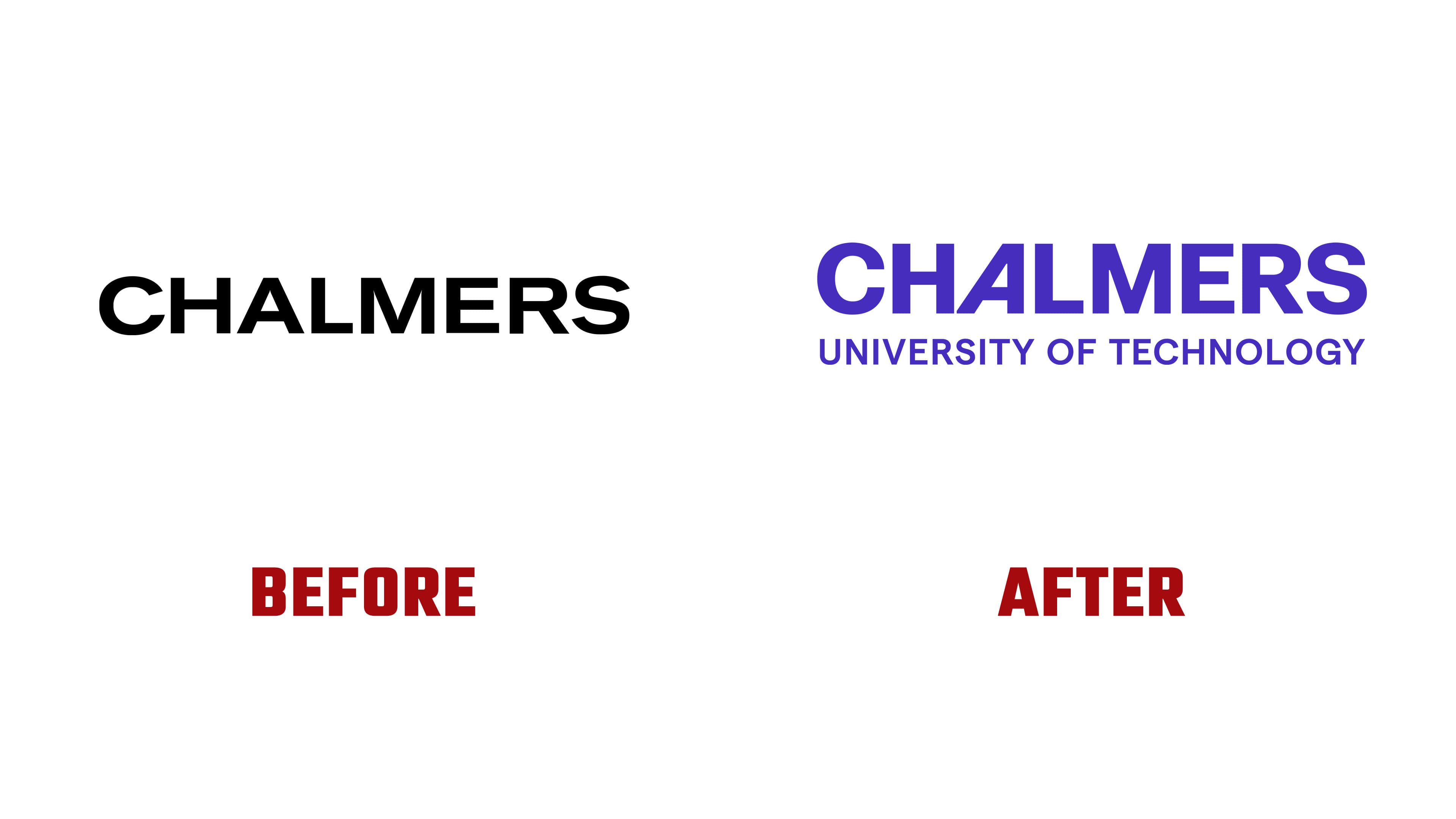
The previous mark looked stricter and drier. The black CHALMERS wordmark in a heavy sans serif gave it an almost industrial feel. The new logo kept the dense engineering foundation while moving closer to an academic and technological environment. The purple color softened the earlier rigidity and gave the image a more current digital tone.
The update applies to the entire structure, including Chalmers Foundation, Chalmers University of Technology, Chalmers Ventures, Chalmers Fastigheter, and Chalmers Next Labs. The team prepared combined logo versions for the subsidiaries, with each organization’s name placed next to the shared mark. The unified system helps audiences, partners, and external platforms see the connections among the university, foundations, companies, and initiatives.
The move to the new identity sparked debate. Part of the audience reacted strongly to the departure from the previous coat of arms, fearing a loss of the link to the university’s history. The university explained that the change involved an updated logo and a shared system for the group, while preserving its heritage. The new mark helps the brand speak with one voice across all channels while maintaining its connection to the Chalmers name.