


 Bofa Logo PNG
The BofA logo emphasizes the national identity of one of the largest banks in the United States. At the same time, the emblem conveys the main qualities of the credit and financial organization: durability, reliability, a modern approach, steady growth, and confidence.
Bank of America traces its history to 1904, when Amadeo Giannini founded the Bank of Italy in San Francisco to serve workers and immigrants often excluded from established banks. Operating from a converted saloon, he visited businesses and docks to reach customers. After the 1906 earthquake, he moved the bank’s funds out of the city and issued loans based on personal trust to support rebuilding.
During the 1920s, the bank expanded across California through acquisitions and became the state’s largest by 1927. After a 1930 merger with a Los Angeles institution, it adopted the name Bank of America National Trust and Savings Association. In the 1930s, it financed projects including the Golden Gate Bridge and introduced new banking services.
In 1958, the bank launched BankAmericard, the forerunner of Visa. International expansion followed in the 1960s and 1970s through overseas branches. Property losses and troubled Latin American loans created pressure in the 1980s, while the 1998 merger with NationsBank formed the modern corporation.
Further expansion came through FleetBoston Financial in 2004 and MBNA in 2006. During the 2008 financial crisis, Bank of America acquired Countrywide Financial and Merrill Lynch, reshaping its mortgage and investment banking operations. From 2010 to 2015, management focused on capital, governance, and risk controls. Between 2016 and 2023, the company expanded mobile and online banking and introduced digital services and banking products.
Meaning and History
What is BofA?
This financial organization provides services to individuals, small businesses, and large corporations. The bank offers various products, including financial management, investments, lending, and account services. With an extensive network of branches and ATMs and a convenient digital platform, clients can address their financial needs online and in person. The bank actively operates in international markets, supporting businesses and individual clients in their financial decisions.
1930 – 1969

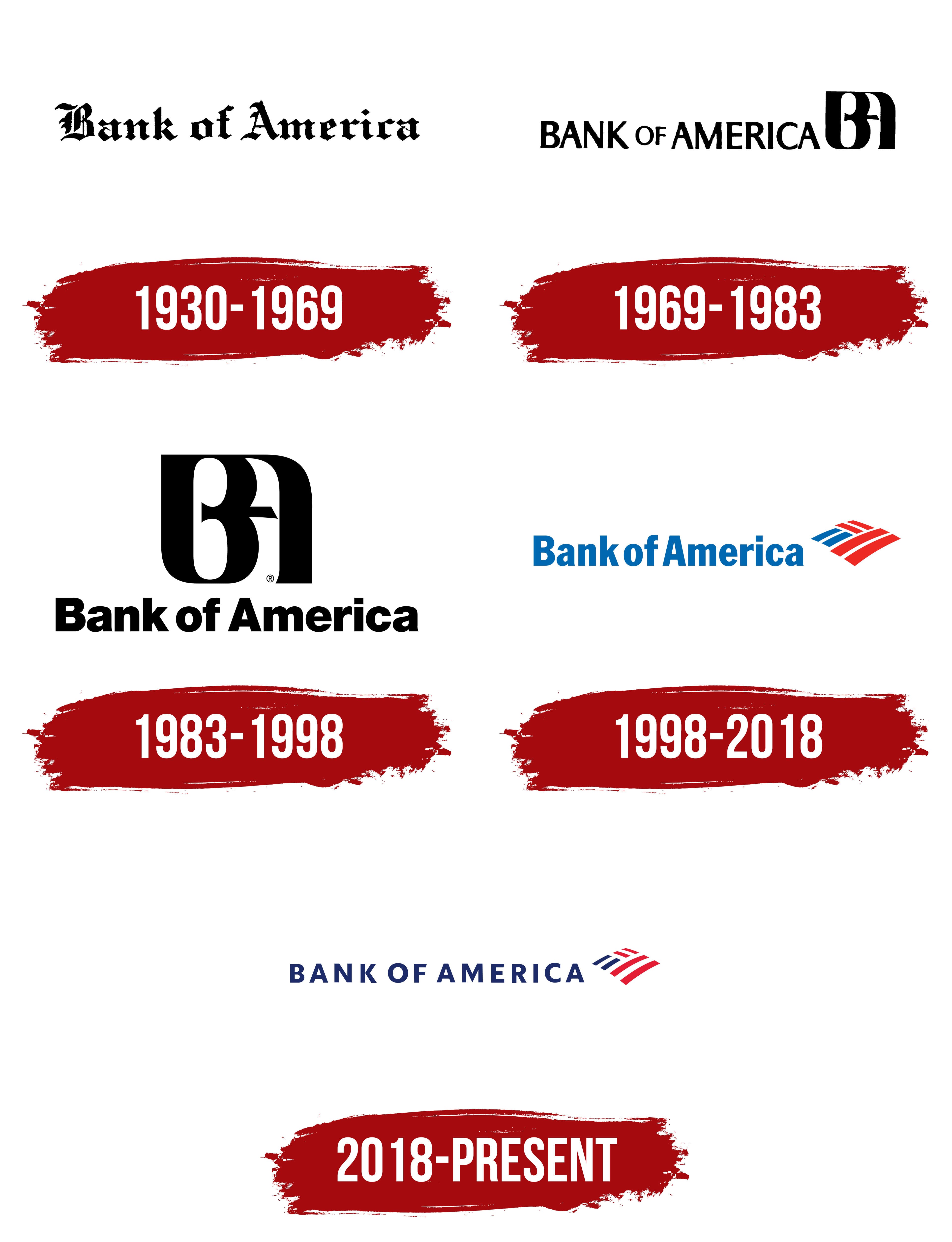
This logo belonged to the predecessor of the modern BofA, a now-defunct company founded in 1904 as the Bank of Italy and renamed in 1930 to Bank of America. The new name formed the basis of the wordmark, which was used for the next 39 years.
The inscription appears impressive due to the Gothic font, Fraktur. In the early 20th century, this style was associated with reliability and stability, which was crucial for a financial institution during the Great Depression. The medieval-style emblem evoked a sense of conservatism, appealing to depositors seeking a dependable bank.
The Gothic font used in the logo is similar to Archive Black Title by Archive Type. It features the same ornate lines, sharp angles, elegant curves, and extravagant decorative elements. The traditional black color symbolizes the seriousness and authority of the organization. This was a typical choice for the era, as color printing was not widely accessible then.
The Seal 1930 – 1969
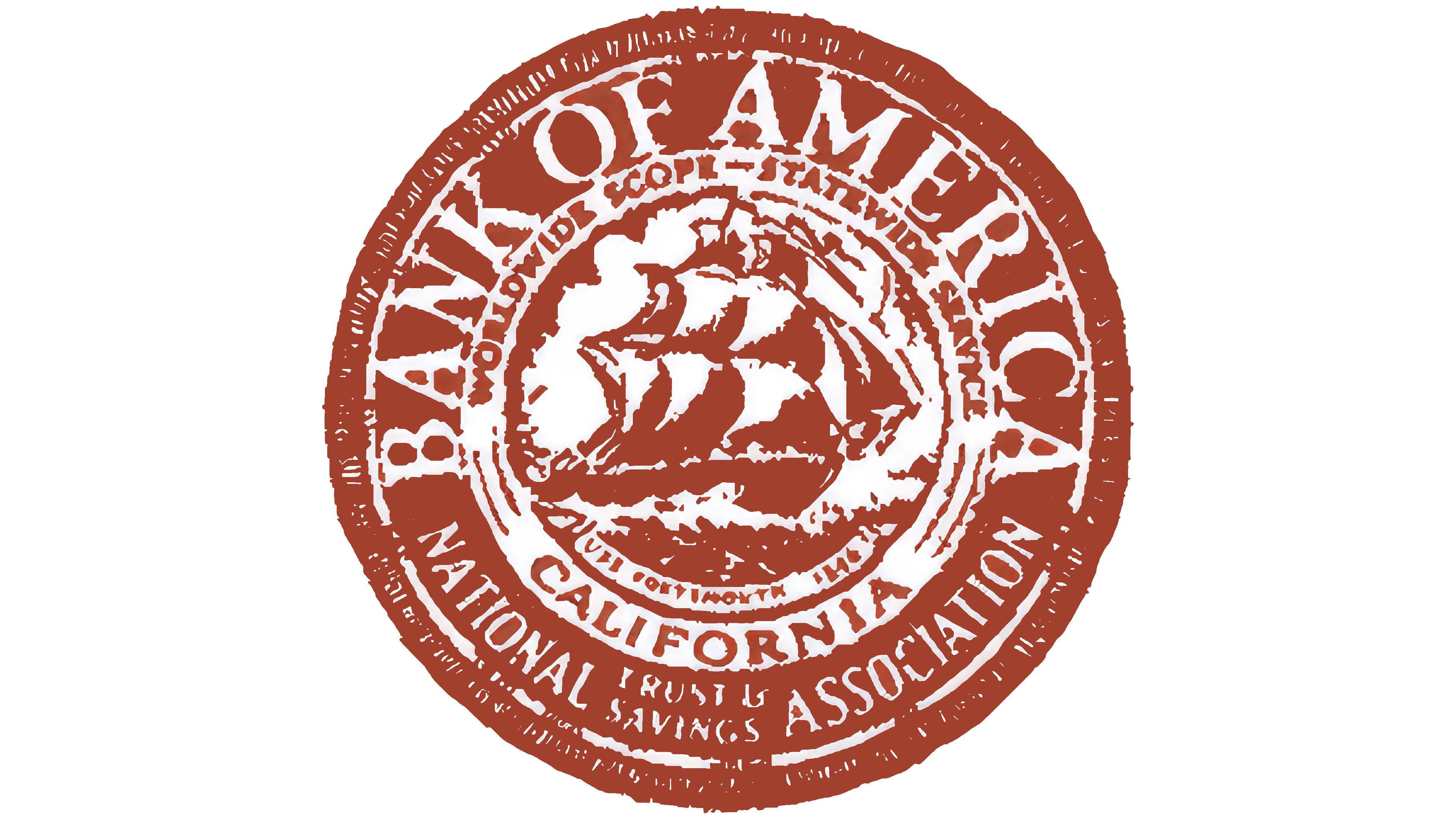
The old round BofA emblem is designed in the classic style of early 20th-century banking seals. At its center is a sailing ship swiftly gliding over waves, driven by a favorable wind. This symbol is closely tied to the history of the United States, where water transport was once heavily used for trade with other countries. The ship represents economic growth, progress, and the pursuit of new horizons.
The ship is encircled by a thin ring with the inscription “WORLDWIDE SCOPE STATEWIDE SERVICE.” The first part of the phrase emphasizes the bank’s intention to operate internationally, while the second reflects its commitment to providing credit and financial services to U.S. residents. At the bottom, the word “CALIFORNIA” evokes the organization’s origins in Northern California.
The wide outer ring contains the name “Bank of America.” Designers deliberately enlarged this text to showcase the ambitions of a growing institution. Below, the phrase “NATIONAL TRUST AND SAVINGS ASSOCIATION” appears, a standard designation historically used by U.S. banks. The reddish-brown seal gives it a vintage appearance, emphasizing the brand’s historical heritage and respect for tradition.
1969 – 1983

The executives were initially reluctant to change the bank’s visual identity but ultimately decided to do so to emphasize its modern image. The new logo symbolized progress and rapid technological development, which were characteristic of that era. The minimalist, stylish, and geometrically precise design allowed the organization to move away from its conservative past and appeal to a broader clientele, including young, progressive Americans.
The “BANK OF AMERICA” inscription is now rendered in a font with contrasting stroke thickness. The letters feature subtle serifs with small, thickened ends that create a sense of stability. This font inspires trust because its retro style evokes associations with traditional values, while the dynamic shape of the glyphs suggests readiness for change.
An abstract mark formed from the capital letters “B” and “A” has been added to the right of the credit and financial institution’s name. The monogram is styled like a personal stamp to highlight the brand’s individuality. The “B” and “A” are not merely interwoven; they merge into an inseparable structure with a shared vertical element. This avant-garde symbol conveys unity, support, and mutual assistance, fostering trust among the bank’s clients. The black color was retained as a tribute to tradition.
1983 – 1998
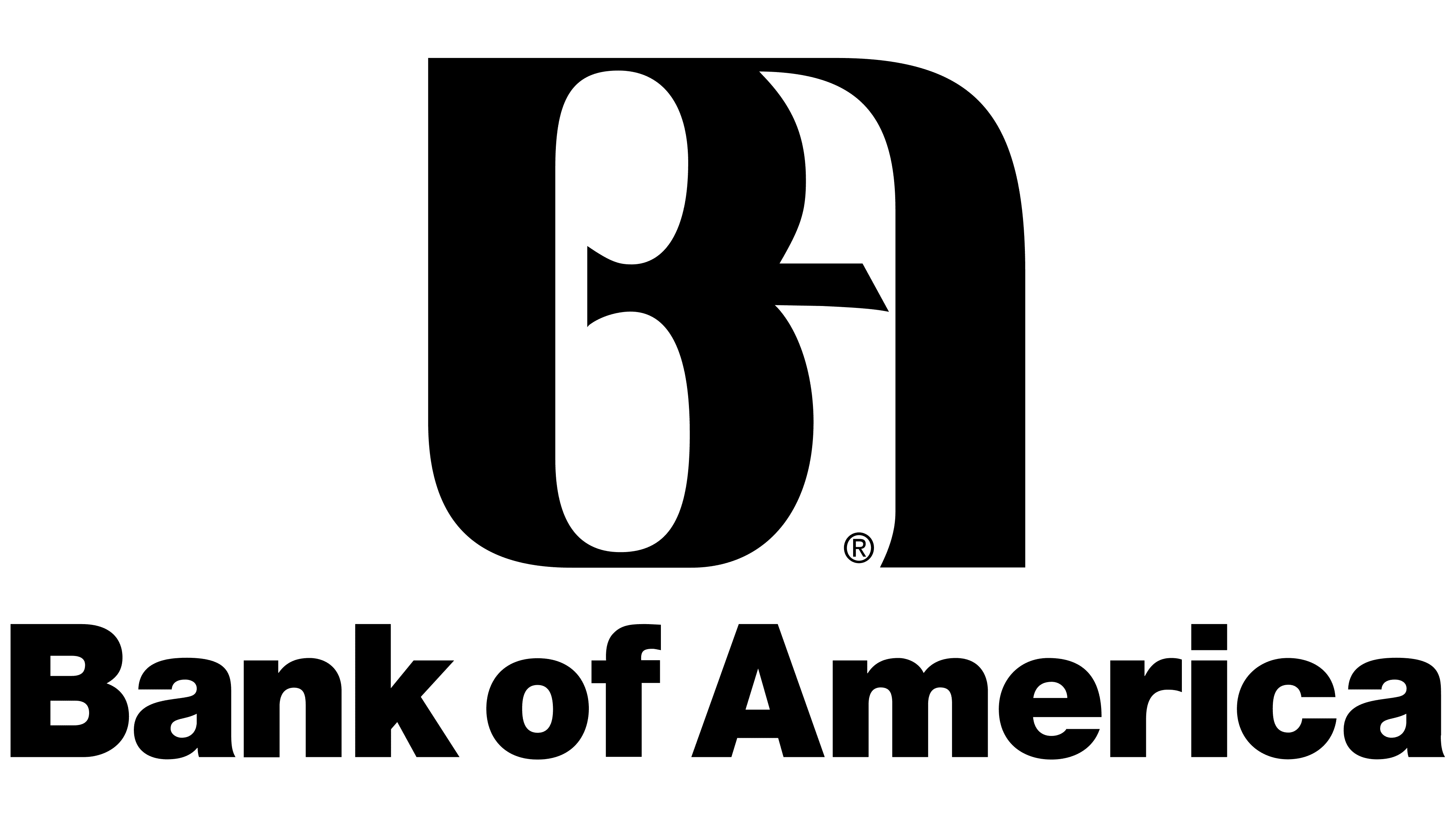
The designers enlarged the letters “BA,” making them the primary identifying mark of Bank of America. The old monogram is presented in a new form, though its original shape has remained nearly unchanged. It still features the “B” and “A” combined into a unified symbol with three vertical elements. Smooth curves suggest the organization’s readiness to adapt to changing customer preferences, while sharp angles evoke a sense of reliability.
The brand name is now positioned at the bottom of the logo, resembling a low pedestal supporting the monogram. Only the initial letters “B” and “A” remain capitalized, while the rest are lowercase, creating a sense of accessibility and friendliness. The new Helvetica Black font appears bold and minimalist due to its consistent stroke thickness, geometric glyph shapes, and lack of serifs.
As before, the emblem uses black, reflecting the bank’s core principles: stability, professionalism, and confidence in the future. The classic combination of black and white not only underscores loyalty to tradition but also enhances the clarity of each letter.
1998 – 2018

In 1998, the now-defunct Bank of America merged with NationsBank, giving rise to the modern BofA. The logo features the bank’s full name, which is associated with leadership and a rich historical legacy. The newly created institution abandoned the monogram as an outdated symbol, replacing the ornate “BA” with a geometric abstraction. However, even here, there is a reference to those letters: the two blue stripes represent “B,” while the four red stripes symbolize an inverted “A.”
The diamond-shaped pattern mimics the U.S. flag, making it a display of national pride. The flowing American flag reminds us that BofA is one of the country’s largest credit and financial institutions and supports its citizens’ financial stability. Moreover, the emblem not only highlights the brand’s patriotic nature but also evokes a sense of comfort, as the quadrilateral pattern resembles a patchwork quilt.
The “Bank of America” name has been enlarged, shifted left, and recolored blue to unify the logo into a cohesive whole. The new Franklin Gothic Condensed font differs from the previous Helvetica Black’s more elongated letter shapes. This makes the text appear dynamic, subtly hinting at the organization’s continuous growth.
2018 – today
As the banking sector evolved, BofA had to redesign its logo to attract new customers. At the same time, it was important for the designers to preserve the brand’s established visual identity, which had become recognizable over the past decade. Therefore, the changes focused on specific details, such as color, font, and the shape of elements, rather than the overall look of the emblem.
The stylized United States flag still resembles a diamond composed of red and blue stripes. However, the ends of the fragments have now been aligned to form relatively smooth lines without sharp transitions. This creates a sense of lightness, smoothness, and effortless motion, hinting at the accessibility of the organization’s services.
The two blue lines on the left suggest the letter “B,” while the remaining red quadrilaterals resemble an inverted “A.” This subtle reference to “BA” remains in the old BofA monogram. The white gaps between the flag’s colored parts have been widened, making the emblem feel less cluttered. The red and blue stripes no longer overlap, forming a harmonious composition with defined edges.
Although the logo lacks gradients and shadows, the flag still appears three-dimensional. Smooth curves, particularly noticeable at the bottom, achieve a sense of depth, giving the impression that the flag is waving in the wind. The shape adds a sense of grandeur and dignity, reflecting Bank of America’s patriotism. The flag’s majestic appearance serves as a reminder that BofA is one of the largest credit and financial institutions in the United States.
The wordmark was also updated: the designers used a modified version of the Elisar DT Infant font. With simple, smooth lines, the uppercase letters convey the bank’s stability. At the same time, diagonal cuts at the ends of “E” and “F” add dynamism to the emblem. Wide letter spacing makes the brand name more legible, creating a sense of confidence.
The logo continues to use the colors of the American flag: red, white, and blue. However, the shades have been noticeably deepened and made more vibrant. These colors reflect the organization’s patriotism and symbolize its core qualities. Red represents strength and authority, white signifies transparency and purity, and blue demonstrates consistency and determination.