


Bolt logo, it couldn’t be simpler. However, it may seem so only at first sight because when you return to it again, you can see the atmosphere of great seriousness and deep conceptuality. The logo is a self-promotion of the company’s carsharing, car rental, and two-wheeler services.
Markus Villig was born on December 17, 1993, on Saaremaa Island in Estonia. He grew up in a country building a digital economy after independence, while his brother Martin worked at Skype. After school, Markus enrolled at the University of Tartu to study computer science, but left after one semester.
The idea came from Tallinn’s weak taxi market. Customers had to call several companies, drivers were often late, picked up other passengers, and refused card payments. In 2013, Villig borrowed €5,000 from his parents and, with Martin Villig and developer Oliver Leisalu, founded Taxify. Markus wrote the prototype and recruited drivers himself at the airport and train station.
Taxify launched in Tallinn in August 2013. The first months were difficult, but by 2014, the service had established a strong position in Estonia and expanded into Latvia and Lithuania. Instead of fighting Uber in Western Europe, Taxify entered markets with weaker ride-hailing coverage. By 2016, it was working in South Africa, Kenya, and Nigeria. In 2017, it launched in Baku and Malta, while its London entry was paused by Transport for London until 2019.
Didi Chuxing invested in 2017, and in 2018, Daimler, Didi, and other funds joined a $175 million round. Taxify reached a $1 billion valuation, and 24-year-old Villig became Europe’s youngest unicorn founder. In 2018, the company changed its name to Bolt. Later, it added Bolt Food, electric scooters, and Bolt Drive. By 2021, after backing from Sequoia Capital, Bolt’s valuation had passed $4.7 billion.
Meaning and History
![]()
At first, this company was called mTakso, but it was quickly renamed Taxify. It was opened by a 19-year-old student who wanted to bring together all local taxi services (mainly in Riga and Tallinn) on a single website. The young man borrowed 5,000 euros from his parents and hired a specialist who helped him develop and launch the website. The father and mother also supported the son, contributing to the influx of customers. As a result, the service was established in the summer of 2013, and in 2014, it reached the international level. Its offices appeared in London, Paris, and other European cities.
Actions soon intensified in other areas, both in the service sector and in regional coverage. Subdivisions were opened in Africa. The new organization worked hard, studying the demands of each market. Such activities have yielded tangible results: Bolt entered the top 3 of the FT1000 rankings for 2019 and 2020. In particular, this is a list of the fastest-growing companies in Europe, according to the Financial Times.
The platform has about 1.5 million drivers, serving about 75 million people. The Bolt service is available in 300 cities worldwide and is well recognized by its logo. It is at once catchy, practical, and simple. This company has two visual identity marks: old and new.
What is Bolt?
Bolt is an Estonian transport service with its website and mobile app of the same name. It is engaged in the rental of bicycles, scooters, and electric scooters, as well as car sharing, food delivery, and car rental. Its branches are present in 300 cities worldwide, including Europe, Africa, Latin America, and Western Asia. The head office is located in Tallinn (Estonia). Markus Villig founded the company in 2013.
2013 – 2019
![]()
The debut logo consists of two parts: graphics and text. The first is the dialogue bubble, which is located to the right of the caption. A yellow line outlines it. The checkers on the white inner space are painted the same color, three identical squares arranged in a checkerboard pattern. A muted, sunny hue is extremely important for a car rental service, as it is classic for taxis in any country. The second is the platform’s very name. It is printed in black lowercase letters. The inscription is set in an even, smooth sans-serif font.
2019 – today
![]()
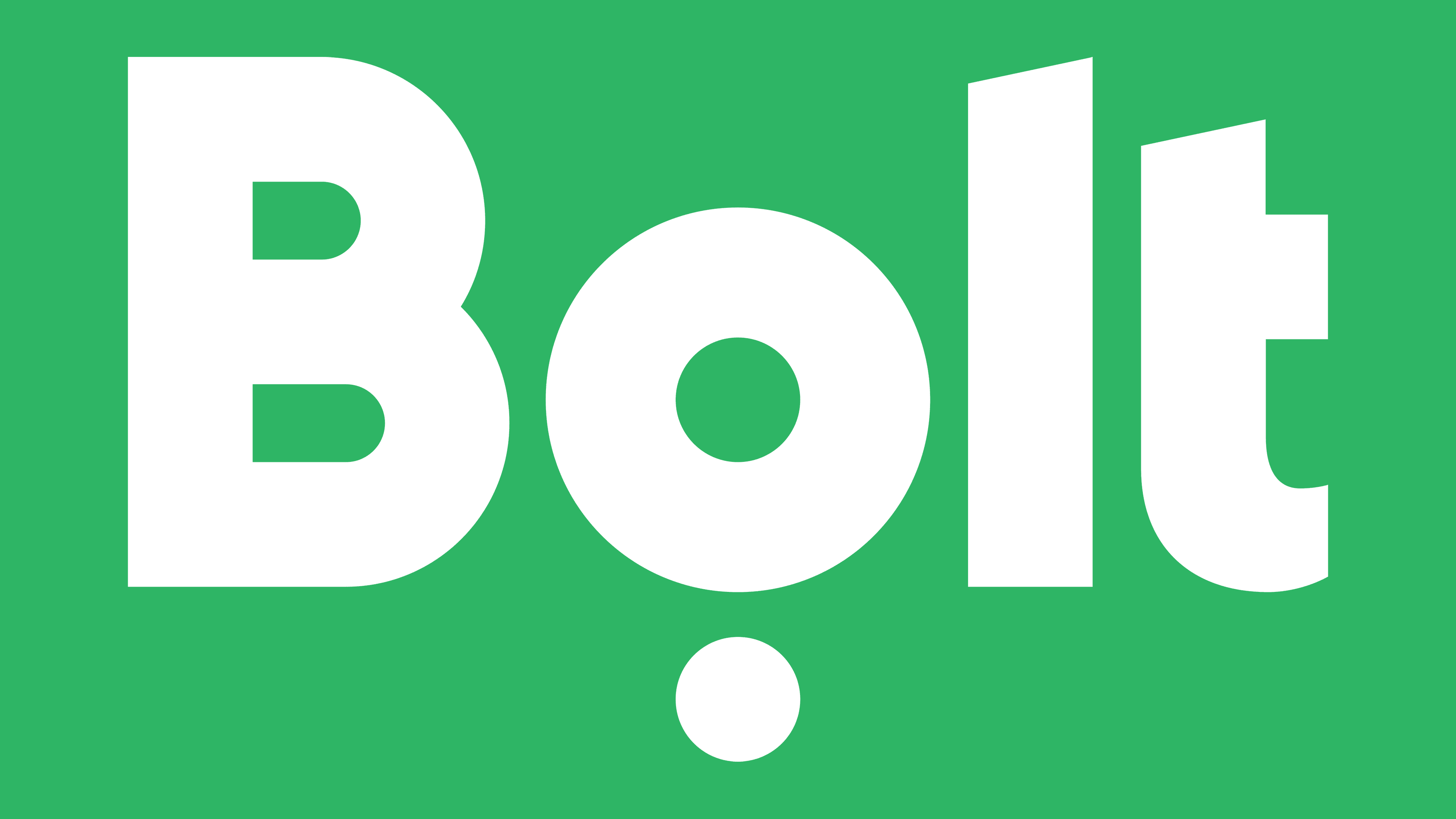
After the rebranding, Bolt has a modern emblem that embodies a symbiosis of modernity and practicality. It is not so innovative as conceptual because the designers have implemented the idea of transport dynamics. The movement conveys the lower element, a wheel with a solid fill in light emerald. The name, consisting of lowercase letters, is painted in the same shade, except for the first letter, which is kept in capital according to the spelling.
The characters in the inscription are massive, bold, and even. They do not have serifs, and the lines are extremely clear, strict, and short. This is evidenced by the absence of the left half of the crossbar “t.” An interesting emphasis is placed on the vertical columns at the “l” and “t,” whose tops are cut diagonally.
Font and Colors
The wheel theme is used in both logos. In the first, it is transmitted via a taxi (speech bubble); in the second, through a thick dot under the letter “o,” which itself resembles a steering wheel. In the current Bolt logo, the road direction is also represented by letters resembling road-sign elements.
The earliest version of the logo uses the Hurme Geometric Sans 4 SemiBold typeface, designed by Hurme Design. In the current version, the service name is set in a font almost identical to Bw Modelica SS01 Condensed Black from Branding With Type. It’s just that the “o” in the logo is rounder, while the “l” and “t” have their tops cut at an angle.
The modern corporate palette includes a pastel shade of emerald green. Previously, a combination of black and yellow was used, which has long symbolized the taxi service. The change to a different color scheme is due to the expansion of Bolt services.