


BOND builds a cosmetics brand around the connection between people, product, and daily care. The Brazilian brand was launched in 2025. It brings skincare and makeup together in compact products created with input from real customers. Women founded the brand and focus on practicality, safe formulas, convenience, and collaborative product development.
The name works in two directions. In Portuguese, the sound is close to “bonde,” meaning a group of friends. In English, “bond” means connection and unity. Because of that, the name fits the Brazilian market and leaves room for international growth. It carries the brand’s idea, where the founders, customers, and community take part in developing products together.
The BOND logo is a clean sans-serif wordmark. It is short and compact, and it works well across packaging, social media, retail, and digital formats. Minimalism fits a brand whose products need to look modern, neat, and quick to understand.

The main idea of the logo is tied to its compact form. The four letters look like a tight block, where proportions, spacing, and stroke balance matter. The letter “B” has a subtle horizontal line between its two bowls.
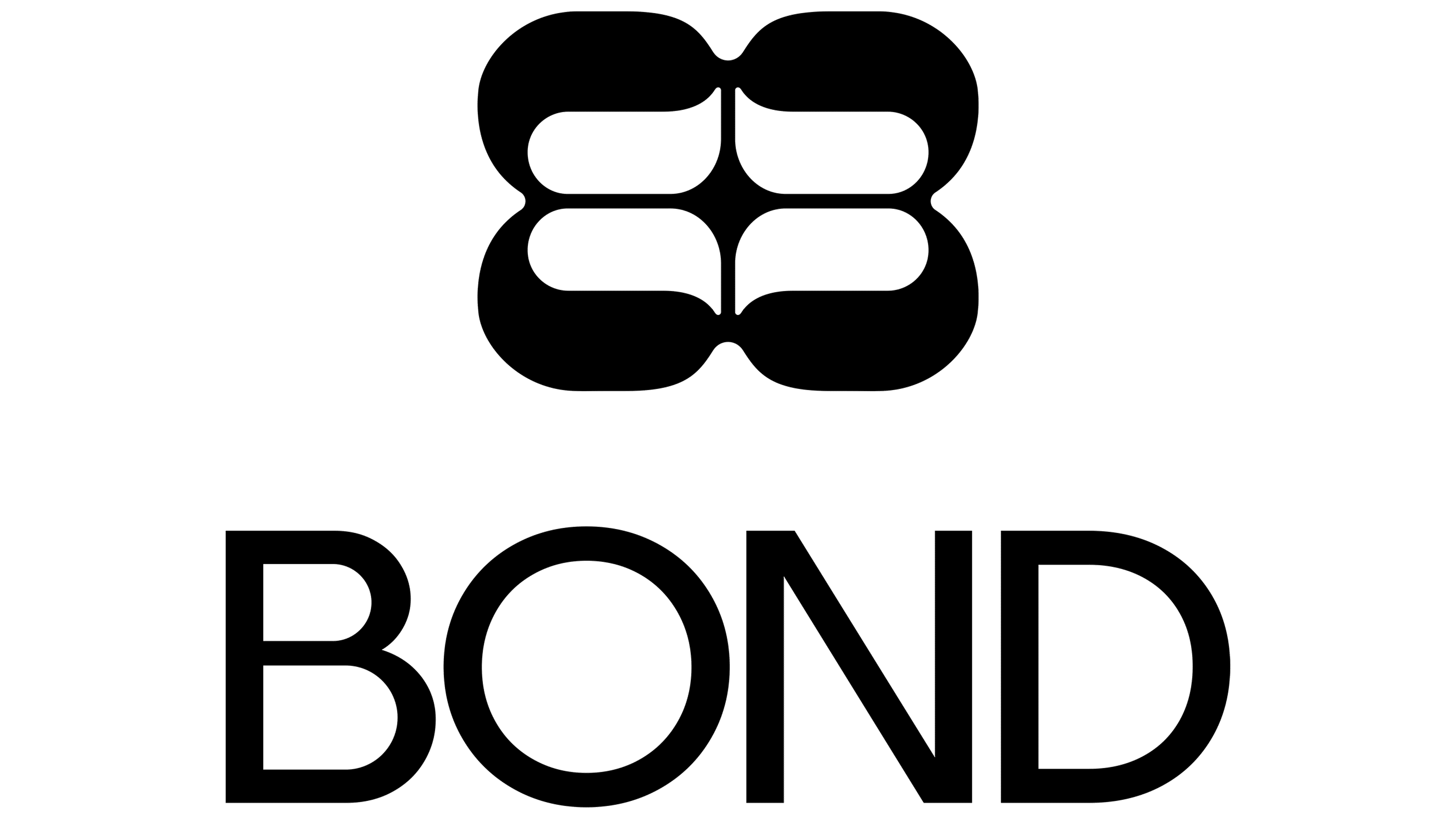
The secondary mark is built from a mirrored repeat of the “B.” The monogram resembles a butterfly and adds a softer layer to the strict logo. It supports the theme of connection and a female community. Two parts come together to form a single entity, conveying the relationship between the brand and its audience. The main wordmark remains primary, while the monogram helps in more emotional formats.
The BOND identity uses open space, a clear structure, and bright colors connected with ingredients and product benefits. Because of this, the brand can more easily separate categories and maintain a scientific tone.
The system uses the Exposure typeface. It adds contrast to the short wordmark and pairs with the soft monogram. Illustrations explain product benefits, while photos of models make the brand feel closer to a real community.
The new BOND presents skincare and makeup as part of a simple routine created together with the audience. The logo conveys the idea of connection through the name, the monogram develops it through form, and the whole system helps the brand look modern and ready to grow beyond the local market.