The Bradesco logo burns like an Olympic flame, conveying the bank’s leadership and innovative approach to customer service. The latest technologies are available to investors. And as the emblem shows, the bank is not going to stop.
Bradesco: Brand overview
| Founded: | March 10, 1943 |
| Headquarters: | Osasco, São Paulo, Brazil |
| Website: | banco.bradesco |
Bradesco is the third largest private banking structure in Latin America, with an annual profit of $526 million. In addition to banking, it provides insurance, brokerage, and travel services. Collects taxes and utility bills. The Bradesco logo unites 72,000 employees in 5,000 offices.
Bank Bradesco is the success story of Amador Aguiar, the thirteenth country boy in the family. Starting with an ordinary clerk, after 20 years, he became the head of the small banking structure Almeida Banking House, creating the largest bank in Brazil from it in 10 years, which he led until the age of 86.
Meaning and History
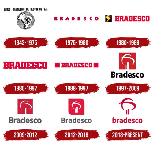
The company’s logo has changed many times, marking new milestones of prosperity and growth. The invariable red color accompanied all emblems, speaking of the Brazilian passion and love of the bank for its work.
What is Bradesco?
Brazil’s largest financial institution, with a net income of $23.4 billion. There are 53,000 ATMs and about 5,000 branches across the country—with headquarters in Sao Paulo.
1943 – 1975
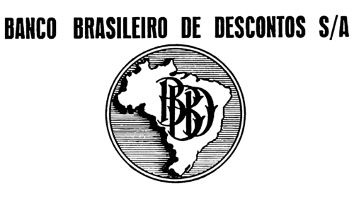
The first logo consisted of an inscription and a coin depicting a map of Brazil, on which the monogram of the name was intertwined.
The inscription above the coin read Banco Brasileiro de Descontos S.A. The combination translates as “Brazilian discount,” showing the organization’s disposition towards ordinary contributors. At the dawn of banking, financial institutions did business only with wealthy citizens. The middle class and the poor were not served. Therefore, the name chosen by Aguiarom was revolutionary and attracted a lot of clients to the institution.
The coin personified prosperity and indicated the direction of the organization’s work. The silhouette of Brazil showed that the bank would serve all the country’s inhabitants and planned to spread its branches everywhere.
1975 – 1980
From the 1960s to the 1970s, the bank grew enormously. He introduced computer technology, doubled the number of offices, and bought less successful offices. Therefore, in the wake of the Brazilian Miracle, the company’s logo was updated, making it more modern.
The new emblem consisted of the word Bradesco written in medium-sized capital letters with significant spacing between them. A distinctive feature, in addition to the inter-letter spaces, was the appearance of a color-rich cherry.
The name itself is a compound word from parts of the bank’s full name: Brasileiro de Descontos. The abbreviation emphasized the individuality of the bank and was better remembered.
The intervals hinted at the expansion of the structure, spreading throughout the country. At the same time, the preservation of the medium and even small size of letters informed: the bank works with medium and small businesses.
The hue of the logo reads the rise, the increase in activity, and the introduction of innovations.
1980 – 1988
The founder resigned as CEO, and the era of the new leader Lázaro de Mello Brandão begins, who grew up in a bank from a simple clerk.
The logo, which Brandão initiated, is larger and more compact than the previous one. It has shown expansion through opening branches, which has continued at a rapid pace. Bradesco was everywhere. At the same time, there was an increase in service, manufacturability, and professionalism. The bank has launched a customer support telephone line.
In the logo of this time, a black square pierced by lightning appeared in front of the name. He talked about the speed and quality of service thanks to computerization and the telephone line. He pointed out that the bank is growing and developing, cutting through the darkness of inflation.
1988 – 1997
There have been global changes in the financial sector. A new currency has been introduced in the country. Banks were forbidden to work more than 5 hours a day to stop inflation. Therefore, Bradesco had to lay off many employees, close branches, and focus on modernizing work, outsourcing certain areas to other organizations.
The new logo is the name surrounded by red squares on both sides. The image said: “Even in a period of trouble when circumstances beyond the bank’s control hit the wallet, the institution continues to work, trying to preserve and increase the income of depositors. All finances are securely protected.
And the bank persevered, taking first place among Brazilian banks in 1993-94.
1997 – 2009
In 1997, Bradesco acquired one of the largest banks in Brazil, Banco de Crédito Nacional. After the merger and rebranding, the concept of the company logo has changed dramatically.
The name has a new font with one capital letter and black color. And the square moved up. It ignited a schematic torch.
The bank celebrated victory and prosperity. It was the best financial institution in the country. Therefore, a torch appeared at the head of the emblem as a symbol of leadership. The fire showed that Bradesco set the tone for the industry, leading the rest of the banks. The institution introduces new technologies, opens new offices, and offers new services.
The bright scarlet color conveyed energy, the beating of the heart. The company is the pulse of the country, to which others adapt.
2009 – 2012
In 2009, another major deal was closed to buy competitor Banco Ibi. The scale of the conglomerate has increased even more. The updated logo demonstrates the dilution of the original Bradesco and the infusion of other employees, corporate culture, and capital into it. The process is shown by changing the name from black to grey. But this mixing leads to the organization’s fire burning even brighter. The red square becomes much more massive, and the white lines of the torch are clearer.
2012 – 2018
The bank received a contract from the state and became an organization entrusted with paying salaries to the country’s civil servants. The new badge introduced for the occasion is softer and shows Bradesco’s stability and confidence. The gradual acquisition by the conglomerate of a common structure and policy is expressed in the darker color of the inscription. And loyalty is shown by two rounded corners of a square with a torch.
2018 – today
At the beginning of the year, Octavio de Lazari came to the management of the bank, and in 2018 Bradesco, thanks to him, increased its financial value by half. Rebranding has become one of the stages of modernization.
The last sign of the company is simple and elegant—all elements of the inscription stretch upwards. The torch is still burning above the name but without the red square. The absence of a capital letter indicates a return to the policy of customer leadership. The emblem reads more freedom and leadership.
Font and Colors
The main color that accompanies Bradesco throughout history is red. It symbolizes the dedication laid down by the founder of the bank. Customer care, reliability, and love of work are among the values and goals of the organization. Therefore, the institution enjoys the trust of the inhabitants of the country.
The hue also shows a pioneering mission—leadership among other banks in Brazil.
The font is reminiscent of Chypre Cond Extra Bold.
Bradesco color codes
| Red | Hex color: | #cc082f |
|---|---|---|
| RGB: | 204 8 47 | |
| CMYK: | 0 96 77 20 | |
| Pantone: | PMS 187 C |
