The basic theme of this logo is water. The Brita logo conveys its purity in detail because the company is associated with the production of filters. The abstract style emphasizes the products’ transparency, safety, and affordability. It is expressed by light lines, which symbolize water. The graphics are perfectly balanced with clear glyphs. The dynamics of the flowing fluid are felt everywhere.
Brita: Brand overview
| Founded: | 1966 |
| Founder: | Heinz Hankammer |
| Headquarters: | Taunusstein, Germany |
| Website: | brita.com |
Meaning and History
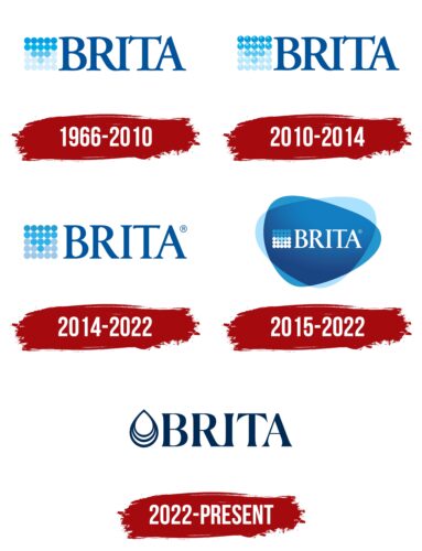
Visual recognition of the brand is at a high level because, since 1966, the company’s logo has succumbed to only minimal changes. Brita’s traditional white and blue color palette is associated with Brita’s activities by millions of Brita customers worldwide. During this time, four versions of the logo were presented. Each new redesign complemented the previous version, making the company logo more attractive to the target audience.
What is Brita?
These are high-quality water filters from a leading German company with many years of experience and authority in the market.
1966 – 2010
The original version of the logo was presented almost immediately after the company’s creation. It consisted of a verbal inscription and an emblem located to the left. The brand name used an elegant, bold serif typeface with tall letters. All symbols are in uppercase, which adds confidence and strength to the entire logo. The emblem consists of 25 round balls, which together form a square. Each ball has its shade of blue. As a result, the Brita logo visually communicates the company’s main purpose. Blue is the color most people associate with water.
2010 – 2014
Interestingly, the first version of the logo lasted for 44 years. The 2010 redesign made minimal changes to elements of the image, making it more modern. The letters in the word name were now in white on a blue background. At the same time, the greatest changes concerned the emblem. Thanks to the use of shadows, it seems that all 25 circles are presented in three-dimensional form.
2014 – 2022
Visually, this version of the logo is very similar to the original but with modern innovations. The company decided to return to a white background and blue letters. The same exquisite sans-serif font was used, but with slight changes in lettering style. For example, the length of the upper horizontal line in the letter “i” has become shorter, and therefore it does not touch the next letter “t.” Also, thanks to the white background, 3D circles have become more prominent and attract the attention of potential buyers. In general, the logo looks quite professional and progressive.
2015 – 2022
Together with the previous version, another logo is used in parallel. The main elements remain unchanged, except for the reuse of white letters on a blue background. However, here the background in the form of two triangles with strongly rounded corners is first of all striking: blue and light blue. Looks very intriguing and interesting.
2022 – today
The meaning of the Brita logo has become more obvious because now a drop of water looks like a drop, not like a set of abstract dots. Its triple shape symbolizes the filtration process: the liquid seeps through the purification system, getting rid of impurities. A dark blue color in combination with white represents purity, freshness, and thirst quenching.
The wordmark on the right has a slim design that matches the shape of Brita’s ergonomic filter jugs and filter bottles. Elegant letters with sharp triangular serifs and different stroke thicknesses were clearly designed to order. Moreover, the adjacent “R” and “I” are in contact at the bottom, which introduces an imbalance in the kerning.
Font and Colors
The Brita wordmark in all logo variations is in capital letters using an elegant serif typeface. The main attention deserves the diagonal serif in the letter “T.” As a result, an elegant yet classic typeface looks more unique and progressive. Throughout the brand’s existence, the style of writing the name has not changed much.
If we talk about the color palette, then the logo is based on white and blue. Moreover, a blue gradient is used, from a dark shade to a light blue. As a result, the 25 circles of the emblem look mysterious and interesting. Thus, the company demonstrates to potential buyers the water filtration process in which the organization is engaged. The selected range of colors directly reflects the professionalism and development of the company. Thanks to the right palette, the Brita logo looks sharp and sophisticated, staying in the minds of the target audience for a long time.
Britas color codes
| Cool Black | Hex color: | #002a53 |
|---|---|---|
| RGB: | 0 42 83 | |
| CMYK: | 100 49 0 67 | |
| Pantone: | PMS 295 C |
