


The Canadian Physiotherapy Association introduced a new logo and identity for Congress 2026 in Halifax. Created by Humanity, the identity draws on anatomy and the everyday work of physiotherapists. The update accompanies CPA’s 2026–2030 development program, which focuses on education, career advancement, and the profession’s role in shaping healthcare.
Humanity named the logo concept “Planes of Motion.” The designers based it on the three anatomical planes, sagittal, frontal, and transverse, which physiotherapists use to study body position and joint movement. Vertical and horizontal sections form a cross, connecting it to healthcare. A diagonal band runs through it from the lower left to the upper right. Its angle draws on a runner’s starting stance and conveys a person’s return to physical activity after rehabilitation.
The emblem is built from rectangles and triangular sections. Light turquoise at the edges gives way to dark teal where the shapes intersect. Translucent layers reveal the shapes’ boundaries and the color changes created by their overlap. Humanity associates these pairings with science and care, precision and empathy, and professional expertise and community advocacy. The intersecting planes symbolize collaboration among the different disciplines and specialties within CPA.
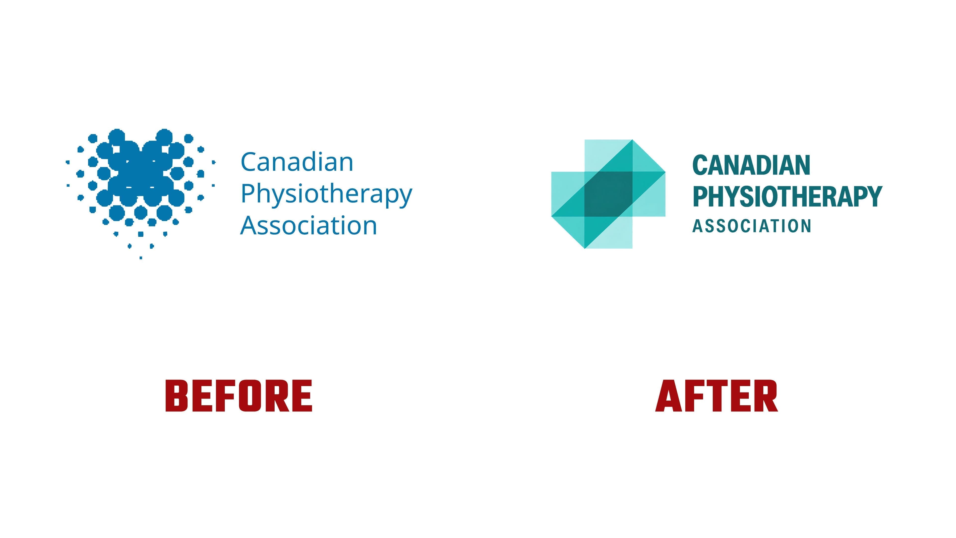
The previous logo expressed care through a heart-like image made from blue circles of varying sizes. Larger dots occupied the middle, while smaller ones extended toward the edges and bottom. To the right, the name appeared on three lines in a light sans-serif typeface, with each word beginning with a capital letter. The new version replaces the dotted image with intersecting planes and an anatomical reference.

The name remains on the right, arranged across three lines. CANADIAN and PHYSIOTHERAPY now appear in bold, condensed sans-serif capitals. ASSOCIATION is smaller underneath, with increased letter spacing. The dark teal lettering matches the emblem’s overlapping areas. The heavy weight gives the top two lines prominence.
Humanity began with research and consultations involving association members, volunteers, division leaders, and partners. The agency needed to address current CPA members’ needs, reach future generations of physiotherapists, and help the public understand the profession’s role. The project centered on turning professional ambitions into practical results. The team developed the positioning, audience communication guidelines, logo system, and launch campaign.
The tagline “Built to Move” connects the update to the association’s plans. CPA aims to broaden access to knowledge, support professional development, and help physiotherapists take part in shared initiatives. Membership is intended to offer tangible benefits for day-to-day practice and career growth, from educational resources to opportunities to exchange experience with colleagues.
We developed related identities for specialty divisions and participating provincial and territorial associations. Shared principles connect them to the national organization, while individual imagery reflects their areas of practice. The logo’s angled planes extend into frames, patterns, and shapes used to hold photographs. The identity appears across the website, presentations, reports, social media, apparel, and bags.