The Care Bears logo is bright and soft, just like the characters. The vibrant colors emphasize the characters’ diversity, unique appearances, and personalities, making the emblem lively and memorable. Regardless of the release year, each version of the logo includes elements symbolizing love and care. These details are easily seen in the images of hearts, rainbow motifs, and smooth, soft fonts, which give the emblem a sense of kindness and tenderness—core themes of the entire brand.
Care Bears: Brand overview
In 1981, American Greetings Corporation decided to expand beyond greeting cards, marking the start of the Care Bears’ journey. Artist Elena Kubu created the first sketches of the lovable bears, initially intended to appear on cards and other children’s products. Ten characters were designed, each with its own color and belly symbol representing its personality and unique role. In 1982, American Greetings partnered with Kenner Products to create a line of plush toys based on these designs. The decision proved successful, and the first toys hit store shelves in 1983. Each bear’s distinct name, personality, and “care ability” captured the attention of children and parents alike.
The first television special, The Care Bears in the Land Without Feelings, was released in 1984. It introduced a larger audience to the magical world of Care-a-Lot. Its success led to creating an animated series from 1985 to 1988.
The year 1985 was particularly significant. In addition to the series, The Care Bears Movie, the first full-length animated film, premiered. The movie earned nearly $22 million at the box office, setting a record for an independent animated film. This led to two sequels: A New Generation in 1986 and The Adventure in Wonderland in 1987.
By the late 1980s, the bears’ popularity declined, and the toy line was discontinued in 1990. However, the brand wasn’t forgotten. In 1991, Those Characters From Cleveland, a division of American Greetings, attempted to revive the franchise with a new line of toys and updated character designs.
A new era began in 2002 when Play Along Toys introduced a fresh product line, reigniting interest. A new animated series, Adventures in Care-a-Lot, premiered in 2003 and ran until 2006.
In 2007, American Greetings sold the rights to Cloudco Entertainment (formerly AG Properties). Under Cloudco’s ownership, the franchise expanded further. A new series, Welcome to Care-a-Lot, aired on The Hub (later known as Discovery Family) in 2012. In 2015, the characters returned to Netflix with Care Bears & Cousins, reintroducing original figures alongside characters from the 1980s universe.
In 2019, Cloudco Entertainment launched Unlock the Magic on Boomerang. This new animated series featured updated designs and new adventures in the magical world of Silver Lining.
As of 2023, the brand remains beloved across multiple generations. The franchise continues to evolve, adapting to new platforms and media while maintaining its core values of love, friendship, and caring. In addition to toys and animated shows, the characters appear in various products, mobile apps, and video games. From simple greeting card illustrations to a globally recognized brand, the legacy has thrived for over 40 years, demonstrating its ability to connect with audiences of all ages.
Meaning and History
What is Care Bears?
This franchise centers around charming bears known for the bright emblems on their bellies, symbolizing various emotions and virtues such as love, friendship, courage, and even irritability. Each bear in this mystical group has its unique personality and mission — to help those in need by using their powers to spread kindness and positive energy through the flashes of symbols on their bellies. These bears have won the hearts of both children and adults. The franchise included toys, TV shows, movies, and a wide range of merchandise, solidifying their place in pop culture. Their friendship, empathy, and care messages resonate with generations of fans.
1983 – 1985
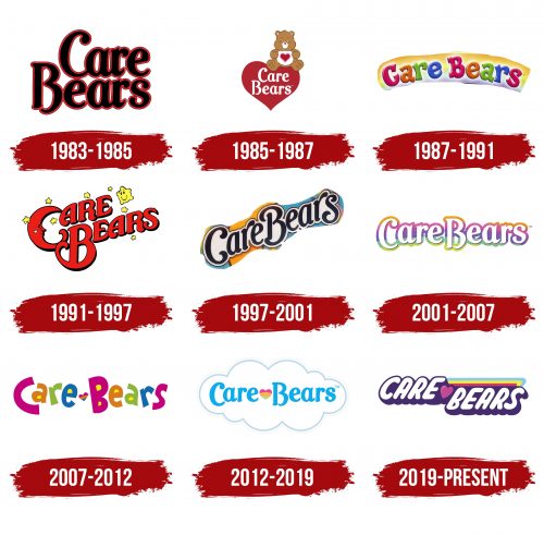
The first Care Bears emblem consists of the name, arranged on two levels. The design is based on a brown background that resonates with the color of their fur, creating a connection with the characters. The franchise name is neatly written in black letters with rounded glyphs on this background, giving the logo a soft and friendly appearance.
The color scheme emphasizes natural warmth, and the closely spaced letters enhance the coziness and care as if all logo elements are enveloped in a soft layer. The emblem was designed for the first series of toys introduced to the public at a fair in 1983. This logo reflects the atmosphere of tenderness and care the franchise sought to convey.
1985 – 1987
The Care Bears emblem adorned all franchise products, starting with the animated films “The Care Bears in the Land Without Feelings” and “The Care Bears Battle the Freeze Machine.” The logo was created to align with the image on a greeting card, emphasizing the characters’ loving and caring nature. At the center is a large red heart filled with emotion, with the brand name written inside.
One of the franchise’s main characters sits atop the heart—a small bear with a cute and slightly bashful expression gazing off to the side. On his white belly is a heart, a distinctive feature of all the bears, as each one is unique and has its color, emotion, and symbol on its belly. The first bear created was Tenderheart Bear, the leader of the entire group. His main mission is to bring love and care to the world, as reflected in the logo. The love embodied by the big heart is the key message of the brand and its emblem.
1987 – 1991
The emblem, created to match the bright and colorful Care Bears, consists of the brand name spelled in multicolored letters. Just as each bear has its unique fur color, the letters of the logo are painted in various colors, reflecting the individuality and character of the bears. The brand name is neatly placed against a rainbow background, enhancing the kind and positive message of the franchise, as if inviting viewers into a world of joy and care.
This logo was used in the musical animated film “The Care Bears Adventure in Wonderland,” released in 1987. It highlights the story’s magical and fantastical atmosphere. The rainbow in the emblem symbolizes the light and warmth the bears bring to viewers’ hearts, offering wishes of love and friendship, just as their characters do in every episode.
1991 – 1997
The franchise was relaunched with seven bears as the main characters. The new emblem connected with the night sky, creating a cozy and magical atmosphere. The brand name is written in red, rising upward, and arranged on two levels. The letter “C” particularly stands out, as it was transformed into the shape of a crescent moon. Scattered around the name are golden stars, one of which is larger and smiles at the moon, creating the impression of a friendly interaction.
The logo is filled with warmth and kindness, reflecting the essence of the entire franchise. This design conveys a sense of comfort and magic, especially emphasized by the interaction of celestial symbols. This emblem first appeared on the poster for “The Care Bears Movie,” marking a new chapter for the characters and their story.
1997 – 2001
The sign was created specifically for the second part of Care Bears Movie II: A New Generation. The title is rendered in smooth and soft letters arranged in an ascending ribbon, giving the logo a sense of movement and lightness. In the original design, the title is surrounded by familiar stars that were also present in the previous logo. These stars continue to enhance the atmosphere of magic inherent in the franchise.
The image represents the magical rainbow on which the animal cubs escaped to the sky, fleeing from the evil sea serpent. This detail adds visual appeal to the logo and symbolizes rescue and hope. Altogether, it creates a mood of fantasy and kindness that permeates the entire film, highlighting the core values of the series.
2001 – 2007
The new emblem was closely tied to Play Along Toys’s release of toys and the movies created to promote them. The franchise name is written in white letters against a rainbow palette, where bright shades gradually change, giving the image a sense of fantasy and magic. The rainbow background evokes the rainbow carousel in the movie Care Bears: Journey to Joke-a-lot, adding a sense of dynamism and fun to the emblem.
The logo’s color transitions also symbolize the magical fountain in the kingdom of Care-a-lot, representing the light and magic of this place. The logo became a harmonious continuation of the franchise’s overall concept, conveying its spirit—joy, kindness, and the magic the bears bring to their audience.
2007 – 2012
With the release of “Care Bears: Oopsy Does It!”, the bears got a new look, and with it came an updated logo. It reflects the joyful and carefree mood of the film, following the new style of the franchise’s 15 characters. This cheerful design was later incorporated into the series “Care Bears: Adventures in Care-a-lot.” The logo became bright and lively: each letter has its unique color and is slightly tilted, creating a sense of movement.
The title is divided by a rainbow heart, adding warmth and symbolizing friendship and care. The holes in the letters are filled with yellow markers, giving the text even more light and positive energy. The letters seem to happily step forward to meet new adventures, emphasizing the joyful and kind atmosphere the bears have always brought to their stories.
2012 – 2019
The 2012 emblem is warm and soft, highlighting the franchise’s updated look. The title is written in blue letters as if resting on a light and airy cloud, giving the logo a sense of lightness and fantasy. The central element that draws attention is a bright rainbow heart, instantly associated with the magical world of the bears.
This emblem was created to mark another update to the franchise, timed with the release of the series “Care Bears: Welcome to Care-a-Lot.” The rainbow heart and soft lines of the logo convey the atmosphere of magic and kindness characteristic of this new stage in the story’s development.
2019 – today
The Care Bears logo, introduced with the release of the animated series “Unlock the Magic,” perfectly captures the spirit of the refreshed characters and their adventures. This logo stands out with its dynamic and vibrant details, which align with the themes of kindness, caring, and magic inherent in the franchise.
The “Care Bears” text is in bold white font with purple side shadows. The font appears smooth and rounded as if written by a child’s hand. The slight forward tilt of the text gives a sense of movement and speed, as though the text itself is about to take off on another adventure with the bears. Between the words, there’s a pink heart—a symbol of love and friendship, which has always been a vital part of the Care Bears universe. It emphasizes that the main values of the series are caring for others and emotional support.
An additional emblem element is three colorful stripes reminiscent of a rainbow. The rainbow has always been an important symbol, as bears often use it to travel between their world and Earth. Blue, yellow, and pink bright colors are associated with joy, kindness, and magic.
The visual sign reflects the franchise’s update, introducing new elements while staying true to the original idea. It maintains a connection with the past—the same warm and friendly style that audiences loved back in the 1980s—while at the same time appearing modern and appealing to a new audience.
