



The refreshed brand identity and logo for Care.com, developed by the Manual studio, emphasize the human dimension of care that forms the foundation of this popular platform. Originally established as a place to find nannies and domestic helpers, Care.com has expanded its services to include elder care, tutoring, home maintenance, and pet care. Millions of families rely on its services, selecting trusted professionals worldwide.
The previous coral-colored logo appeared overly playful, failing to convey the essence, reliability, and broad scope of the company. To reimagine the brand, Manual introduced the expressive Oceanic Text typeface with gentle serifs, making the new wordmark appear both friendly and authoritative.
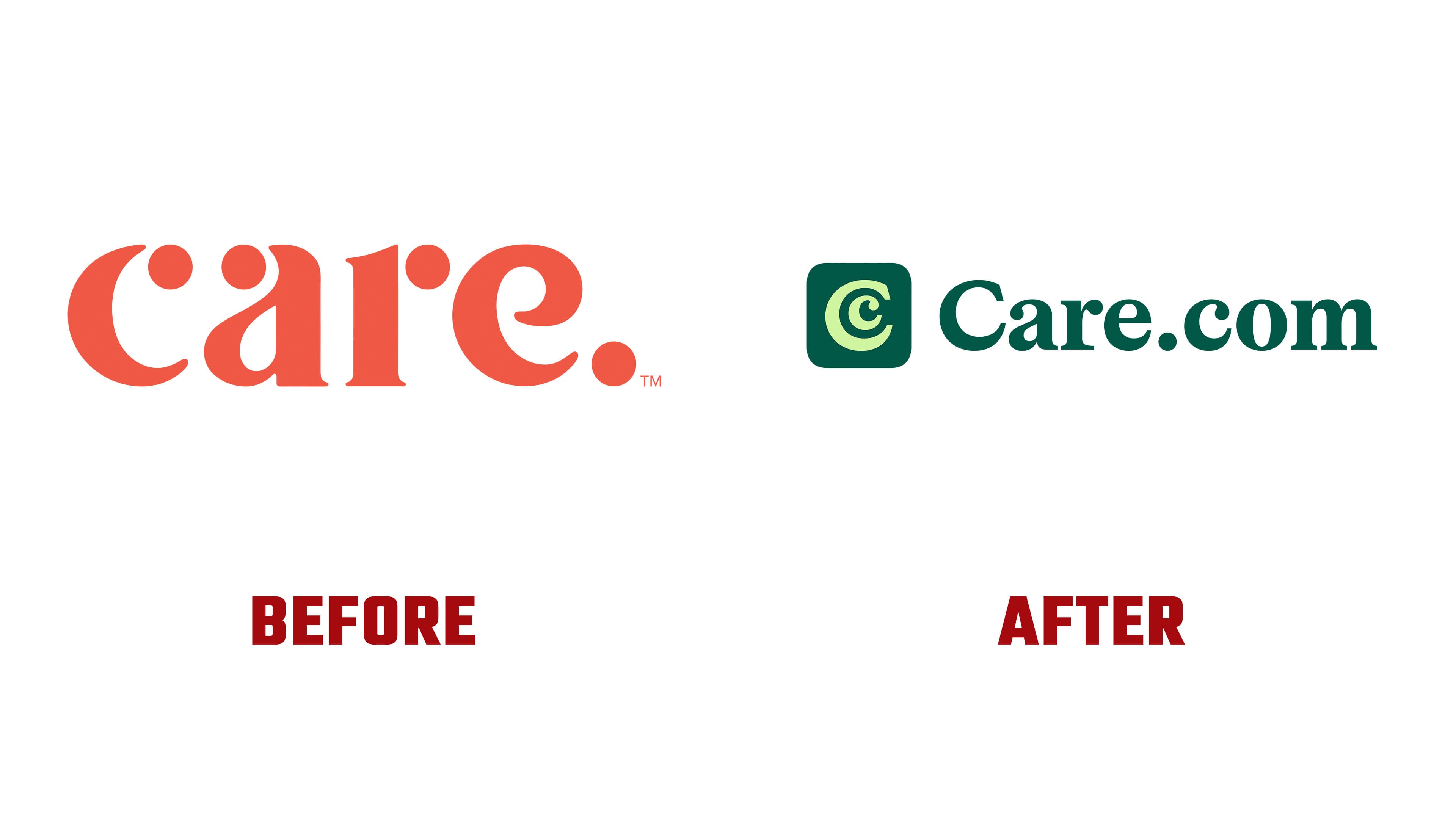
The logo’s standout feature is a monogram combining two letters, “C.” The larger letter gently surrounds the smaller one, symbolizing care, protection, and support. The symbol is presented in a modern mobile-app style, emphasizing the digital aspect of the platform and its readiness to assist at any moment.
The new color palette is built around natural shades of green. Combined with accent colors, it effectively captures various life stages and emotional states, from childhood through maturity.

Typography further enhances the identity through a combination of two typefaces: NaN Druid Sans in headlines conveys confidence, while Oceanic Text in the main content provides warmth and approachability.
As a result, Care.com now has an identity meeting the needs of families seeking care as well as the professionals providing it. The updated visual style thoughtfully captures the company’s core values, offering the relevance and humanity necessary for effective interaction with a contemporary audience.
