


 Catholic Community of Washington Logo PNG
The Catholic Community of Washington’s logo conveys the ideas of compassion and mutual assistance, which are the foundation of charity. The emblem’s design reflects a balance between humanity and seriousness, emphasizing the organization’s high level of responsibility.
Catholic Community Services of Western Washington traces its roots to Catholic relief programs created in the 1920s. Formally established as Catholic Charities in 1929, it initially supported homeless people, single mothers, and orphans in Seattle. During the 1930s, it opened soup kitchens and shelters and built a parish-based network of social aid.
In the 1940s, the organization assisted military families and refugees, then added adoption support and family counseling after World War II. During the 1950s, it hired trained counselors and social workers, opened family centers, and introduced programs for older adults. The agency expanded across western Washington in the 1960s, adding youth and community services.
By the 1970s, affordable housing had become a major field, with apartment projects for older residents and low-income families. Employment and vocational programs were added, while the 1980s brought mental health care, addiction rehabilitation and expanded senior services. In the 1990s, CCSWW adopted case-management systems and widened support for immigrants, refugees and homeless people.
During the 2000s, CCSWW introduced new data systems and programs for veterans and their families. In the 2010s, CCSWW worked with public agencies and nonprofit partners on long-term responses to poverty and homelessness. By 2023, it had become one of Washington State’s largest private nonprofit social-service networks, serving people regardless of religious affiliation.
Meaning and History
What is the Catholic Community of Washington?
This religious community brings parishes, schools, and charitable organizations together to support residents and assist them in various aspects of life. It provides education, offers social services such as food banks and shelters, and promotes cultural development and interfaith dialogue. With its multicultural structure and active engagement with society, this community plays an important role in the life of the capital region, blending spiritual values with care for people.
1918 – today
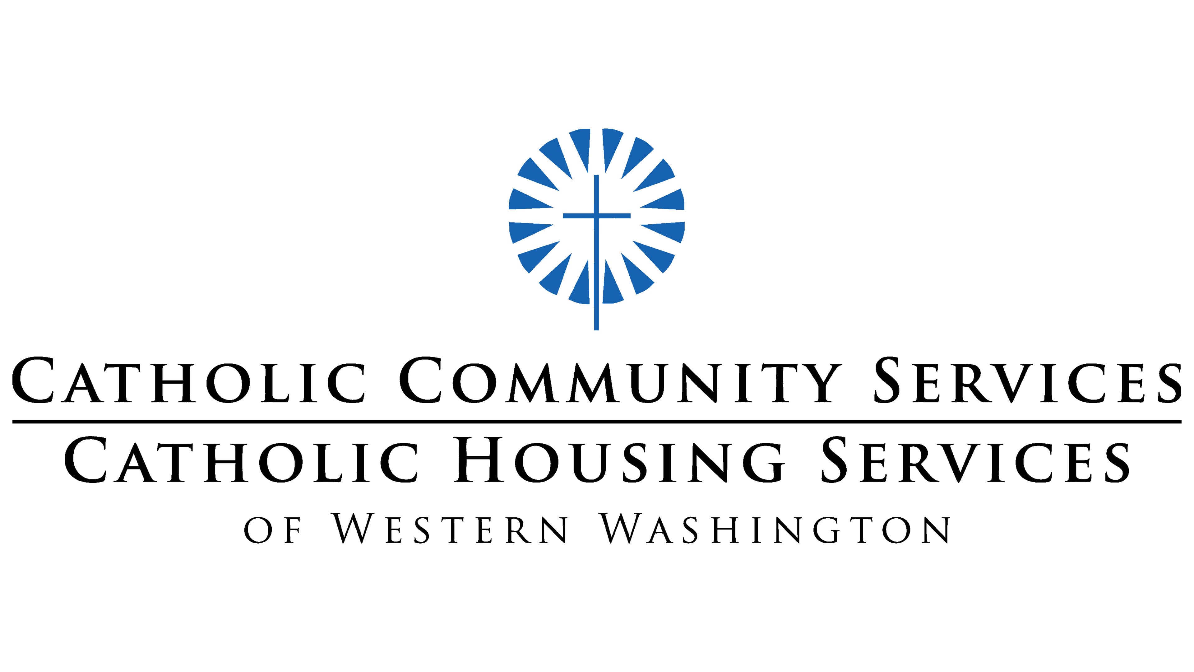
The Catholic Church in Western Washington provides humanitarian aid to vulnerable populations through its charitable programs, Catholic Housing Services (CHS) and Catholic Community Services (CCS). Interestingly, CHS and CCS share a common mission and a single logo incorporating both organizations’ names.
At the top of the emblem is a distinctive symbol, a white circle filled with radiating lines resembling sun rays. The bright stripes are separated by small dark blue triangles arranged in a ring. Their sharp angles point inward toward a thin Catholic cross at the center, creating the impression that it emits light.
The sun is associated with warmth, life, and renewal, so the halo of white rays symbolizes the care and hope CHS and CCS bring to those in need. The lines radiating outward from the center represent the organization’s far-reaching impact on American society. The cross signifies a connection to religion, as the charitable mission is rooted in faith in God. The colors of the logo also carry symbolic meanings:
- Blue represents tranquility, hope, and trust, as it is associated with heavenly purity and innocence in Catholicism.
- White conveys a sense of stability and confidence. The empty light space emphasizes the sincerity of CHS and CCS.
- Black text symbolizes professionalism, seriousness, and responsibility.
All text is positioned at the bottom, elevating the above symbol. The phrases “CATHOLIC COMMUNITY SERVICES” and “CATHOLIC HOUSING SERVICES” are separated by a long horizontal line, indicating that these are two distinct organizations united by a common mission. The third line reads “OF WESTERN WASHINGTON,” specifying the region where the charitable programs operate.
The inscriptions use the same serif font with prominent details. The thin lines give the logo a sense of lightness, making the text visually soft and less imposing. All three lines are written in uppercase letters, with the initial “C,” “S,” “H,” and “W” further enlarged to give the organization names an authoritative appearance.