![]() Thrive Togetehr Logo PNG
Thrive Togetehr Logo PNG
The Thrive Together Logo connects people by creating a space where they feel heard. The organization strives to help and open up full opportunities for people with hearing impairments to communicate and participate in society.
Thrive Together’s history began in 1999 when four deaf women founded Iowa Deaf Women’s Advocacy Services (IDWAS) to help women with hearing impairments overcome everyday challenges. Initially, the organization offered basic counseling and information from a small office, where it hosted group meetings and therapy sessions. IDWAS achieved a major milestone early on by creating Iowa’s first crisis hotline, specifically designed for deaf and hard-of-hearing women, providing vital emergency support. As the years went by, advocacy efforts grew, and the group collaborated with government agencies to improve access to services. Outreach expanded into rural areas, offering workshops and self-defense training tailored to the community’s needs. A new peer support program enabled people with hearing impairments to connect and support one another directly. Eventually, reflecting its broader commitment, IDWAS rebranded as Thrive Together, becoming inclusive of all individuals with hearing impairments, regardless of gender. The nonprofit continued to develop culturally tailored services and strengthened partnerships with other organizations. Today, Thrive Together is an essential resource, continuously adapting its programs to enhance the lives of deaf and hard-of-hearing individuals across Iowa.
Meaning and History
![]()
What is Thrive Together?
This team strives to remove barriers for the deaf and hard of hearing in the United States. They help connect the world of silence and sound by offering support, educational programs, and hands-on help in everyday life. The organization’s specialists and volunteers do everything possible to ensure that people with hearing loss can freely communicate, develop, and feel like full-fledged participants in society. All their work is based on one principle: everyone wins when people help each other.
1999 – 2020
![]()
The story of the ADWAS organization began with the desire to support people with hearing loss, make their lives easier and more comfortable, and provide contact and support. The logo conveys this core idea and appears friendly.
The emblem features a blue hand on which the organization’s name is displayed. The hand is large, with a soft and calm shape. Between its fingers are four small white palms emerging from the spaces between the larger hand’s fingers. Visually, it conveys a sense of care, support, and interaction. The white palms symbolize contact and readiness to help.
The name “adwas” is located within the blue hand, written in a simple, slightly italicized, light green handwritten font. The letters are sans-serif, rounded, and smooth, with a gentle, soft character.
The logo’s colors complement the general idea: the primary blue is calm, evoking trust and reliability, while the light green suggests freshness and positivity. Together, these elements form an emblem that clearly illustrates ADWAS’s mission.
2020 – today
![]()
The name change helped to more clearly indicate who the work is done for and why, supporting diverse people who can grow and achieve their goals together.
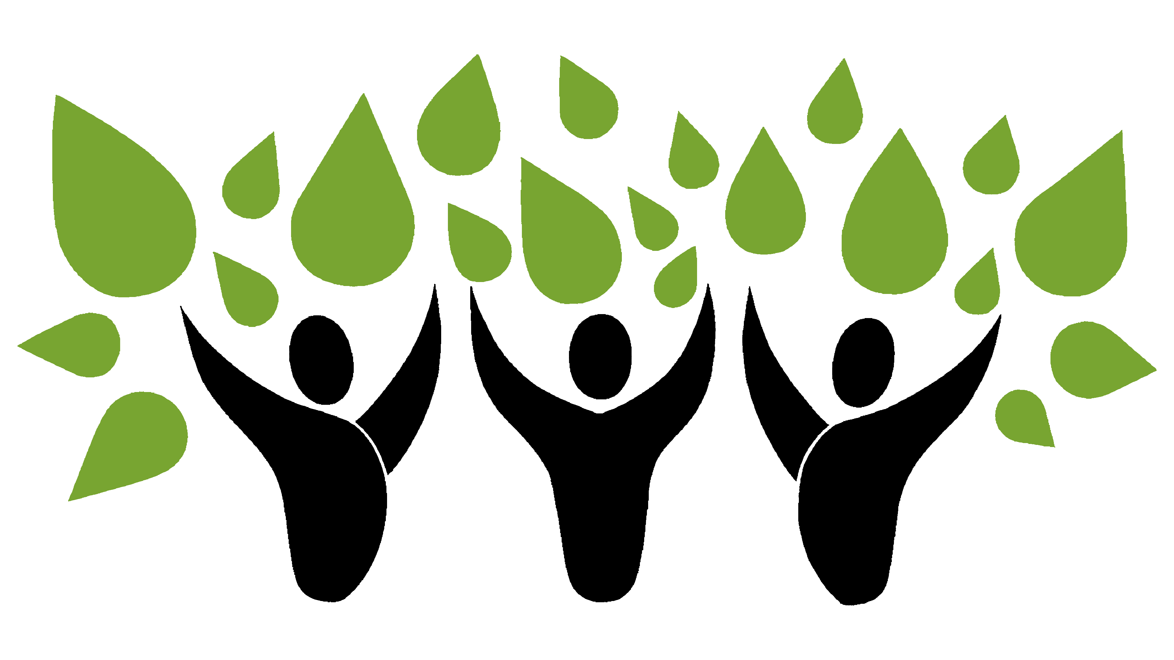
Visually, the logo was designed symmetrically and vertically. The upper part is a symbol, and the lower is the name. The symbol is simple and clear: three black figures with raised hands. Above them are green leaves that together form a tree, symbolizing development, growth, and “togetherness.” The leaves vary in size and shape; they are not identical, emphasizing diversity and naturalness.
Below is text arranged in two lines: at the top, the word “THRIVE” is written in large, geometric, strict, and solid black letters. The second word, “TOGETHER,” is slightly thinner and written in green. This word has a distinctive feature: the letters “O” and “G” intertwine to form rings. The symbol conveys unity and solidarity.
The colors were chosen logically: black represents stability, strength, and confidence. Green, a natural, harmonious, and calm hue, communicates the idea of living growth and positive interaction.
The Thrive Together logo represents support, unity, and growth for everyone, without exception.