


 Cava Logo PNG
The Cava logo represents the taste of Mediterranean life, where gastronomy intertwines with tradition, and food becomes a story told through aromas and textures. The restaurant seamlessly blends the coziness of home cooking with the pace of modern life, offering guests natural ingredients, time-tested recipes, and a sense of freedom of choice.
CAVA’s history began in 2006 when childhood friends Ted Xenohristos, Ike Grigoropoulos, and Dimitri Moschovitis opened their first Greek-inspired restaurant, Cava Mezze, in Rockville, Maryland. After early success in the Washington, DC, region, the founders introduced a line of retail spreads and sauces.
In 2011, recognizing the growth of the fast-casual market, the founders, joined by Brett Schulman, launched CAVA Grill in Bethesda, offering Mediterranean cuisine in a more casual, accessible format. Rapid expansion followed between 2012 and 2015, driven by significant investments, including a $45 million funding round in 2015.
From 2015 to 2017, the brand extended its reach to California and the East Coast, growing its retail division and increasing supermarket distribution. A strategic acquisition occurred in 2018 with the purchase of Zoe’s Kitchen for $300 million, adding over 200 locations nationwide.
Between 2019 and 2021, CAVA integrated Zoe’s Kitchen locations into its operations, strengthening market presence. In 2023, the company further solidified its industry position through an IPO on the New York Stock Exchange, securing additional funding.
By 2024, CAVA maintained steady growth, continuously adapting its menu while remaining committed to Mediterranean culinary traditions and high-quality ingredients.
Meaning and History
What is Cava?
This is a restaurant chain where guests can create their own dishes by choosing from a selection of fresh Mediterranean ingredients. The menu features a variety of vegetables, hummus, falafel, pita, and sauces inspired by Greek and Middle Eastern culinary traditions. Customers can mix and match a base, protein, and toppings to create their ideal combination. Spacious, modern interiors with bright accents enhance the atmosphere, while affordable prices make the restaurants popular with those who enjoy delicious, healthy food.
2011 – 2014
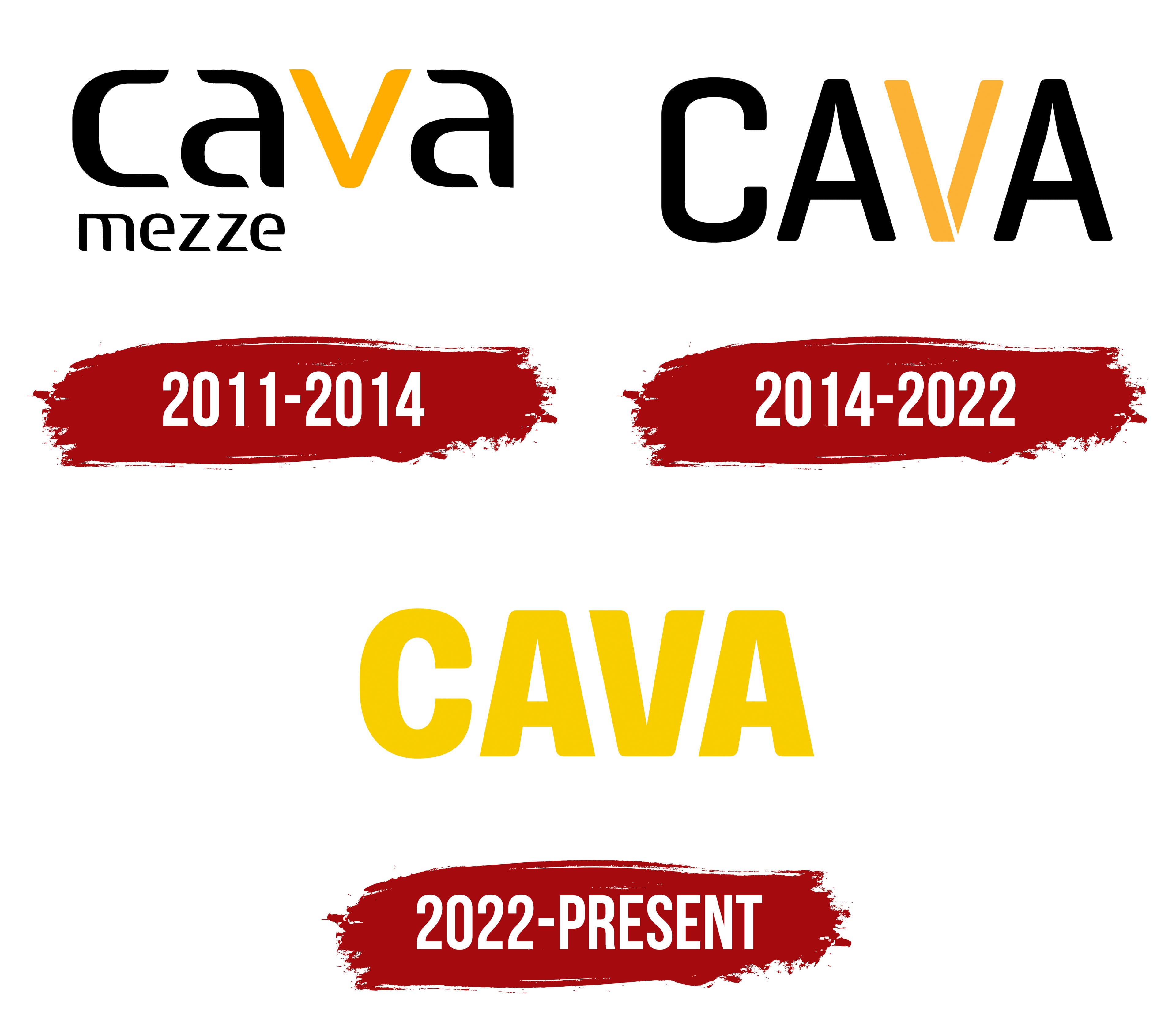
The appearance of the first fast-casual Cava restaurant in Bethesda in January 2011 was accompanied by the development of a new logo. The company abandoned the name “Cava Mezze Grill,” leaving only the short “Cava.” The word “mezze” remained in the logo but was shifted down to the left corner and written in a smaller size. The project was developed by the brand’s in-house studio, in collaboration with designer Igor Bastidas and Colophon Foundry, resulting in a distinct visual system that reflects the transition from a local restaurant to a future chain.
The logo’s design was concise and text-based. The main inscription was built on a custom grotesque typeface inspired by traditional restaurant signage in the region. The letters had rounded shapes with smooth lines and uniform stroke width. The proportions were balanced, and the entire word in lowercase looked modern and restrained. The additional word “mezze” matched the style of the main typeface but was thinner and smaller.
An important accent was placed on the color detail. The letter “v” in the word “Cava” was highlighted in a rich yellow color, while the other letters were black. The yellow tone was interpreted as a sign of energy, dynamism, and growth. It reflected the company’s transition to the scaling and network development stage. The black color of the other letters maintained a strict and traditional character, linking the new brand to the region’s heritage and cultural foundation.
The Cava logo marked a transitional stage, reflecting the company’s ambition to move beyond the local level while maintaining a balance between minimalism and respect for origins.
2014 – 2022
By uniting the restaurant direction and the fast casual format under the Cava brand, the company used the new logo as a key transition tool. The visual system was developed in collaboration with Gin Lane, a New York agency specializing in innovative retail and food service brands. Along with the redesign, the company planned a nationwide expansion and the development of digital services, including mobile apps and online ordering platforms.
The main difference in the new version was the reworked letter “V.” Its form was built from two segments that diverge and rejoin at the bottom, symbolizing the union of two areas of business: restaurant service and fast-casual. Visually, the element resembled a blooming bud or a stylized spice, metaphorically linking the logo to culinary diversity and the freshness of Mediterranean cuisine on which the Cava concept is based.
The color of the “V” symbol changed. The yellow accent of the previous version gave way to a saffron-orange shade. It is associated with the rich aromas of the Mediterranean region, emphasizing the products’ naturalness and the emotional connection to gastronomic culture.
The logo’s typographic base became more substantial. Unlike the previous light style, the new version was set in a massive grotesque with minimal letter spacing and written in capital letters. The font gained geometricity and density, conveying the brand’s reliability, solidity, and maturity, and was oriented toward further growth.
After the redesign, the “V” became an independent brand mark and has been used separately from the full name in mobile apps, on packaging, and in employee uniforms. The chain expanded its presence in the United States, acquired the sauce-making company Zoes Kitchen, and strengthened its position in the digital space. The visual concept was tied to business objectives, reflecting quality, technological advancement, and current principles of healthy eating. The new Cava logo became a symbol of the brand’s mature stage of development, marking the transition from a local chain to a national player.
2022 – today
Cava’s entry into the public market was accompanied by the creation of a new identity meant to emphasize the company’s status as a national player. The development was entrusted to the New York studio Mythology, known for its collaborations with Warby Parker, Glossier, and Everlane. The team was tasked with creating a universal style that would work equally well in digital services, restaurants, packaging, and marketing materials.
The logo is based on a specially developed grotesque typeface. The font is massive and wide, with a dense structure and slightly rounded contours. The letter spacing is tight, making the name appear as a monolithic block. The absence of additional decorative elements creates a strict, cohesive solution that visually conveys ideas of stability and consistent growth. All letters in the inscription are made in the same style, symbolizing the consolidation of all business directions into a single system.
The palette was redesigned and received its own name, “Cava Yellow.” The basis of the new style became a rich yellow color. It is associated with Mediterranean spices, citrus, and solar energy, emphasizing the brand’s origin and gastronomic profile. The new color extended to restaurant interiors, employee uniforms, digital media, and packaging, becoming the main element of the updated style.
The identity update was not limited to the logo. Along with it, the website, menu, and visual presentation on social media were changed. The company synchronized the restaurant updates with the strengthening of its digital infrastructure, which laid the foundation for the IPO in 2023.
The new Cava logo reflects the transition from a rapidly growing chain to a national-scale public institution. The form and color convey a technological orientation and adherence to modern principles of healthy eating. At the same time, the identity signifies the brand’s maturity and its trajectory toward long-term development.