


 QDOBA Logo PNG
The QDOBA logo symbolizes a restaurant chain known for its vibrant and lively cuisine. The key features are the original ingredient combination and improvisation, which give each dish a distinctive flavor and personality.
QDOBA began in Denver in 1995, when former Merrill Lynch investment banker Anthony Miller and Culinary Institute of America graduate Robert Hauser opened the first Zuma Fresh Mexican Grill restaurant. The restaurant used fresh ingredients and a fast-casual format, offering Mexican food with shorter service than a full-service restaurant.
Trademark disputes forced the business to change its name from Zuma to Z-Teca. A second naming conflict led to QDOBA in 1999, a coined name without a defined meaning. Franchising expanded during the early 2000s as the chain moved beyond Denver. The main rival was Chipotle Mexican Grill, founded in the same city in 1993 with a similar counter-service model and customizable dishes. The two Denver chains competed through the 2000s, though Chipotle eventually achieved greater scale and brand recognition.
In 2003, Jack in the Box acquired QDOBA and funded further restaurant openings, operational changes, and franchise development. The network grew to several hundred U.S. locations during the following 15 years. In 2018, the parent company sold QDOBA to Apollo Global Management for $305 million to concentrate resources on the core chain.
Butterfly Equity purchased QDOBA in 2022 and placed it in a restaurant portfolio with Lemonade and Modern Market Eatery. The group centered on brands using fresh ingredients and made-to-order meals. QDOBA continued serving customizable Mexican dishes, including large San Francisco-style burritos with varied fillings.
Meaning and History
What is QDOBA?
It is an American chain of Mexican restaurants where customers assemble their meals from their favorite ingredients, with no extra charge for popular additions, such as guacamole. The menu features burritos, bowls, and tacos, accompanied by a variety of sauces and toppings. The restaurants are popular for their bright style, large portions, and customizable dishes.
1997 – 2000
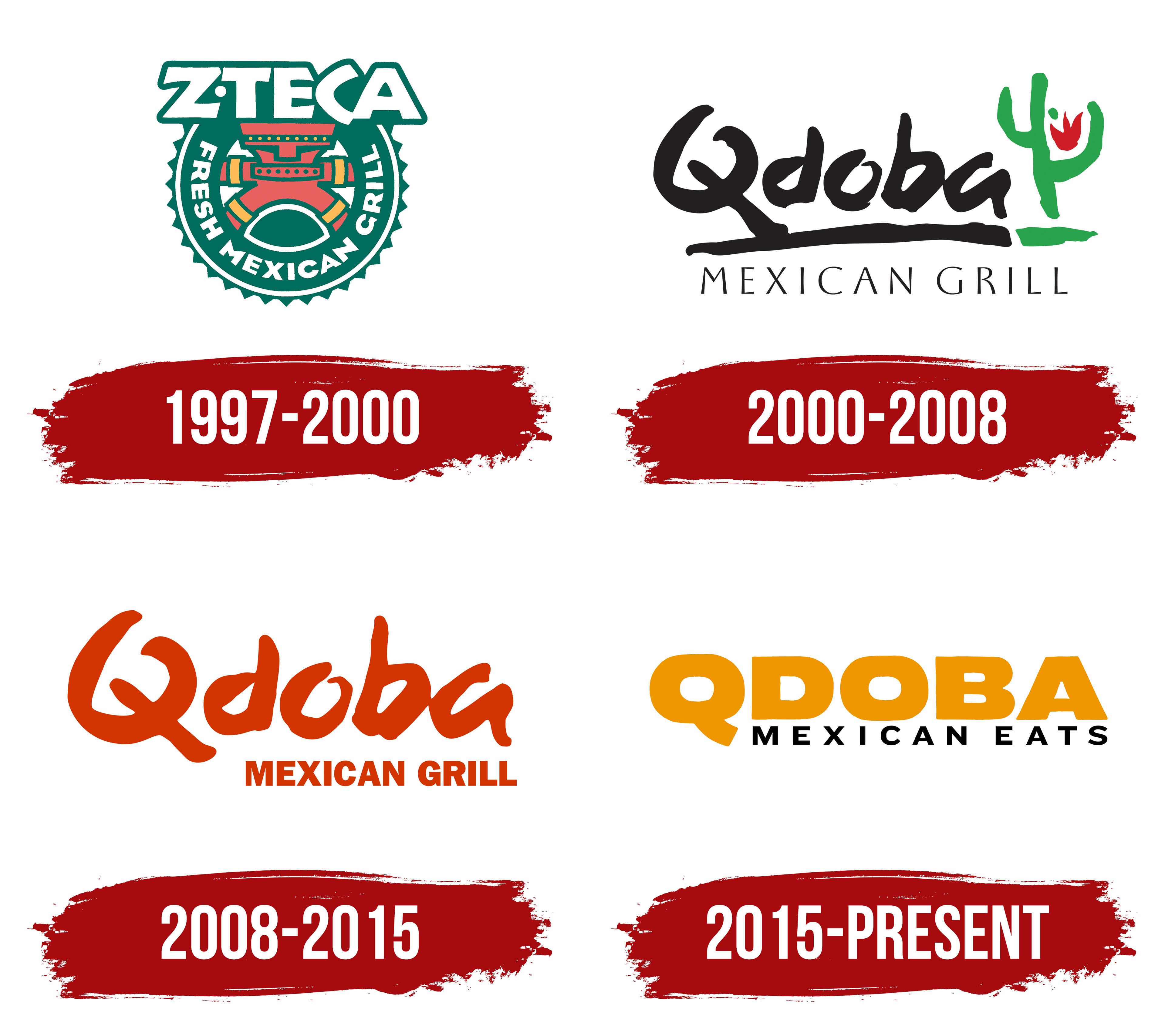
The Z-Teca Mexican Grill logo featured a colorful reference to Aztec cultural heritage. Designers drew inspiration from the ancient Mexican civilization to highlight the authenticity of the restaurant’s dishes. A dark green background symbolized Mexican jungles, reflecting the cuisine’s natural roots.
At the center was a stylized human figure reminiscent of Aztec temple drawings. Red and yellow were symbolic choices that represented life force, the sun, and warmth in Aztec culture.
The bold font consisted of white letters outlined in green, blending traditional Mexican style with contemporary dynamics. The name Z-Teca was designed to convey both the energy and historical depth of the brand.
The circular shape was surrounded by triangular elements, which emphasized the sun and visually integrated the logo. This design drew on Aztec calendars and time-related symbols, complementing the restaurant’s atmosphere.
Overall, the logo conveyed traditional recipes through ancient cultural imagery adapted to modern lifestyles.
2000 – 2008
The updated QDOBA Mexican Grill logo marked a significant rebranding in both name and design. The restaurant abandoned the Aztec style and adopted a casual appearance. The logo, designed by Heckler Associates, was recognized for its significant contribution to the restaurant brand’s development.
The word “Qdoba” appeared brush-painted, reflecting handmade preparation and home-cooked meals. The custom-designed typeface uniquely represented the chain’s culinary philosophy, inspired by Mexican culture.
Both the main name and the slogan “Mexican Grill” appeared in black, balanced by a green-and-red cactus symbol. The cactus linked the brand directly to Mexican heritage, representing endurance and traditional Mexican cooking.
Red on the cactus symbolized chili peppers, a key ingredient in Mexican cuisine, while green represented the fresh ingredients.
The dynamic, artistic logo style distinguished the brand from more formal Mexican restaurant identities, showcasing innovation and freedom, and aligning with the market shift in 2000.
2008 – 2015
In 2008, the company simplified its logo to better communicate its brand philosophy. The redesign, done by Prophet Studio, emphasized brand recognition through text.
Removing the cactus, the restaurant highlighted its name prominently, using the same distinctive handwritten typeface with larger, more confident letters.
The mahogany color of the logo represented warmth, hospitality, spice, and the richness of Mexican cuisine.
The phrase “Mexican Grill” appeared below in a strict geometric sans-serif font, closely resembling Helvetica Bold, which contrasts with the handwritten style above and balances the design, emphasizing the food quality.
The lack of graphical elements indicated a desire for brand recognition based purely on the name. The redesign made the brand appear modern, concise, and appealing to younger consumers who value quality and stylish simplicity.
2015 – today
When the QDOBA Mexican Eats restaurant chain decided to update its style, the agency Prophet, which had previously been responsible for the company’s image, was invited again. The new logo was intended to reflect the changes within the chain, namely the expansion of the menu and the transition to a modern approach to food presentation.
The main part of the logo consists of the word “QDOBA,” rendered in capital letters in a custom typeface that resembles the well-known Helvetica Black. The letterforms are bold and wide. The inscription is executed in an unusual shade of orange called “Dull Mandarin.” This color reflects the warmth, spices, and mood of Mexican cuisine, which underpins the restaurant’s menu.
The lower inscription “MEXICAN EATS” is set in black capital letters. The typeface is thinner and more restrained, built on a geometric sans-serif structure. The spacing between the letters is increased.
The change in the slogan from “Mexican Grill” to “Mexican Eats” emphasized the brand’s desire to offer a variety of dishes rather than focus exclusively on grilling. The new logo turned out simple, bright, and balanced. It demonstrates an updated design format that combines Mexican culinary traditions with a modern, accessible presentation style.
Font and Colors
The main logo font is based on the bold, technological Integral CF Heavy typeface, slightly modified to feature softer outlines and avoid sharp serifs for a smoother appearance. The secondary text, “Mexican Eats,” uses Sweet Sans Heavy Small Caps, a strict style that balances the main lettering.
The color palette centers on Muted Mandarin, a warm orange chosen to evoke Mexican spices. The additional black color complements the mandarin hue, emphasizing the dynamic identity. This palette conveys the vibrant flavors of Mexican dishes, highlighted by simple styling.