


CD PROJEKT RED unveiled an updated fiery bird emblem at gamescom on August 25, 2026. The Polish studio behind The Witcher and Cyberpunk worked with Mucho on the project. The design was simplified for international communications and use on screens, in print, and on physical objects at different sizes.
The bird retains its left-facing head, rounded chest, feet, and tall fan of pointed feathers. The previous version combined a red body with black details around the eye, beak, and wing. The new silhouette uses a single color, with cutouts that separate internal sections and reveal the background. An angular mask around the eye and a separate notch at the beak replace the head’s finer details.
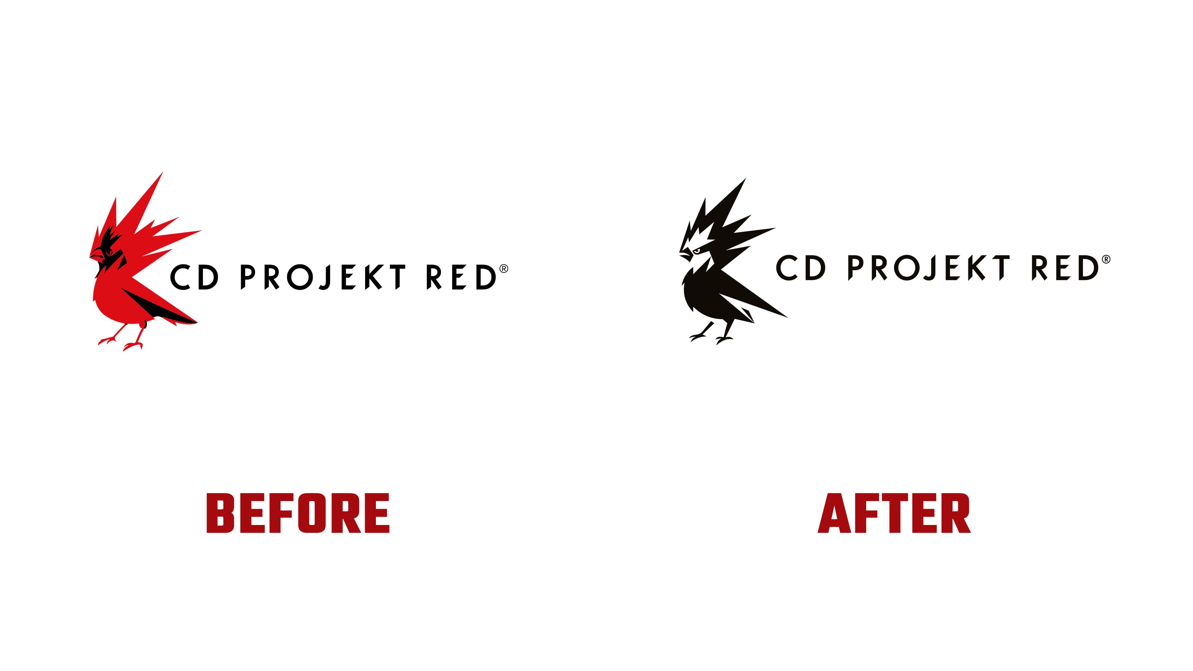
The feet are thicker, and the long feathers behind the head form several large points. At the bottom, two pointed shapes replace the elongated wing with its black inset. These larger details help preserve the bird’s appearance at smaller sizes. The system includes red and black versions, light- and dark-background treatments, and horizontal and vertical arrangements with the name.
The bird’s history began with REDbird, introduced on May 14, 2014, ahead of The Witcher 3. At the time, it was described as a red cardinal and associated with the studio’s independence. Studio head Adam Badowski added a reference to the raróg, a fiery creature from Slavic folklore said to bring luck and prosperity. Fire represented strength, passion, and creativity. In materials for the 2026 update, the company uses the name Raróg.

Red was part of the brand’s history before the bird. CD PROJEKT RED was established in 2002, and the RED name connects to the team’s first workplace in Łódź. The city’s red-brick industrial architecture influenced the name and early logo. In the new identity, red covers large areas of the background. Mucho’s presentation places a black bird and wordmark against a red field.
In the vertical arrangement, CD PROJEKT RED sits beneath the emblem on one line. The widely spaced uppercase sans-serif letters sit on a single line. Rounded “C,” “D,” and “O” forms combine with diagonal cuts in certain strokes of the “P,” “R,” “J,” “E,” “K,” and “T.” The open letter spacing complements the bird’s compact silhouette and separates the name from the illustration.
The identity appeared at the studio’s business booth at gamescom 2026. Red surfaces carried the emblem’s color into the meeting and discussion space.