 CD Projekt Logo PNG
Video game development involves creating storylines, characters, and game worlds that hold players’ attention for extended periods. Projects require teams of programmers, artists, and writers working together in a unified production process. The CD Projekt logo is associated with a company that creates video games emphasizing story, open worlds, and player interaction with the narrative.
Marcin Iwiński and Michał Kiciński founded CD Projekt in Warsaw in May 1994. In the 1990s, the company imported and localized Western computer games. This made the products accessible to the Polish audience. By 1998, the company had become a leading distributor and collaborated with Blizzard, Interplay, and BioWare.
In 2002, the founders of CD Projekt RED established the company to develop their own games. The first project was an adaptation of Andrzej Sapkowski’s novels about the witcher Geralt. Development lasted five years. In October 2007, they released The Witcher. It received critical acclaim and sold more than one million copies in its first year.
In 2008, the company released an updated version, The Witcher Enhanced Edition. In 2011, it presented The Witcher 2: Assassins of Kings. The game was a breakthrough. In 2012, it was released on Xbox 360, which brought the studio international recognition.
In 2010, the company launched the digital platform GOG.com. It focused on selling DRM-free games. In 2012, CD Projekt RED began developing The Witcher 3: Wild Hunt. The game was released in May 2015 and became a global phenomenon. Sales exceeded 50 million copies. The expansions Hearts of Stone and Blood and Wine strengthened the studio’s market position.
In 2012, CD Projekt announced the game Cyberpunk 2077. After eight years of development, it was released on December 10, 2020. Technical issues accompanied the launch. This caused a reputational crisis and a decline in the company’s stock price.
In 2021 and 2022, the company released a series of updates that stabilized the game’s performance. In February 2023, the major expansion Phantom Liberty was released. It received positive reviews and helped partially restore audience trust.
In 2022, the company announced the start of development of a new game in The Witcher universe on Unreal Engine 5.
CD Projekt remains one of Europe’s largest independent game companies. Its structure includes the divisions CD Projekt RED and GOG.com. It continues to develop The Witcher and Cyberpunk franchises.
Meaning and History
What is CD Projekt?
A Polish holding company engaged in the development, publishing, and digital distribution of video games. It is known for the Witcher and Cyberpunk 2077 series, as well as for the GOG.com platform, which distributes DRM-free games. The company began operations in the 1990s by localizing Western projects, including Baldur’s Gate, with voice acting and adaptations for Polish audiences. Later, the company founded a studio that released games based on Andrzej Sapkowski’s works. The Witcher trilogy brought international recognition and made the company a leader in the European gaming industry. Cyberpunk 2077’s success grew after updates, the release of an anime on Netflix, and the announcement of Project Orion.
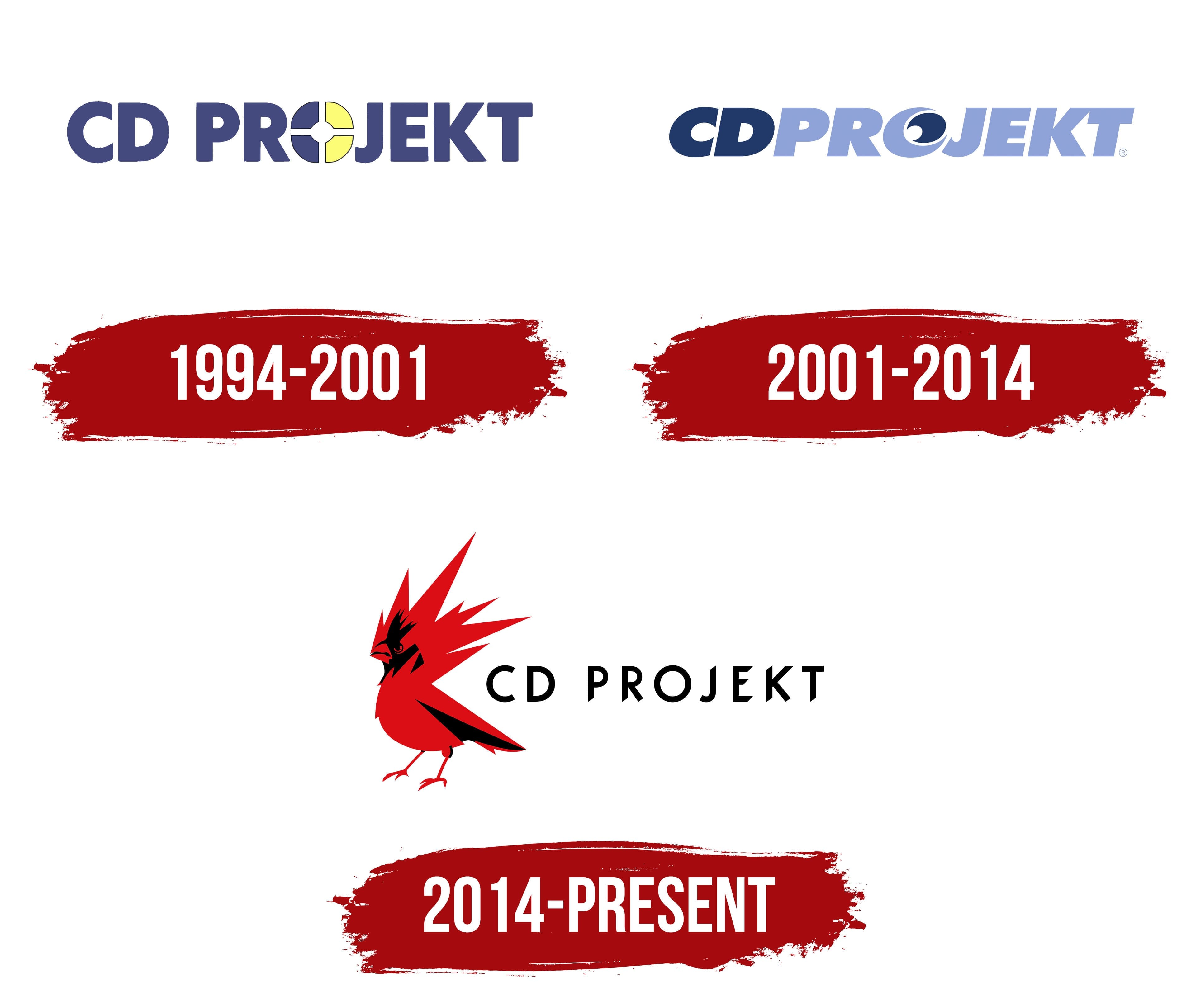
1994 – 2001

Marcin Iwiński and Michał Kiciński established CD Projekt in Warsaw in May 1994. Before incorporating the company, the founders sold computer games. Their new business focused on legally importing discs from the United States and distributing international releases in Poland. Local customers received licensed games, while publishers worked with a Polish partner.
CD Projekt later began preparing Polish editions of international games. The company translated text and recorded voice-overs. Baldur’s Gate was among its major localization projects. Game adaptation expanded a business that had previously focused primarily on importing and selling discs.
The CD Projekt name reflected the young company’s business. CD referred to compact discs, which served as a medium for computer software. Projekt corresponded with the English word “project,” while the “k” reflected Polish spelling. The name combined the product format with work on game releases for the local market.
The first logo consisted of CD and PROJEKT. The name appeared in uppercase sans-serif letters. Vertical and horizontal strokes were equally thick, while dense geometric forms created a heavy line. The typeface resembled Impact and Franklin Gothic Heavy. The source materials do not identify its exact name.
A stylized disc replaced the “O” in PROJEKT. Intersecting white lines divided the circle into 4 curved sections. A small rounded opening appeared at the center. Two sections were blue-purple, while the others were light yellow with a lemon undertone.
Rich blue-purple covered the letters and half of the disc. The light yellow sections distinguished the “O” from the surrounding characters. They created a bright area in the middle of the word. White lines separated the colored sections and kept their boundaries tight.
The circle resembled the surface of a CD-ROM, though its silhouette resembled a target. Its position within the name connected the figure with compact discs, which formed the foundation of the business. The disc kept PROJEKT readable and communicated the origin of CD through the image of the storage medium.
The early logo represented the company during its period of importing, distributing, and localizing computer games. The CD Projekt RED studio was established within the group in 2002 to develop original projects. The Witcher became the studio’s first major game.
2001 – 2014

CD Projekt introduced a redesigned wordmark in 2001. The combined CDPROJEKT spelling replaced the separate CD PROJEKT form. The new version appeared before CD Projekt RED was created. It accompanied the company’s expansion from importing and localizing international games into developing original projects.
All letters were joined into a dense horizontal line. The characters touched or were divided by narrow spaces, turning CD and PROJEKT into a unified block. The compact arrangement shortened the name while preserving the connection between compact discs and the Polish word Projekt. Color marked the boundary between the 2 sections.
The opening “C” and “D” used a rich dark blue. Beginning with “P,” the letters changed to light blue with a purple undertone. The color transition ran from left to right, uniting both sections. The dark letters represented CD, while the lighter section corresponded with PROJEKT.
The name appeared in heavy uppercase sans-serif letters. The characters leaned to the right and had extended proportions and dense strokes. The style resembled Eurostile Extended Bold Italic and an italic version of Bank Gothic. The diagonal position distinguished the 2001 logo from the earlier version with upright letters.
The “O” changed the most. A rounded figure with a spiral-like interior replaced the circle divided into 4 colored sections. Its outer area used the same light blue as PROJEKT. A dark blue crescent appeared inside, separated from the edge by a white arc.
The circle, crescent, and white gap created several nested layers. The light arc followed the rounded contour, separating the inner and outer sections. The dark crescent connected the “O” with CD, while the light blue shell continued the color of PROJEKT. The 2-color division turned the letter into a link between the name’s 2 parts.
The rounded “O” retained a reference to the CD-ROM associated with the company’s early operations. CD Projekt began by distributing games on compact discs, so the storage medium remained present in the name. The spiral-like design updated the earlier disc form and distinguished the “O” from the other geometric letters.
The group established CD Projekt RED in 2002 to develop video games. The CDPROJEKT logo accompanied the studio’s creation and the start of work on The Witcher. The compact wordmark united the group’s historical name as game development became a new line of business.
A series of corporate changes followed the transaction with Optimus S.A. The public company became CD Projekt RED S.A. in 2011. The group returned to the historical CD PROJEKT form in 2012, while the distribution division became CDP.pl. The blue wordmark retained its established appearance throughout the changes.
2014 – today
CD PROJEKT introduced a new corporate identity featuring a red-and-black bird on May 14, 2014. It replaced the disc-shaped “O” from the previous logo. It connected the parent company with the CD Projekt RED studio. Within the group, the emblem was named REDbird. The update covered corporate materials and The Witcher 3: Wild Hunt.
CD PROJEKT had previously used a slanted blue wordmark with a spiral figure inside the “O.” The 2014 redesign shifted the primary theme from compact discs to game development. The bird represented RED, the group’s Polish origins, and the team’s creative energy.
The northern cardinal inspired REDbird. The company associated the bird with freedom and courage. Red represented energy, enthusiasm for game development, and the team’s inner fire. Studio head Adam Badowski expanded the idea by referring to the Raróg, a mythical firebird from Slavic tradition and a harbinger of good fortune.
The combination of the cardinal and Raróg joined a natural image with a cultural reference. Red supported the CD Projekt RED name, while the mythological motif recalled the company’s Polish and Slavic roots. The emblem represented the entire group and remained independent of the characters or narratives from individual games.
The bird appears in profile, facing left. A pointed beak, angular head, and elongated body create a concentrated predatory silhouette. Thin legs end in claws. Sharp edges along the breast and wing add tension, while the body appears poised for action.
REDbird consists of red planes with triangular ends. Long feathers from the crest, wing, and tail extend upward and to the right, resembling a burst of flame. Fragments of different lengths form an uneven outer edge. The interior geometry preserves the bird’s complete silhouette.
Black areas form the beak, eye, sections of the head, breast, wing, and legs. They separate the red planes and reveal the figure’s structure through color. The combination of sharp red sections and dark inserts unites the appearance of a cardinal with the image of a mythical firebird.
CD PROJEKT appears to the right of REDbird. The name uses thin uppercase sans-serif letters. The characters are equal in height, upright, and widely spaced. The style resembles Futura. Black lettering repeats the bird’s dark areas, while open spaces between the letters balance the dense emblem.
CD PROJEKT RED uses a related version featuring the same bird and the word RED. The shared emblem connects the parent organization with the game studio, while the wordmark identifies the specific corporate name. The system supports different applications while preserving a unified image for the group.
The group sold GOG in late 2025 and focused on developing and publishing games through CD PROJEKT RED. Shareholders approved corporate changes in June 2026. Industry publications reported that the parent organization was adopting the CD PROJEKT RED name to create a single international identity for the game development division. REDbird remained part of the active identity and continued to appear with the CD PROJEKT RED name.