


![]() Blizzard Logo PNG
Blizzard Logo PNG
For this game developer, the name serves as the basis for the emblem. But the letters in the emblem are not ordinary but trembling. The shaky letter effect has been used for a long time: the company chose the Blizzard logo with torn glyphs almost at the beginning of its career. And since then, it has stayed within the original design because it allows the concept, plot, and identity to tie together.
On February 8, 1991, UCLA graduates Allen Adham, Frank Pearce, and Mike Morhaime founded Silicon & Synapse in Irvine. Each invested about $10,000, and Morhaime borrowed his share from his grandmother. During its first years, the studio mainly survived by porting games, including The Lord of the Rings and Battle Chess II, to Amiga and Windows.
At the same time, the team began making original titles. Rock N’ Roll Racing and The Lost Vikings helped the young studio gain a stronger name among console players. In early 1994, Davidson & Associates bought the company for $6.75 million. After Chaos Studios proved unavailable, the studio was renamed Blizzard Entertainment.
In November 1994, Blizzard released Warcraft: Orcs & Humans, followed by Warcraft II: Tides of Darkness in 1995. In 1996, the company bought Condor Games, renamed it Blizzard North, and released Diablo with Battle.net, an early free online service for multiplayer gaming.
StarCraft arrived in March 1998, sold about 3 million copies in its first 3 months, and became a major esports title in South Korea. Diablo II followed in 2000 and became one of the defining hack-and-slash games of its era. World of Warcraft launched in 2004, sold 240,000 copies in North America on its first day, and reached 12 million subscribers by 2010. After the 2008 merger of Vivendi Games and Activision, Blizzard released StarCraft II, Diablo III, Hearthstone, and Overwatch. Mike Morhaime stepped down in 2018, and in 2023, Microsoft acquired Activision Blizzard for $68.7 billion.
Meaning and History
![]()
The history of this corporation began the moment three graduates of the University of Los Angeles received their diplomas. Friends decided to open a joint business, and each invested about $10,000. Morhaime borrowed them from his grandmother. The result was a company focused on designing and creating video games for other studios. In 1993, they developed The Lost Vikings and Rock n’ Roll Racing.
The guys chose the name Silicon & Synapse specifically to emphasize their concept. From their point of view, the word “silicon” should refer to the building block of the computer, and the second part (“synapse”), the building block of the brain. But in 1993, Adham said this was a bad option and that it should be changed, as their company was confused about whether to produce silicon for the chemical industry or silicone for the breast implant industry. This is how Chaos Studios was born, embodying the unsystematic development processes.
Then the service repeatedly passed from hand to hand until it finally became the property of Activision Blizzard. However, Microsoft Corporation recently announced its intention to acquire a well-known computer game developer to become its sole publisher. The purchase process was supposed to start in January 2022 and be completed in mid-2023. So far, nothing is known about the preservation of identity, but the company has accumulated five logos over its entire existence. One of them was designed by Stu Rose.
What is Blizzard?
Blizzard is an American corporation whose full name is Blizzard Entertainment. It is engaged in developing and releasing video games. Its most famous product is Warcraft. The company appeared in 1991 and, at first, was called Silicon & Synapse. Later, it was replaced by the Chaos Studios version (in 1993), and a year later, it received its current name and became a subsidiary of Activision Blizzard. Its founders are Allen Adham, Frank Pearce, and Michael Morhaime. The head office is located in Irvine, California.
1991 – 1994
![]()
The debut emblem featured an extraordinary character, a brain in glasses with folded arms and crossed legs. He looked to the left. Next to it (on the right) was the company’s name. The phrase “Silicon & Synaps” spanned two lines and resembled handwritten lettering, except that the letters were vertical rather than diagonal. The background was a gray rectangle formed from light and dark shades, scattered in chaotic spots.
1994
![]()
The rebrand updated the visual identity. Its result was a black-and-red rectangle. The dark background with bloody lettering and bottom lighting evoked a stunning, mystique-like effect reminiscent of computer games. The military strategy and battle genre fits perfectly into this concept. The first part of the name (“Chaos”) was located in the upper tier and occupied a central place. It was a red inscription with “trembling” letters. This impression was formed by the wavy lines used to make the symbols. The second fragment (“Studios”) was at the bottom, was painted blue, and typed in strict sans-serif characters.
1994 – 2010
![]()
After rebranding as Blizzard Entertainment, the video game developer received a new logo. The designers have retained the old style: “trembling” letters with uneven edges, characters of varying heights, a dark background, and a classic inscription at the bottom, set in capital letters. But there was also a significant difference. So, the authors depicted the emblem horizontally and not vertically, as in the previous version, and chose blue instead of red. They circled everything with a frame of the same color.
2010 – today
![]()
The next option was a light logo without rectangular frames. The first word of the company name is sky blue, highlighted in the middle. A whitish highlight appears from under the inscription, further brightening the letters. The second part consists of capital characters, white with a black border.
2015 – today
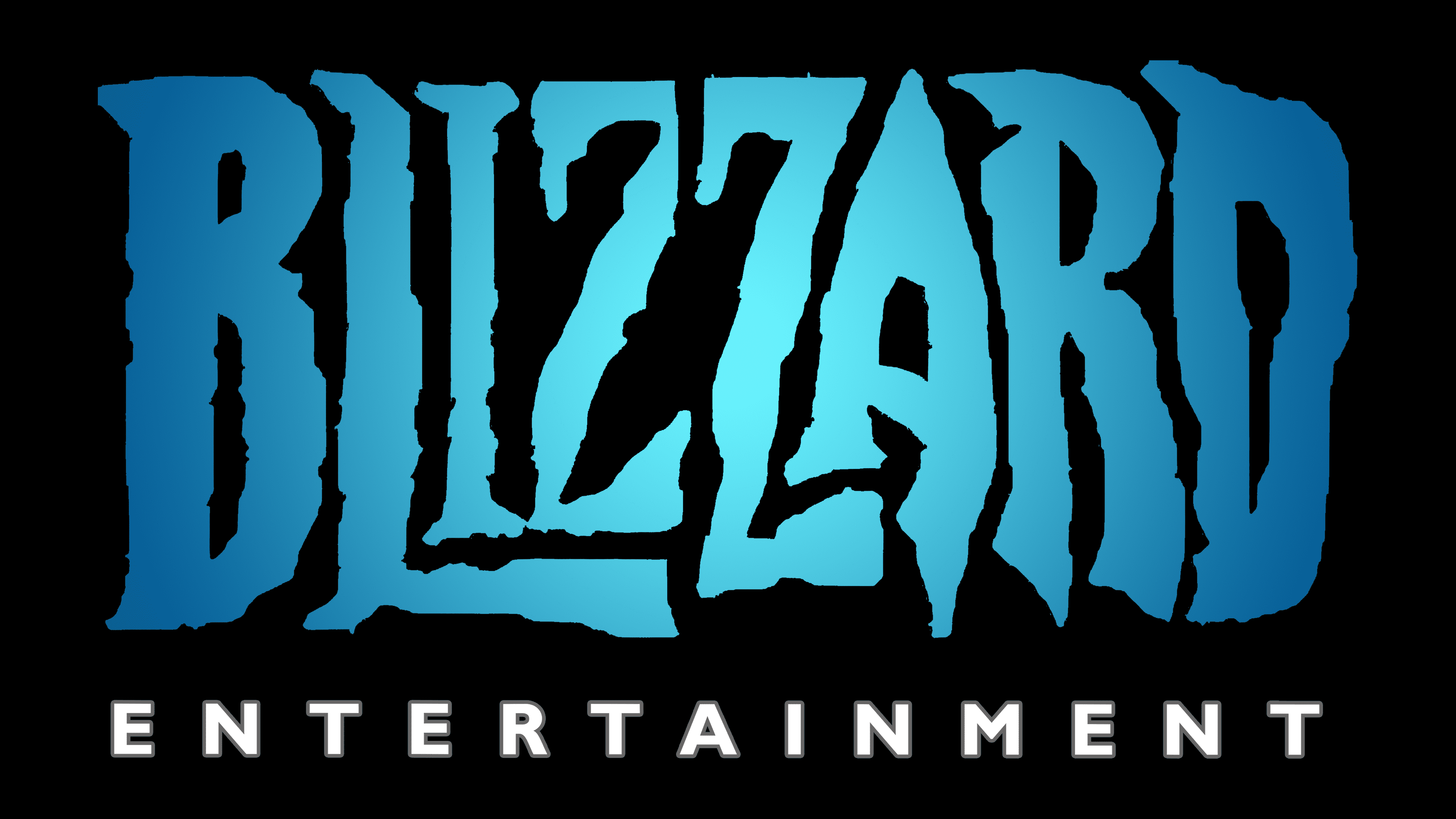
![]()
The text character is used, with only minor changes, almost completely corresponding to the version adopted in 2010. They differ in color: in this logo, the letters are much lighter than in the previous one and have a blue tint with gradient transitions. The lower inscription is painted in the same tone as the upper one but without sharp tint variations. It is strict, smooth, and centered. Although there are no frames, the logo’s hypothetical rectangular shape is preserved.
Font and Colors
Blizzard’s visual identity has evolved along with its name. It was constantly modified to match the thematic focus of video games, attracting attention with non-standard letterforms in various sizes. This is the main highlight of the corporate identity.
The basic set is individual. These are drawn letters of a chaotic wave-like shape with a “trembling” effect. They have different sizes and different leg heights, which makes them recognizable. While “Blizzard” is in the unique Custom font, “Entertainment” is in Gill Sans Bold.
The corporate palette includes bright colors that stand out clearly on both dark and light backgrounds. Among them are red and several shades of blue: cobalt, sky blue, and neutral blue. The very first logo uses two types of cold gray.