Château Mercier updated its image, focusing on the past. The château in Sierre was built between 1906 and 1908. For a long time, it was perceived as a historic place with a museum-like tone. After Veryx’s work, the image changed. It now looks like a venue for culture, leisure, meetings, seminars, weddings, receptions, and culinary events.
The main change is visible in the logo. The previous mark depicted the château through the building’s silhouette and classic lettering. It resembled the emblem of a foundation or institution focused on preserving heritage. The new version shifts the focus from the facade to the word MERCIER. The brand now reads like the name of a place connected to history and contemporary events.
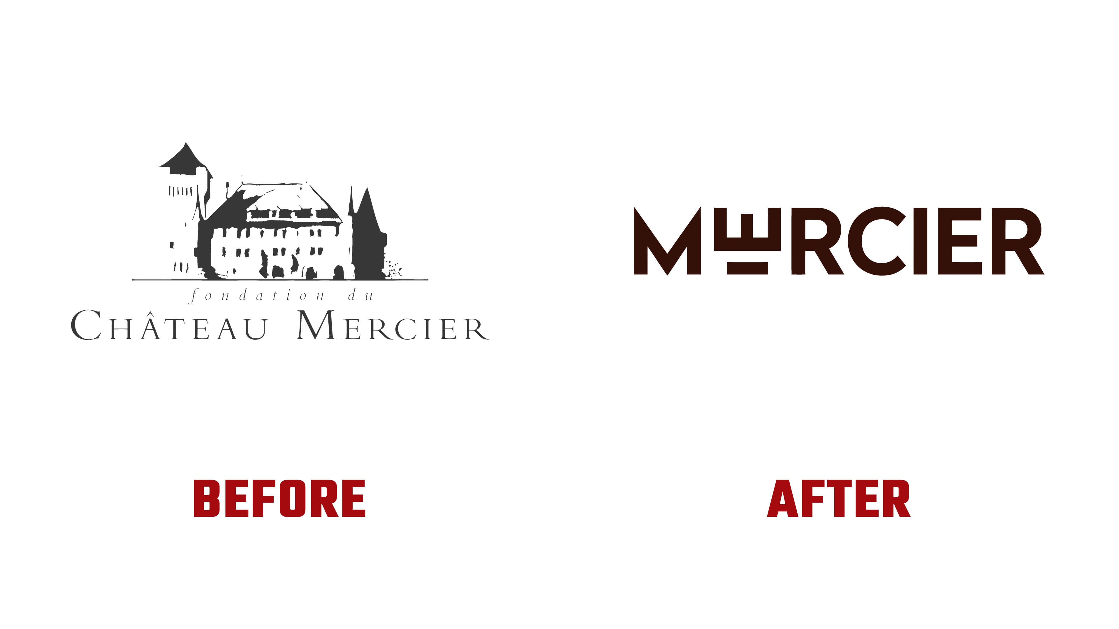
The MERCIER wordmark received a more personal look. The memorable part of the mark is tied to the unusual treatment of the letter “E.” Its style refers to the château’s architecture, arches, walls, facade, and interior details. The logo takes specific motifs from the building and transfers them into a typographic form.
The update carries an Art Deco influence. For Château Mercier, it fits the period when the building was constructed and helps keep the connection to the past in a lighter form. The dark burgundy background and light lettering change the overall impression of the brand. It moved closer to culture, hospitality, wine, gastronomy, and intimate events.

The redesign reduces the distance between the château and its visitors. Château Mercier looks like a place for work, meetings, celebrations, events, and rest. Its historic status remains, while the image became more open and warmer. The new mark helps the foundation update the château’s public image and present it as an open cultural address.