 China Eastern Airlines Logo PNG
The logo of China Eastern Airlines represents the airline’s role as a major connector in Asia and globally. Highlighting its origins in Shanghai, this emblem underscores the airline’s crucial function in linking China’s eastern borders with numerous international destinations. It symbolizes a gateway between the East and the rest of the world, reflecting Shanghai’s dynamic nature as a cosmopolitan hub of trade and culture.
China Eastern Airlines: Brand overview
China Eastern Airlines, one of the leading carriers in China, is based in Shanghai, with Shanghai Pudong International Airport serving as its principal hub. The airline is significant in China’s aviation sector, ranking second to Air China in fleet size, the number of passengers transported, and overall revenue.
China Eastern Airlines’ fleet is impressively large, boasting over 600 planes. These include aircraft models from Airbus and Boeing, such as the A320, A321, A330, B737, and B777. By 2022, the airline managed an expansive network of almost 1,000 domestic and international routes, reaching over 210 locations in Asia, Europe, North America, and Oceania.
China Eastern Airlines’ services are not restricted to passenger transportation alone; it also offers cargo transportation. The SkyTeam airline alliance counts the airline among its members. Major stakeholders of the airline include the Chinese government through state-owned entities like the China Eastern Air Holding Company and international investors like Delta AirLines.
The inception of China Eastern Airlines dates back to 1988, with its headquarters remaining in Shanghai ever since. As of 2021, the airline employed approximately 100,000 staff members. The airline has earned a reputation for being among China’s safest and most profitable. However, it is acknowledged that its international brand recognition and service quality do not match that of leading Gulf carriers or prominent Asian airlines such as Singapore Airlines.
Meaning and History
What is China Eastern Airlines?
It is a major Chinese airline headquartered in Shanghai. It operates a network of domestic and international flights connecting China to destinations in Asia, Europe, North America, and Australia. Known for its comprehensive services, it provides various classes of service, including economy, business, and first class, focusing on passenger comfort and satisfaction. The airline is a member of SkyTeam, which expands its global reach through partnerships with other international airlines. The fleet is known for its modern fleet of seaplanes, providing reliable and efficient air transportation.
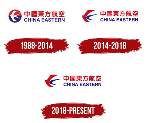
1988 – 2014
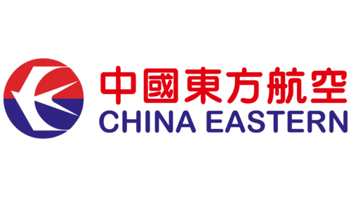
From 1988 to 2014, China Eastern Airlines’ logo featured blue and red, representing the sea and sky. These colors became a permanent part of the company’s brand identity, reflecting its core principles and values.
The logo centers around a circle, symbolizing perfection and wholeness in various global cultures. This emblem highlights the airline’s commitment to excellent service, modern technology, and improved aircraft quality. The circle represents the Sun, the main celestial body associated with leadership and prosperity, emphasizing the company’s dominant position in the aviation industry.
The logo is divided into two halves: red on the top and blue on the bottom. The red half represents speed and dynamism, essential attributes for flights in the skies, where the company strives to excel. The blue half symbolizes the ocean over which China Eastern Airlines’ planes operate, highlighting its global presence and extensive network of routes.
The airplane in the logo is depicted as a stylized white seagull, seamlessly blending with the sea and sky elements. This design symbolizes a modern airliner’s lightness, speed, and elegance.
Additional logo elements include red ideographs adjacent to the red half and a blue English inscription next to the blue half. This arrangement reinforces the color division and symbolizes the company’s focus on serving China’s domestic market and international destinations. The prominence of the Chinese inscription emphasizes respect for the homeland and focuses on serving the nation’s residents, thereby accentuating the company’s national identity in a global context.
2014 – 2018
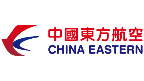
The company’s logo was updated to make it lighter and airier. The seagull, a key design element, is now depicted as soaring freely, extending beyond the circle. This represents the pursuit of freedom and overcoming limitations, embodying the spirit of the company and its drive for excellence and progress in the aviation industry.
The seagull’s wings and tail are red and blue, making the image vibrant and memorable while representing the company’s corporate colors. These colors symbolize passion and professionalism, embodying the company’s technical capabilities and customer focus. Red is associated with energy and passion for work, while blue signifies professionalism and the pursuit of perfection.
The design’s dynamic nature is highlighted by the depiction of the seagull moving at high speed, similar to the speed of the company’s airplanes. This element emphasizes the timeliness and efficiency of the airline’s services to its passengers.
The emblem’s text, executed in red and blue, symbolizes the merging of the emotional and rational, reflecting a balance between a human approach to passengers and strict logic in technical support and management. This combination highlights the global nature of the company, serving both Western and Eastern routes, offering passengers comfort and convenience on board with excellent technical performance of the aircraft.
An interesting design feature is the bird’s wings, which resemble the letter “C,” the first letter of the company’s name, enhancing brand recognition.
2018 – today
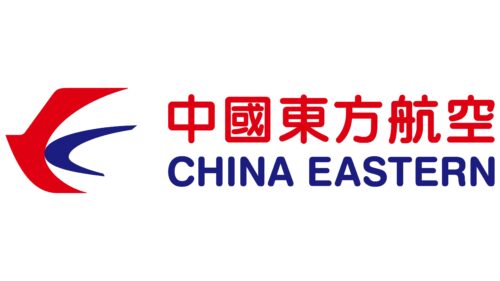
In 2018, the company decided to redesign its logo further, reflecting changes in its strategic brand positioning. The main focus was on strengthening the company’s identity in the Chinese domestic market, visually expressed through the change in the color of the bird’s wings and the size of the English inscription.
The bird’s wings, a key logo element, became lighter. This color change symbolizes renewal and enlightenment, emphasizing the company’s agility and adaptability to changing market conditions. The lighter wings symbolize purification and a new beginning, part of the company’s effort to enhance its reputation and brand perception among domestic consumers.
The English inscription in the logo was reduced in size, reflecting the decision to focus on the brand’s success in China. This change emphasizes that while the company continues to serve international markets, its main focus and primary achievements are tied to its home region. The reduction in the size of the English inscription indicates that outside China, the carrier has not yet achieved the same level of popularity and recognition as within the country.
