


![]() Chuck E. Cheese Logo PNG
Chuck E. Cheese Logo PNG
The cartoon character of the emblem offers fun and a rich entertainment program. The sign encrypts a large selection of delicious food and good cheer. “Everyone will walk away from us fed and satisfied,” the revived Chuck E. Cheese logo informs.
Chuck E. Cheese began in 1977, when Nolan Bushnell, co-founder of Atari, opened the first location in San Jose, California. The idea combined pizza, arcade games, cartoons, and family entertainment under one roof. The brand’s main character was Chuck E. Cheese, a mouse mascot built for a restaurant where children could play while parents stayed for food. The format aligned with the late-1970s arcade boom and gave the chain a clear place in American family dining.
In the 1980s, Chuck E. Cheese expanded quickly, but growth brought financial pressure and strong competition from ShowBiz Pizza Place. In 1984, the company went through bankruptcy, after which ShowBiz Pizza acquired Chuck E. Cheese’s and kept the stronger name.
The new owner updated the restaurants with newer games, redesigned interiors, and revised animatronic shows. Over time, Chuck E. Cheese became known for its mix of pizza, birthday parties, arcade games, and robotic stage entertainment. By the 2000s, the chain began modernizing its model. Card-based payment systems gradually replaced tokens and paper tickets, and the menu added lighter options.
The brand still faced falling traffic, tougher competition, and safety concerns. In 2020, the COVID-19 pandemic forced the parent company, CEC Entertainment, into bankruptcy again and led to store closures. Even after that setback, Chuck E. Cheese continued operating, with more than 600 locations worldwide and a business model still centered on family visits, games, food, and children’s parties.
Meaning and History
![]()
Developing a business concept from a simple family restaurant to an entire entertainment chain meant improving the quality of service and forming a new and improved position in the market, offering what people expect and strive for. The surge in product demand and the idea of a versatile family vacation resulted from the management team’s detailed work and a well-written business plan.
What is Chuck E. Cheese?
Chuck E. Cheese is a chain of restaurants and family entertainment centers. The company is headquartered in Texas, with locations in America, India, and the Middle East. In each institution, you can eat deliciously, play, and watch a show.
1977 – 1981
![]()
The first logo was born in San Jose (California), even though the first establishment opened in 1977. The logo is a plate with a rodent in the middle; however, it is difficult to determine whether it is a mouse or a rat. Nevertheless, this is the hero around whom the compositional line will be built in subsequent logo versions. The red background, outlined with yellow dots, and the yellow letters reading “Chuck E. Cheese” were supported at the bottom by an enlarged blue insert reading “Pizza Time Theater.” Interestingly, the institution’s name is tempting, but it is not yet clear what is offered in the “Theater.” The organizers wanted to maintain the intrigue and, with a joke, described the restaurant as a place where pizzas measure time.
1981 – 1984
![]()
Another commercial version, reminiscent of the film’s opening, was used for advertising. This is a mouse in a red circle, below the inscription in italics and capital letters “Chuck E. Cheese,” and below the phrase with capital letters, which was already there. The combination of the two fonts and the red-and-orange edging of the black logo plate is both visible and simple. Nevertheless, it looks beautiful, as if to say this is a place for great pastimes; performances and incredible stories await visitors.
1984 – 1989
![]()
The defining inscription “Pizza Time Theater” was removed during this period, leaving only the brand’s name. Visually, there appears to be no difference in the logo’s font or design; nevertheless, the overall image appears stretched and scaled. The rodent hero does not change; it remains a favorite mascot, featured in advertising.
1989 – 1993
![]()
At this time, the logo underwent decisive changes, reflecting a new era in the brand’s development. The logo has changed a lot:
- A green outline
- A white background
- A mouse with a white fill in a red and yellow circle
- The three words “ChuckECheese’s Pizza” startling a new concept
It felt empty because of the white background, and the mouse, outlined in thin green, looked ridiculous and isolated. The general idea is there, but the execution is poor and poorly thought out. The name has also been modified because pizza is the only connecting word left.
1993 – 1994
![]()
The minimalistic, cartoonish, playful logo once again pleases visitors to this chain of establishments. It looks lively, bright, and easy to remember. There are no contours and shadows, but there is a mouse in a cap (now you can see that it is a mouse); she opens her arms in an invitation gesture and looks out of the green circle. Below is “Chuck E. Cheese’s Pizza” (the company name is decorated with a reddish-yellow gradient, a dot appears after the E, and the word “pizza” is cherry-colored).
1994 – 1998
![]()
The new logo and business expansion are already available. The mouse image is used for small branded shops. The rodent has acquired a red athlete’s uniform and a blue-and-red baseball cap. He shows “super” with one hand and rests his chubby cheek with the other; his dreamy expression shows how delicious the pizza is. The inscription remains; the red letters are underlined in shadow, and only the word “pizza” has been removed from the logo. The image of a mouse was well-suited to the target audience, so the need to emphasize the main dish on the menu disappeared on its own.
1998 – 2004
![]()
The second version of the previous logo: the rodent’s shape is yellow with green stripes, and it has a green-and-red cap with the letter C. That year, a subsidiary of CEC Entertainment, the former ShowBiz Pizza Time, appeared. This logo is still used in some places.
2004 – 2012
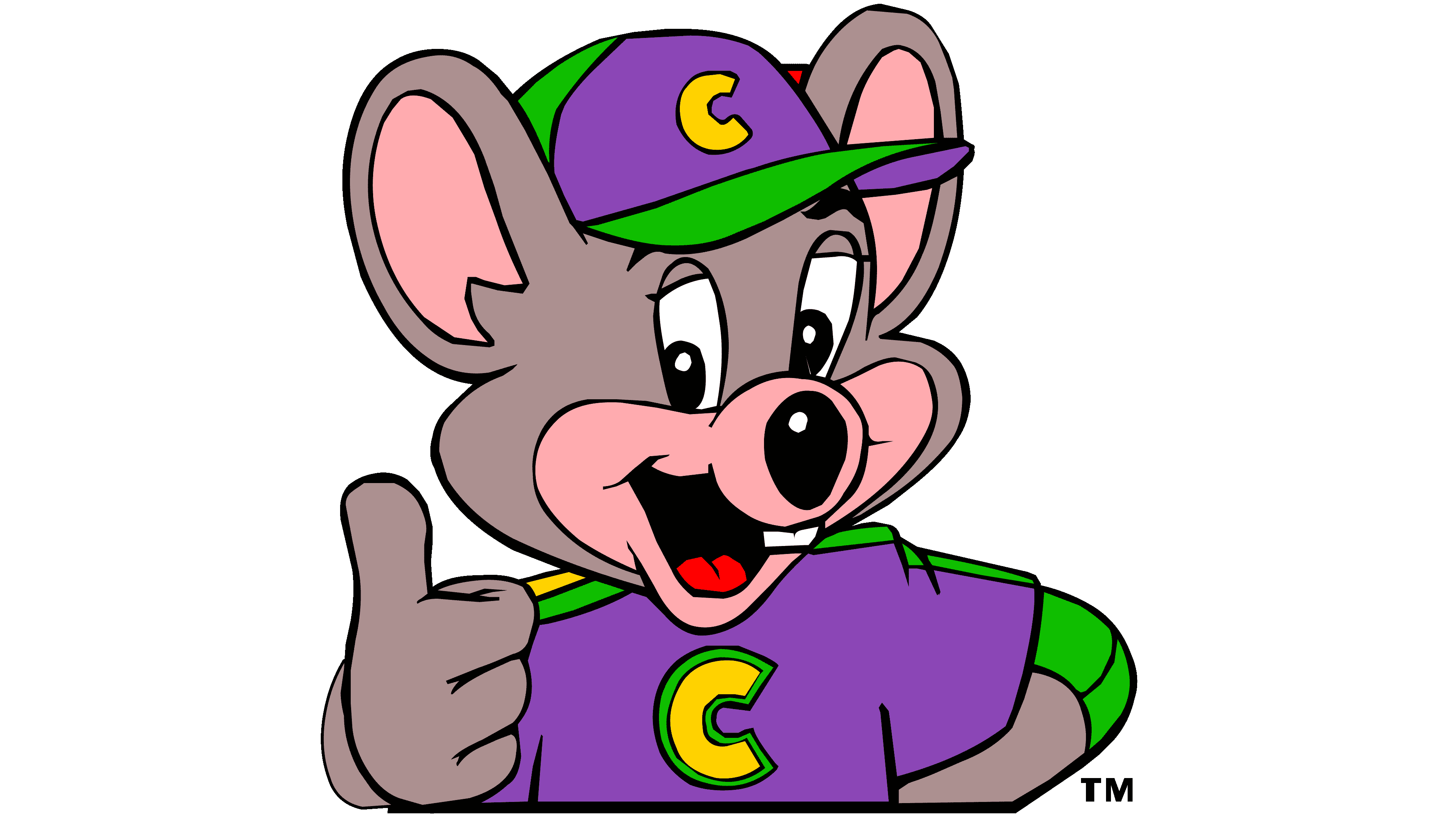
![]()
The new mouse expression, the new purple C-shape, and the thumbs-up indicate that the logo update reflects the realities of the times and adds modernity to the earlier designs. It’s not a bad color combination and has a nice overall concept, while the rodent looks like a comic-book superhero. The letters of the brand name have become dark red with a shadow.
2012 – 2019
![]()
During this period, the company underwent a major rebranding. The logo began to resemble the first options, with a rodent’s head and red letters in the name. Below, they added a brand characteristic. The rodent began to smile more widely; now, only the head was depicted less anthropomorphically, closer to nature.
2017 – 2019
![]()
In 2018, Chuck E. Cheese revamped its logo and rebranded it to “Chuck E. Cheese Pizzeria & Games.” The update made the iconic mouse-head emblem smaller and shifted it to the left to improve the logo’s balance. The redesign featured the name “Chuck E. Cheese” in bold red cursive at the top of the logo, while “Pizzeria & Games” was displayed below in a strong black uppercase sans-serif font. This change was aimed at modernizing the brand’s look and better showcasing its dining and gaming offerings, making it more attractive to a wider audience.
2019 – today
![]()
From the original logo, there is a mouse in a red circle. The lettering has become laconic and centered, divided into two lines: “Chuck E. and Cheese,” without the apostrophe and the branded “S”.
Unfortunately, in June 2020, the company was forced to declare bankruptcy due to the coronavirus pandemic. Several establishments and locations were closed. Nevertheless, the company stayed afloat after reviving in January 2021, thanks to a new management structure and the opening of new locations.
Font and Colors

The closest typeface used in the logo is called Kabel Black. It was designed by Rudolf Koch and first published by Linotype. It is a geometric sans-serif with straight lines. In some variations, it is shaded or in italics.
The official palette consists of six colors. These include Standard Black, Vivid Red # F3001C, Cinereous # 8F8178, Desert Sand Beige #EEBFAF, Timberwolf # DAD1CA, and Kelly Green # 5DA313.
FAQ
Which American children’s restaurant chain has a mouse as its emblem?
Chuck E. Cheese, an American children’s restaurant chain, features a mouse as its symbol. The name comes from its mascot, Chuck E. Cheese, a mouse known for bringing fun, games, and entertainment to families. Nolan Bushnell, who also co-founded Atari, started Chuck E. Cheese. He wanted to create a place where families could enjoy arcade games, pizza, and live shows. The first Chuck E. Cheese’s Pizza Time Theatre opened in 1977 in San Jose, California. This place, blending food, games, and animated performances, quickly became loved for family fun, birthdays, and celebrations, making Chuck E. Cheese a key part of childhood in America.
What are Chuck E. Cheese’s rules?
Chuck E. Cheese has a clear rule for kids visiting: anyone under 18 must be accompanied by an adult. This ensures every guest, especially the younger ones, has a safe and fun time. When minors visit, they must be accompanied by a parent or guardian throughout the visit. This policy helps keep Chuck E. Cheese a secure place where families can enjoy games, food, and shows together. It’s all about ensuring kids are safe while having fun, which is a big part of what Chuck E. Cheese stands for.
Can you eat at Chuck E. Cheese without a kid?
Yes, adults can visit Chuck E. Cheese even without kids. While Chuck E. Cheese is designed for kids to have fun, play games, and enjoy parties with their families, it’s also a place where adults can enjoy themselves. You’re welcome to come in, whether you want to revisit childhood memories, play arcade games, or just eat pizza. Chuck E. Cheese invites everyone looking for a fun time or a taste of nostalgia to come and experience what they offer. So, if you feel like having pizza or enjoying arcade games, Chuck E. Cheese is a good spot to visit.
What does Chuck E. Cheese stand for?
Charles Entertainment Cheese, or Chuck E. Cheese, is the mascot for the Chuck E. Cheese family entertainment centers run by CEC Entertainment Concepts L.P. First introduced in 1977 as a rat, Chuck E. Cheese became a mouse in 1993, and this image has stuck around. He’s the face of the brand, embodying the fun and family-oriented atmosphere the centers offer. The place is about giving families and kids a space to play games, enjoy rides, and eat pizza while ensuring everything’s safe and welcoming. Chuck E. Cheese often takes center stage in performances and birthday parties at these centers.
Changing Chuck E. Cheese from a rat to a mouse was a strategic move to make him more attractive and relatable to the brand’s main audience: kids and their families. This shift supports the company’s goal to be a top choice for family entertainment and celebrations. Over the years, Chuck E. Cheese has become a go-to for fun, birthdays, and arcade games, thanks largely to the charm and appeal of Charles Entertainment Cheese.
When did Chuck E. Cheese change its logo?
Chuck E. Cheese has changed its logo over 10 times to keep up with new branding strategies and what families expect. The latest change was in 2019, and it looks much like the 2013 logo, with minor tweaks. These updates help Chuck E. Cheese stay current and attractive to its main customers, families, and kids. The goal with each logo change is to keep Chuck E. Cheese’s image fresh and modern without losing the fun, kid-friendly vibe it’s known for. All these changes over the years show how Chuck E. Cheese is growing and staying a favorite spot for family fun.
Who is the owner of Chuck E. Cheese?
Since 2020, Chuck E. Cheese, officially known as CEC Entertainment Holdings, LLC, has been owned by Monarch Alternative Capital. This American investment fund stepped in to save Chuck E. Cheese from bankruptcy. Monarch focuses on helping troubled companies, and its purchase of Chuck E. Cheese signals an interest in turning around businesses with growth potential. Monarch’s role at Chuck E. Cheese is crucial, helping keep the well-known family entertainment chain stable and fresh so it remains a favorite place for family enjoyment.
Why did Chuck E. Cheese change their mascot?
Chuck E. Cheese originally had a rat as its mascot, fitting the brand’s playful theme. But having a rat as a mascot, especially for a restaurant focused on kids and families, didn’t sit well because rats are often associated with cleanliness concerns, a big deal in places where people eat.
So, the company decided to switch the mascot from a rat to a mouse, a similar-looking creature that is often viewed more positively as cute and friendly. This made more sense for Chuck E. Cheese, a place about family fun and safety.
In 2012, to keep up with the times and appeal to a new generation, Chuck E. Cheese updated its mascot again. This time, they made the mouse mascot look more modern and relatable to today’s kids and their families, without losing the essence that made Chuck E. Cheese special. This change shows the brand’s effort to stay current and remain a favorite spot for family entertainment.
What does the E in Chuck E. Cheese stand for meme?
A few years ago, Chuck E. Cheese’s creative director revealed a fun fact about the brand’s mascot: the ‘E’ in Chuck E. Cheese stands for ‘Entertainment.’ So, the mascot’s full name is Charles Entertainment Cheese. This name perfectly captures what the brand is about, not just a pizza place, but a center for family fun. It highlights Chuck E. Cheese’s goal of offering a place where kids and their families can have fun with games, shows, and parties while enjoying its food. This interesting tidbit has become well-loved by fans, underlining the brand’s unique and playful spirit.
What does the Chuck E. Cheese logo symbolize?
The Chuck E. Cheese logo combines the ideas of active fun and a love of cheese, perfectly aligning with the brand’s theme of entertainment and pizza. This logo aligns with the brand’s aim to blend enjoyment and food in a place where families can enjoy together. The mascot’s creation story is quite interesting. Initially, the brand wanted a coyote as its mascot, but a rat costume was mistakenly purchased. Instead of sticking with the rat, the founder switched to a friendlier, happier mouse character. This decision changed the brand’s direction, moving from Coyote Pizza to Rick Rat’s Pizza and finally to Chuck E. Cheese. This unexpected turn in choosing the mascot added a special touch to the brand, showing how a simple mistake could create a beloved and iconic identity.
What was the first Chuck E. Cheese logo?
The first Chuck E. Cheese logo featured a sophisticated rat wearing a red bow tie and a small gentleman’s hat, giving it a distinguished look that matched the brand’s entertainment value. The logo had “Chuck E. Cheese” written on both sides of the mascot, with “Pizza Time Theater” below, highlighting the brand’s mix of food and fun. The design was accented with yellow dots, similar to theater lights, adding a festive touch. This setup effectively showcased Chuck E. Cheese as a place for family entertainment and dining, capturing the essence of what would become a lasting attraction for kids and parents.
What is the meaning behind Chuck E. Cheese?
The Chuck E. Cheese logo means more than just its fun look. It highlights the brand’s main attractions: games and shows. The mascot, Charles Entertainment Cheese, shows how well the brand blends entertainment with eating for families and kids.
Chuck E. Cheese combines active fun, good food, and family time. The “Entertainment” in the mascot’s name points to the games, shows, and parties that make Chuck E. Cheese special. It suggests that Chuck E. Cheese isn’t just a regular restaurant; it’s a place where families can have fun and eat together, making lasting memories.
The logo represents the brand’s promise: a joy-filled place where families can play and eat. It’s meant to ensure a visit packed with fun, with something for everyone from arcade games to a menu that pleases both kids and adults. Chuck E. Cheese aims to be the top choice for family fun, blending the thrill of playing with the joy of eating together.
What is the Chuck E. Cheese slogan?
Chuck E. Cheese’s first slogan, “Pizza Time Theater,” introduced a unique concept that mixed pizza with entertainment, drawing families in with its promise of a special dining and fun experience. This catchy phrase was part of the original logo and set the stage for the brand, which was all about a place where eating and entertainment meet, especially designed for families and kids.
In 2014, the brand embraced a new slogan: “Where a kid can be a kid.” This line gets right to the heart of Chuck E. Cheese’s mission. It’s all about creating a place bursting with joy, where the magic of childhood can thrive through play, positive experiences, and laughter. It shows the brand’s commitment to helping kids enjoy their youth in a safe, fun environment. This slogan reflects the brand’s ongoing promise to make every visit a chance for kids to revel in the freedom and happiness of being young.
Is Chuck E. Cheese a rat or a mouse?
Nolan Bushnell, who founded Chuck E. Cheese, originally planned to call it Coyote Pizza and use a coyote mascot. However, he bought a rat costume for the first performance instead due to a mix-up. Initially, Bushnell considered naming it Rick Rat’s Pizza, but his team suggested Chuck E. Cheese instead.
From 1977 to 1993, Chuck E. Cheese was represented by a rat. In 1993, the mascot was changed to a mouse to make the character friendlier and more appealing to families and kids, the brand’s main audience. This shift from a rat to a mouse was a significant move, helping better align the mascot with Chuck E. Cheese’s goal of providing a welcoming, entertaining space for family fun and dining.