


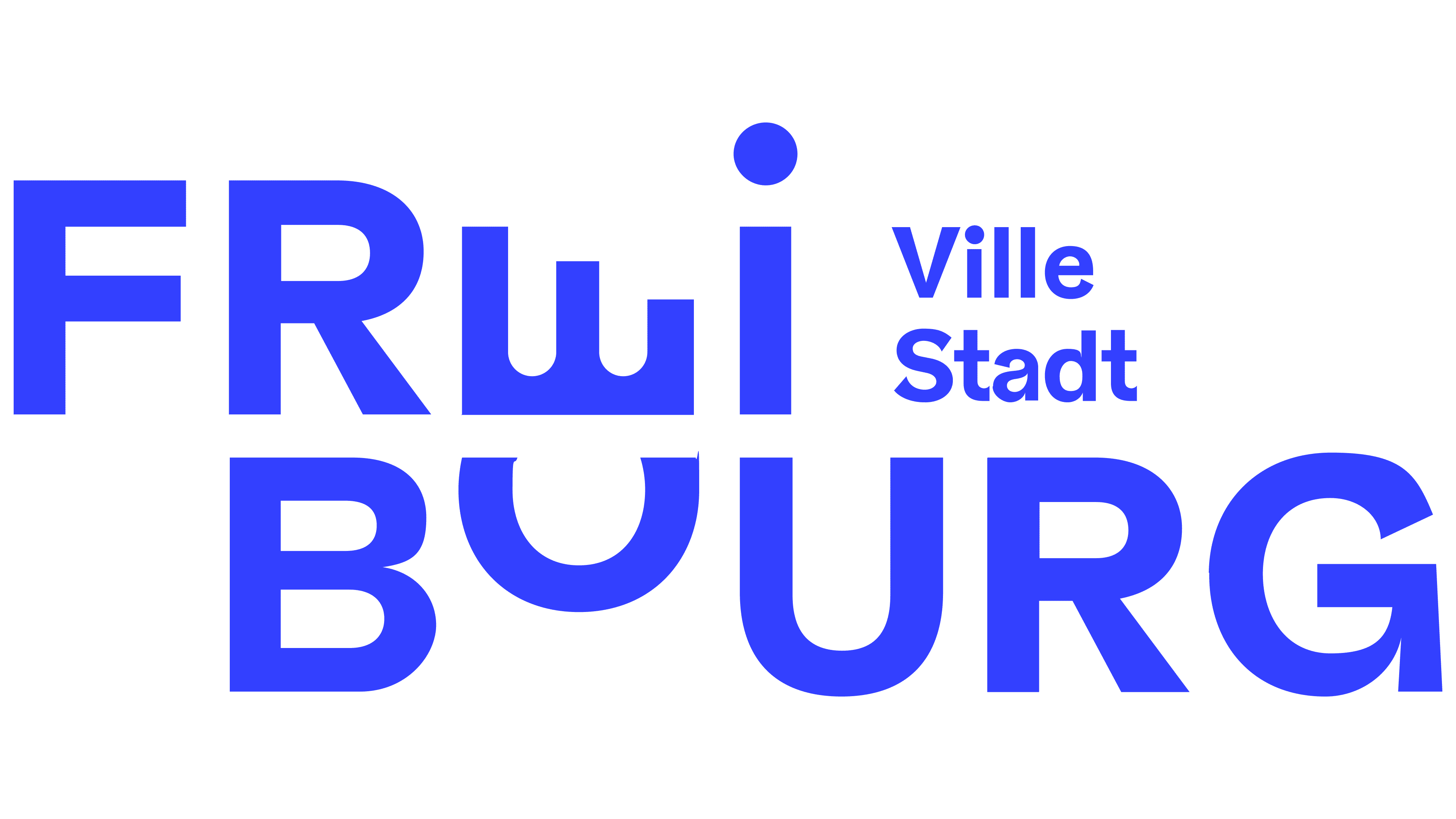
After years of debate, Fribourg introduced a city logo that combines its French name, Fribourg, and its German name, Freiburg. Unveiled on October 7, 2025, the identity was developed by Volontiers, FF Studio, and the Centre d’intégration socioprofessionnel (CIS), a center for social and vocational integration. The designers combined the two names with historical symbols of the Swiss city.
Discussions began in 2013, when officials proposed a logo using the French name. The municipal parliament also called for the German name to be represented. That March, representatives from all parties supported a resolution to that effect. The project was sent back for revision, and the issue resurfaced in 2017.
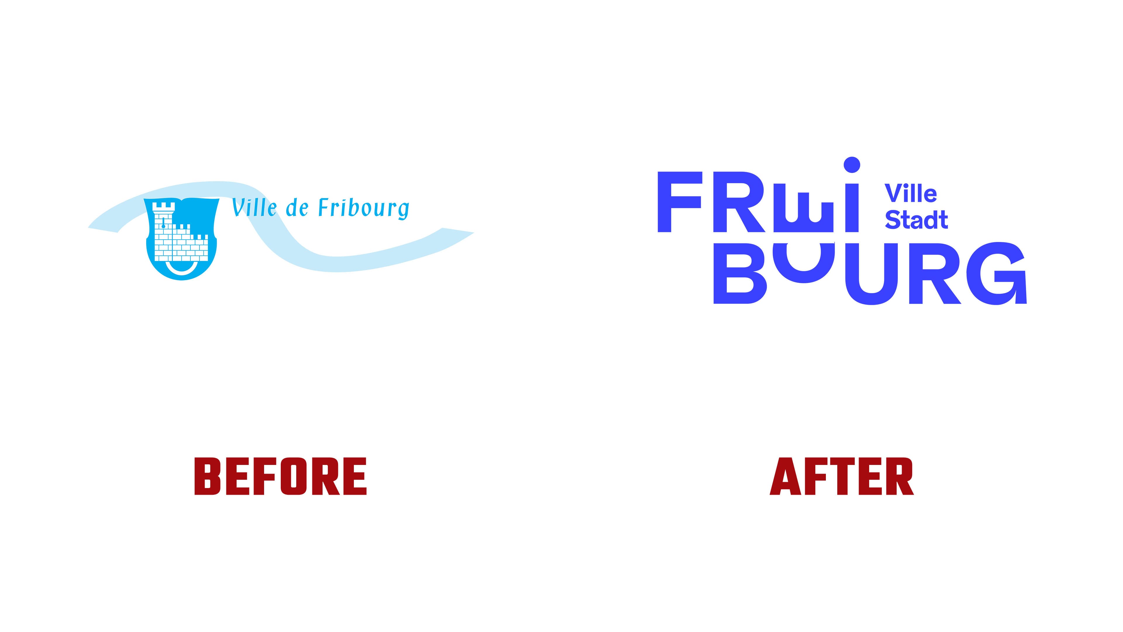
The municipality announced a new competition on November 14, 2024. The municipality invited agencies and independent designers based within the municipality to participate. The administration asked them to modernize the outdated identity, improve the legibility of the lettering, and include both city names. Fifty entrants submitted proposals. The jury and city government unanimously supported the winning design, replacing an identity used for about 20 years.
The new logo arranges the name on two lines, with the lower line shifted to the right. Its lettering allows viewers to read Fribourg by combining FRI and BOURG, and Freiburg by combining FREI and BURG. Both versions share most of the lettering. The distinguishing “E” and “O” sit one above the other, forming a monogram. To the right of the upper row are Ville and Stadt, the French and German words for “city.”
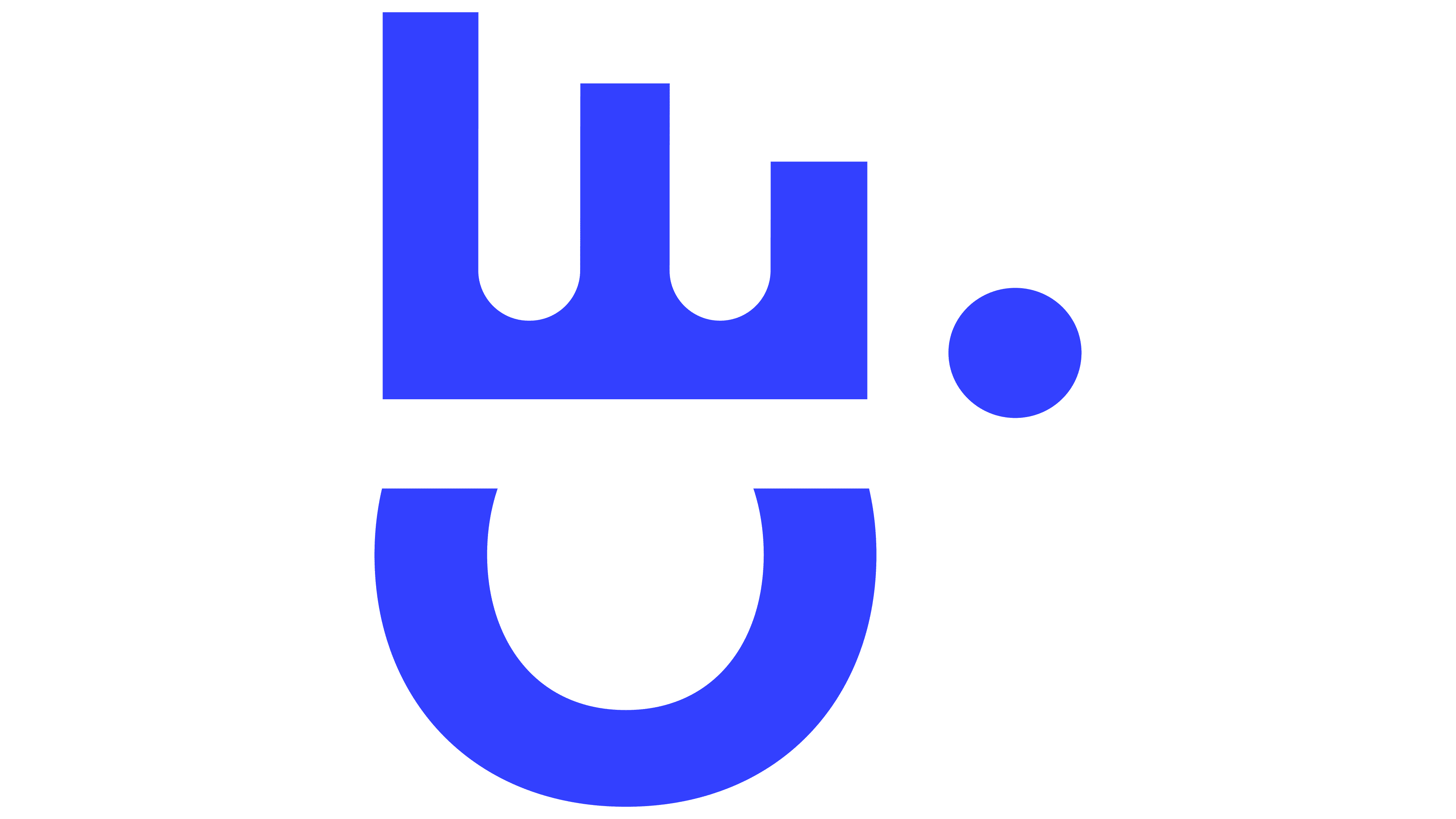
The monogram draws on Fribourg’s coat of arms. The designers transformed its tower and fortified wall into an “E” for Freiburg, while a ring became the “O” for Fribourg. The rotated “E” suggests three projections from the fortifications. Beneath it, an open “O” forms a rounded base. Two large letters replace the detailed fortress illustration. The official guidelines connect their shapes with the city’s walls and bridges, as well as openness and hospitality.
The previous identity featured a blue shield with a white fortress. Beside it, Ville de Fribourg appeared in narrow serif lettering. A light blue wave passed behind the shield and continued beneath the name. The heraldic reference is now integrated into the lettering, connecting the city’s history with the French and German versions of its name.
The full logo is intended for official documents and materials that introduce the city to an audience. The monogram is used on smaller surfaces, including profile images, the website favicon, pins, and pens. The primary blue is called Bleu Sarine, after the Sarine River. Its specifications are #3A42FF for digital use and Pantone 2728 C for print. The black is named Noir Poya. The logo can also appear in white or black.
The three participants developed the final design through collaboration. Volontiers invited FF Studio to develop the initial idea. According to CIS, its joint submission with Volontiers included two options. They then combined and refined these options with FF Studio’s involvement. The studio lists the logo, visual identity, and brand story among its contributions. They planned a gradual rollout, using old and new materials during the transition.
The logo’s release prompted a fresh political debate. The Communauté romande du pays de Fribourg criticized the design, calling for it to reflect the relative proportions of French- and German-speaking residents. Mayor Thierry Steiert said the logo supports the city’s marketing and promotional efforts. He treated the official status of French and German as a separate issue.