


 Confirmation Bias Logo PNG
The Confirmation Bias logo embodies the essence of a band that seamlessly blends progressive rock with modern, heavy sounds. Initially launched as an enthusiast-driven project, the musicians experimented with rhythms, layered arrangements, and emotional delivery, creating their unique sound.
Confirmation Bias was developed from Rusj, a tribute group formed in Rogaland, Norway, in 2013 as A Working Man’s Tribute to Rush. Its musicians had backgrounds in Mayah, Sea of Dreams, GoldOcean, The Optimæ, Millennya, “Misplaced Neighbourhood”, The Brothers of Mercy, Philharmonien, The Fire X Project, Taking Back October, and Diamond Dogs.
Around 2016, the core members began writing original material. They adopted the name Confirmation Bias, a psychological term for favoring information that supports existing beliefs. Over the next several years, they completed the lineup, rehearsed new songs, and worked through a long recording process.
The group released “Epiphany” in March 2023 and “In Memory Of…” in November. The second song was written in memory of someone whose life spanned two centuries. Both singles appeared on Bandcamp and streaming platforms before the debut album Century Mornings arrived on March 29, 2024. Developed over more than five years, the record contains seven tracks and runs slightly over an hour.
Progradio.com, Norway Rock Magazine, and Sea of Tranquility reviewed the album, noting the title track and “Residence in You,” a song about fake news and online trolling. Comparisons included Leprous and Gazpacho. The band marked the release at Spor 5 in Stavanger on April 6, 2024, later played Ogna Scene and Asker Kulturhus, and made its first international appearance outside Norway at the Summers End festival in Britain during late 2024.
Meaning and History
What is Confirmation Bias?
This Norwegian progressive rock band seamlessly blends elements of jazz, classical, and psychedelic rock. Their compositions feature intricate arrangements with expressive vocals, rich keyboard sections, and powerful guitar riffs. The lyrics explore philosophical and existential themes. The band performs live with high-energy shows where musicians showcase their virtuosity, creating an immersive atmosphere filled with vibrant emotions.
2016 – today

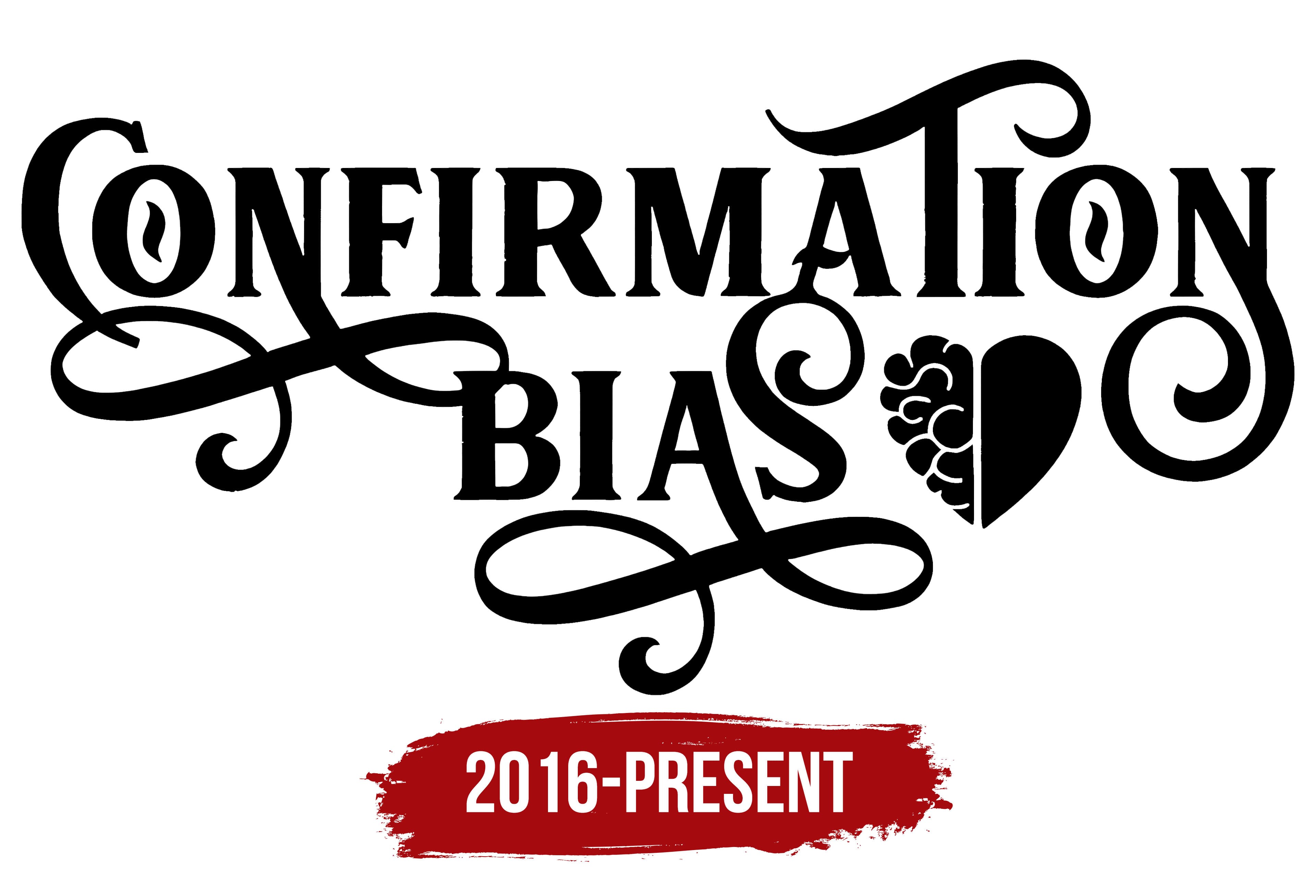
The Confirmation Bias emblem was conceived as a visual continuation of the ideas explored in the podcast, which examines the interaction between rational and emotional perception. To achieve this effect, the authors drew inspiration from vintage signs and decorative typography, combining intellectual content with the image’s emotional expressiveness.
The logo’s composition is built around two lines of text. In the upper part is the word “Confirmation,” and in the lower part is the word “Bias.” The second word slightly overlaps the first, creating an interlacing effect and emphasizing the interpenetration of concepts. The structure brings the inscription closer to an ornamental composition, enhancing its decorative character.
In the letter “O,” the authors placed almond-shaped eyes, denoting the subjectivity of vision and the limitations of human perception. Another key symbol is represented by a stylized heart divided into two halves. One side is shaped like a brain, while the other retains the traditional silhouette. The heart visually embodies the opposition between rational analysis and emotional feeling, which lies at the core of the podcast’s theme.
The font used is massive with extended serifs and an abundance of decorative curls. The variability of stroke thickness and elongated elements creates the impression of handwritten calligraphy, evoking the aesthetics of past eras. Despite the abundance of ornamentation, the logo is executed in a black-and-white palette. The composition is strict and contrasting, maintaining a balance between the complexity of form and the minimalism of color.
The choice of an antique typeface, rather than the minimalist fonts typically used for such projects, makes it stand out and lends it individuality. Analytical work with information is conveyed through an expressive and multilayered visual language. The Confirmation Bias logo combines symbolism, typographic decorativeness, and historical references, turning the name into a multilayered sign that reflects the podcast’s specificity and research orientation.
