![]() Cookie Run Kingdom Logo PNG
Cookie Run Kingdom Logo PNG
The Cookie Run: Kingdom logo conveys the game’s playful, entertaining nature. Its bright design emphasizes appeal to an audience seeking simple, engaging gameplay.
Cookie Run: Kingdom’s origins can be traced back to Devsisters, a Korean company founded by Jihoon Lee and Sejong Kim in 2007. Their first major success was the 2009 mobile game OvenBreak, which became globally popular. Cookie Run launched in 2013 and quickly became a hit in South Korea and internationally.
Cookie Run: Kingdom, launched on January 19, 2021, combined city-building simulation with RPG mechanics, inviting players to build kingdoms and collect cookie-hero teams. Within months, it became a top-grossing game in South Korea, Taiwan, and Thailand.
In 2023, Cookie Run: Kingdom was released on PC via Google Play Games, expanding its reach to new audiences. As of 2025, the game features 158 unique characters. That year, Devsisters connected the OvenBreak and Kingdom universes more closely. The company continues to expand its franchise, releasing updates and new games, such as Cookie Run: OvenSmash.
Meaning and History
![]()
What is Cookie Run: Kingdom?
It is a popular South Korean mobile game featuring cartoon cookie characters. Players build their towns and send heroes on adventures. Each character has unique abilities and personalities, allowing players to create new characters and enhance their settlements. The game gained popularity due to its colorful graphics, engaging storytelling, and regular updates.
2019 pre-launch
![]()
The Cookie Run: Kingdom logo was developed by the in-house design team at Devsisters Corporation in 2019 as part of the project’s pre-launch preparations ahead of its official global release in January 2021. This visual style was utilized in promotional materials, teasers, and presentations at industry events, including the G-STAR 2019 expo in Busan.
The composition comprises two levels of typography and additional graphic elements, combined into a unified system of symbols and forms.
The upper level features a three-dimensional yellow “Cookie Run” wordmark in a custom, hand-drawn sans-serif typeface. The glyphs are bold, rounded, and smoothly contoured. Their style imitates the texture of soft cookies or icing, with expressive volumetric shadows and light highlights that underscore the game’s sweet, playful theme.
The lower level contains the word “Kingdom” in a taller, lighter font, with subtle chevron deformation of the letterforms. This text sits on a purple ribbon that curves at both ends. Instead of standard typographic separators, sparkling decorative star highlights and a stylized sword are used.
The sword serves as both a striking visual detail and a symbolic element aligned with JRPG conventions that inspire Cookie Run: Kingdom. It is styled as a candy artifact, with a handle adorned with decorative wings and a pink gemstone. The blade is faceted with perspective details, evoking the cookie-shaped heroes of the game’s universe and reinforcing the fantasy setting.
The color palette includes several contrasting shades, each carrying a distinct meaning. Yellow and golden hues in the main text reference confectionery, evoking sweetness, joy, and friendliness. The purple ribbon reinforces themes of magic, wonder, and adventure. Pink accents in the gems and star highlights enhance the visual identity’s whimsical, game-like nature. White tones and gradient highlights add vibrancy, giving the forms depth and visual dynamism.
The Cookie Run: Kingdom logo is a well-considered composition of forms, type, and colors that unite to express both the project’s genre identity and the emotional tone of gameplay.
2021 – today
![]()
The Cookie Run: Kingdom logo, introduced in January 2021, coinciding with the game’s global release, was created by Devsisters Corporation under the direction of art director Seo Ji-hyun. The visual concept reflects a shift in the brand’s thematic focus from heroic battles to the building and development of a player’s kingdom. All graphic and typographic elements are original, hand-crafted by the studio’s in-house design team.
The composition is built on two typographic levels, set against a horizontally stretched red ribbon resembling a royal banner.
The upper row is the “CookieRun” wordmark in a custom sans serif with smooth, rounded contours and prominent three-dimensional modeling. The letters have substantial stroke weight, gentle rounded edges, and a rich orange-yellow gradient with glossy highlights, creating the effect of thick caramel.
The lower level is the word “KINGDOM,” visually larger and dominating the composition. Its letters are rendered in an even bolder, more voluminous style with pronounced plasticity reminiscent of caramel or confectionery glaze. The glyphs have thick strokes and a perspective effect that reinforces a sense of grandeur and monumentality. A distinctive detail is the decorative club symbol placed within the “O,” which references in-game currency and guild emblems, tying the logo to the game’s content.
The color palette is structured and purposeful, with the main orange-yellow gradient (“CookieRun”: #FDBB35 → #F98C00) emphasizing the candy theme and creating a visual link to confectionery products and a welcoming game atmosphere. The golden-yellow gradient of the lower word (“KINGDOM”: #FFDC7F → #FFC636) conveys luxury, prosperity, and royal status, reinforcing the kingdom metaphor. The red ribbon (#D72828 → #F93D3D) serves as a backdrop, symbolizing celebration, authority, and grandeur.
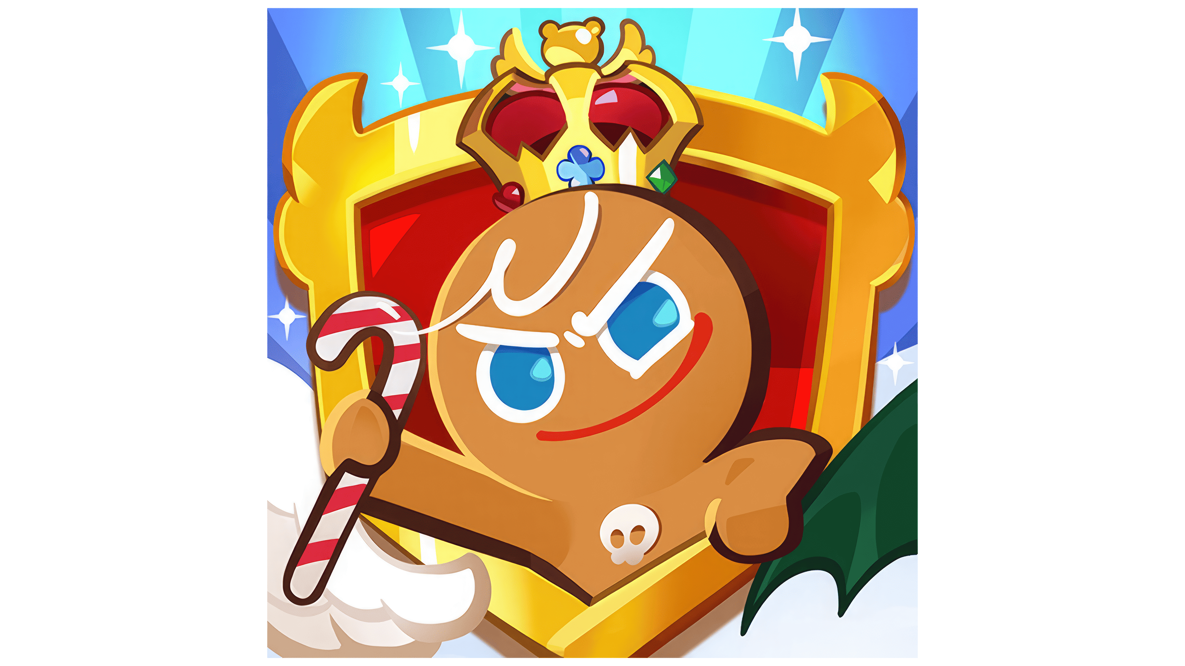
Above the composition is a crown featuring the “Jelly Bear Icon,” a long-standing emblem in the Cookie Run series dating back to OvenBreak. The crown is encrusted with multicolored gemstones representing the variety of in-game factions and clans. This design choice enriches the imagery and fosters an emotional connection between the audience and the brand’s visual symbols.
The Cookie Run: Kingdom logo features a carefully designed visual system in which typography, symbols, and color choices work in harmony with the brand’s goals.