
Cooper Tires updated its brand in March 2026 and brought an image from its early history back into the identity. The project was handled by Publicis P1T Crew, with creative direction led by BBH USA. The new style moves the company away from the neutral look of tire brands and toward a dense road-oriented system for drivers, dealers, and partners.
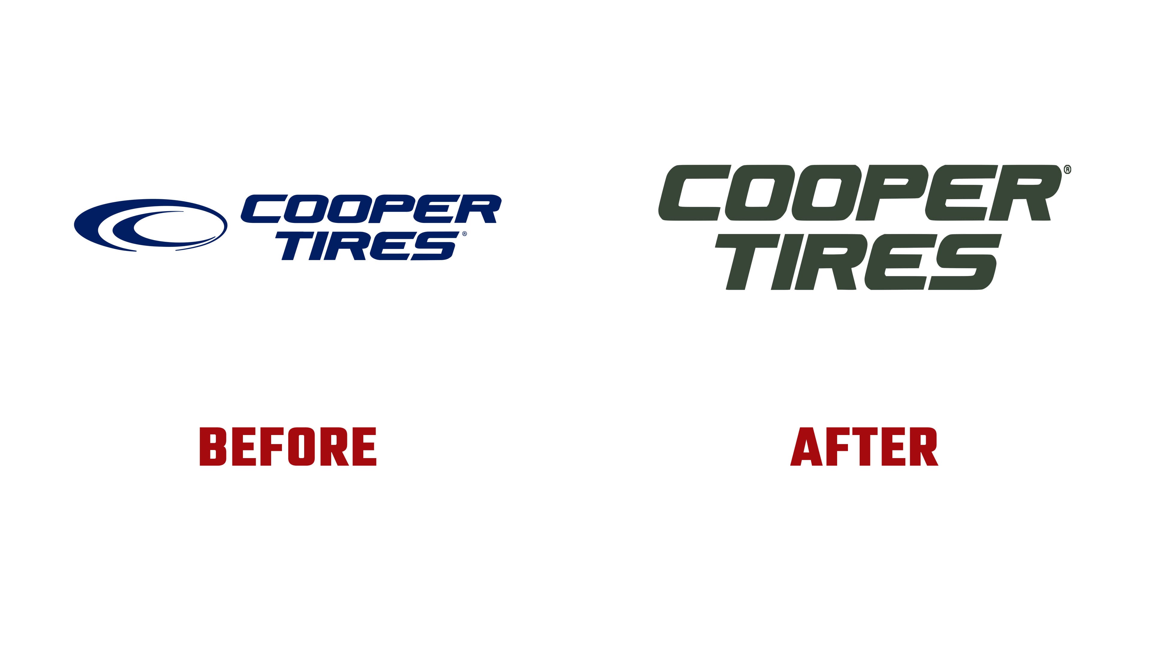
The company has worked in the tire industry for more than a century. The brand’s reputation is tied to endurance, difficult conditions, real trips, and practical needs. The previous logo, with its oval emblem, curved lines, blue color, and slanted type, emphasized speed, motorsports, and engineering. The new image shifts the focus toward the road, heavy use, outdoor settings, and Cooper’s heritage.
In the new system, the knight motif takes the lead. It refers to the Armored Cord tire from the 1940s, which helped the company strengthen its position in the industry. The knight’s helmet provides a historical anchor for the brand. It turns it into a sign of readiness for demanding conditions. An American gray wolf now appears beside it. Its image is connected with endurance, adaptation, and travel across different routes. There is also a connection to Ohio, where the brand comes from.
The new logo became denser. In the wordmark, large, heavy letters give a sense of weight and control. The brand moved away from the earlier decorative sports look toward a more compact form, where the name carries the main load. The knight and the wolf expand the mark into an emblem with a story, taking the brand beyond standard tire typography.

The color system changed. The previous red, blue, and white scheme was replaced by Valor Green, Heritage Orange, Gravel Grey, Stone White, and Rubber Black. The green shade is connected with the road, natural surroundings, demanding conditions, and off-road aesthetics. Heritage Orange refers to early Cooper and adds energy while separating the brand from its old racing-style presentation.
The redesign is built around a practical image. The company makes tires for people who need durability, traction, control, and readiness for a range of conditions. The logo with the knight and wolf speaks to drivers who connect tires with the road, load, and trust in their equipment. For Cooper Tires, the new logo became a return to heritage in a modern form.