


 Courvoisier Logo PNG
Elegance and grace are read in the emblem of alcohol. The Courvoisier logo evokes the era when Napoleon himself drank cognac. The sign focuses on the drink’s age, aging, delicate taste, and elitism.
Courvoisier is an elite cognac produced in France since 1835, made by blending four grape varieties, then distilling and aging it in special oak barrels. The brand complies with European standards and is among the few that have the full right to be called cognac rather than brandy. The monarchs of France, England, Denmark, and Sweden appreciated its taste. The drink was served at the Eiffel Tower’s opening, and instead of stars, the brand affixed diamonds to its labels.
Based in the Charente district, the homeland of cognac, the company is one of the four largest drink producers. The company exports up to 15 million bottles per year. The company offers seven classic options. These include the standard VS and VSOP, aged 4 to 10 years, and more premium offerings (Napoleon, 18-Year-Old, Initiale Extra, L’Essence) aged 11 to 50 years. Each variety has two to seven honorary awards. In addition, unique blends are dedicated to specific dates or events (for example, the 200th anniversary of Bonaparte’s coronation). They include alcohols of the late 19th and early 20th centuries.
Since 2005, the Japanese company Suntory Holdings Limited, which produces beer and spirits, has owned cognac.
Meaning and History
The business was founded at the very beginning of the 19th century, when Courvoisier (Emmanuel Courvoisier), with the support of the city’s mayor, Louis Vallois, opened his company to sell elite wines produced in the region. And then he became a winemaker himself. Later, their children moved production to the city near Cognac (Zharnak) so the drink would have the most authentic taste. The company’s headquarters are still located there. In 1843, the partners officially registered the brand as Courvoisier. The founding families kept production until 1909, after which the brand passed to English owners. The company’s agent in the United Kingdom bought Courvoisier because the drink was highly valued there. The brand’s original design, its emblems, and the new owners’ reputation. They linked the company’s logo to France, the founder, and Napoleon Bonaparte.
What is Courvoisier?
Owned by Beam Suntory, this company represents the pinnacle of French cognac craftsmanship. It produces exceptional spirits in Jarnac, in the Cognac region. The company offers a unique range of cognacs, from the versatile VS to the luxurious XO Imperial, through meticulous grape selection and aging expertise. Using eaux-de-vie from the finest plots of Grande and Petite Champagne, the company stands out for its unique blending technique, creating incredibly smooth cognacs with delicate floral aromas and depth of flavor.
Old
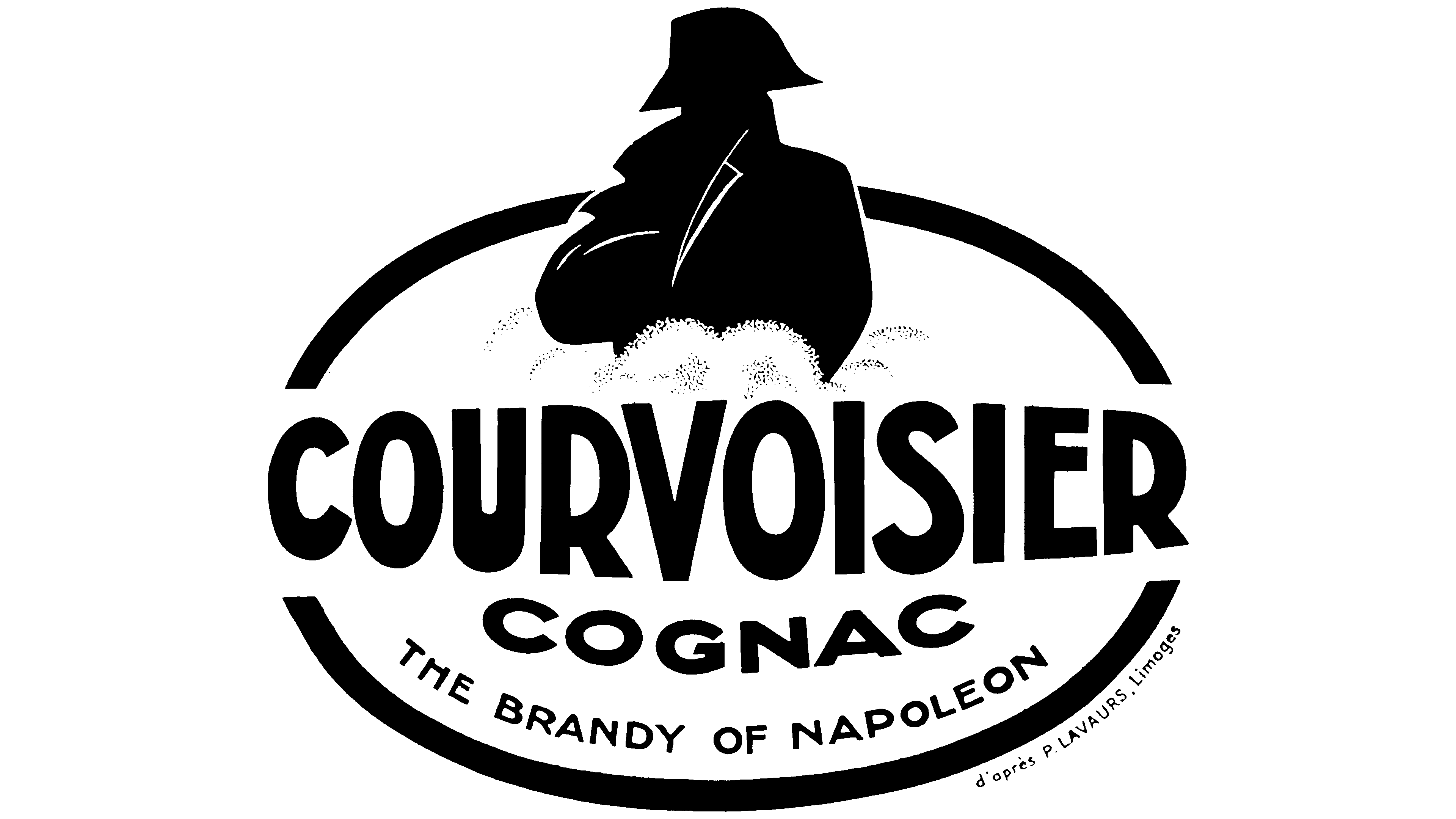
The first visual sign featured the emperor himself. The company has used his image since 1909. The emblem depicted the commander’s waist-deep shadow, surrounded by clouds, inside an oval, with the brand’s name written in the center. The signature at the bottom read “cognac,” and below it, a small postscript: “Napoleon’s brandy.” The label had a cream background. All inscriptions and drawings are in black. The letters increased toward the center, creating a three-dimensional effect that hinted at the shape of a bottle of an elite drink.
The silhouette of Bonaparte on the emblem, along with an additional inscription using an “informal nam,e” appeared in connection with the emperor’s attention to this drink. It was believed that the commander visited Courvoisier’s warehouses during a visit to Bercy and purchased their products for his soldiers. And four years later, going into exile, he took a couple of barrels of elite brandy with him. On the way, the British who accompanied the captive tried his stock and began calling it Napoleon’s cognac. In 1869, the emperor’s nephew granted Courvoisier the title of purveyor to the Imperial Court.
The shadow of Napoleon on the label was meant to convey the emperor’s love, and his presence in the clouds symbolized the brand’s patronage even after his earthly journey ended. It also hinted at the brandy’s high “ethereal” taste, worthy of royalty.
The cream background was typical for the decals of that time. In Courvoisier, it denoted the drink’s soft taste.
New
Simonov briefly fought to keep the brand from being taken over by German invaders during World War II. The company’s head, George S., left for the UK for a while, sold it to his French friends, and bought it back after the war. The owner continued to develop the brand in Napoleon’s style and, in 1951, introduced a new drink named after the commander’s wife, Josephine. Gradually, this form became a classic for expensive cognacs. By the end of the century, the brand logo had become more elegant and modern. The 2005 ownership change did not affect the mark’s main motif.
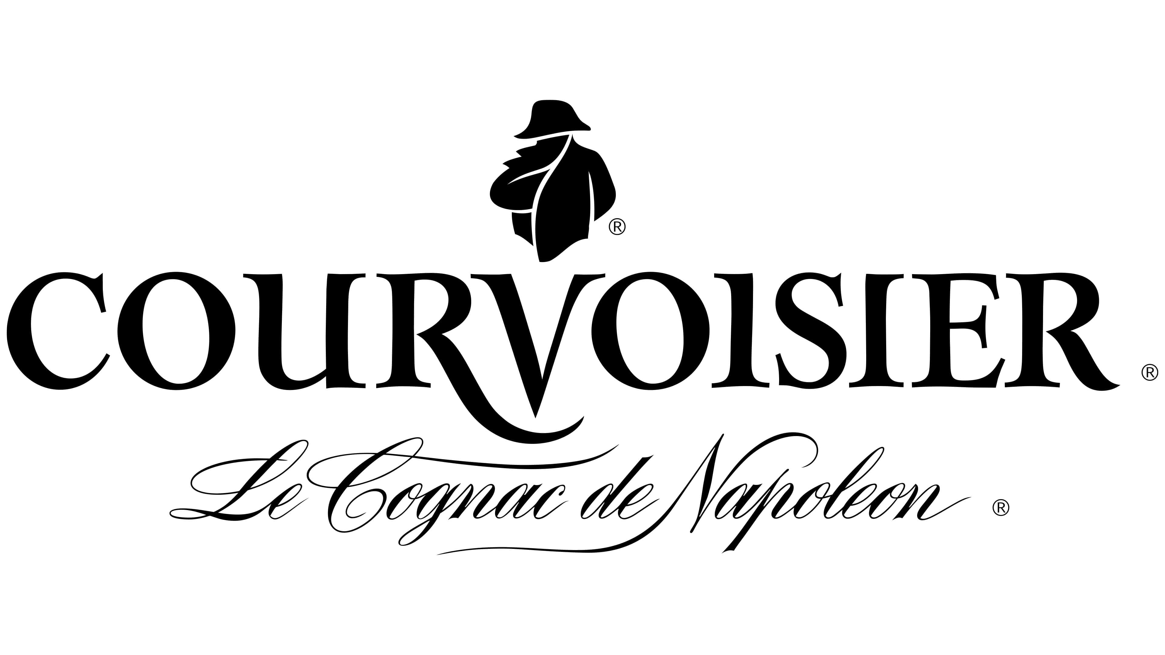
The new logo looks much more sophisticated. It features ornate, French-style serif inscriptions. The center of the composition is the letter V, symbolizing the word “victory.” Above it is Napoleon’s shadow, and below the letter is an unusual leg on the letter R. The word “brandy” was removed because, under the new rules, Courvoisier is among the few that may be called “cognac.” Therefore, the signature reads: “Cognac of Napoleon.” The Emperor’s image has become more schematic, resembling a golden seal impression. Everything in the new sign signals cognac’s high royal status.
Font and Colors
Both the first and second emblems were created in black and white. This symbolizes classic taste, strict adherence to the recipe, and the ancient roots of this company’s cognacs. Since 2015, the logo has used gold, which conveys the drink’s premium quality and elitism.
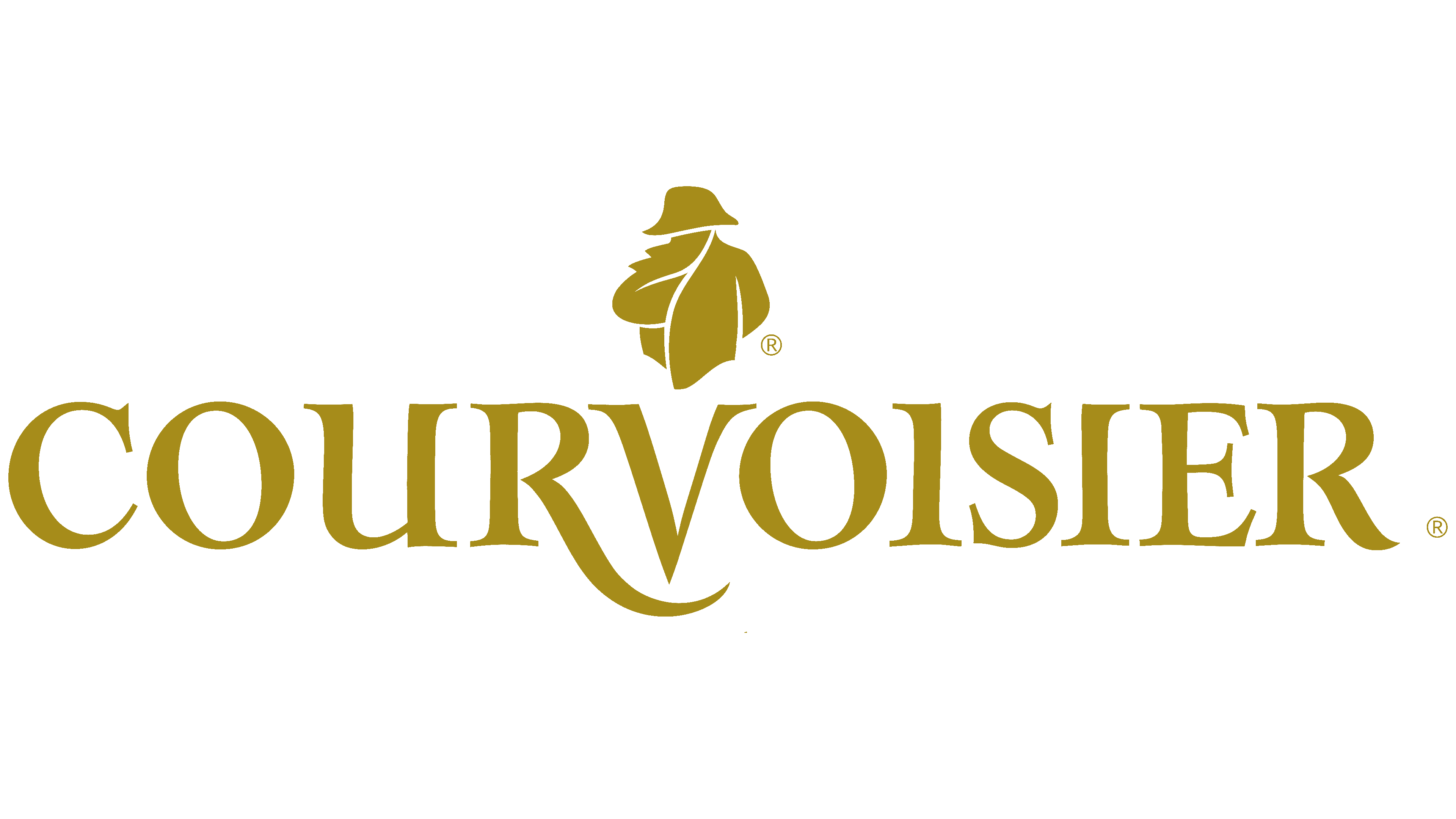
The first character’s font is similar to Tw Cen MT Condensed Extra Bold. The new emblem uses the Colonna MT font, but with a longer R stem. It better matches the drink’s sophisticated bouquet and French roots.