


![]() Crown Royal Logo PNG
Crown Royal Logo PNG
The royal drink represents the Crown Royal logo. Great taste makes whiskey worthy of honors and awards. The emblem suggests that alcohol was served to the tables of nobles and high-ranking persons who appreciated the brand at its true value.
Crown Royal began in 1939, when King George VI and Queen Elizabeth visited Canada as reigning monarchs. Seagram president Samuel Bronfman decided the royal tour needed a Canadian whisky made for the occasion. At the Waterloo distillery in Ontario, he and his team tested more than 600 blends before settling on a mix of about 50 grain whiskies.
The presentation was as important as the liquid. Crown Royal was placed in faceted crystal decanters with crown-shaped stoppers, then packed in purple velvet bags with gold stitching and cord. Ten cases traveled on the royal train, giving the new whisky a story tied directly to the monarchy.
For 25 years, Crown Royal was sold only in Canada. In 1964, Seagram introduced it to the United States with little national advertising, relying on distributors, word of mouth, and the purple bag. Production later centered in Gimli, Manitoba, on the shore of Lake Winnipeg. In 1992, Crown Royal Reserve became the brand’s first major line extension after decades as a single-product label.
Diageo acquired Crown Royal in 2000 as part of the Seagram deal. By 2002, it had passed Canadian Club in U.S. sales. It became the leading Canadian whisky in America, ahead of rivals such as Black Velvet. Crown Royal XR followed in 2006, using whisky from the closed Waterloo distillery. Later releases included Crown Royal Black in 2010 and Crown Royal Maple in 2012. In 2016, Jim Murray’s Whisky Bible named Crown Royal Northern Harvest Rye the world’s best whisky.
Meaning and History
The emergence of the Crown Royal brand was preceded by remarkable events surrounding the royal tour. As far as is known, King George VI and his wife were the first members of the British royal family to visit Canada. A local businessman appreciated their adventurism and decided to give the monarchs a valuable gift, a blended whisky of his own making. He already had experience in making alcoholic drinks, but the businessman wanted to create something unique, and that is why he tried hundreds of blends with different proportions of ingredients. The resulting alcohol was poured into crystal decanters, which filled ten cases.
This recipe became the basis for Crown Royal whiskey when the drink’s fame grew so great that the entrepreneur had to launch it into mass production. The first batch came into stores in the 1960s. The product was recognizable by its distinctive logo featuring a crown on the cushion and by the subtle italic inscription. The design was developed to match the bottle’s elegant shape.
What is Crown Royal?
This is a well-known Canadian whisky brand owned by Diageo, famous for its smooth taste and distinctive purple-bag packaging with gold accents. From the classic Deluxe blend to special variants like Northern Harvest Rye and Black, each product in the lineup is marked by expressive flavor characteristics achieved through the artful blending of aged whiskies. The whiskies are crafted by the brand’s master blenders, who use a mix of grain whiskies aged in oak barrels at the distillery in Gimli, Manitoba.
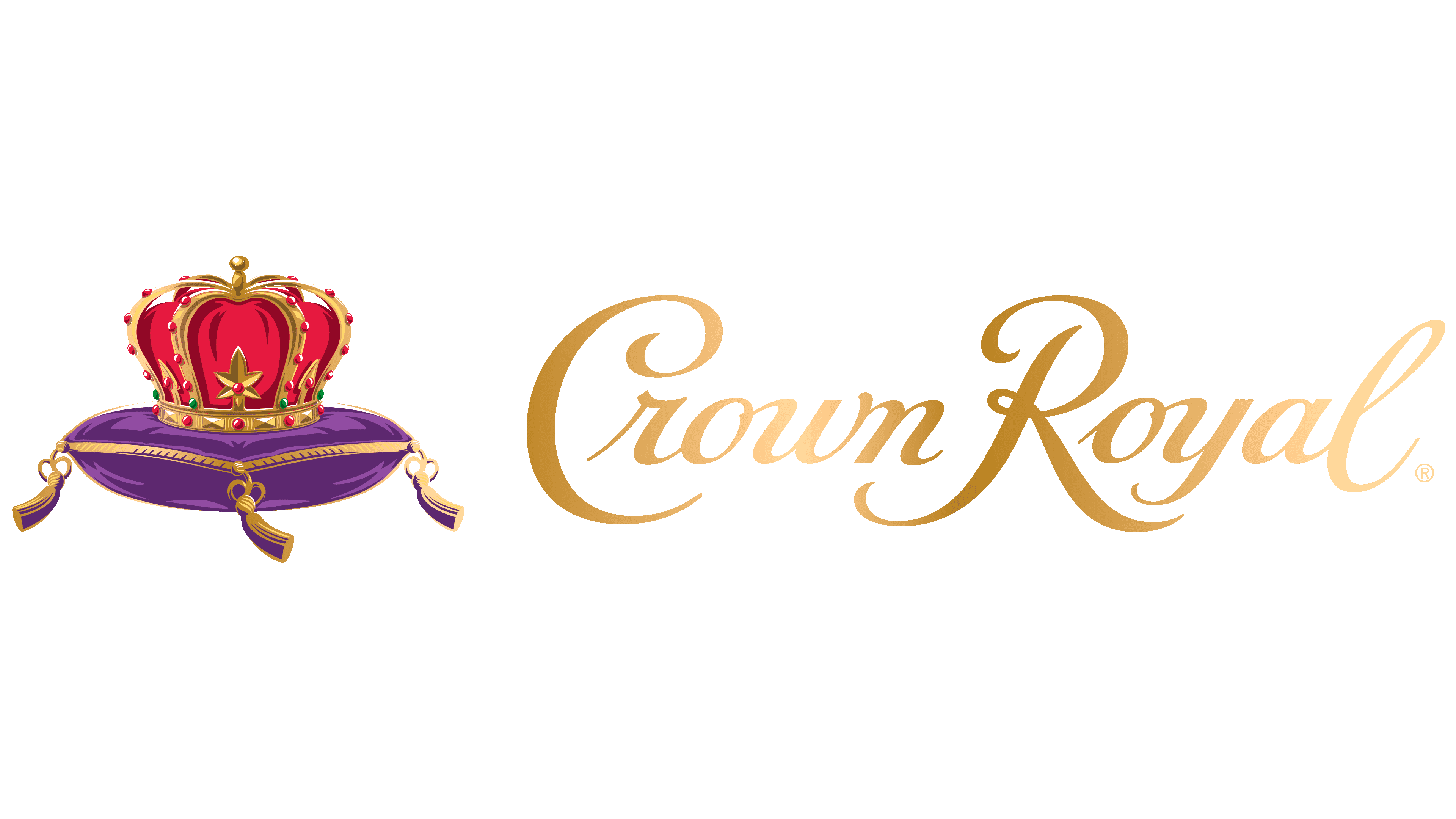
In the 2000s, the trademark was modernized by graphic artist Chris Mitchell, who ran his studio, Epic Icons. He redid the crown, making it more colorful and adding a three-dimensional effect by combining several shades of gold, red, and purple. The logo is still in use today to remind Crown Royal of its glorious past.
The main visual symbol of the whisky is the crown on the cushion. These elements reflect the brand’s historical heritage, which was created for the king and queen of Great Britain. They look luxurious, matching the high status of royalty. The crown has a gold frame embellished with precious stones. The cushion is not simple either – it is decorated with gold embroidery and tassels.
Chris Mitchell turned an ordinary pictorial icon into a symbol of luxury using simple graphic tools. He slightly changed the colors and shape of the emblem, giving it a truly royal look.
Font and Colors
The Crown Royal lettering is as much a part of the logo as the design. It is in italics and appears to be handwritten. A similar typeface can be found in the Kuenstler Script family, first appearing in 1902. It is a type of Roundhand calligraphy with contrasting strokes. But the Crown Royal has bolder letters, designed for better readability.
The color palette contains red, gold, and magenta. Such a combination is reminiscent of the colors of a whiskey gift box designed for members of the monarchy. As far as we know, the entrepreneur put the decanters in individual purple bags with gold embroidery. And red was added to emphasize the drink’s noble origins.