![]() Crumbl Cookies Logo
Crumbl Cookies Logo
The Crumbl Cookies logo evokes thoughts of warm cookies and instant gratification. It all started with the search for the perfect recipe to give taste and an unforgettable experience. Experimenting with ingredients and updating the menu weekly turned each week into a small feast of taste.
The story of Crumbl Cookies began in 2017 when cousins Jason McGowan and Sawyer Hemsley decided to bake the perfect cookie in Logan, Utah. They started small, focusing only on chocolate chip cookies and continuously improving the recipe based on customer suggestions. Early on, they introduced the unique idea of a weekly rotating menu, keeping customers excited to return regularly for fresh flavors. The brand’s signature pink packaging was also established, quickly becoming easily recognizable. Soon after, the company expanded quickly through franchising, attracting partners drawn to its delicious cookies and creative business approach. Launching a mobile app further boosted customer convenience, allowing easy ordering and delivery. Ice cream was added to the menu, offering customers even more variety. Growth accelerated rapidly, with hundreds of new recipes and locations opening nationwide. The company’s lively social media pages kept fans eagerly awaiting new weekly flavors. A loyalty program was introduced to reward regular customers, and delivery services improved significantly. Eventually, Crumbl Cookies expanded internationally, introducing exciting new flavors and textures to audiences worldwide. As of early 2024, the company continues to grow rapidly, explore innovative menu ideas, and welcome new franchisees into its thriving business.
Meaning and History
![]()
What is Crumbl Cookies?
This is a chain of bakeries known for fresh and unusual cookies. Every week, new flavors appear on the menu, from classic chocolate to original combinations like caramel pecan or blueberry cheesecake. Customers can watch the baking process; the branded pink packaging makes each purchase remarkable. The rapid development of the network is associated with an original approach to the assortment and active customer engagement through social networks.
2017 – 2018
![]()
The brand was created by two cousins, Sawyer Hemsley and Jason McGowan, who set out on a simple mission: baking delicious cookies with new flavors every week. Since then, a small idea has grown into a large bakery chain, where every cookie is as appetizing and fresh as the one in this logo.
Crumbl chose to represent their work as straightforwardly as possible: they simply drew a cookie and wrote the brand name. The symbol looks like a classic homemade cookie with an unusual edge, as if someone has already taken a bite. It gives off a natural, informal, and homey feel.
The black dots on the cookies represent chocolate chips, a common ingredient in fresh-baked treats. Their varying sizes make the design more dynamic and resemble the real texture of baked goods.
The text below is neat and simple. The lowercase letters are smooth and rounded, standing evenly next to each other, with no extra decorative details. The brand name is intentionally written in all lowercase, making it look calm and unpretentious.
2018 – today
![]()
For this version, Crumbl decided to experiment slightly by combining a baker’s image with a cookie. A simple symbol appeared on the left: a stylized figure of a chef wearing a hat that smoothly transitions into a cookie, with a bite still taken out. The cookie is marked with small dots resembling chocolate chips.
The baker looks straight ahead with dot-like eyes, and a wide, curved smile lends the symbol a friendly, welcoming feel. The lines are minimalist, clean, and precise, without any extra details.
To the right is the text: the brand name in large, bold letters, all in lowercase. The font is soft and rounded, almost like the letters were “baked” from dough. Below it, the second word, “cookies,” appears in a thinner, simpler font, resembling a casual signature.
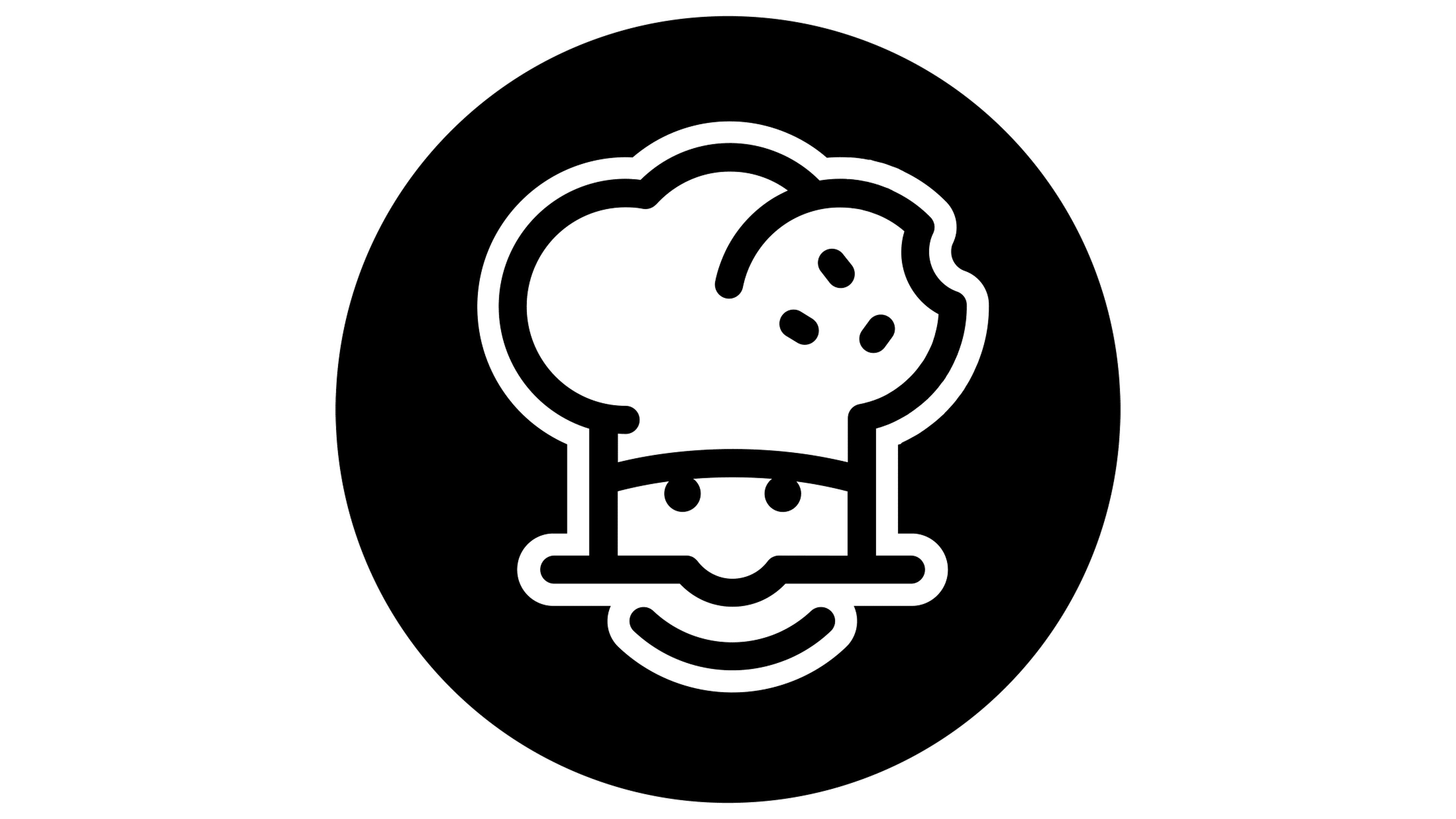
2020 – today
![]()
Crumbl decided to refine the symbol by adding a bold, contrasting background. The baker’s image, with the unique hat, a cookie with a bitten edge, was placed inside a solid black circle. This design choice makes all the lines and details stand out more clearly.
The smile, dot-like eyes, and cookie with small, round fragments remain clean and easily recognizable. The symbol remained the same shape, with no complex changes or modifications.
The cookie and friendly baker continue to represent the company’s core idea: delicious, fresh-baked treats and desserts accessible to everyone. Minimalism and simplicity remain key elements of the brand’s style.
2023 – today
![]()
This version of Crumbl Cookies’ logo has been reduced to the absolute minimum, leaving only one word: “crumbl.” No extra symbols, bakers, or cookies. The name is written in a smooth, rounded font that resembles melting ice cream or soft-baked pastries, the essence of the company’s specialty. The thick, rounded letters without sharp edges give a soft impression, much like the feel of freshly baked cookies.