


![]() Dacia Logo PNG
Dacia Logo PNG
The Dacia logo says the brand’s cars are ideally suited for any road. It is a practical and convenient means of transport for daily movement. The emblem encodes information about the durability, strength, and reliability of machines.
Dacia is Romania’s most famous car brand and is of great importance to the country, as its contribution to the national economy is significant. It is the largest exporter and one of the most impressive companies in the domestic market. The company was founded in 1966, and after 33 years, it passed into the ownership of the French concern Groupe Renault. Since the beginning of 2021, the brand has been part of the Renault Dacia-Lada business group structure. The headquarters are located in the town of Mioveni in Argeș County.
Although the car manufacturer entered Romania in the second half of the 20th century, it already had the experience and infrastructure to produce a wide range of technical products. The fact is that enterprises in the region were opened during World War II by order of Marshal Ion Antonescu. And since the company was located near the village of Pitesti, it was called Uzina de Autoturisme Pitesti (UAP), which was reflected in the logo. The main plant was built later, in 1968, in Mioveni.
Then the company got down to work, choosing the basic design of the Renault 12 as its sample, which it had previously acquired. But before the full preparation of the industrial site and its equipment, the plant focused on the Renault 8 model, purchased under license. The Romanians released it under the name Dacia 1100. There was also a variant of the 1100S, equipped with a powerful engine and twin headlights. It was intended for motorsport and police.
Meaning and History
![]()
Year after year, the automaker’s range was replenished and improved, and demand abroad increased. In the winter of 2021, the French brand owner announced the merger of the two brands into a new division. These included Dacia and Lada. At the same time, the logo was redesigned, resulting in a complete change in its shape. Moreover, Dacia was chosen as the primary brand to expand its coverage across various automotive market segments.
What is Dacia?
Dacia is an affordable car manufacturer from Romania. Officially named S.C. Automobile Dacia S.A., it was named after the ancient Dacian Kingdom, which existed until 106 AD. The company was established in 1966, and two years later, it opened a factory and began producing Renault 8 cars under license. Initially, the cars were intended for the domestic market, but they later began exporting to other countries. In 1999, the Dacia brand was acquired by Groupe Renault.
1966 – 1978
![]()
The first logo features a classic shield with a wide top and a narrow bottom that ends in a sharp point. The interior space is divided into two parts: with the plant’s name and the image of an eagle at the top of the mountain ranges. The first name’s abbreviation is used as the text – Uzina de Autoturisme Pitesti (UAP). The symbols are curly, large, and with serifs. The “A” has a teardrop stroke at the top left. “U” and “P” have a very wide in-letter gap. The signs are white and located on a black rectangular background. Three snow-capped mountain peaks occupy the lower zone. In the middle of them stands a large bird with its wings spread.
1978 – 1988
![]()
The second emblem is the same as the first, but in monochrome only. It lacks the colorfulness of the first logo. Therefore, instead of beige, blue, and mint, gray, white, and black are used. The bird, frame, and mountains are silvery, the letters and the dividing line are white, and the background is black. In addition, all elements have received a three-dimensional volume and appear convex.
1988 – 1997
![]()
In 1990, the brand was renamed Dacia, after the historical region where its production base is located. The developers removed all images that evoked this part of Romania during the redesign and replaced them with the word “Dacia.” Conceptually, it conveys the same essence as the picture of the mountains. The authors slightly rounded the upper part of the shield and stretched the middle to make it look more harmonious. They also added two edging stripes, white (wider) and black (narrower). The style of the letters remained the same, curly, with an elongated teardrop-shaped cap at the “A.”
1997 – 2003
![]()
The designers have kept the logo’s traditional shape by simply removing the frames. They also stretched the letters a bit and replaced the black background with blue.
2003 – 2008
![]()
To bring the logo closer to the technical design, the developers added many triangles to the shield; the apexes are all turned in one direction and stand on the edge. Due to this visual effect, the logo has a three-dimensional quality. The font was changed for the first time: large serifs disappeared, leaving only miniature protrusions. The authors also added a wide gray border around the perimeter.
2008 – 2015
![]()
The first version of the modern identity of the Romanian car manufacturer was developed in 2008. It is a stylized interpretation of a traditional shield, resembling a car door handle. The icon is made in a metallic gloss with smooth contours. The sleek sans-serif lettering is set in soft type with a streamlined feel. The new logo also looks like an inverted “A” with a rounded top. Thanks to the white edging, the brand name is visible on the gradient surface.
2015 – 2021
![]()
The designers painted the letters blue, removed the excessive darkening at the bottom, and removed the two vertical lines at the edge. As a result, the emblem looks wider, cleaner, and fresher.
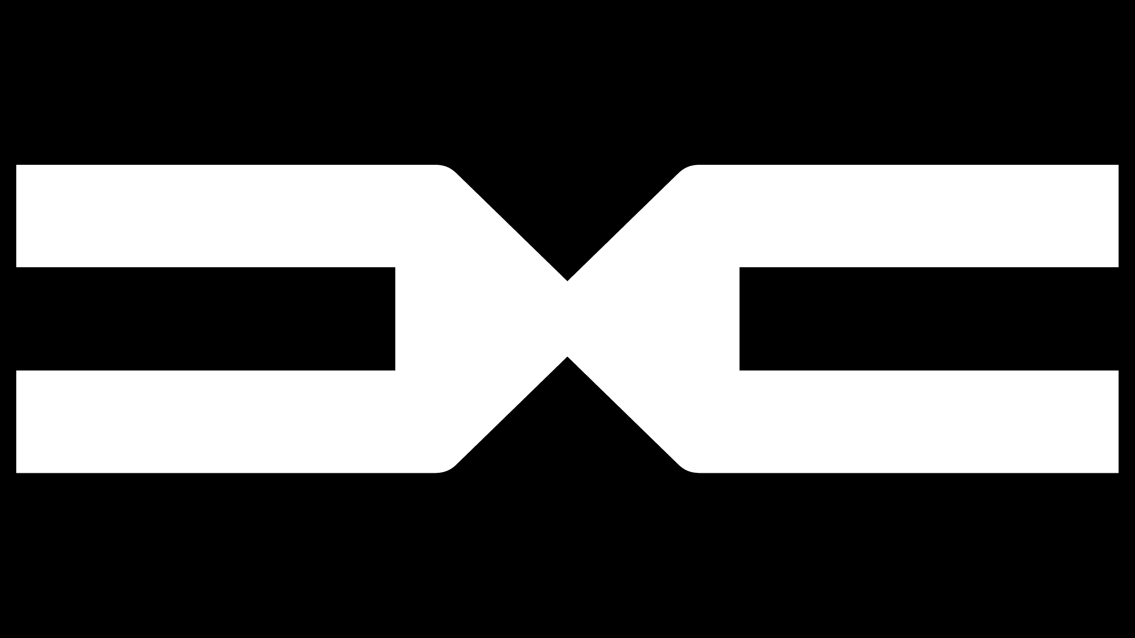
2021 – today
![]()
The previously announced Dacia Bigster model was adorned with a radically different, exclusive logo. It fits so harmoniously into the concept of a recently presented car that it is not even perceived as a symbol of visual identity. The badge looks like a natural pattern on the radiator grille, “embroidered” in the Romanian national style. The decor consists of the letters “D” and “C” butted together by the corner.
The inscription is complete but uses authentic symbols in the icon, decorated beneath the ancient letters in a geometric shape. “D” lacks a line on the left, making it look like “C.” “A” has no inner bar. Only “I” retained its previous appearance and remained unchanged. Moreover, the mirrored letters look like two tuning forks lying on their sides.
Font and Colors
The brand strictly adheres to the principle of originality and selects only authentic signs associated with the plant’s location. Dacia was the name of a region in modern Romania, so the population considers itself the descendant of the Dacians, a Frankish tribe that occupied this area. Romanians are very proud of this fact, and out of respect, they named their car brand that way. And the debut logo depicts the Balkan mountains, where their ancestors lived.
For the emblem’s design, the designers used a typeface similar to Nulshock Bold, Kinn Bold, and Tussilago Heavy. But the outlines of the letters are widened, rounded, and modernized.

Among the basic colors of the corporate palette are blue, black, silver, and white. The earliest version also has blue, mint, and beige.