


![]() Walt Disney World Logo PNG
Walt Disney World Logo PNG
The Disney World logo is full of dreams and fairy tales. It perfectly conveys the mood of a magical place for games and entertainment. However, the emblem shows that amid dreams and adventures, there is a bright, reasonable grain that every visitor must find and carry into the real world.
In the late 1940s, Walt Disney conceived of a family park after visiting Griffith Park in Los Angeles. Disneyland opened on July 17, 1955, in Anaheim and quickly became a commercial success. However, most visitors came from the western United States.
In November 1963, Disney’s team surveyed Central Florida, focusing on highway access and proximity to McCoy Air Force Base, which later became Orlando International Airport. In 1964, the company began secret land purchases through shell firms to avoid price inflation. The project was unveiled on November 15, 1965, with plans for EPCOT to be an experimental city.
Walt Disney died on December 15, 1966, before construction began. His brother Roy O. Disney returned to lead the project. On May 12, 1967, Florida approved the Reedy Creek Improvement District, granting Disney municipal-level control. Construction started later that month, and the resort was named Walt Disney World.
The project shifted away from the city concept toward a large-scale resort. Magic Kingdom opened on October 1, 1971, with about 10,000 visitors. Contemporary Resort, Polynesian Village Resort, and the monorail system launched alongside it. Roy Disney died on December 20, 1971.
Expansion continued with the opening of EPCOT Center in 1982, followed by the opening of new hotels and parks under CEO Michael Eisner. Disney-MGM Studios opened in 1989, Blizzard Beach in 1994, and Animal Kingdom in 1998.
Competition in the area grew with the opening of Universal Studios Florida in 1990. New additions in 2017 included Pandora, and in 2019 included Star Wars: Galaxy’s Edge, maintaining high attendance levels across the resort.
Meaning and History
![]()
Disney World’s fairytale universe is filled with locations and characters from animated films, and its trademark is similar to that of The Walt Disney Company. The designers did well on the branding component, connecting all parts of the media empire with common symbols.
What is Disney World?
This is the abbreviated name of the Walt Disney World Resort complex in the United States. It is located near Orlando, Florida. It includes hotels, parks, restaurants, cafes, shops, water parks, and entertainment venues covering about 100 square km.
1971 – 1996
![]()
The entertainment complex opened in 1971. By then, Roy Disney had already died, but he insisted that this place be named after his brother. This is how the inscription “Walt Disney World” appeared on the emblem. True, the first version used a streamlined sans-serif font, not at all what modern TV viewers are used to.
The “D” looked like a square with two rounded corners, and inside was a globe with Mickey Mouse ears. The designers chose this character because he was considered one of the most popular characters in Disney cartoons. The globe was meant to convey the resort’s global nature and worldwide fame.
1996 – 2005
![]()
In 1996, the logo featuring the complex’s full name was introduced: “Walt Disney World RESORT.” The first two words were written in a corporate font that imitated Walt Disney’s signature. The third was to their right, and the fourth was to the bottom, right-aligned. All letters in the word “RESORT” were capitalized.
Above the light blue lettering, the designers depicted a large shooting star and many small stars around it. In this context, the night sky symbolizes a dream because people often make wishes while watching meteorites burn up in the atmosphere.
2005 – today
![]()
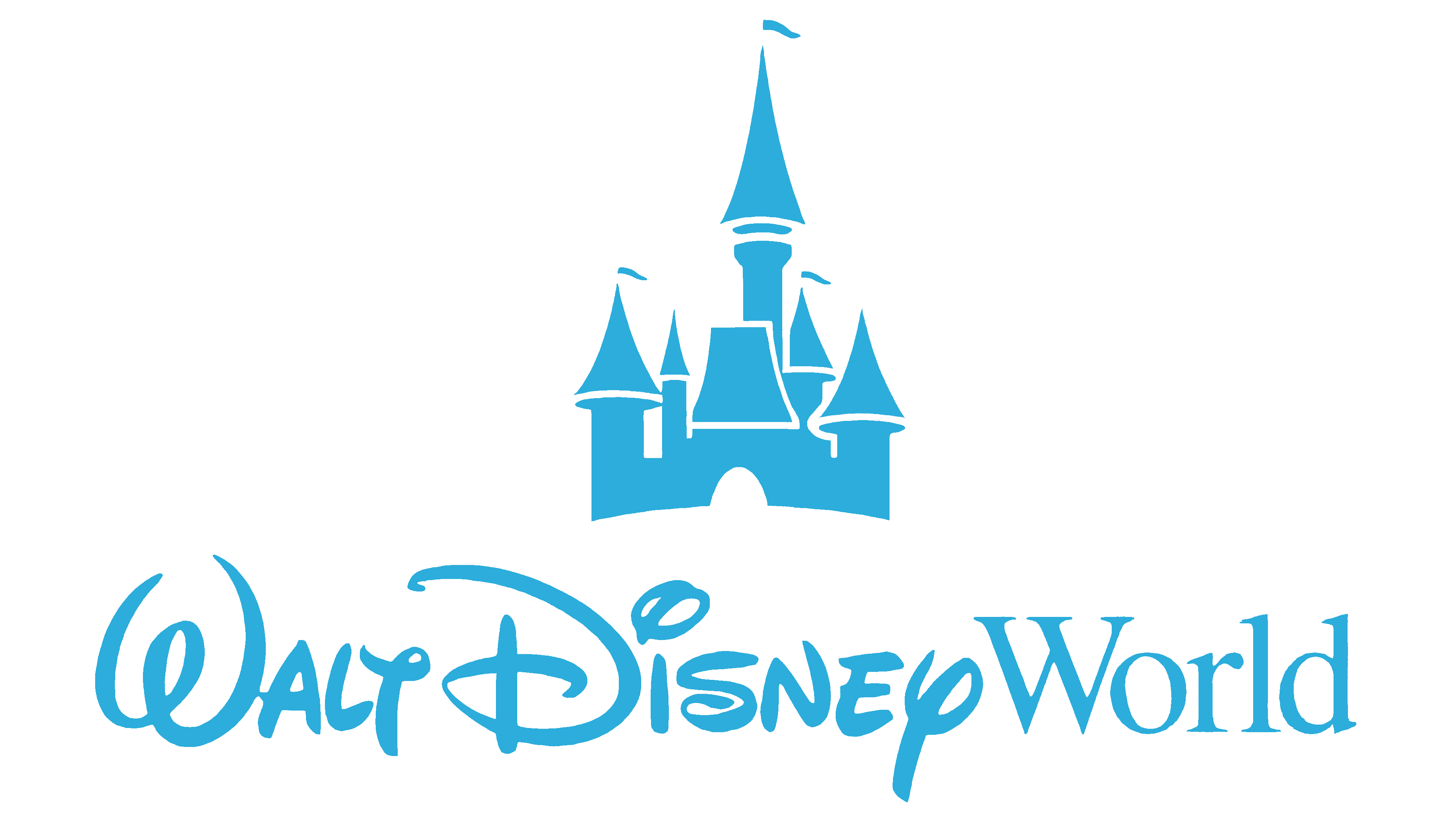
After the update, the logo became more compact and minimalistic. First, the developers removed the stars and the word “RESORT,” leaving only the resort name’s main part. Second, they changed the color to a darker shade of blue, almost black. This simplified version is still used today and represents Disney World as a division of the Walt Disney Company.
The entertainment center has a text trademark, but the first two words can be called a separate emblem associated with all Disney brands. Its prototype appeared long ago, when the famous American entrepreneur opened an animation studio and began searching for his recognizable style.
Font and Colors
The resort recreation area logo uses two fonts. They look contrasting because one is round and ornate, and the other is smooth, with sharp serifs. At first glance, the phrase “Walt Disney” appears to be handwritten. There is some truth in this because both words adapt to the animator’s signature.
Once upon a time, Walt, like many other cartoonists, created an unusual print signature. He constantly refined and improved it, making it the company’s distinctive sign. After his death, the new leaders of the multimedia empire decided to revive the old tradition and once again improve Walt Disney’s signature, with the designers’ involvement.
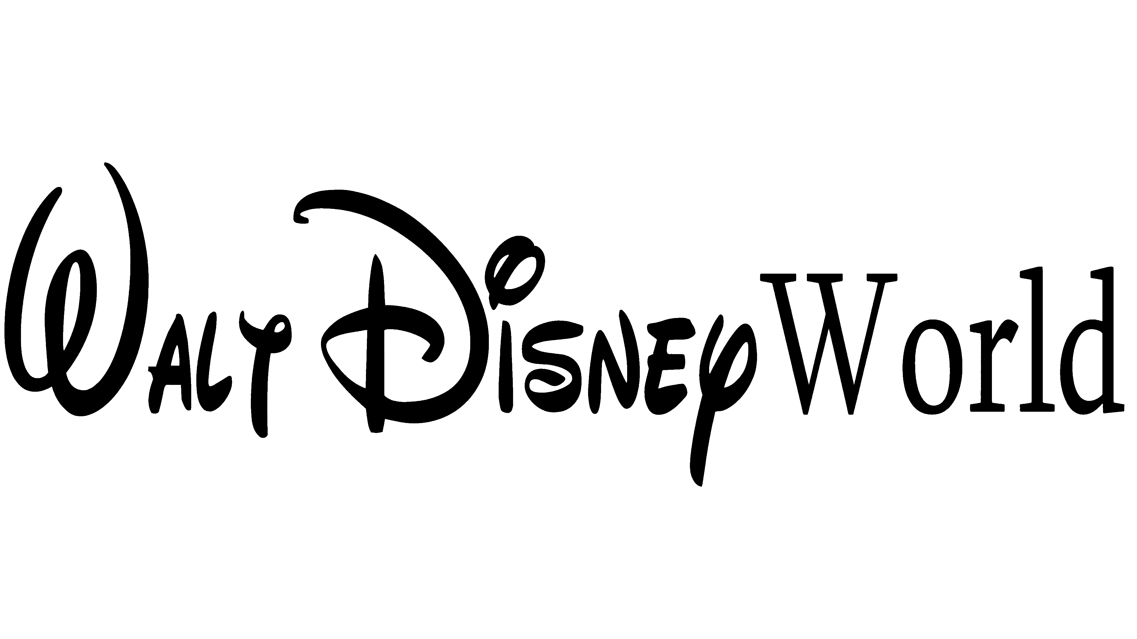
The experts used handwriting samples of the greatest American entrepreneur and added some details. The inscription appeared on the Disney World logo in this form. The word “World” is in a standard serif typeface and looks conservative.
The color scheme is also not very festive. It is strict and minimalist because it uses only two colors: black with a blue shade (for the entertainment complex’s name) and white (for the background).
FAQ
What character is on the Disney logo?
The logo’s character is Mickey Mouse, central to the brand’s identity. Created by Walt Disney and Ub Iwerks, Mickey first appeared in the 1928 short film Steamboat Willie and has since become Disney’s symbol.
The logo uses Mickey Mouse to identify the company with its most famous character. Mickey represents the magic, creativity, and joy that Disney brings to its audience. His recognizable image evokes nostalgia and happiness, making him the perfect choice for the logo.
What does the Disney symbol mean?
The logo is a famous icon that holds special meaning for its audience. It features a fairy-tale-inspired Cinderella Castle that represents the brand’s identity as a provider of magical entertainment.
The castle symbolizes a world of fantasy and imagination. It suggests a place where dreams come true, aligning with Disney’s mission to inspire and entertain. This imagery resonates with children and adults, evoking a sense of wonder and nostalgia.
By including the castle in the logo, Disney communicates its focus on creating magical experiences and stories that captivate and delight its audience.
What is the Disney World logo?
The logo features a dark blue stylized version of Walt Disney’s signature. The word “World” is set in classic Times New Roman, giving it a formal look. This logo has been in use since 2005.
The combination of Walt Disney’s signature and the elegant “World” font highlights the brand’s heritage and commitment to creating magical experiences. It captures the essence of Disney World as a place where dreams come true, making it instantly recognizable and meaningful to fans worldwide.
What is Disney World’s slogan?
Disney World’s slogan was “Where Dreams Come True” until 2020. This slogan highlighted the park as a place where magical experiences and dreams come to life, evoking the enchanting atmosphere and joy that visitors could expect.
In the fall of 2020, the slogan changed to “The Most Magical Place On Earth.” This new slogan focuses on the wonders and magical experiences throughout Disney World. It reinforces the idea that the park is full of extraordinary attractions and moments, creating unforgettable memories for visitors.
Who owns Disney World in Florida?
The Walt Disney Company owns the brand in Florida and operates through its division, Disney Parks, Experiences, and Products. This division manages Disney’s theme parks, resorts, and related experiences worldwide.
As part of The Walt Disney Company, the company benefits from its extensive resources, creativity, and expertise. This ownership and management structure ensures the brand maintains its high standards of magic, innovation, and customer service, making it a top destination for family entertainment and magical experiences.